Deck 9: Plots, Graphs, and Pictures
ملء الشاشة (f)
سؤال
سؤال
سؤال
سؤال
سؤال
سؤال
سؤال
The following is an example of what type of data picture? 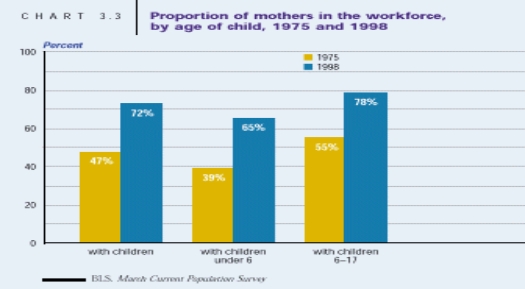
A)A pie chart.
B)A bar graph.
C)A pictogram.
D)A line graph.
A)A pie chart.
B)A bar graph.
C)A pictogram.
D)A line graph.
سؤال
سؤال
Use the following narrative: Narrative: Lottery dollar. Suppose you came across the following graph in the paper, accompanied by an article on where each dollar spent on lottery tickets goes.
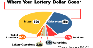
{Lottery dollar narrative} This graph has a problem, according to the four characteristics that any good graph should have.What is the problem with this graph?
{Lottery dollar narrative} This graph has a problem, according to the four characteristics that any good graph should have.What is the problem with this graph?
سؤال
سؤال
سؤال
سؤال
سؤال
سؤال
The following is an example of what type of data picture? 
A)A pie chart.
B)A bar graph.
C)A pictogram.
D)A line graph.
A)A pie chart.
B)A bar graph.
C)A pictogram.
D)A line graph.
سؤال
سؤال
سؤال
سؤال
سؤال
سؤال
سؤال
سؤال
سؤال
سؤال
سؤال
سؤال
سؤال
سؤال
سؤال
سؤال
سؤال
The following is an example of what type of data picture? 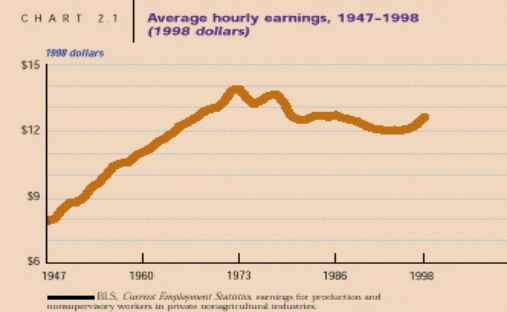
A)A pie chart.
B)A scatterplot.
C)A pictogram.
D)A line graph.
A)A pie chart.
B)A scatterplot.
C)A pictogram.
D)A line graph.
سؤال
سؤال
سؤال
سؤال
سؤال
The following is an example of what type of data picture? 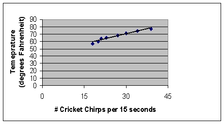
A)A line graph.
B)A scatterplot.
C)A Cartesian coordinate graph.
D)None of the above.
A)A line graph.
B)A scatterplot.
C)A Cartesian coordinate graph.
D)None of the above.
سؤال
سؤال
سؤال
سؤال
سؤال
What is wrong with the following histogram?
SHAPE \* MERGEFORMAT
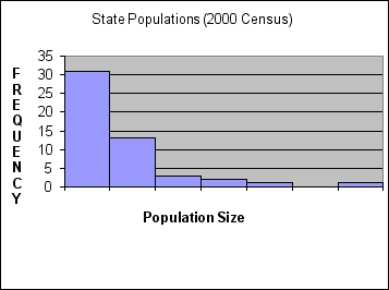

SHAPE \* MERGEFORMAT
سؤال
For Questions use the following narrative:
Narrative: Average hourly earnings
The graph below, done in 1998 by the Bureau of Labor Statistics, represents the average hourly earnings of U.S.workers from 1947-1998 (in 1998 dollars).

{Average hourly earnings narrative} The designers of this graph expressed all their data in terms of 1998 dollars.Explain why they did this, and whether or not you think this is a good idea.
Narrative: Average hourly earnings
The graph below, done in 1998 by the Bureau of Labor Statistics, represents the average hourly earnings of U.S.workers from 1947-1998 (in 1998 dollars).
{Average hourly earnings narrative} The designers of this graph expressed all their data in terms of 1998 dollars.Explain why they did this, and whether or not you think this is a good idea.
سؤال
سؤال
For Questions use the following narrative
Narrative: Pick 3 lottery
The Kansas Pick 3 Lottery results through 3/15/97 are shown in the table below.In this game, three numbers are drawn each week, and numbers can be repeated (such as 2, 3, 3).

{Pick 3 lottery narrative} Display the data in a bar graph that makes the point that each number is drawn about the same percentage of the time.
Narrative: Pick 3 lottery
The Kansas Pick 3 Lottery results through 3/15/97 are shown in the table below.In this game, three numbers are drawn each week, and numbers can be repeated (such as 2, 3, 3).
{Pick 3 lottery narrative} Display the data in a bar graph that makes the point that each number is drawn about the same percentage of the time.
سؤال
سؤال
For Questions use the following narrative:
Narrative: Average hourly earnings
The graph below, done in 1998 by the Bureau of Labor Statistics, represents the average hourly earnings of U.S.workers from 1947-1998 (in 1998 dollars).
{Average hourly earnings narrative} Describe the scale used on the vertical axis and whether or not it is appropriate.
سؤال
سؤال
For Questions use the following narrative
Narrative: Pick 3 lottery
The Kansas Pick 3 Lottery results through 3/15/97 are shown in the table below.In this game, three numbers are drawn each week, and numbers can be repeated (such as 2, 3, 3).
{Pick 3 lottery narrative} Using the number of times each number was drawn, display the data in a bar graph that looks as though the number 1 was chosen much less often, and number 2 much more often, than the other numbers.(This will be a misleading graph.) Explain why the lottery chose to display their data in a similar way in their newsletter.
سؤال
سؤال
سؤال
سؤال
سؤال
سؤال
سؤال
سؤال

فتح الحزمة
قم بالتسجيل لفتح البطاقات في هذه المجموعة!
Unlock Deck
Unlock Deck
1/57
العب
ملء الشاشة (f)
Deck 9: Plots, Graphs, and Pictures
1
Which of the following is not a characteristic of a good plot, graph, or picture of data?
A)A source must be given for the data.
B)The picture should contain as much information, color, and extra material as possible to keep readers interested.
C)The labels should be clear and informative.
D)All of the above are good characteristics of a good plot, graph, or picture of data.
A)A source must be given for the data.
B)The picture should contain as much information, color, and extra material as possible to keep readers interested.
C)The labels should be clear and informative.
D)All of the above are good characteristics of a good plot, graph, or picture of data.
The picture should contain as much information, color, and extra material as possible to keep readers interested.
2
Which of the following should be indicated by the labels on a graph?
A)The title or purpose of the picture.
B)What each of the axes, bars, pie segments, etc., denotes.
C)The scale of each axis, including starting points.
D)All of the above.
A)The title or purpose of the picture.
B)What each of the axes, bars, pie segments, etc., denotes.
C)The scale of each axis, including starting points.
D)All of the above.
All of the above.
3
What is one advantage of a bar graph over a pie chart?
a bar graph is much more versatile.it can be used to represent actual frequencies instead of percentages, and to represent proportions that are not required to sum to 100%.
4
Although a scatterplot can be more difficult to read than a line graph, it displays more information.Explain why.
فتح الحزمة
افتح القفل للوصول البطاقات البالغ عددها 57 في هذه المجموعة.
فتح الحزمة
k this deck
5
Which of the following is not true about the plots, graphs, or pictures of data that you come across in the media?
A)Most of these pictures can give you a clear, quick visual summary of that data.
B)One purpose is to convey a message more quickly than if you had to study the data on your own.
C)Very few of the pictures are misleading because they are checked for accuracy and fairness before being presented.
D)None of the above.
فتح الحزمة
افتح القفل للوصول البطاقات البالغ عددها 57 في هذه المجموعة.
فتح الحزمة
k this deck
6
Which of the following is not a type of picture for organizing categorical data?
A)A pie chart.
B)A bar graph.
C)A pictogram.
D)A histogram.
A)A pie chart.
B)A bar graph.
C)A pictogram.
D)A histogram.
فتح الحزمة
افتح القفل للوصول البطاقات البالغ عددها 57 في هذه المجموعة.
فتح الحزمة
k this deck
7
The following is an example of what type of data picture?
A)A pie chart.
B)A bar graph.
C)A pictogram.
D)A line graph.
A)A pie chart.
B)A bar graph.
C)A pictogram.
D)A line graph.
فتح الحزمة
افتح القفل للوصول البطاقات البالغ عددها 57 في هذه المجموعة.
فتح الحزمة
k this deck
8
A __________ is like a bar graph except that it uses pictures related to the topic of the graph.
فتح الحزمة
افتح القفل للوصول البطاقات البالغ عددها 57 في هذه المجموعة.
فتح الحزمة
k this deck
9
Use the following narrative: Narrative: Lottery dollar. Suppose you came across the following graph in the paper, accompanied by an article on where each dollar spent on lottery tickets goes.
{Lottery dollar narrative} This graph has a problem, according to the four characteristics that any good graph should have.What is the problem with this graph?
{Lottery dollar narrative} This graph has a problem, according to the four characteristics that any good graph should have.What is the problem with this graph?
فتح الحزمة
افتح القفل للوصول البطاقات البالغ عددها 57 في هذه المجموعة.
فتح الحزمة
k this deck
10
A __________ can be used to represent two or three categorical variables simultaneously.
فتح الحزمة
افتح القفل للوصول البطاقات البالغ عددها 57 في هذه المجموعة.
فتح الحزمة
k this deck
11
What type of data situation is best for using a pie chart (discuss type of data and number of variables)?
فتح الحزمة
افتح القفل للوصول البطاقات البالغ عددها 57 في هذه المجموعة.
فتح الحزمة
k this deck
12
Which of the following is not possible to include on a bar graph?
A)Frequency in each category for a categorical variable.
B)Information representing two or three categorical variables simultaneously.
C)Proportions that are not required to sum to 100%.
D)All of the above are possible with a bar graph.
A)Frequency in each category for a categorical variable.
B)Information representing two or three categorical variables simultaneously.
C)Proportions that are not required to sum to 100%.
D)All of the above are possible with a bar graph.
فتح الحزمة
افتح القفل للوصول البطاقات البالغ عددها 57 في هذه المجموعة.
فتح الحزمة
k this deck
13
Name three basic characteristics that a good plot, graph, or picture of data should exhibit.
فتح الحزمة
افتح القفل للوصول البطاقات البالغ عددها 57 في هذه المجموعة.
فتح الحزمة
k this deck
14
Name three types of statistical pictures that are used to represent measurement data.
فتح الحزمة
افتح القفل للوصول البطاقات البالغ عددها 57 في هذه المجموعة.
فتح الحزمة
k this deck
15
The following is an example of what type of data picture?
A)A pie chart.
B)A bar graph.
C)A pictogram.
D)A line graph.
A)A pie chart.
B)A bar graph.
C)A pictogram.
D)A line graph.
فتح الحزمة
افتح القفل للوصول البطاقات البالغ عددها 57 في هذه المجموعة.
فتح الحزمة
k this deck
16
It is easy to be misled by pictograms.Explain how.
فتح الحزمة
افتح القفل للوصول البطاقات البالغ عددها 57 في هذه المجموعة.
فتح الحزمة
k this deck
17
The focus of each type of data picture for categorical data is conveying information about the relative size of groups compared to each other.Explain what is meant by 'relative size.'
فتح الحزمة
افتح القفل للوصول البطاقات البالغ عددها 57 في هذه المجموعة.
فتح الحزمة
k this deck
18
What is the purpose of a plot, graph, or picture of data?
فتح الحزمة
افتح القفل للوصول البطاقات البالغ عددها 57 في هذه المجموعة.
فتح الحزمة
k this deck
19
What does each dot on a scatterplot represent, in terms of both the individuals and their measurements?
فتح الحزمة
افتح القفل للوصول البطاقات البالغ عددها 57 في هذه المجموعة.
فتح الحزمة
k this deck
20
Name a situation in which a scatterplot is most useful for displaying measurement data.
فتح الحزمة
افتح القفل للوصول البطاقات البالغ عددها 57 في هذه المجموعة.
فتح الحزمة
k this deck
21
Even if you were to account for the trend, seasonal components, and smooth irregular cycles, you would still not be able to perfectly explain or predict a time series plot.Why not?
فتح الحزمة
افتح القفل للوصول البطاقات البالغ عددها 57 في هذه المجموعة.
فتح الحزمة
k this deck
22
What two things should you check regarding the timeline of a time series in order to avoid being misled?
فتح الحزمة
افتح القفل للوصول البطاقات البالغ عددها 57 في هذه المجموعة.
فتح الحزمة
k this deck
23
If a long-term trend in a time series plot is linear, we can estimate it by finding a regression line, with time period as the __________ variable.
فتح الحزمة
افتح القفل للوصول البطاقات البالغ عددها 57 في هذه المجموعة.
فتح الحزمة
k this deck
24
Which of the following does not describe a time series plot with an irregular cycle?
A)It repeatedly goes up and back down smoothly, but with an irregular pattern so as not to be predictable.
B)It randomly fluctuates with no pattern at all.
C)Its irregularity can often be explained by outside factors such as political or social situations.
D)All of the above.
A)It repeatedly goes up and back down smoothly, but with an irregular pattern so as not to be predictable.
B)It randomly fluctuates with no pattern at all.
C)Its irregularity can often be explained by outside factors such as political or social situations.
D)All of the above.
فتح الحزمة
افتح القفل للوصول البطاقات البالغ عددها 57 في هذه المجموعة.
فتح الحزمة
k this deck
25
Which of the following components of a time series plot is defined as what's left over when the other three components have been removed?
A)Random fluctuations
B)Seasonal components
C)Irregular cycles
D)Long-term trend
A)Random fluctuations
B)Seasonal components
C)Irregular cycles
D)Long-term trend
فتح الحزمة
افتح القفل للوصول البطاقات البالغ عددها 57 في هذه المجموعة.
فتح الحزمة
k this deck
26
Why is it important for a manufacturer to know about any seasonal component to the time series of the sales of their product?
فتح الحزمة
افتح القفل للوصول البطاقات البالغ عددها 57 في هذه المجموعة.
فتح الحزمة
k this deck
27
A(n) __________ is useful for displaying the relationship between two measurement variables.
فتح الحزمة
افتح القفل للوصول البطاقات البالغ عددها 57 في هذه المجموعة.
فتح الحزمة
k this deck
28
Most time series contain the same four components Name two of them.
فتح الحزمة
افتح القفل للوصول البطاقات البالغ عددها 57 في هذه المجموعة.
فتح الحزمة
k this deck
29
What characteristics do statistical pictures of measurement data allow us to examine?
A)Trends or patterns in the data.
B)Variability in the data.
C)The overall shape of the data.
D)All of the above.
A)Trends or patterns in the data.
B)Variability in the data.
C)The overall shape of the data.
D)All of the above.
فتح الحزمة
افتح القفل للوصول البطاقات البالغ عددها 57 في هذه المجموعة.
فتح الحزمة
k this deck
30
How does a time series plot differ from a histogram?
A)A histogram displays one measurement variable, but a time series plot displays data with two measurement variables (time is one of them).
B)A histogram displays data collected at one point in time, while a time series plot displays data collected over a series of times.
C)If a histogram is flat, that indicates more variability than if it were bell-shaped.If a time series plot is flat, that indicates less variability than if it were bell-shaped.
D)All of the above.
فتح الحزمة
افتح القفل للوصول البطاقات البالغ عددها 57 في هذه المجموعة.
فتح الحزمة
k this deck
31
Measurement data displayed in terms of how they change over time can not be represented by what type of statistical picture?
A)A line graph.
B)A bar graph.
C)A histogram.
D)All of the above can be used.
A)A line graph.
B)A bar graph.
C)A histogram.
D)All of the above can be used.
فتح الحزمة
افتح القفل للوصول البطاقات البالغ عددها 57 في هذه المجموعة.
فتح الحزمة
k this deck
32
The following is an example of what type of data picture?
A)A pie chart.
B)A scatterplot.
C)A pictogram.
D)A line graph.
A)A pie chart.
B)A scatterplot.
C)A pictogram.
D)A line graph.
فتح الحزمة
افتح القفل للوصول البطاقات البالغ عددها 57 في هذه المجموعة.
فتح الحزمة
k this deck
33
How can a time series plot mislead the reader into thinking that a trend in the data is long term, when in fact it is only short term?
فتح الحزمة
افتح القفل للوصول البطاقات البالغ عددها 57 في هذه المجموعة.
فتح الحزمة
k this deck
34
Which of the following does not describe a time series?
A)A time series is a record of a variable across time.
B)A time series is usually measured at equally spaced time intervals.
C)A time series is a data set on numerous individuals measured in units of time (for example, time until completion of the obstacle course; or time until graduation).
D)All of the above describe a time series.
فتح الحزمة
افتح القفل للوصول البطاقات البالغ عددها 57 في هذه المجموعة.
فتح الحزمة
k this deck
35
Name one way in which a time series plot can be misleading.
فتح الحزمة
افتح القفل للوصول البطاقات البالغ عددها 57 في هذه المجموعة.
فتح الحزمة
k this deck
36
Explain why it is not wise to forecast a trend very far into the future.
فتح الحزمة
افتح القفل للوصول البطاقات البالغ عددها 57 في هذه المجموعة.
فتح الحزمة
k this deck
37
The following is an example of what type of data picture?
A)A line graph.
B)A scatterplot.
C)A Cartesian coordinate graph.
D)None of the above.
A)A line graph.
B)A scatterplot.
C)A Cartesian coordinate graph.
D)None of the above.
فتح الحزمة
افتح القفل للوصول البطاقات البالغ عددها 57 في هذه المجموعة.
فتح الحزمة
k this deck
38
Which of the following describes the result of seasonally adjusting a time series (such as the unemployment rate)?
A)The seasonal extremes have been removed.
B)One time period no longer dominates each year as the high or the low.
C)The variability is reduced.
D)All of the above.
A)The seasonal extremes have been removed.
B)One time period no longer dominates each year as the high or the low.
C)The variability is reduced.
D)All of the above.
فتح الحزمة
افتح القفل للوصول البطاقات البالغ عددها 57 في هذه المجموعة.
فتح الحزمة
k this deck
39
Name two questions you should ask to avoid being misled when reading time series data.
فتح الحزمة
افتح القفل للوصول البطاقات البالغ عددها 57 في هذه المجموعة.
فتح الحزمة
k this deck
40
A(n) __________ is a good way to represent measurement data as it changes over time.
فتح الحزمة
افتح القفل للوصول البطاقات البالغ عددها 57 في هذه المجموعة.
فتح الحزمة
k this deck
41
A statistical picture isn't worth much if the __________ can't be trusted.
فتح الحزمة
افتح القفل للوصول البطاقات البالغ عددها 57 في هذه المجموعة.
فتح الحزمة
k this deck
42
What is wrong with the following histogram?
SHAPE \* MERGEFORMAT
SHAPE \* MERGEFORMAT
فتح الحزمة
افتح القفل للوصول البطاقات البالغ عددها 57 في هذه المجموعة.
فتح الحزمة
k this deck
43
For Questions use the following narrative:
Narrative: Average hourly earnings
The graph below, done in 1998 by the Bureau of Labor Statistics, represents the average hourly earnings of U.S.workers from 1947-1998 (in 1998 dollars).
{Average hourly earnings narrative} The designers of this graph expressed all their data in terms of 1998 dollars.Explain why they did this, and whether or not you think this is a good idea.
فتح الحزمة
افتح القفل للوصول البطاقات البالغ عددها 57 في هذه المجموعة.
فتح الحزمة
k this deck
44
In what way(s) can a poorly done histogram be misleading?
A)Changes in labeling on one or more axes.
B)Not starting at zero as a way to exaggerate trends.
C)Using poor information.
D)All of the above.
A)Changes in labeling on one or more axes.
B)Not starting at zero as a way to exaggerate trends.
C)Using poor information.
D)All of the above.
فتح الحزمة
افتح القفل للوصول البطاقات البالغ عددها 57 في هذه المجموعة.
فتح الحزمة
k this deck
45
For Questions use the following narrative
Narrative: Pick 3 lottery
The Kansas Pick 3 Lottery results through 3/15/97 are shown in the table below.In this game, three numbers are drawn each week, and numbers can be repeated (such as 2, 3, 3).
{Pick 3 lottery narrative} Display the data in a bar graph that makes the point that each number is drawn about the same percentage of the time.
فتح الحزمة
افتح القفل للوصول البطاقات البالغ عددها 57 في هذه المجموعة.
فتح الحزمة
k this deck
46
In what way(s) can a poorly done pie chart be misleading?
A)Changes in labeling on one or more axes.
B)Not starting at zero as a way to exaggerate trends.
C)Using poor information.
D)All of the above.
A)Changes in labeling on one or more axes.
B)Not starting at zero as a way to exaggerate trends.
C)Using poor information.
D)All of the above.
فتح الحزمة
افتح القفل للوصول البطاقات البالغ عددها 57 في هذه المجموعة.
فتح الحزمة
k this deck
47
For Questions use the following narrative:
Narrative: Average hourly earnings
The graph below, done in 1998 by the Bureau of Labor Statistics, represents the average hourly earnings of U.S.workers from 1947-1998 (in 1998 dollars).
{Average hourly earnings narrative} Describe the scale used on the vertical axis and whether or not it is appropriate.
فتح الحزمة
افتح القفل للوصول البطاقات البالغ عددها 57 في هذه المجموعة.
فتح الحزمة
k this deck
48
Name 3 of the 12 questions you should ask when you look at a statistical picture, before trying to interpret it.
فتح الحزمة
افتح القفل للوصول البطاقات البالغ عددها 57 في هذه المجموعة.
فتح الحزمة
k this deck
49
For Questions use the following narrative
Narrative: Pick 3 lottery
The Kansas Pick 3 Lottery results through 3/15/97 are shown in the table below.In this game, three numbers are drawn each week, and numbers can be repeated (such as 2, 3, 3).
{Pick 3 lottery narrative} Using the number of times each number was drawn, display the data in a bar graph that looks as though the number 1 was chosen much less often, and number 2 much more often, than the other numbers.(This will be a misleading graph.) Explain why the lottery chose to display their data in a similar way in their newsletter.
فتح الحزمة
افتح القفل للوصول البطاقات البالغ عددها 57 في هذه المجموعة.
فتح الحزمة
k this deck
50
If the scale on the vertical axis is in very large increments with very little space between each one, what does this do to the appearance of the data?
A)It makes differences appear smaller than they really are.
B)It makes differences appear larger than they really are.
C)It does nothing to affect the appearance of the data.
D)It makes the information easier to read and understand.
A)It makes differences appear smaller than they really are.
B)It makes differences appear larger than they really are.
C)It does nothing to affect the appearance of the data.
D)It makes the information easier to read and understand.
فتح الحزمة
افتح القفل للوصول البطاقات البالغ عددها 57 في هذه المجموعة.
فتح الحزمة
k this deck
51
Which of the following would automatically mean a statistical picture is misleading?
A)A histogram where the scale is very large.
B)A pictogram where all money is converted to current U.S.dollar amounts.
C)A line graph where the axes do not start at zero.
D)None of the above.
A)A histogram where the scale is very large.
B)A pictogram where all money is converted to current U.S.dollar amounts.
C)A line graph where the axes do not start at zero.
D)None of the above.
فتح الحزمة
افتح القفل للوصول البطاقات البالغ عددها 57 في هذه المجموعة.
فتح الحزمة
k this deck
52
Suppose you have data on the number of accidents at a certain inter
A)A bar graph with one bar for each year of data available; the bars are an equal distance apart.
B)A line graph with the years from 1960 through 1990 marked off in equal increments and dots on the line graph representing the number of accidents for the years for which data are available.The dots are connected with lines.
C)A pie chart with a slice for the percentage of accidents occurring in each of the four years for which data is available.
D)Any of the above.
فتح الحزمة
افتح القفل للوصول البطاقات البالغ عددها 57 في هذه المجموعة.
فتح الحزمة
k this deck
53
Name two of the five most common problems in plots, graphs and pictures.
فتح الحزمة
افتح القفل للوصول البطاقات البالغ عددها 57 في هذه المجموعة.
فتح الحزمة
k this deck
54
Which of the following is not true about a plot, graph, or picture of data?
A)Extraneous information should be excluded; the more extra information on a graph, the more confusing it can get.
B)Many graphs are misleading; the public must look at them critically before trying to interpret their results.
C)The scale on a graph doesn't matter.Measurement data can be displayed using any scale as long as that scale is consistent.
D)All of the above statements are true.
فتح الحزمة
افتح القفل للوصول البطاقات البالغ عددها 57 في هذه المجموعة.
فتح الحزمة
k this deck
55
Units of measurement are important.If a graph showed the number of crimes in each state for a given year, this would be misleading; the __________ should be reported instead.
فتح الحزمة
افتح القفل للوصول البطاقات البالغ عددها 57 في هذه المجموعة.
فتح الحزمة
k this deck
56
Which of the following is not a characteristic of a good plot, graph, or picture of data?
A)Financial data collected over time should be adjusted for inflation.
B)Any breaks between years where data is missing should be closed in and not left as empty spaces.
C)The labels should be clear and informative.
D)All of the above are good characteristics of a good plot, graph, or picture of data.
فتح الحزمة
افتح القفل للوصول البطاقات البالغ عددها 57 في هذه المجموعة.
فتح الحزمة
k this deck
57
Many time series measure variables that either increase or decrease steadily across time.This steady change is called a(n) __________.
فتح الحزمة
افتح القفل للوصول البطاقات البالغ عددها 57 في هذه المجموعة.
فتح الحزمة
k this deck
فتح الحزمة
افتح القفل للوصول البطاقات البالغ عددها 57 في هذه المجموعة.


