Deck 9: Working With Charts
ملء الشاشة (f)
سؤال
سؤال
سؤال
سؤال
سؤال
سؤال
سؤال
سؤال
سؤال
سؤال
سؤال
سؤال
سؤال
سؤال
سؤال
سؤال
سؤال
سؤال
سؤال
سؤال
سؤال
سؤال

In the accompanying figure, item 2 points to the ____.
A) data series
B) legend
C) chart title
D) data range
سؤال

In the accompanying figure, item 1 points to the ____.
A) x-axis
B) data range
C) axis titles
D) data series
سؤال
سؤال

In the accompanying figure, there are ____ categories.
A) four
B) five
C) zero
D) three
سؤال
سؤال
سؤال
سؤال

In the accompanying figure, the item "Month" is the ____.
A) horizontal axis title
B) chart title
C) vertical axis title
D) legend
سؤال
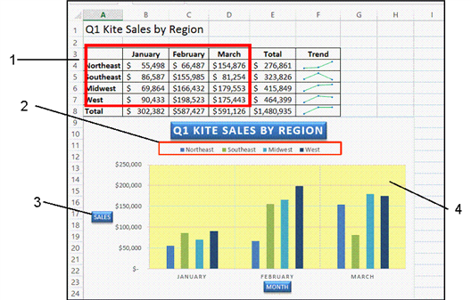
In the accompanying figure, item 4 points to the ____.
A) plot area
B) chart area
C) fill color
D) highlighted area
سؤال
سؤال

In the accompanying figure, item 3 points to the ____.
A) x-axis
B) y-axis
C) vertical axis title
D) horizontal axis title
سؤال
سؤال
سؤال
سؤال

In the accompanying figure, in each category, there are ____ data series.
A) two
B) three
C) four
D) five
سؤال
سؤال
سؤال

In the accompanying figure, the plot area is ____.
A) yellow
B) transparent
C) light blue
D) white
سؤال
سؤال
سؤال
سؤال
سؤال
سؤال
سؤال
سؤال
سؤال
سؤال
سؤال
سؤال
سؤال
سؤال
سؤال
سؤال
سؤال
سؤال
سؤال
سؤال
سؤال
سؤال
سؤال
سؤال
Match between columns
سؤال
سؤال
سؤال

فتح الحزمة
قم بالتسجيل لفتح البطاقات في هذه المجموعة!
Unlock Deck
Unlock Deck
1/66
العب
ملء الشاشة (f)
Deck 9: Working With Charts
1
A trendline is a line that connects high or low points in a data series and shows a trend.
True
2
The horizontal axis is also known as the Y-axis.
False
3
A chart layout is a predefined set of chart colors and fills.
False
4
A(n) data series is a sequence of related numbers that shows a trend
فتح الحزمة
افتح القفل للوصول البطاقات البالغ عددها 66 في هذه المجموعة.
فتح الحزمة
k this deck
5
A worksheet is a much more effective way to communicate data to an audience than a chart.
فتح الحزمة
افتح القفل للوصول البطاقات البالغ عددها 66 في هذه المجموعة.
فتح الحزمة
k this deck
6
The vertical axis provides values, not categories.
فتح الحزمة
افتح القفل للوصول البطاقات البالغ عددها 66 في هذه المجموعة.
فتح الحزمة
k this deck
7
A data marker represents one value in a data series.
فتح الحزمة
افتح القفل للوصول البطاقات البالغ عددها 66 في هذه المجموعة.
فتح الحزمة
k this deck
8
A scatter chart is used for showing relative importance of values over a period of time.
فتح الحزمة
افتح القفل للوصول البطاقات البالغ عددها 66 في هذه المجموعة.
فتح الحزمة
k this deck
9
It is possible to move a chart to a new location on the worksheet after it has been created.
فتح الحزمة
افتح القفل للوصول البطاقات البالغ عددها 66 في هذه المجموعة.
فتح الحزمة
k this deck
10
Data series identify the values on each axis
فتح الحزمة
افتح القفل للوصول البطاقات البالغ عددها 66 في هذه المجموعة.
فتح الحزمة
k this deck
11
A chart layout is a predefined arrangement of chart elements
فتح الحزمة
افتح القفل للوصول البطاقات البالغ عددها 66 في هذه المجموعة.
فتح الحزمة
k this deck
12
Clustered Column is a type of Column chart
فتح الحزمة
افتح القفل للوصول البطاقات البالغ عددها 66 في هذه المجموعة.
فتح الحزمة
k this deck
13
It is important to organize your rows and columns of data so that when you create a chart, it illustrates the points you want to make.
فتح الحزمة
افتح القفل للوصول البطاقات البالغ عددها 66 في هذه المجموعة.
فتح الحزمة
k this deck
14
You can move the legend of a chart to a new location using the Chart Elements menu
فتح الحزمة
افتح القفل للوصول البطاقات البالغ عددها 66 في هذه المجموعة.
فتح الحزمة
k this deck
15
The chart area is also known as the plot area.
فتح الحزمة
افتح القفل للوصول البطاقات البالغ عددها 66 في هذه المجموعة.
فتح الحزمة
k this deck
16
Pointing to a sizing handle of a chart allows you to move it
فتح الحزمة
افتح القفل للوصول البطاقات البالغ عددها 66 في هذه المجموعة.
فتح الحزمة
k this deck
17
The horizontal and vertical axes are included in the plot area.
فتح الحزمة
افتح القفل للوصول البطاقات البالغ عددها 66 في هذه المجموعة.
فتح الحزمة
k this deck
18
In a worksheet, you select the cells that contain the data you want to chart, and then click the Recommended Charts button on the INSERT tab to choose from a selection of chart types
فتح الحزمة
افتح القفل للوصول البطاقات البالغ عددها 66 في هذه المجموعة.
فتح الحزمة
k this deck
19
The chart background is an example of a chart object .
فتح الحزمة
افتح القفل للوصول البطاقات البالغ عددها 66 في هذه المجموعة.
فتح الحزمة
k this deck
20
You can change one type of chart to another by clicking the Change Chart Type button on the CHANGE TOOLS DESIGN tab
فتح الحزمة
افتح القفل للوصول البطاقات البالغ عددها 66 في هذه المجموعة.
فتح الحزمة
k this deck
21
The ____ is the horizontal line at the base of the chart that shows categories.
A) title axis
B) z-axis
C) x-axis
D) y-axis
A) title axis
B) z-axis
C) x-axis
D) y-axis
فتح الحزمة
افتح القفل للوصول البطاقات البالغ عددها 66 في هذه المجموعة.
فتح الحزمة
k this deck
22
In the accompanying figure, item 2 points to the ____.
A) data series
B) legend
C) chart title
D) data range
فتح الحزمة
افتح القفل للوصول البطاقات البالغ عددها 66 في هذه المجموعة.
فتح الحزمة
k this deck
23
In the accompanying figure, item 1 points to the ____.
A) x-axis
B) data range
C) axis titles
D) data series
فتح الحزمة
افتح القفل للوصول البطاقات البالغ عددها 66 في هذه المجموعة.
فتح الحزمة
k this deck
24
Tiny charts that fit into one cell and show a trend are known as ____.
A) mini charts
B) micro charts
C) sparklines
D) scatterlines
A) mini charts
B) micro charts
C) sparklines
D) scatterlines
فتح الحزمة
افتح القفل للوصول البطاقات البالغ عددها 66 في هذه المجموعة.
فتح الحزمة
k this deck
25
In the accompanying figure, there are ____ categories.
A) four
B) five
C) zero
D) three
فتح الحزمة
افتح القفل للوصول البطاقات البالغ عددها 66 في هذه المجموعة.
فتح الحزمة
k this deck
26
To change the color of a sparkline marker is to change its ____.
A) priority
B) style
C) level
D) significance
A) priority
B) style
C) level
D) significance
فتح الحزمة
افتح القفل للوصول البطاقات البالغ عددها 66 في هذه المجموعة.
فتح الحزمة
k this deck
27
A chart ____ is a predefined set of chart colors and fills.
A) tool
B) gallery
C) layout
D) style
A) tool
B) gallery
C) layout
D) style
فتح الحزمة
افتح القفل للوصول البطاقات البالغ عددها 66 في هذه المجموعة.
فتح الحزمة
k this deck
28
A column sparkline is a miniature line chart that includes a bar for each cell in a selected ____.
A) chart
B) range
C) line graph
D) worksheet
A) chart
B) range
C) line graph
D) worksheet
فتح الحزمة
افتح القفل للوصول البطاقات البالغ عددها 66 في هذه المجموعة.
فتح الحزمة
k this deck
29
In the accompanying figure, the item "Month" is the ____.
A) horizontal axis title
B) chart title
C) vertical axis title
D) legend
فتح الحزمة
افتح القفل للوصول البطاقات البالغ عددها 66 في هذه المجموعة.
فتح الحزمة
k this deck
30
In the accompanying figure, item 4 points to the ____.
A) plot area
B) chart area
C) fill color
D) highlighted area
فتح الحزمة
افتح القفل للوصول البطاقات البالغ عددها 66 في هذه المجموعة.
فتح الحزمة
k this deck
31
____ are vertical and horizontal lines in a chart that help to identify the value for each data series.
A) Data lines
B) Data markers
C) Gridlines
D) Grid markers
A) Data lines
B) Data markers
C) Gridlines
D) Grid markers
فتح الحزمة
افتح القفل للوصول البطاقات البالغ عددها 66 في هذه المجموعة.
فتح الحزمة
k this deck
32
In the accompanying figure, item 3 points to the ____.
A) x-axis
B) y-axis
C) vertical axis title
D) horizontal axis title
فتح الحزمة
افتح القفل للوصول البطاقات البالغ عددها 66 في هذه المجموعة.
فتح الحزمة
k this deck
33
The ____ is the vertical line that defines the left edge of the chart and provides values.
A) title axis
B) z-axis
C) x-axis
D) y-axis
A) title axis
B) z-axis
C) x-axis
D) y-axis
فتح الحزمة
افتح القفل للوصول البطاقات البالغ عددها 66 في هذه المجموعة.
فتح الحزمة
k this deck
34
You can add _____ to a sparkline to indicate values for each cell in the selected range.
A) color
B) weight
C) stars
D) markers
A) color
B) weight
C) stars
D) markers
فتح الحزمة
افتح القفل للوصول البطاقات البالغ عددها 66 في هذه المجموعة.
فتح الحزمة
k this deck
35
The ____ identifies what each data series represents.
A) legend
B) data marker
C) data title
D) gridline
A) legend
B) data marker
C) data title
D) gridline
فتح الحزمة
افتح القفل للوصول البطاقات البالغ عددها 66 في هذه المجموعة.
فتح الحزمة
k this deck
36
In the accompanying figure, in each category, there are ____ data series.
A) two
B) three
C) four
D) five
فتح الحزمة
افتح القفل للوصول البطاقات البالغ عددها 66 في هذه المجموعة.
فتح الحزمة
k this deck
37
The ____ is for comparing data equally across categories and series.
A) title axis
B) z-axis
C) x-axis
D) y-axis
A) title axis
B) z-axis
C) x-axis
D) y-axis
فتح الحزمة
افتح القفل للوصول البطاقات البالغ عددها 66 في هذه المجموعة.
فتح الحزمة
k this deck
38
The Move Chart button is in the ____ group on the CHART TOOLS DESIGN tab.
A) Location
B) Move
C) Copy/Move
D) Copy/Paste
A) Location
B) Move
C) Copy/Move
D) Copy/Paste
فتح الحزمة
افتح القفل للوصول البطاقات البالغ عددها 66 في هذه المجموعة.
فتح الحزمة
k this deck
39
In the accompanying figure, the plot area is ____.
A) yellow
B) transparent
C) light blue
D) white
فتح الحزمة
افتح القفل للوصول البطاقات البالغ عددها 66 في هذه المجموعة.
فتح الحزمة
k this deck
40
A ____ sheet does not include any worksheet cells.
A) spread
B) backup
C) data
D) chart
A) spread
B) backup
C) data
D) chart
فتح الحزمة
افتح القفل للوصول البطاقات البالغ عددها 66 في هذه المجموعة.
فتح الحزمة
k this deck
41
To select nonadjacent ranges, hold the ____ key.
A) [Tab]
B) [Enter]
C) [Ctrl]]
D) [Shift]
A) [Tab]
B) [Enter]
C) [Ctrl]]
D) [Shift]
فتح الحزمة
افتح القفل للوصول البطاقات البالغ عددها 66 في هذه المجموعة.
فتح الحزمة
k this deck
42
An assortment of different chart layouts can be found in the ____.
A) Quick Layout gallery
B) Chart Styles gallery
C) Layout dialog box
D) Chart Themes gallery
A) Quick Layout gallery
B) Chart Styles gallery
C) Layout dialog box
D) Chart Themes gallery
فتح الحزمة
افتح القفل للوصول البطاقات البالغ عددها 66 في هذه المجموعة.
فتح الحزمة
k this deck
43
Explain what a data table is.
فتح الحزمة
افتح القفل للوصول البطاقات البالغ عددها 66 في هذه المجموعة.
فتح الحزمة
k this deck
44
If you want to modify the formatting or alignment of a chart element, you can do so in the ____ pane.
A) Modify
B) Chart Changes
C) Format
D) Design
A) Modify
B) Chart Changes
C) Format
D) Design
فتح الحزمة
افتح القفل للوصول البطاقات البالغ عددها 66 في هذه المجموعة.
فتح الحزمة
k this deck
45
To remove a data table from a chart click the Data Table check box in the Chart _____________ menu to remove it.
فتح الحزمة
افتح القفل للوصول البطاقات البالغ عددها 66 في هذه المجموعة.
فتح الحزمة
k this deck
46
The Switch Row/Column button is in the ____ group on the CHART TOOLS DESIGN tab.
A) Chart
B) Data
C) Tools
D) Number
A) Chart
B) Data
C) Tools
D) Number
فتح الحزمة
افتح القفل للوصول البطاقات البالغ عددها 66 في هذه المجموعة.
فتح الحزمة
k this deck
47
A win/loss sparkline only shows _______ type(s) of bar(s).
A) one
B) three
C) two
D) four
A) one
B) three
C) two
D) four
فتح الحزمة
افتح القفل للوصول البطاقات البالغ عددها 66 في هذه المجموعة.
فتح الحزمة
k this deck
48
To modify chart element text, such as a title, click in the ____ text.
A) box
B) placeholder
C) dialog box
D) pane
A) box
B) placeholder
C) dialog box
D) pane
فتح الحزمة
افتح القفل للوصول البطاقات البالغ عددها 66 في هذه المجموعة.
فتح الحزمة
k this deck
49
To change fill colors, textures and fonts for your chart, click the Chart ____ button.
A) Styles
B) Layout
C) Gallery
D) Themes
A) Styles
B) Layout
C) Gallery
D) Themes
فتح الحزمة
افتح القفل للوصول البطاقات البالغ عددها 66 في هذه المجموعة.
فتح الحزمة
k this deck
50
Compare a chart layout to a chart style.
فتح الحزمة
افتح القفل للوصول البطاقات البالغ عددها 66 في هذه المجموعة.
فتح الحزمة
k this deck
51
After you move a chart to a chart sheet, which button can you use to apply a layout?
A) Chart Style
B) Quick Layout
C) Quick Chart
D) Layout Style
A) Chart Style
B) Quick Layout
C) Quick Chart
D) Layout Style
فتح الحزمة
افتح القفل للوصول البطاقات البالغ عددها 66 في هذه المجموعة.
فتح الحزمة
k this deck
52
The Offset Bottom Shadow style is an example of a shape _______________ that can be added to a chart element.
فتح الحزمة
افتح القفل للوصول البطاقات البالغ عددها 66 في هذه المجموعة.
فتح الحزمة
k this deck
53
A(n) _____________________ in a chart is a grid containing the chart's underlying worksheet data.
فتح الحزمة
افتح القفل للوصول البطاقات البالغ عددها 66 في هذه المجموعة.
فتح الحزمة
k this deck
54
Primary Major Horizontal is an example of a type of _____________________.
فتح الحزمة
افتح القفل للوصول البطاقات البالغ عددها 66 في هذه المجموعة.
فتح الحزمة
k this deck
55
If data labels on a chart are too small to read you can increase their ____ size before printing the chart.
A) text
B) font
C) letter
D) form
A) text
B) font
C) letter
D) form
فتح الحزمة
افتح القفل للوصول البطاقات البالغ عددها 66 في هذه المجموعة.
فتح الحزمة
k this deck
56
Describe how to print a chart without printing the worksheet data.
فتح الحزمة
افتح القفل للوصول البطاقات البالغ عددها 66 في هذه المجموعة.
فتح الحزمة
k this deck
57
The _____________________ is the part of the chart contained within the horizontal and vertical axes.
فتح الحزمة
افتح القفل للوصول البطاقات البالغ عددها 66 في هذه المجموعة.
فتح الحزمة
k this deck
58
On the CHART TOOLS FORMAT tab, click the More button in the ______________ Styles gallery to add a shape style to your chart element.
فتح الحزمة
افتح القفل للوصول البطاقات البالغ عددها 66 في هذه المجموعة.
فتح الحزمة
k this deck
59
A ____ chart is an effective tool for comparing the relative values of parts to a whole.
A) Pie
B) Column
C) Bubble
D) Circle
A) Pie
B) Column
C) Bubble
D) Circle
فتح الحزمة
افتح القفل للوصول البطاقات البالغ عددها 66 في هذه المجموعة.
فتح الحزمة
k this deck
60
The Chart ________________gallery shows four Colorful palette options and several Monochromatic palette options.
فتح الحزمة
افتح القفل للوصول البطاقات البالغ عددها 66 في هذه المجموعة.
فتح الحزمة
k this deck
61
You put together a spreadsheet for your company containing the quarterly sales figures for each region. Each column of the spreadsheet represents a quarter and each row represents a department's figures.
Describe which chart type you should use to show how three of the departments compared to each other for all of the quarters.
Describe which chart type you should use to show how three of the departments compared to each other for all of the quarters.
فتح الحزمة
افتح القفل للوصول البطاقات البالغ عددها 66 في هذه المجموعة.
فتح الحزمة
k this deck
62
Your supervisor has created a spreadsheet and a chart is included in the workbook.
Your supervisor thinks the chart legend is too large, how should you fix the chart?
Your supervisor thinks the chart legend is too large, how should you fix the chart?
فتح الحزمة
افتح القفل للوصول البطاقات البالغ عددها 66 في هذه المجموعة.
فتح الحزمة
k this deck
63
Match between columns
فتح الحزمة
افتح القفل للوصول البطاقات البالغ عددها 66 في هذه المجموعة.
فتح الحزمة
k this deck
64
Your supervisor has created a spreadsheet and a chart is included in the workbook.
Describe how you should change the chart to have an overall theme of purple elements.
Describe how you should change the chart to have an overall theme of purple elements.
فتح الحزمة
افتح القفل للوصول البطاقات البالغ عددها 66 في هذه المجموعة.
فتح الحزمة
k this deck
65
You put together a spreadsheet for your company containing the quarterly sales figures for each region. Each column of the spreadsheet represents a quarter and each row represents a department's figures.
Describe which chart type you should use to show how each quarter contributed to the total sales for a single department.
Describe which chart type you should use to show how each quarter contributed to the total sales for a single department.
فتح الحزمة
افتح القفل للوصول البطاقات البالغ عددها 66 في هذه المجموعة.
فتح الحزمة
k this deck
66
You put together a spreadsheet for your company containing the quarterly sales figures for each region. Each column of the spreadsheet represents a quarter and each row represents a department's figures.
Describe which chart type(s) you should use to display how all of the departments performed for the first quarter.
Describe which chart type(s) you should use to display how all of the departments performed for the first quarter.
فتح الحزمة
افتح القفل للوصول البطاقات البالغ عددها 66 في هذه المجموعة.
فتح الحزمة
k this deck
فتح الحزمة
افتح القفل للوصول البطاقات البالغ عددها 66 في هذه المجموعة.


