Deck 3: A Picture Is Worth a Thousand Words: Creating and Interpreting Graphics
ملء الشاشة (f)
سؤال
سؤال
سؤال
سؤال
سؤال
سؤال
سؤال
سؤال
سؤال
سؤال
سؤال
سؤال
سؤال
سؤال
سؤال
سؤال
سؤال
سؤال
سؤال
سؤال
سؤال
سؤال
سؤال
سؤال
سؤال
سؤال
سؤال
سؤال
سؤال
سؤال
سؤال
سؤال
سؤال
سؤال
سؤال
سؤال
سؤال
سؤال
سؤال
سؤال
سؤال
سؤال
سؤال
سؤال
سؤال
سؤال
سؤال
سؤال
سؤال
سؤال
سؤال
سؤال
سؤال
سؤال
سؤال
سؤال
Below are some data about whether a sample of individuals knows how to ride a bicycle
 Is this data continuous or discrete?
Is this data continuous or discrete? سؤال
Below are some data about whether a sample of individuals knows how to ride a bicycle
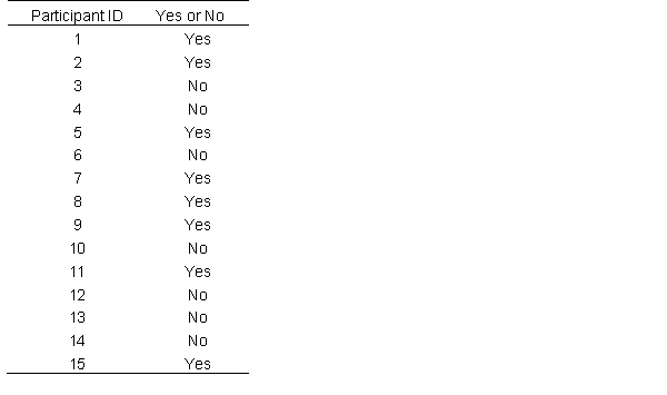 What type of chart did you construct for the question above?
What type of chart did you construct for the question above? سؤال
Below are some data about whether a sample of individuals knows how to ride a bicycle
 What percentage of the participants knows how to ride a bicycle?
What percentage of the participants knows how to ride a bicycle? سؤال
Below are some data about whether a sample of individuals knows how to ride a bicycle
 How many participants do not know how to ride a bicycle?
How many participants do not know how to ride a bicycle? سؤال
Below are some data about whether a sample of individuals knows how to ride a bicycle
 The frequencies of the data would be represented by which axis?
The frequencies of the data would be represented by which axis? سؤال
سؤال
سؤال
سؤال
سؤال
Using the data below about how many airline miles each participant accrued over the span of the year
 Would a bar chart or a frequency histogram is best for visualizing this data?
Would a bar chart or a frequency histogram is best for visualizing this data? سؤال
Using the data below about how many airline miles each participant accrued over the span of the year
 Is this a type of data discrete or continuous?
Is this a type of data discrete or continuous? سؤال
Using the data below about how many airline miles each participant accrued over the span of the year
 How may people in this data set flew 70,000 or more miles in the last year?
How may people in this data set flew 70,000 or more miles in the last year? سؤال
Using the data below about how many airline miles each participant accrued over the span of the year
 how many people in this data set flew between 20000 and 59999 miles in the last year?
how many people in this data set flew between 20000 and 59999 miles in the last year? سؤال
Using the data below about how many airline miles each participant accrued over the span of the year
 In this type of data visualization, frequencies are plotted on which axis?
In this type of data visualization, frequencies are plotted on which axis? سؤال
سؤال
سؤال
سؤال
سؤال
 Approximately how many individuals have GPAs 3.8 or higher?
 سؤال
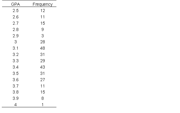 Is this data continuous or discrete?
 سؤال
سؤال
A customer service center is interested in how many calls they get during different times of the day. They record the number of calls they receive ever two hours (time here is presented in military time).
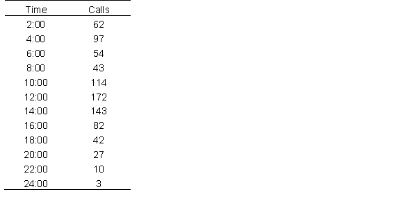 At which hour did the call center receive the fewest calls? At which hour did they receive the most?
At which hour did the call center receive the fewest calls? At which hour did they receive the most? سؤال
A customer service center is interested in how many calls they get during different times of the day. They record the number of calls they receive ever two hours (time here is presented in military time).
 Would this data be best described as a unimodal or bimodal distribution?
Would this data be best described as a unimodal or bimodal distribution?
فتح الحزمة
قم بالتسجيل لفتح البطاقات في هذه المجموعة!
Unlock Deck
Unlock Deck
1/78
العب
ملء الشاشة (f)
Deck 3: A Picture Is Worth a Thousand Words: Creating and Interpreting Graphics
1
The y-axis was more formally known as the abscissa.
False
2
Histograms and Bar Charts are similar in that they plot frequencies on the y-axis and possible observations on the x-axis.
True
3
Pie charts are most useful when presenting categorical data and relative frequencies.
True
4
Scatterplots are usually used to graph the relationship between two variables.
فتح الحزمة
افتح القفل للوصول البطاقات البالغ عددها 78 في هذه المجموعة.
فتح الحزمة
k this deck
5
Graphs are the best and necessary method for presenting data.
فتح الحزمة
افتح القفل للوصول البطاقات البالغ عددها 78 في هذه المجموعة.
فتح الحزمة
k this deck
6
When plotting a graph, the axes should always be labeled.
فتح الحزمة
افتح القفل للوصول البطاقات البالغ عددها 78 في هذه المجموعة.
فتح الحزمة
k this deck
7
It is possible for the reader of statistics to over interpret what is being stated on a graph.
فتح الحزمة
افتح القفل للوصول البطاقات البالغ عددها 78 في هذه المجموعة.
فتح الحزمة
k this deck
8
When a graph is used, it can always be assumed that it is the best and correct way to visualize data.
فتح الحزمة
افتح القفل للوصول البطاقات البالغ عددها 78 في هذه المجموعة.
فتح الحزمة
k this deck
9
When plotting a bar chart, the bars in the graph are not supposed to touch
فتح الحزمة
افتح القفل للوصول البطاقات البالغ عددها 78 في هذه المجموعة.
فتح الحزمة
k this deck
10
Bar charts are for discrete data and histograms are for continuous data
فتح الحزمة
افتح القفل للوصول البطاقات البالغ عددها 78 في هذه المجموعة.
فتح الحزمة
k this deck
11
When using a stem-and-leaf plot, it is still possible to identify all the datapoints in a dataset.
فتح الحزمة
افتح القفل للوصول البطاقات البالغ عددها 78 في هذه المجموعة.
فتح الحزمة
k this deck
12
graphs are always necessary for presenting data.
فتح الحزمة
افتح القفل للوصول البطاقات البالغ عددها 78 في هذه المجموعة.
فتح الحزمة
k this deck
13
When you have continuous data, there can be an infinite number of points between two adjacent data values
فتح الحزمة
افتح القفل للوصول البطاقات البالغ عددها 78 في هذه المجموعة.
فتح الحزمة
k this deck
14
Frequency polygons are like histograms, except used for discrete data.
فتح الحزمة
افتح القفل للوصول البطاقات البالغ عددها 78 في هذه المجموعة.
فتح الحزمة
k this deck
15
For the number 62, a stem-and-leaf-plot would plot 6 as the stem and 2 as the leaf.
فتح الحزمة
افتح القفل للوصول البطاقات البالغ عددها 78 في هذه المجموعة.
فتح الحزمة
k this deck
16
If you are interested in plotting the means of two experimental groups, it is best to use a histogram
فتح الحزمة
افتح القفل للوصول البطاقات البالغ عددها 78 في هذه المجموعة.
فتح الحزمة
k this deck
17
One reason why scientists didn't always trust the data was because graphs don't show raw data
فتح الحزمة
افتح القفل للوصول البطاقات البالغ عددها 78 في هذه المجموعة.
فتح الحزمة
k this deck
18
The y-axis is called the ordinate
فتح الحزمة
افتح القفل للوصول البطاقات البالغ عددها 78 في هذه المجموعة.
فتح الحزمة
k this deck
19
Only raw data can be plotted. Means cannot be plotted.
فتح الحزمة
افتح القفل للوصول البطاقات البالغ عددها 78 في هذه المجموعة.
فتح الحزمة
k this deck
20
In a time-series graph, time is plotted along the ordinate
فتح الحزمة
افتح القفل للوصول البطاقات البالغ عددها 78 في هذه المجموعة.
فتح الحزمة
k this deck
21
The horizontal axis is also known as the _______________; the vertical is also known as the _________________.
A) X-axis; longitudinate
B) ordinate; y-axis
C) abscissa; ordinate
D) ordinate; abscissa
A) X-axis; longitudinate
B) ordinate; y-axis
C) abscissa; ordinate
D) ordinate; abscissa
فتح الحزمة
افتح القفل للوصول البطاقات البالغ عددها 78 في هذه المجموعة.
فتح الحزمة
k this deck
22
Which of the following the best description of discrete data?
A) Discrete data are on ratio scales
B) Discrete data are generally on nominal and ordinal scale
C) Discrete data are best presented in histograms
D) Discrete data should not be graphed.
A) Discrete data are on ratio scales
B) Discrete data are generally on nominal and ordinal scale
C) Discrete data are best presented in histograms
D) Discrete data should not be graphed.
فتح الحزمة
افتح القفل للوصول البطاقات البالغ عددها 78 في هذه المجموعة.
فتح الحزمة
k this deck
23
In a stem-and-leaf plot, which of the following is true?
A) It is more like a table: you can extract every data point from the dataset
B) Generally, if you have values like 10 and 20, 1 and 2 would be the stems, and 0 would be the leaves.
C) They are useful because they group data without losing information
D) All of the above
A) It is more like a table: you can extract every data point from the dataset
B) Generally, if you have values like 10 and 20, 1 and 2 would be the stems, and 0 would be the leaves.
C) They are useful because they group data without losing information
D) All of the above
فتح الحزمة
افتح القفل للوصول البطاقات البالغ عددها 78 في هذه المجموعة.
فتح الحزمة
k this deck
24
Histograms show ___________ on the ordinate and ________ on the abscissa
A) frequencies; groups
B) frequencies; observations
C) observations; frequencies
D) observations; groups
A) frequencies; groups
B) frequencies; observations
C) observations; frequencies
D) observations; groups
فتح الحزمة
افتح القفل للوصول البطاقات البالغ عددها 78 في هذه المجموعة.
فتح الحزمة
k this deck
25
A frequency polygon is best used when data are ________________ while a bar chart is best used when the data are __________________.
A) On an ordinal scale; on a nominal scale
B) continuous; discrete
C) categorical; continuous
D) discrete; on an ordinal scale.
A) On an ordinal scale; on a nominal scale
B) continuous; discrete
C) categorical; continuous
D) discrete; on an ordinal scale.
فتح الحزمة
افتح القفل للوصول البطاقات البالغ عددها 78 في هذه المجموعة.
فتح الحزمة
k this deck
26
A researcher is interested in the number of hours football players spend practicing during the season. He wants to plot the data showing the number of players who practice at various amounts of hours. Which of the following is the best way to plot this data?
A) histograms and frequency polygons
B) Pie charts
C) Bar charts
D) Any of the above will work equally effectively.
A) histograms and frequency polygons
B) Pie charts
C) Bar charts
D) Any of the above will work equally effectively.
فتح الحزمة
افتح القفل للوصول البطاقات البالغ عددها 78 في هذه المجموعة.
فتح الحزمة
k this deck
27
If you have a dataset plotting relative frequencies of individuals'' favorite color, which of the following is most appropriate?
A) bar charts
B) histograms and frequency polygons
C) pie charts
D) scatter plots
A) bar charts
B) histograms and frequency polygons
C) pie charts
D) scatter plots
فتح الحزمة
افتح القفل للوصول البطاقات البالغ عددها 78 في هذه المجموعة.
فتح الحزمة
k this deck
28
When you want to portray the relationship between two continuous variables, it is best to use a…
A) Scatterplot
B) Bar chart
C) Time-series plot
D) All of the above are valid methods.
A) Scatterplot
B) Bar chart
C) Time-series plot
D) All of the above are valid methods.
فتح الحزمة
افتح القفل للوصول البطاقات البالغ عددها 78 في هذه المجموعة.
فتح الحزمة
k this deck
29
A researcher examining whether taller parents also have taller children. Which of the following would be a good way to plot her data?
A) a pie chart
B) a stem-and-leaf graph
C) a time-series plot
D) a scatterplot
A) a pie chart
B) a stem-and-leaf graph
C) a time-series plot
D) a scatterplot
فتح الحزمة
افتح القفل للوصول البطاقات البالغ عددها 78 في هذه المجموعة.
فتح الحزمة
k this deck
30
A university is interested in their students' eating habits. They sampled students and asked the number of meals they usually skip in a given a week.
If you want to plot the percentage students in each category, you should use a …
A) Bar chart
B) Pie chart
C) Scatterplot
D) None of the above are appropriate.
If you want to plot the percentage students in each category, you should use a …
A) Bar chart
B) Pie chart
C) Scatterplot
D) None of the above are appropriate.
فتح الحزمة
افتح القفل للوصول البطاقات البالغ عددها 78 في هذه المجموعة.
فتح الحزمة
k this deck
31
A university is interested in their students' eating habits. They sampled students and asked the number of meals they usually skip in a given a week.
In this sample, the best way to plot the data in its current form is using a …
A) Bar chart
B) Pie chart
C) Scatterplot
D) Frequency polygon
In this sample, the best way to plot the data in its current form is using a …
A) Bar chart
B) Pie chart
C) Scatterplot
D) Frequency polygon
فتح الحزمة
افتح القفل للوصول البطاقات البالغ عددها 78 في هذه المجموعة.
فتح الحزمة
k this deck
32
A university is interested in their students' eating habits. They sampled students and asked the number of meals they usually skip in a given a week.
Which of the following types of graphs is least effective for this data?
A) histogram
B) frequency polygon
C) stem and leaf graph
D) all of the above are actually effective and equally useful for this data
Which of the following types of graphs is least effective for this data?
A) histogram
B) frequency polygon
C) stem and leaf graph
D) all of the above are actually effective and equally useful for this data
فتح الحزمة
افتح القفل للوصول البطاقات البالغ عددها 78 في هذه المجموعة.
فتح الحزمة
k this deck
33
In a frequency polygon, each point on the graph represents the _____________ of a(n)___________.
A) relative proportion; observation
B) frequency; observation
C) observation; individual
D) None of the above.
A) relative proportion; observation
B) frequency; observation
C) observation; individual
D) None of the above.
فتح الحزمة
افتح القفل للوصول البطاقات البالغ عددها 78 في هذه المجموعة.
فتح الحزمة
k this deck
34
A research wants to compare the means of three groups in his experiment. Which of the following is the most effect method of doing so?
A) frequency polygon
B) stem-and-leaf graph
C) bar chart
D) scatterplot
A) frequency polygon
B) stem-and-leaf graph
C) bar chart
D) scatterplot
فتح الحزمة
افتح القفل للوصول البطاقات البالغ عددها 78 في هذه المجموعة.
فتح الحزمة
k this deck
35
Which of the following is not good practice when plotting graphs?
A) x and y axes intersect at 0
B) x and y axes are clearly labeled
C) creating as many graphs as possible
D) having a title to your graph
A) x and y axes intersect at 0
B) x and y axes are clearly labeled
C) creating as many graphs as possible
D) having a title to your graph
فتح الحزمة
افتح القفل للوصول البطاقات البالغ عددها 78 في هذه المجموعة.
فتح الحزمة
k this deck
36
The K.I.S.S. rule suggests that graphs should be…
A) simple
B) clear
C) short
D) All of the above
A) simple
B) clear
C) short
D) All of the above
فتح الحزمة
افتح القفل للوصول البطاقات البالغ عددها 78 في هذه المجموعة.
فتح الحزمة
k this deck
37
A manager wants to track his employees' productivity throughout the work day to see when his team needs the most support to increase output. He collects his data that shows the amount of output his workers are producing every hour. How can he visualize the data?
A) stem-and-leaf plot
B) time-series plot
C) pie chart
D) frequency polygon
A) stem-and-leaf plot
B) time-series plot
C) pie chart
D) frequency polygon
فتح الحزمة
افتح القفل للوصول البطاقات البالغ عددها 78 في هذه المجموعة.
فتح الحزمة
k this deck
38
Which of the following is most similar to a frequency polygon, with regards to the type of data that it plots and the way it is interpreted?
A) bar chart
B) pie chart
C) stem-and-leaf graph
D) histogram
A) bar chart
B) pie chart
C) stem-and-leaf graph
D) histogram
فتح الحزمة
افتح القفل للوصول البطاقات البالغ عددها 78 في هذه المجموعة.
فتح الحزمة
k this deck
39
Who invented the stem-and-leaf graph?
A) Galton
B) Newton
C) Pearson
D) Tukey
A) Galton
B) Newton
C) Pearson
D) Tukey
فتح الحزمة
افتح القفل للوصول البطاقات البالغ عددها 78 في هذه المجموعة.
فتح الحزمة
k this deck
40
Scatterplots were created by
A) Darwin
B) Galton
C) Tukey
D) Pearson
A) Darwin
B) Galton
C) Tukey
D) Pearson
فتح الحزمة
افتح القفل للوصول البطاقات البالغ عددها 78 في هذه المجموعة.
فتح الحزمة
k this deck
41
In a scatterplot, the y-axis is used to label…
A) Frequency of a variable
B) observations of a variable
C) relative frequency of a variable
D) any of the above
A) Frequency of a variable
B) observations of a variable
C) relative frequency of a variable
D) any of the above
فتح الحزمة
افتح القفل للوصول البطاقات البالغ عددها 78 في هذه المجموعة.
فتح الحزمة
k this deck
42
Consider a data with two outcomes: yes and no. The best way to plot this data is…
A) Bar chart
B) Pie chart
C) Histogram
D) Stem-and-leaf graph
A) Bar chart
B) Pie chart
C) Histogram
D) Stem-and-leaf graph
فتح الحزمة
افتح القفل للوصول البطاقات البالغ عددها 78 في هذه المجموعة.
فتح الحزمة
k this deck
43
Which of the following is not the right way to use a graph?
A) Time-series graphs usually have time on the x-axis
B) Pie charts are used to relative frequencies
C) Frequency polygons should be used just like bar charts
D) Histograms should have bars that are touching each other
A) Time-series graphs usually have time on the x-axis
B) Pie charts are used to relative frequencies
C) Frequency polygons should be used just like bar charts
D) Histograms should have bars that are touching each other
فتح الحزمة
افتح القفل للوصول البطاقات البالغ عددها 78 في هذه المجموعة.
فتح الحزمة
k this deck
44
Which would be the correct way to split the number 237 in a stem-and-leaf graph?
A) 2 would be the stem, and 37 as the leaf.
B) 23 as the stem, and 7 as the leaf.
C) 237 is the stem, there is no leaf.
D) There is no stem, and 237 are all leaf.
A) 2 would be the stem, and 37 as the leaf.
B) 23 as the stem, and 7 as the leaf.
C) 237 is the stem, there is no leaf.
D) There is no stem, and 237 are all leaf.
فتح الحزمة
افتح القفل للوصول البطاقات البالغ عددها 78 في هذه المجموعة.
فتح الحزمة
k this deck
45
Each point on scatterplot represents…
A) one observation from one variable for one individual
B) two observations from two variables for the same individual
C) the mean
D) two observations from two variables for two individuals
A) one observation from one variable for one individual
B) two observations from two variables for the same individual
C) the mean
D) two observations from two variables for two individuals
فتح الحزمة
افتح القفل للوصول البطاقات البالغ عددها 78 في هذه المجموعة.
فتح الحزمة
k this deck
46
For each scenario, identify the best type of visualization for the data
Having two groups: Experimental and Placebo in a drug trial. A researcher wants to plot mean differences in the number of days it took for the patient to recover.
Having two groups: Experimental and Placebo in a drug trial. A researcher wants to plot mean differences in the number of days it took for the patient to recover.
فتح الحزمة
افتح القفل للوصول البطاقات البالغ عددها 78 في هذه المجموعة.
فتح الحزمة
k this deck
47
For each scenario, identify the best type of visualization for the data
Having the relative frequencies of the individuals' choice for car brands
Having the relative frequencies of the individuals' choice for car brands
فتح الحزمة
افتح القفل للوصول البطاقات البالغ عددها 78 في هذه المجموعة.
فتح الحزمة
k this deck
48
For each scenario, identify the best type of visualization for the data
A research wants to plot the relationship between income and the number of years of education in a sample of employed workers.
A research wants to plot the relationship between income and the number of years of education in a sample of employed workers.
فتح الحزمة
افتح القفل للوصول البطاقات البالغ عددها 78 في هذه المجموعة.
فتح الحزمة
k this deck
49
Identify three good practices involving the use of graphs
فتح الحزمة
افتح القفل للوصول البطاقات البالغ عددها 78 في هذه المجموعة.
فتح الحزمة
k this deck
50
Explain the difference between a frequency histogram and a bar chart. What data are they each best used for and give an example of how they are used.
فتح الحزمة
افتح القفل للوصول البطاقات البالغ عددها 78 في هذه المجموعة.
فتح الحزمة
k this deck
51
Use the following stem and leaf-plot to answer the next few questions. The data plots the temperature of the day when there were earthquakes in the last 5 years.
فتح الحزمة
افتح القفل للوصول البطاقات البالغ عددها 78 في هذه المجموعة.
فتح الحزمة
k this deck
52
Use the following stem and leaf-plot to answer the next few questions. The data plots the temperature of the day when there were earthquakes in the last 5 years.
How many observations were there?
How many observations were there?
فتح الحزمة
افتح القفل للوصول البطاقات البالغ عددها 78 في هذه المجموعة.
فتح الحزمة
k this deck
53
Use the following stem and leaf-plot to answer the next few questions. The data plots the temperature of the day when there were earthquakes in the last 5 years.
how many earthquakes occurred between 70 and 80 degrees?
how many earthquakes occurred between 70 and 80 degrees?
فتح الحزمة
افتح القفل للوصول البطاقات البالغ عددها 78 في هذه المجموعة.
فتح الحزمة
k this deck
54
Use the following stem and leaf-plot to answer the next few questions. The data plots the temperature of the day when there were earthquakes in the last 5 years.
Identify one other way to graph this data
Identify one other way to graph this data
فتح الحزمة
افتح القفل للوصول البطاقات البالغ عددها 78 في هذه المجموعة.
فتح الحزمة
k this deck
55
Explain why graphs sometimes need to be interpreted with caution
فتح الحزمة
افتح القفل للوصول البطاقات البالغ عددها 78 في هذه المجموعة.
فتح الحزمة
k this deck
56
Below are some data about whether a sample of individuals knows how to ride a bicycle
Is this data continuous or discrete?
Is this data continuous or discrete? فتح الحزمة
افتح القفل للوصول البطاقات البالغ عددها 78 في هذه المجموعة.
فتح الحزمة
k this deck
57
Below are some data about whether a sample of individuals knows how to ride a bicycle
What type of chart did you construct for the question above?
What type of chart did you construct for the question above? فتح الحزمة
افتح القفل للوصول البطاقات البالغ عددها 78 في هذه المجموعة.
فتح الحزمة
k this deck
58
Below are some data about whether a sample of individuals knows how to ride a bicycle
What percentage of the participants knows how to ride a bicycle?
What percentage of the participants knows how to ride a bicycle? فتح الحزمة
افتح القفل للوصول البطاقات البالغ عددها 78 في هذه المجموعة.
فتح الحزمة
k this deck
59
Below are some data about whether a sample of individuals knows how to ride a bicycle
How many participants do not know how to ride a bicycle?
How many participants do not know how to ride a bicycle? فتح الحزمة
افتح القفل للوصول البطاقات البالغ عددها 78 في هذه المجموعة.
فتح الحزمة
k this deck
60
Below are some data about whether a sample of individuals knows how to ride a bicycle
The frequencies of the data would be represented by which axis?
The frequencies of the data would be represented by which axis? فتح الحزمة
افتح القفل للوصول البطاقات البالغ عددها 78 في هذه المجموعة.
فتح الحزمة
k this deck
61
Discrete data suggests that…
A) Between any two data points is a continuous scale
B) Between any two adjacent data points there are no possible measurements
C) Between any two adjacent data points there is exactly one possible measurement
D) Between any two observed data points that are the maximum and minimum values of the possible values there are no other measurements possible.
فتح الحزمة
افتح القفل للوصول البطاقات البالغ عددها 78 في هذه المجموعة.
فتح الحزمة
k this deck
62
Which of the following is usually not an example of discrete data?
A) Biological sex
B) Yes or no responses
C) Length as measured by a ruler
D) Whether an individual has a smart phone or not
A) Biological sex
B) Yes or no responses
C) Length as measured by a ruler
D) Whether an individual has a smart phone or not
فتح الحزمة
افتح القفل للوصول البطاقات البالغ عددها 78 في هذه المجموعة.
فتح الحزمة
k this deck
63
Continuous data suggests that…
A) the data lie on a continuum between true and false.
B) there can be up to an infinite number of possible responses between any two adjacent data points.
C) there must be a finite number of possible data points between the maximum possible value and the minimum possible value.
D) There are no additional possible measurements between any two adjacent data points on the scale.
فتح الحزمة
افتح القفل للوصول البطاقات البالغ عددها 78 في هذه المجموعة.
فتح الحزمة
k this deck
64
A frequency histogram is best used when data is ________________ while a bar chart is best used when the data is __________________.
A) on an ordinal scale; on a nominal scale
B) on a ratio scale; on a nominal scale
C) discrete; continuous
D) discrete; on an ordinal scale.
A) on an ordinal scale; on a nominal scale
B) on a ratio scale; on a nominal scale
C) discrete; continuous
D) discrete; on an ordinal scale.
فتح الحزمة
افتح القفل للوصول البطاقات البالغ عددها 78 في هذه المجموعة.
فتح الحزمة
k this deck
65
Using the data below about how many airline miles each participant accrued over the span of the year
Would a bar chart or a frequency histogram is best for visualizing this data?
Would a bar chart or a frequency histogram is best for visualizing this data? فتح الحزمة
افتح القفل للوصول البطاقات البالغ عددها 78 في هذه المجموعة.
فتح الحزمة
k this deck
66
Using the data below about how many airline miles each participant accrued over the span of the year
Is this a type of data discrete or continuous?
Is this a type of data discrete or continuous? فتح الحزمة
افتح القفل للوصول البطاقات البالغ عددها 78 في هذه المجموعة.
فتح الحزمة
k this deck
67
Using the data below about how many airline miles each participant accrued over the span of the year
How may people in this data set flew 70,000 or more miles in the last year?
How may people in this data set flew 70,000 or more miles in the last year? فتح الحزمة
افتح القفل للوصول البطاقات البالغ عددها 78 في هذه المجموعة.
فتح الحزمة
k this deck
68
Using the data below about how many airline miles each participant accrued over the span of the year
how many people in this data set flew between 20000 and 59999 miles in the last year?
how many people in this data set flew between 20000 and 59999 miles in the last year? فتح الحزمة
افتح القفل للوصول البطاقات البالغ عددها 78 في هذه المجموعة.
فتح الحزمة
k this deck
69
Using the data below about how many airline miles each participant accrued over the span of the year
In this type of data visualization, frequencies are plotted on which axis?
In this type of data visualization, frequencies are plotted on which axis? فتح الحزمة
افتح القفل للوصول البطاقات البالغ عددها 78 في هذه المجموعة.
فتح الحزمة
k this deck
70
Which would be the correct way to split the number 357 in a stem-and-leaf graph?
A) 3 would be the stem, and 57 as the leaf.
B) 35 as the stem, and 7 as the leaf.
C) 357 is the stem, there is no leaf.
D) There is no stem, and 357 are all leaf.
A) 3 would be the stem, and 57 as the leaf.
B) 35 as the stem, and 7 as the leaf.
C) 357 is the stem, there is no leaf.
D) There is no stem, and 357 are all leaf.
فتح الحزمة
افتح القفل للوصول البطاقات البالغ عددها 78 في هذه المجموعة.
فتح الحزمة
k this deck
71
Which of the following is an advantage of the stem-and-leaf graph over histograms and bar charts?
A) histograms and bar charts are better for nominal and ordinal data, whereas stem-and-leaf plots are better for ratio and interval data.
B) Histograms and bar charts are less useful for ungrouped data, whereas stem-and-leaf graphs are less useful for grouped data.
C) Stem-and-leaf graphs are better for presenting grouped data without losing the original raw format.
D) Stem-and-leaf graphs are better for data that have small frequencies and bar charts and histograms are better for data that have large frequencies.
فتح الحزمة
افتح القفل للوصول البطاقات البالغ عددها 78 في هذه المجموعة.
فتح الحزمة
k this deck
72
A frequency polygon is most similar to which of the following data visualizations methods?
A) Pie chart
B) Scatter plot
C) Histogram
D) Bar chart
A) Pie chart
B) Scatter plot
C) Histogram
D) Bar chart
فتح الحزمة
افتح القفل للوصول البطاقات البالغ عددها 78 في هذه المجموعة.
فتح الحزمة
k this deck
73
Frequency polygons are best used when the data are _____________________.
A) qualitative
B) nominal
C) discrete
D) continuous
A) qualitative
B) nominal
C) discrete
D) continuous
فتح الحزمة
افتح القفل للوصول البطاقات البالغ عددها 78 في هذه المجموعة.
فتح الحزمة
k this deck
74
Approximately how many individuals have GPAs 3.8 or higher? فتح الحزمة
افتح القفل للوصول البطاقات البالغ عددها 78 في هذه المجموعة.
فتح الحزمة
k this deck
75
Is this data continuous or discrete? فتح الحزمة
افتح القفل للوصول البطاقات البالغ عددها 78 في هذه المجموعة.
فتح الحزمة
k this deck
76
When graphing a relationship between two variables, which of the following would the best option to do so?
A) Histogram
B) Bar chart
C) Pie chart
D) Scatterplot
A) Histogram
B) Bar chart
C) Pie chart
D) Scatterplot
فتح الحزمة
افتح القفل للوصول البطاقات البالغ عددها 78 في هذه المجموعة.
فتح الحزمة
k this deck
77
A customer service center is interested in how many calls they get during different times of the day. They record the number of calls they receive ever two hours (time here is presented in military time).
At which hour did the call center receive the fewest calls? At which hour did they receive the most?
At which hour did the call center receive the fewest calls? At which hour did they receive the most? فتح الحزمة
افتح القفل للوصول البطاقات البالغ عددها 78 في هذه المجموعة.
فتح الحزمة
k this deck
78
A customer service center is interested in how many calls they get during different times of the day. They record the number of calls they receive ever two hours (time here is presented in military time).
Would this data be best described as a unimodal or bimodal distribution?
Would this data be best described as a unimodal or bimodal distribution? فتح الحزمة
افتح القفل للوصول البطاقات البالغ عددها 78 في هذه المجموعة.
فتح الحزمة
k this deck
فتح الحزمة
افتح القفل للوصول البطاقات البالغ عددها 78 في هذه المجموعة.


