Deck 14: Graphical Representation of Data
ملء الشاشة (f)
سؤال
سؤال
2) The following stem and leaf chart shows that in the data set: 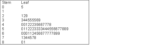
A) There were four scores between 20 and 29
B) There were three scores of 42
C) There were four scores of 60
D) There were some scores of 82 or more
A) There were four scores between 20 and 29
B) There were three scores of 42
C) There were four scores of 60
D) There were some scores of 82 or more
سؤال
3) A problem with the chart shown below is that: Figure 1 Mean reading times (secs.) for trained and untrained groups
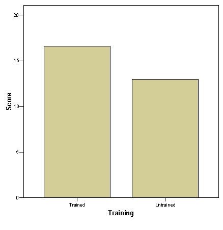
A) The X axis labelling is inadequate
B) The Y axis labelling is inadequate
C) The Y axis starts from zero
D) The two bar columns should be joined together
A) The X axis labelling is inadequate
B) The Y axis labelling is inadequate
C) The Y axis starts from zero
D) The two bar columns should be joined together
سؤال
سؤال
سؤال
سؤال
سؤال
سؤال
سؤال

فتح الحزمة
قم بالتسجيل لفتح البطاقات في هذه المجموعة!
Unlock Deck
Unlock Deck
1/10
العب
ملء الشاشة (f)
Deck 14: Graphical Representation of Data
1
1) In a bar chart:
A) It is not too important to show that the Y axis does not start at zero
B) It important to show that the Y axis does not start at zero
C) The Y axis very rarely starts at zero
D) The Y axis must start at zero
A) It is not too important to show that the Y axis does not start at zero
B) It important to show that the Y axis does not start at zero
C) The Y axis very rarely starts at zero
D) The Y axis must start at zero
B
2
2) The following stem and leaf chart shows that in the data set:
A) There were four scores between 20 and 29
B) There were three scores of 42
C) There were four scores of 60
D) There were some scores of 82 or more
A) There were four scores between 20 and 29
B) There were three scores of 42
C) There were four scores of 60
D) There were some scores of 82 or more
B
3
3) A problem with the chart shown below is that: Figure 1 Mean reading times (secs.) for trained and untrained groups
A) The X axis labelling is inadequate
B) The Y axis labelling is inadequate
C) The Y axis starts from zero
D) The two bar columns should be joined together
A) The X axis labelling is inadequate
B) The Y axis labelling is inadequate
C) The Y axis starts from zero
D) The two bar columns should be joined together
B
4
4) In a histogram:
A) Columns can represent percentages
B) Columns can only represent frequencies
C) Spaces are not required where there are no members of a category on the x axis
D) Columns do not have to be joined together
A) Columns can represent percentages
B) Columns can only represent frequencies
C) Spaces are not required where there are no members of a category on the x axis
D) Columns do not have to be joined together
فتح الحزمة
افتح القفل للوصول البطاقات البالغ عددها 10 في هذه المجموعة.
فتح الحزمة
k this deck
5
5) A bar chart representing scores from a substantial number of people:
A) Can be drawn where each column represents one individual's score
B) Cannot be drawn where each column represents one individual's score
C) Is inappropriate if each column represents one individual's score
D) Is aesthetically pleasing if each column represents one individual's score
A) Can be drawn where each column represents one individual's score
B) Cannot be drawn where each column represents one individual's score
C) Is inappropriate if each column represents one individual's score
D) Is aesthetically pleasing if each column represents one individual's score
فتح الحزمة
افتح القفل للوصول البطاقات البالغ عددها 10 في هذه المجموعة.
فتح الحزمة
k this deck
6
6) When putting charts into reports:
A) It is better to make them as colourful as possible
B) It is better to make them as busy as possible
C) It is better to include as many as possible
D) It is better to keep them as simple as possible
A) It is better to make them as colourful as possible
B) It is better to make them as busy as possible
C) It is better to include as many as possible
D) It is better to keep them as simple as possible
فتح الحزمة
افتح القفل للوصول البطاقات البالغ عددها 10 في هذه المجموعة.
فتح الحزمة
k this deck
7
7) In a bar chart:
A) Columns cannot be combined to represent values on two or more variables
B) Columns can combined to represent values on two or more variables but some kind of legend must be provided
C) Columns can be combined to represent values on two or more variables and a legend is not always necessary
D) If columns for two or more variables are combined the chart becomes a histogram
فتح الحزمة
افتح القفل للوصول البطاقات البالغ عددها 10 في هذه المجموعة.
فتح الحزمة
k this deck
8
8) Which of the following is true:
A) Box plots are based on the median and interquartile range of a data set
B) Box plots are based on the mean and interquartile range of a data set
C) Box plots are based on the mean and standard deviation of a data set
D) Box plots are based on the median and standard deviation of a data set
A) Box plots are based on the median and interquartile range of a data set
B) Box plots are based on the mean and interquartile range of a data set
C) Box plots are based on the mean and standard deviation of a data set
D) Box plots are based on the median and standard deviation of a data set
فتح الحزمة
افتح القفل للوصول البطاقات البالغ عددها 10 في هذه المجموعة.
فتح الحزمة
k this deck
9
9) A frequency polygon:
A) Shows the mean of each column of a histogram
B) Shows the class interval columns of a histogram
C) Shows the peaks of class intervals of a histogram
D) Shows the standard deviation of each column of a histogram
A) Shows the mean of each column of a histogram
B) Shows the class interval columns of a histogram
C) Shows the peaks of class intervals of a histogram
D) Shows the standard deviation of each column of a histogram
فتح الحزمة
افتح القفل للوصول البطاقات البالغ عددها 10 في هذه المجموعة.
فتح الحزمة
k this deck
10
10) A stem and leaf chart:
A) Does not show the raw data of a data set but creates a histogram shape
B) Shows the raw data of a data set but also creates a histogram shape
C) Shows the raw data of a data set but does not create a histogram shape
D) Does not show the raw data of a data set nor does it create a histogram
Shape
A) Does not show the raw data of a data set but creates a histogram shape
B) Shows the raw data of a data set but also creates a histogram shape
C) Shows the raw data of a data set but does not create a histogram shape
D) Does not show the raw data of a data set nor does it create a histogram
Shape
فتح الحزمة
افتح القفل للوصول البطاقات البالغ عددها 10 في هذه المجموعة.
فتح الحزمة
k this deck
فتح الحزمة
افتح القفل للوصول البطاقات البالغ عددها 10 في هذه المجموعة.


