Deck 3: Graphic Representation of Frequency Distributions
ملء الشاشة (f)
سؤال
سؤال
سؤال
سؤال
سؤال
سؤال
سؤال
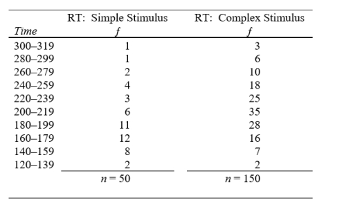
A human factors psychologist is engaged in a program of research to improve the readability of cockpit instrument panels. The data give the results of one of her experiments using 200 Air Force pilot trainees as subjects. The reaction time (RT) to simple and complex stimuli is measured in milliseconds. Plot the percentage frequency polygons for the two sets of data. Put them both on the same graph. Compare the two distributions and record your conclusions.
سؤال
سؤال
Suppose the frequency curve below is based on 400 cases and is drawn to a much larger scale on a blackboard. Suppose the total area under the blackboard version is 200 square inches. (a) If the area between scores of 30 and 40 equals 50 square inches, how many cases fall between 30 and 40? (b) Suppose 160 cases fall above a score of 50. What is the area under the curve above a score of 50? 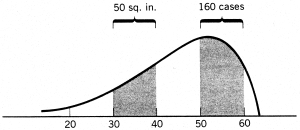
سؤال
سؤال
سؤال
سؤال
سؤال
سؤال
سؤال
سؤال
سؤال
سؤال
سؤال
سؤال
سؤال
سؤال
سؤال
سؤال

فتح الحزمة
قم بالتسجيل لفتح البطاقات في هذه المجموعة!
Unlock Deck
Unlock Deck
1/25
العب
ملء الشاشة (f)
Deck 3: Graphic Representation of Frequency Distributions
1
(a)Construct a graph to exhibit the preference of sports fans obtained in Problem 4 of Chapter 2 (Instructor's Manual). Provide an adequate title and labels for the axes.?
(b) Suppose you had used percentage frequencies instead. In what way(s) would the percentage frequency graph differ from the original graph? What would have to be done to change the graph of (a) to a percentage frequency graph?
(b) Suppose you had used percentage frequencies instead. In what way(s) would the percentage frequency graph differ from the original graph? What would have to be done to change the graph of (a) to a percentage frequency graph?
(a) For this problem, because the data are distinct categories, we would construct a bar diagram. Vertical scale extends from zero to a value high enough to include the largest frequency of 9. On the horizontal scale, the width of each bar should be the same with a small space between the bars. Because this is a nominal scale, it does not matter in what order we arrange the bars.
(b) The graph would look exactly the same; the only difference is that the divisions on the vertical scale would represent percentages rather than numbers of cases. The change can be accomplished merely by relabeling the divisions on the vertical scale: an ƒ of 1 becomes a % ƒ of 4; an ƒ of 2 becomes a % ƒ of 8; and so forth.
(b) The graph would look exactly the same; the only difference is that the divisions on the vertical scale would represent percentages rather than numbers of cases. The change can be accomplished merely by relabeling the divisions on the vertical scale: an ƒ of 1 becomes a % ƒ of 4; an ƒ of 2 becomes a % ƒ of 8; and so forth.
2
The following is the distribution of complaints of students visiting the counseling center of a small college: academic problems (59), social relationships (28), romantic relationships (46), depression (39), anxiety (12), somatic complaints such as headaches or sleeplessness (28), all others (32). Construct a graph to exhibit these data. Include a title and appropriate labels.
Again, the graph would be a bar diagram. Vertical scale extends from zero to a value high enough to include the largest frequency of 59. There should be a small space between adjoining bars. Because this is a nominal scale, the order in which you arrange the bars does not matter.
3
Describe the similarities of and differences between a bar diagram and a histogram.
A histogram is used with numerical scores, whereas a bar diagram is appropriate for non-numerical, particularly qualitative, data. They are very similar except that a bar diagram has spaces inserted between the rectangles.
4
In a university, male psychology majors are distributed as follows: 24 freshmen, 61 sophomores, 109 juniors, 104 seniors, and 92 graduate students. Comparable figures for women (in the same order of classification) are: 74, 58, 99, 53, and 67. Construct a bar diagram suitable for displaying the comparative relation between the sexes; include a title and appropriate labels. What conclusions appear significant from inspection of these data?
فتح الحزمة
افتح القفل للوصول البطاقات البالغ عددها 25 في هذه المجموعة.
فتح الحزمة
k this deck
5
Construct a histogram and frequency polygon for the distribution of achievement test scores by university freshmen obtained in Problem 5 of Chapter 2 (Instructor's Manual).
فتح الحزمة
افتح القفل للوصول البطاقات البالغ عددها 25 في هذه المجموعة.
فتح الحزمة
k this deck
6
(a) Plot the frequency polygon for the distribution of hourly wages obtained in Problem 7 of Chapter 2 (Instructor's Manual). Title and label.
(b) By re-labeling the appropriate axis, convert the frequency polygon to a percentage frequency polygon (do not redraw the polygon).
(b) By re-labeling the appropriate axis, convert the frequency polygon to a percentage frequency polygon (do not redraw the polygon).
فتح الحزمة
افتح القفل للوصول البطاقات البالغ عددها 25 في هذه المجموعة.
فتح الحزمة
k this deck
7
A human factors psychologist is engaged in a program of research to improve the readability of cockpit instrument panels. The data give the results of one of her experiments using 200 Air Force pilot trainees as subjects. The reaction time (RT) to simple and complex stimuli is measured in milliseconds. Plot the percentage frequency polygons for the two sets of data. Put them both on the same graph. Compare the two distributions and record your conclusions.
فتح الحزمة
افتح القفل للوصول البطاقات البالغ عددها 25 في هذه المجموعة.
فتح الحزمة
k this deck
8
Construct a cumulative percentage frequency distribution of retention scores obtained in Problem 9 of Chapter 3 (Instructor's Manual). Make a large accurate graph: use graph paper.
فتح الحزمة
افتح القفل للوصول البطاقات البالغ عددها 25 في هذه المجموعة.
فتح الحزمة
k this deck
9
Suppose the frequency curve below is based on 400 cases and is drawn to a much larger scale on a blackboard. Suppose the total area under the blackboard version is 200 square inches. (a) If the area between scores of 30 and 40 equals 50 square inches, how many cases fall between 30 and 40? (b) Suppose 160 cases fall above a score of 50. What is the area under the curve above a score of 50?
فتح الحزمة
افتح القفل للوصول البطاقات البالغ عددها 25 في هذه المجموعة.
فتح الحزمة
k this deck
10
In general, a graph
A) tells less than can be found in the original table frequency distribution
B) avoids the misinterpretation that may be present if table frequency distributions are used
C) tells no story other than that given in its original table frequency distribution
D) is only of value for communicating to the general public
فتح الحزمة
افتح القفل للوصول البطاقات البالغ عددها 25 في هذه المجموعة.
فتح الحزمة
k this deck
11
The Y-axis is also called the
A) abscissa
B) independent variable
C) horizontal axis
D) ordinate
A) abscissa
B) independent variable
C) horizontal axis
D) ordinate
فتح الحزمة
افتح القفل للوصول البطاقات البالغ عددها 25 في هذه المجموعة.
فتح الحزمة
k this deck
12
It is customary to draw the graph of a frequency distribution so that the height is ____________ the width.
A) 1/2 of
B) 3/4 of
C) equal to
D) 1 1/4 times
A) 1/2 of
B) 3/4 of
C) equal to
D) 1 1/4 times
فتح الحزمة
افتح القفل للوصول البطاقات البالغ عددها 25 في هذه المجموعة.
فتح الحزمة
k this deck
13
The best graph for categorical (qualitative) data is the
A) histogram
B) frequency polygon
C) bar diagram
D) polyconic projection
A) histogram
B) frequency polygon
C) bar diagram
D) polyconic projection
فتح الحزمة
افتح القفل للوصول البطاقات البالغ عددها 25 في هذه المجموعة.
فتح الحزمة
k this deck
14
For a histogram, the area encompassed by each bar represents
A) i
B) ƒ
C) n
D) n/i
A) i
B) ƒ
C) n
D) n/i
فتح الحزمة
افتح القفل للوصول البطاقات البالغ عددها 25 في هذه المجموعة.
فتح الحزمة
k this deck
15
A histogram is constructed for the distribution of hourly wages for a group of students. The boundaries of the rectangle for the interval $2.50-2.74 will fall at
A) $2.50-2.74
B) $2.49-2.75
C) $2.505-2.735
D) $2.495-2.745
A) $2.50-2.74
B) $2.49-2.75
C) $2.505-2.735
D) $2.495-2.745
فتح الحزمة
افتح القفل للوصول البطاقات البالغ عددها 25 في هذه المجموعة.
فتح الحزمة
k this deck
16
The midpoint of the interval 23-26 is
A) 25
B) 24
C) 24.5
D) none of the above
A) 25
B) 24
C) 24.5
D) none of the above
فتح الحزمة
افتح القفل للوصول البطاقات البالغ عددها 25 في هذه المجموعة.
فتح الحزمة
k this deck
17
An interval is 7 units wide, and its midpoint is 52.0. The lower apparent limit is
A) 48.5
B) 49.0
C) 49.5
D) 50.0
A) 48.5
B) 49.0
C) 49.5
D) 50.0
فتح الحزمة
افتح القفل للوصول البطاقات البالغ عددها 25 في هذه المجموعة.
فتح الحزمة
k this deck
18
In constructing a frequency polygon, the frequency for the interval 40-49 would be plotted at
A) 39.5
B) 44
C) 44.5
D) 49.5
A) 39.5
B) 44
C) 44.5
D) 49.5
فتح الحزمة
افتح القفل للوصول البطاقات البالغ عددها 25 في هذه المجموعة.
فتح الحزمة
k this deck
19
The lowest interval in which any cases fall is 30-39. The frequency polygon will come down to the X axis at ____________ on the left.
A) 29.5
B) 24.5
C) 30.0
D) 25.0
A) 29.5
B) 24.5
C) 30.0
D) 25.0
فتح الحزمة
افتح القفل للوصول البطاقات البالغ عددها 25 في هذه المجموعة.
فتح الحزمة
k this deck
20
An advantage of the histogram over the frequency polygon is that it better represents
A) a continuous variable
B) interval- or ratio-scaled variables
C) frequency of scores between the limits of the class interval
D) cumulative functions
A) a continuous variable
B) interval- or ratio-scaled variables
C) frequency of scores between the limits of the class interval
D) cumulative functions
فتح الحزمة
افتح القفل للوصول البطاقات البالغ عددها 25 في هذه المجموعة.
فتح الحزمة
k this deck
21
Which graph is best suited for a frequency distribution representing a continuous variable?
A) histogram
B) percentage frequency histogram
C) bar diagram
D) frequency polygon
A) histogram
B) percentage frequency histogram
C) bar diagram
D) frequency polygon
فتح الحزمة
افتح القفل للوصول البطاقات البالغ عددها 25 في هذه المجموعة.
فتح الحزمة
k this deck
22
In comparing two or more frequency distributions with different numbers of cases, the preferred graph is the
A) histogram
B) frequency polygon
C) relative frequency histogram
D) relative frequency polygon
A) histogram
B) frequency polygon
C) relative frequency histogram
D) relative frequency polygon
فتح الحزمة
افتح القفل للوصول البطاقات البالغ عددها 25 في هذه المجموعة.
فتح الحزمة
k this deck
23
Which of the following graphs may be constructed to show relative frequency?
A) histogram
B) frequency polygon
C) bar diagram
D) all of the above
A) histogram
B) frequency polygon
C) bar diagram
D) all of the above
فتح الحزمة
افتح القفل للوصول البطاقات البالغ عددها 25 في هذه المجموعة.
فتح الحزمة
k this deck
24
Plotting the graph of a cumulative distribution differs from plotting the graph of an uncumulated distribution in that
A) a different rule is used to relate height to width
B) cumulative frequency is plotted at the upper real limit of the interval
C) cumulative frequency is plotted at the upper apparent limit of the interval
D) cumulative frequency is plotted at the midpoint of the interval
A) a different rule is used to relate height to width
B) cumulative frequency is plotted at the upper real limit of the interval
C) cumulative frequency is plotted at the upper apparent limit of the interval
D) cumulative frequency is plotted at the midpoint of the interval
فتح الحزمة
افتح القفل للوصول البطاقات البالغ عددها 25 في هذه المجموعة.
فتح الحزمة
k this deck
25
The cumulative graph tends to form an S-shaped figure when the uncumulated distribution has
A) more scores in the middle than at the ends
B) more scores at the lower end
C) more scores at the higher end
D) an even distribution of scores throughout
A) more scores in the middle than at the ends
B) more scores at the lower end
C) more scores at the higher end
D) an even distribution of scores throughout
فتح الحزمة
افتح القفل للوصول البطاقات البالغ عددها 25 في هذه المجموعة.
فتح الحزمة
k this deck
فتح الحزمة
افتح القفل للوصول البطاقات البالغ عددها 25 في هذه المجموعة.


