Deck 11: Displaying Distributions With Graphs
ملء الشاشة (f)
سؤال
One of the following 12 scores
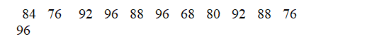
Was omitted from the stemplot below:
The missing score is
A) 76
B) 88
C) 92
D) 96
E) 22666.
Was omitted from the stemplot below:
The missing score is
A) 76
B) 88
C) 92
D) 96
E) 22666.
سؤال
Below is a histogram of the ages of the professors at a large university.  Approximately what percentage of the professors are 30-39 years old?
A) 20%
B) 45%
C) 55%
D) 65%
E) Not enough information
Approximately what percentage of the professors are 30-39 years old?A) 20%
B) 45%
C) 55%
D) 65%
E) Not enough information
سؤال
سؤال
سؤال
Below is a stemplot of the percent of males, 15 and older, who are illiterate in 139 countries, according to the United Nations. For example, the highest illiteracy rate was 69%, in the African country of Mali. 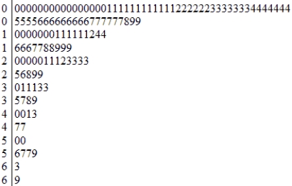
A) clearly skewed to the right.
B) clearly skewed to the left.
C) roughly symmetric.
D) without a clear shape.
A) clearly skewed to the right.
B) clearly skewed to the left.
C) roughly symmetric.
D) without a clear shape.
سؤال
Which of the stemplots below correctly displays the following data values?
5)6 8.5 6.3 6.1 5.6 8.5 8.2 8.1 6.7 8.5 5.8 5.1 8.5
A)

B)

C)

D)

5)6 8.5 6.3 6.1 5.6 8.5 8.2 8.1 6.7 8.5 5.8 5.1 8.5
A)
B)
C)
D)
سؤال
Ten members of a fraternity take a statistics course. Here are their scores on the first exam in the course:
To present the distribution of scores in a graph, you might choose a
A) line graph.
B) bar graph.
C) pie chart.
D) stemplot.
To present the distribution of scores in a graph, you might choose a
A) line graph.
B) bar graph.
C) pie chart.
D) stemplot.
سؤال
سؤال
سؤال
سؤال
سؤال
سؤال
Below is a histogram of the ages of the professors at a large university. 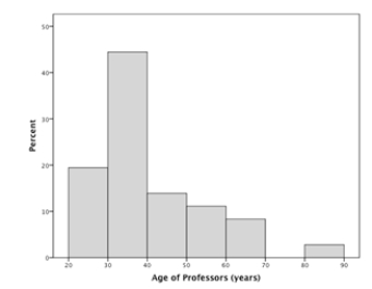 The overall shape of this distribution is
A) skewed to the right.
B) skewed to the left.
C) roughly symmetric.
D) without a clear shape.
The overall shape of this distribution isA) skewed to the right.
B) skewed to the left.
C) roughly symmetric.
D) without a clear shape.
سؤال
Below is a histogram of the number of repetitions of a chin-up exercise the members of two high school gym classes could do. For reference: the minimum done was two students doing none; the most, two students doing 12. 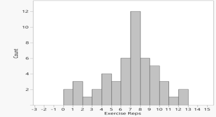 The overall shape of this distribution is
A) roughly symmetric with no outliers.
B) roughly symmetric with one outlier.
C) clearly skewed left.
D) clearly skewed right.
The overall shape of this distribution isA) roughly symmetric with no outliers.
B) roughly symmetric with one outlier.
C) clearly skewed left.
D) clearly skewed right.
سؤال
سؤال
سؤال
سؤال
Below is a histogram of the ages of the professors at a large university.  There are 800 professors at this university. How many of them are in their 70s?
A) 80
B) 10
C) 4
D) 0
E) Not enough information
There are 800 professors at this university. How many of them are in their 70s?A) 80
B) 10
C) 4
D) 0
E) Not enough information
سؤال
سؤال
Below is a stemplot of the scores on a recent statistics test. (Key: 8|2 = 82%)  The overall shape of this distribution is
A) clearly skewed to the right.
B) clearly skewed to the left.
C) roughly symmetric.
D) without a clear shape.
The overall shape of this distribution isA) clearly skewed to the right.
B) clearly skewed to the left.
C) roughly symmetric.
D) without a clear shape.
سؤال
Below is a histogram of the number of repetitions of a chin-up exercise the members of two high school gym classes could do. For reference: the minimum done was two students doing none; the most, two students doing 12.  Approximately how many students did fewer than the 10 repetitions recommended by the presidential fitness guidelines?
A) 3
B) 6
C) 44
D) 50
E) Not enough information
Approximately how many students did fewer than the 10 repetitions recommended by the presidential fitness guidelines?A) 3
B) 6
C) 44
D) 50
E) Not enough information
سؤال
Below is a histogram of the number of repetitions of a chin-up exercise the members of two high school gym classes could do. For reference: the minimum done was two students doing none; the most, two students doing 12.  Approximately how many students were included in this study?
A) 8
B) 15
C) 34
D) 50
E) Not enough information
Approximately how many students were included in this study?A) 8
B) 15
C) 34
D) 50
E) Not enough information

فتح الحزمة
قم بالتسجيل لفتح البطاقات في هذه المجموعة!
Unlock Deck
Unlock Deck
1/22
العب
ملء الشاشة (f)
Deck 11: Displaying Distributions With Graphs
1
One of the following 12 scores
Was omitted from the stemplot below:
The missing score is
A) 76
B) 88
C) 92
D) 96
E) 22666.
Was omitted from the stemplot below:
The missing score is
A) 76
B) 88
C) 92
D) 96
E) 22666.
96
2
Below is a histogram of the ages of the professors at a large university. Approximately what percentage of the professors are 30-39 years old?
A) 20%
B) 45%
C) 55%
D) 65%
E) Not enough information
Approximately what percentage of the professors are 30-39 years old?A) 20%
B) 45%
C) 55%
D) 65%
E) Not enough information
45%
3
A well-drawn histogram should have
A) bars that are all the same width.
B) no space between bars (unless a class has no observations).
C) a clearly marked vertical scale.
D) All of the above
A) bars that are all the same width.
B) no space between bars (unless a class has no observations).
C) a clearly marked vertical scale.
D) All of the above
All of the above
4
You want to make a graph to display the distribution of the salaries of the 1500 professors at a very large university. The best choice is a
A) boxplot.
B) histogram.
C) line graph.
D) pie chart.
E) stemplot.
A) boxplot.
B) histogram.
C) line graph.
D) pie chart.
E) stemplot.
فتح الحزمة
افتح القفل للوصول البطاقات البالغ عددها 22 في هذه المجموعة.
فتح الحزمة
k this deck
5
Below is a stemplot of the percent of males, 15 and older, who are illiterate in 139 countries, according to the United Nations. For example, the highest illiteracy rate was 69%, in the African country of Mali.
A) clearly skewed to the right.
B) clearly skewed to the left.
C) roughly symmetric.
D) without a clear shape.
A) clearly skewed to the right.
B) clearly skewed to the left.
C) roughly symmetric.
D) without a clear shape.
فتح الحزمة
افتح القفل للوصول البطاقات البالغ عددها 22 في هذه المجموعة.
فتح الحزمة
k this deck
6
Which of the stemplots below correctly displays the following data values?
5)6 8.5 6.3 6.1 5.6 8.5 8.2 8.1 6.7 8.5 5.8 5.1 8.5
A)
B)
C)
D)
5)6 8.5 6.3 6.1 5.6 8.5 8.2 8.1 6.7 8.5 5.8 5.1 8.5
A)
B)
C)
D)
فتح الحزمة
افتح القفل للوصول البطاقات البالغ عددها 22 في هذه المجموعة.
فتح الحزمة
k this deck
7
Ten members of a fraternity take a statistics course. Here are their scores on the first exam in the course:
To present the distribution of scores in a graph, you might choose a
A) line graph.
B) bar graph.
C) pie chart.
D) stemplot.
To present the distribution of scores in a graph, you might choose a
A) line graph.
B) bar graph.
C) pie chart.
D) stemplot.
فتح الحزمة
افتح القفل للوصول البطاقات البالغ عددها 22 في هذه المجموعة.
فتح الحزمة
k this deck
8
You are giving a talk about the decay of the American family. You want to show by a graph how the number of divorces has increased between 1968 and 2008. What type of graph should you draw?
A) A bar graph
B) A boxplot
C) A histogram
D) A line graph
E) A stemplot
A) A bar graph
B) A boxplot
C) A histogram
D) A line graph
E) A stemplot
فتح الحزمة
افتح القفل للوصول البطاقات البالغ عددها 22 في هذه المجموعة.
فتح الحزمة
k this deck
9
To display the percent of likely voters who believe they are going to vote for a particular candidate according to a survey taken each week of an election year, starting in January and ending the last week of October, a good choice of a graph would be a:
A) boxplot.
B) histogram.
C) line graph.
D) pie chart.
E) stemplot.
A) boxplot.
B) histogram.
C) line graph.
D) pie chart.
E) stemplot.
فتح الحزمة
افتح القفل للوصول البطاقات البالغ عددها 22 في هذه المجموعة.
فتح الحزمة
k this deck
10
You want to make a graph to display the distribution of the years of experience of the 17 professors in the math department of a large university. The best choice is:
A) boxplot.
B) histogram.
C) line graph.
D) pie chart.
E) stemplot.
A) boxplot.
B) histogram.
C) line graph.
D) pie chart.
E) stemplot.
فتح الحزمة
افتح القفل للوصول البطاقات البالغ عددها 22 في هذه المجموعة.
فتح الحزمة
k this deck
11
A stemplot is
A) the same as a boxplot.
B) a part of a small tree.
C) a picture of a distribution.
D) the same as a histogram.
E) useful for describing categorical variables.
A) the same as a boxplot.
B) a part of a small tree.
C) a picture of a distribution.
D) the same as a histogram.
E) useful for describing categorical variables.
فتح الحزمة
افتح القفل للوصول البطاقات البالغ عددها 22 في هذه المجموعة.
فتح الحزمة
k this deck
12
To display the number of pets owned by each of the 37 students in a class, a good choice of a graph would be a
A) stemplot.
B) bar graph.
C) pie chart.
D) boxplot.
E) line graph.
A) stemplot.
B) bar graph.
C) pie chart.
D) boxplot.
E) line graph.
فتح الحزمة
افتح القفل للوصول البطاقات البالغ عددها 22 في هذه المجموعة.
فتح الحزمة
k this deck
13
Below is a histogram of the ages of the professors at a large university. The overall shape of this distribution is
A) skewed to the right.
B) skewed to the left.
C) roughly symmetric.
D) without a clear shape.
The overall shape of this distribution isA) skewed to the right.
B) skewed to the left.
C) roughly symmetric.
D) without a clear shape.
فتح الحزمة
افتح القفل للوصول البطاقات البالغ عددها 22 في هذه المجموعة.
فتح الحزمة
k this deck
14
Below is a histogram of the number of repetitions of a chin-up exercise the members of two high school gym classes could do. For reference: the minimum done was two students doing none; the most, two students doing 12. The overall shape of this distribution is
A) roughly symmetric with no outliers.
B) roughly symmetric with one outlier.
C) clearly skewed left.
D) clearly skewed right.
The overall shape of this distribution isA) roughly symmetric with no outliers.
B) roughly symmetric with one outlier.
C) clearly skewed left.
D) clearly skewed right.
فتح الحزمة
افتح القفل للوصول البطاقات البالغ عددها 22 في هذه المجموعة.
فتح الحزمة
k this deck
15
Here is a set of data: 1300, 18, 25, 19, -7, 24. Which observation is the outlier?
A) 1300
B) 25
C) 19
D) -7
E) 24
A) 1300
B) 25
C) 19
D) -7
E) 24
فتح الحزمة
افتح القفل للوصول البطاقات البالغ عددها 22 في هذه المجموعة.
فتح الحزمة
k this deck
16
You want to make a graph that shows how the cost of attending your school has increased since 1980. A good choice of graph would be a
A) bar graph.
B) histogram.
C) line graph.
D) pie chart.
E) stemplot.
A) bar graph.
B) histogram.
C) line graph.
D) pie chart.
E) stemplot.
فتح الحزمة
افتح القفل للوصول البطاقات البالغ عددها 22 في هذه المجموعة.
فتح الحزمة
k this deck
17
An analyst wants to draw a graph that displays the distribution of the tuitions of the 400+ institutions of higher learning in her state. The best type of graph to use is a:
A) bar graph.
B) histogram.
C) line graph.
D) stemplot.
A) bar graph.
B) histogram.
C) line graph.
D) stemplot.
فتح الحزمة
افتح القفل للوصول البطاقات البالغ عددها 22 في هذه المجموعة.
فتح الحزمة
k this deck
18
Below is a histogram of the ages of the professors at a large university. There are 800 professors at this university. How many of them are in their 70s?
A) 80
B) 10
C) 4
D) 0
E) Not enough information
There are 800 professors at this university. How many of them are in their 70s?A) 80
B) 10
C) 4
D) 0
E) Not enough information
فتح الحزمة
افتح القفل للوصول البطاقات البالغ عددها 22 في هذه المجموعة.
فتح الحزمة
k this deck
19
You are writing an article for the college newspaper about the cost of attending college. You want to make a graph to compare costs at your school and three similar schools. A good choice of a graph would be a
A) bar graph.
B) histogram.
C) line graph.
D) pie chart.
E) stemplot.
A) bar graph.
B) histogram.
C) line graph.
D) pie chart.
E) stemplot.
فتح الحزمة
افتح القفل للوصول البطاقات البالغ عددها 22 في هذه المجموعة.
فتح الحزمة
k this deck
20
Below is a stemplot of the scores on a recent statistics test. (Key: 8|2 = 82%) The overall shape of this distribution is
A) clearly skewed to the right.
B) clearly skewed to the left.
C) roughly symmetric.
D) without a clear shape.
The overall shape of this distribution isA) clearly skewed to the right.
B) clearly skewed to the left.
C) roughly symmetric.
D) without a clear shape.
فتح الحزمة
افتح القفل للوصول البطاقات البالغ عددها 22 في هذه المجموعة.
فتح الحزمة
k this deck
21
Below is a histogram of the number of repetitions of a chin-up exercise the members of two high school gym classes could do. For reference: the minimum done was two students doing none; the most, two students doing 12. Approximately how many students did fewer than the 10 repetitions recommended by the presidential fitness guidelines?
A) 3
B) 6
C) 44
D) 50
E) Not enough information
Approximately how many students did fewer than the 10 repetitions recommended by the presidential fitness guidelines?A) 3
B) 6
C) 44
D) 50
E) Not enough information
فتح الحزمة
افتح القفل للوصول البطاقات البالغ عددها 22 في هذه المجموعة.
فتح الحزمة
k this deck
22
Below is a histogram of the number of repetitions of a chin-up exercise the members of two high school gym classes could do. For reference: the minimum done was two students doing none; the most, two students doing 12. Approximately how many students were included in this study?
A) 8
B) 15
C) 34
D) 50
E) Not enough information
Approximately how many students were included in this study?A) 8
B) 15
C) 34
D) 50
E) Not enough information
فتح الحزمة
افتح القفل للوصول البطاقات البالغ عددها 22 في هذه المجموعة.
فتح الحزمة
k this deck
فتح الحزمة
افتح القفل للوصول البطاقات البالغ عددها 22 في هذه المجموعة.


