Deck 3: Describing Data Visually
ملء الشاشة (f)
سؤال
سؤال
سؤال
سؤال
سؤال
سؤال
سؤال
سؤال
سؤال
سؤال
سؤال
سؤال
سؤال
سؤال
سؤال
سؤال
سؤال
سؤال
سؤال
سؤال
سؤال
سؤال
سؤال
سؤال
سؤال
سؤال
سؤال
سؤال
سؤال
سؤال
سؤال
سؤال
سؤال
سؤال
سؤال
سؤال
سؤال
سؤال
The number of bins in this histogram (caffeine content in mg/oz for 65 soft drinks)is consistent with Sturges' Rule. 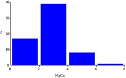
سؤال
سؤال
Because most data values are on the left,we would say that this dot plot (burglary rates per 100,000 persons in 350 U.S.cities)shows a distribution that is skewed to the left (negatively skewed). 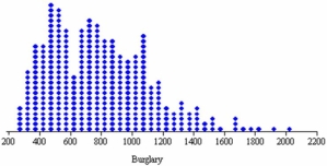
سؤال
سؤال
سؤال
سؤال
سؤال
سؤال
سؤال
سؤال
سؤال
سؤال
سؤال
سؤال
سؤال
سؤال
سؤال
سؤال
سؤال
سؤال
سؤال
سؤال
سؤال
سؤال
سؤال
سؤال
سؤال
The distribution pictured below is: 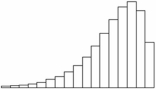
A) bimodal and skewed right.
B) bimodal and skewed left.
C) skewed right.
D) skewed left.
A) bimodal and skewed right.
B) bimodal and skewed left.
C) skewed right.
D) skewed left.
سؤال
سؤال
سؤال
The graph below illustrates which deceptive technique? 
A) Poor Y axis scale
B) Area trick
C) Unclear grid lines
D) Dramatic title
A) Poor Y axis scale
B) Area trick
C) Unclear grid lines
D) Dramatic title
سؤال
Below is a frequency distribution of earnings of 50 contractors in a country. 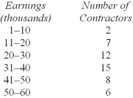 Regarding this distribution,which of the following is correct?
A) The frequency distribution contains too many class intervals.
B) The class interval limits are ambiguous.
C) Too few classes were chosen.
D) The class intervals are too wide.
Regarding this distribution,which of the following is correct?A) The frequency distribution contains too many class intervals.
B) The class interval limits are ambiguous.
C) Too few classes were chosen.
D) The class intervals are too wide.
سؤال
This histogram shows Chris's golf scores in his last 77 rounds at Devil's Ridge.Which is not a correct statement? 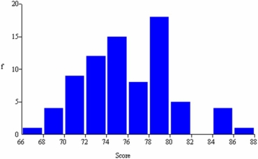
A) The number of bins is consistent with Sturges' Rule.
B) The histogram has a noticeable bimodal shape.
C) The modal class is 78 < 80.
D) About 15 percent of his scores are in the interval 74 < 76.
A) The number of bins is consistent with Sturges' Rule.
B) The histogram has a noticeable bimodal shape.
C) The modal class is 78 < 80.
D) About 15 percent of his scores are in the interval 74 < 76.
سؤال
سؤال
Bob found an error in the following frequency distribution.What is it? 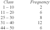
A) The class limits are overlapping too much.
B) The classes are not collectively exhaustive.
C) There are too many classes by Sturges' Rule.
D) The first class must start at 0.
A) The class limits are overlapping too much.
B) The classes are not collectively exhaustive.
C) There are too many classes by Sturges' Rule.
D) The first class must start at 0.
سؤال
سؤال
The distribution pictured below is: 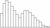
A) bimodal and skewed right.
B) bimodal and skewed left.
C) skewed right.
D) skewed left.
A) bimodal and skewed right.
B) bimodal and skewed left.
C) skewed right.
D) skewed left.
سؤال
سؤال
سؤال
سؤال
سؤال
سؤال

فتح الحزمة
قم بالتسجيل لفتح البطاقات في هذه المجموعة!
Unlock Deck
Unlock Deck
1/108
العب
ملء الشاشة (f)
Deck 3: Describing Data Visually
1
Stacked dot plots are useful in understanding the association between two paired quantitative variables (X,Y).
False
2
Compared to a dot plot,we lose some detail when we present data in a frequency distribution.
True
3
Pie charts are useful in displaying frequencies that sum to a total.
True
4
Sturges' Rule should override judgment about the "right" number of histogram bins.
فتح الحزمة
افتح القفل للوصول البطاقات البالغ عددها 108 في هذه المجموعة.
فتح الحزمة
k this deck
5
Sturges' Rule is merely a suggestion,not an ironclad requirement.
فتح الحزمة
افتح القفل للوصول البطاقات البالغ عددها 108 في هذه المجموعة.
فتح الحزمة
k this deck
6
Dot plots are similar to histograms with many bins (classes).
فتح الحزمة
افتح القفل للوصول البطاقات البالغ عددها 108 في هذه المجموعة.
فتح الحزمة
k this deck
7
The line chart is appropriate for categorical (qualitative)data.
فتح الحزمة
افتح القفل للوصول البطاقات البالغ عددها 108 في هذه المجموعة.
فتح الحزمة
k this deck
8
Dot plots may not reveal the shape of a distribution when the sample is small.
فتح الحزمة
افتح القفل للوصول البطاقات البالغ عددها 108 في هذه المجموعة.
فتح الحزمة
k this deck
9
Scatter plots are used to visualize association in samples of paired data (X,Y).
فتح الحزمة
افتح القفل للوصول البطاقات البالغ عددها 108 في هذه المجموعة.
فتح الحزمة
k this deck
10
Excel's pyramid chart is generally preferred to a bar chart.
فتح الحزمة
افتح القفل للوصول البطاقات البالغ عددها 108 في هذه المجموعة.
فتح الحزمة
k this deck
11
Log scales are common because most people are familiar with them.
فتح الحزمة
افتح القفل للوصول البطاقات البالغ عددها 108 في هذه المجموعة.
فتح الحزمة
k this deck
12
Pie charts are attractive to statisticians,but are rarely used in business or general media.
فتح الحزمة
افتح القفل للوصول البطاقات البالغ عددها 108 في هذه المجموعة.
فتح الحزمة
k this deck
13
A bar chart can sometimes be used instead of a line chart for time series data.
فتح الحزمة
افتح القفل للوصول البطاقات البالغ عددها 108 في هذه المجموعة.
فتح الحزمة
k this deck
14
The Pareto chart is used to display the "vital few" causes of problems.
فتح الحزمة
افتح القفل للوصول البطاقات البالغ عددها 108 في هذه المجموعة.
فتح الحزمة
k this deck
15
A pie chart can generally be used instead of a bar chart.
فتح الحزمة
افتح القفل للوصول البطاقات البالغ عددها 108 في هذه المجموعة.
فتح الحزمة
k this deck
16
Excel's 3D pie charts are usually clearer than 2D pie charts.
فتح الحزمة
افتح القفل للوصول البطاقات البالغ عددها 108 في هذه المجموعة.
فتح الحزمة
k this deck
17
The column chart should be avoided if you are plotting time series data.
فتح الحزمة
افتح القفل للوصول البطاقات البالغ عددها 108 في هذه المجموعة.
فتح الحزمة
k this deck
18
A common error with pie charts is using too few "slices."
فتح الحزمة
افتح القفل للوصول البطاقات البالغ عددها 108 في هذه المجموعة.
فتح الحزمة
k this deck
19
Excel's pyramid charts make it easier to read the data values.
فتح الحزمة
افتح القفل للوصول البطاقات البالغ عددها 108 في هذه المجموعة.
فتح الحزمة
k this deck
20
It is easier to read the data values on a 3D column chart than on a 2D column chart.
فتح الحزمة
افتح القفل للوصول البطاقات البالغ عددها 108 في هذه المجموعة.
فتح الحزمة
k this deck
21
Which criterion is least likely to be used in choosing bins (classes)in a frequency distribution?
A) Following Sturges' Rule
B) Selecting "nice" class (bin)limits
C) Using aesthetic judgment
D) Always starting at zero
A) Following Sturges' Rule
B) Selecting "nice" class (bin)limits
C) Using aesthetic judgment
D) Always starting at zero
فتح الحزمة
افتح القفل للوصول البطاقات البالغ عددها 108 في هذه المجموعة.
فتح الحزمة
k this deck
22
A line chart would not be suitable to display which data?
A) U.S.oil imports from OPEC nations for the last 20 years
B) Annual compensation of the top 50 CEOs
C) Exxon-Mobil's quarterly sales data for the last five years
D) Daily stock market closing prices of Microsoft for the past month
A) U.S.oil imports from OPEC nations for the last 20 years
B) Annual compensation of the top 50 CEOs
C) Exxon-Mobil's quarterly sales data for the last five years
D) Daily stock market closing prices of Microsoft for the past month
فتح الحزمة
افتح القفل للوصول البطاقات البالغ عددها 108 في هذه المجموعة.
فتح الحزمة
k this deck
23
Which of the following is true?
A) Line charts are not used for cross-sectional data.
B) Line charts are useful for visualizing categorical data.
C) Pyramid charts are generally preferred to bar charts.
D) Pie charts can generally be used instead of bar charts.
A) Line charts are not used for cross-sectional data.
B) Line charts are useful for visualizing categorical data.
C) Pyramid charts are generally preferred to bar charts.
D) Pie charts can generally be used instead of bar charts.
فتح الحزمة
افتح القفل للوصول البطاقات البالغ عددها 108 في هذه المجموعة.
فتح الحزمة
k this deck
24
Except for the Y-axis scaling,a histogram will look the same if we use relative frequencies instead of raw frequencies (with the same bin limits).
فتح الحزمة
افتح القفل للوصول البطاقات البالغ عددها 108 في هذه المجموعة.
فتح الحزمة
k this deck
25
Which is not a characteristic of a dot plot?
A) Simplicity
B) Legibility
C) Wide bins
D) Dot stacking
A) Simplicity
B) Legibility
C) Wide bins
D) Dot stacking
فتح الحزمة
افتح القفل للوصول البطاقات البالغ عددها 108 في هذه المجموعة.
فتح الحزمة
k this deck
26
A frequency distribution is a tabulation of n data values into classes called bins.
فتح الحزمة
افتح القفل للوصول البطاقات البالغ عددها 108 في هذه المجموعة.
فتح الحزمة
k this deck
27
Line charts are not used for cross-sectional data.
فتح الحزمة
افتح القفل للوصول البطاقات البالغ عددها 108 في هذه المجموعة.
فتح الحزمة
k this deck
28
The zero origin rule may be waived for bar charts if the objective is merely to visualize relative change over time.
فتح الحزمة
افتح القفل للوصول البطاقات البالغ عددها 108 في هذه المجموعة.
فتح الحزمة
k this deck
29
A column chart would be least suitable to display which data?
A) Annual compensation of 500 company CEOs
B) U.S.exports to its six largest trading partners
C) Exxon-Mobil's quarterly sales for the last four years
D) One-year CD interest rates paid by the eight largest U.S.banks
A) Annual compensation of 500 company CEOs
B) U.S.exports to its six largest trading partners
C) Exxon-Mobil's quarterly sales for the last four years
D) One-year CD interest rates paid by the eight largest U.S.banks
فتح الحزمة
افتح القفل للوصول البطاقات البالغ عددها 108 في هذه المجموعة.
فتح الحزمة
k this deck
30
A frequency distribution usually has equal bin widths.
فتح الحزمة
افتح القفل للوصول البطاقات البالغ عددها 108 في هذه المجموعة.
فتح الحزمة
k this deck
31
A dot plot would be useful in visualizing scores on an exam in a class of 30 students.
فتح الحزمة
افتح القفل للوصول البطاقات البالغ عددها 108 في هذه المجموعة.
فتح الحزمة
k this deck
32
A scatter plot is useful in visualizing trends over time.
فتح الحزمة
افتح القفل للوصول البطاقات البالغ عددها 108 في هذه المجموعة.
فتح الحزمة
k this deck
33
In a bimodal histogram,the two highest bars will have the same height.
فتح الحزمة
افتح القفل للوصول البطاقات البالغ عددها 108 في هذه المجموعة.
فتح الحزمة
k this deck
34
Which display is most likely to reveal association between X and Y?
A) Dot plot
B) Scatter plot
C) Histogram
D) Pareto chart
A) Dot plot
B) Scatter plot
C) Histogram
D) Pareto chart
فتح الحزمة
افتح القفل للوصول البطاقات البالغ عددها 108 في هذه المجموعة.
فتح الحزمة
k this deck
35
It is possible to construct a histogram or frequency polygon with open-ended classes.
فتح الحزمة
افتح القفل للوصول البطاقات البالغ عددها 108 في هذه المجموعة.
فتح الحزمة
k this deck
36
A scatter plot requires two quantitative variables (i.e. ,not categorical data).
فتح الحزمة
افتح القفل للوصول البطاقات البالغ عددها 108 في هذه المجموعة.
فتح الحزمة
k this deck
37
The ______________ can be used to differentiate the "vital few" causes of quality problems from the "trivial many" causes of quality problems.
A) histogram
B) scatter plot
C) Pareto chart
D) box plot
A) histogram
B) scatter plot
C) Pareto chart
D) box plot
فتح الحزمة
افتح القفل للوصول البطاقات البالغ عددها 108 في هذه المجموعة.
فتح الحزمة
k this deck
38
The number of bins in this histogram (caffeine content in mg/oz for 65 soft drinks)is consistent with Sturges' Rule.
فتح الحزمة
افتح القفل للوصول البطاقات البالغ عددها 108 في هذه المجموعة.
فتح الحزمة
k this deck
39
Histograms generally do not reveal the:
A) exact data range.
B) modal classes (bins).
C) degree of skewness.
D) relative frequencies.
A) exact data range.
B) modal classes (bins).
C) degree of skewness.
D) relative frequencies.
فتح الحزمة
افتح القفل للوصول البطاقات البالغ عددها 108 في هذه المجموعة.
فتح الحزمة
k this deck
40
Because most data values are on the left,we would say that this dot plot (burglary rates per 100,000 persons in 350 U.S.cities)shows a distribution that is skewed to the left (negatively skewed).
فتح الحزمة
افتح القفل للوصول البطاقات البالغ عددها 108 في هذه المجموعة.
فتح الحزمة
k this deck
41
Which is not a characteristic of an effective summary table?
A) The main point should be clear within 10 seconds.
B) Data to be compared should be displayed in rows,not columns.
C) Data should be rounded to three or four significant digits.
D) Use space instead of lines to separate columns.
A) The main point should be clear within 10 seconds.
B) Data to be compared should be displayed in rows,not columns.
C) Data should be rounded to three or four significant digits.
D) Use space instead of lines to separate columns.
فتح الحزمة
افتح القفل للوصول البطاقات البالغ عددها 108 في هذه المجموعة.
فتح الحزمة
k this deck
42
Which is not a tip for effective line charts?
A) Line charts are better than bar charts to display cross-sectional data.
B) Numerical labels are omitted on a line chart if there are many data values.
C) Omit data markers (e.g. ,squares,triangles)when there are many data values.
D) Thick lines make it harder to see exact data values.
A) Line charts are better than bar charts to display cross-sectional data.
B) Numerical labels are omitted on a line chart if there are many data values.
C) Omit data markers (e.g. ,squares,triangles)when there are many data values.
D) Thick lines make it harder to see exact data values.
فتح الحزمة
افتح القفل للوصول البطاقات البالغ عددها 108 في هذه المجموعة.
فتح الحزمة
k this deck
43
Which of the following is least useful in visualizing categorical data?
A) Bar chart
B) Pie chart
C) Line chart
D) Pareto chart
A) Bar chart
B) Pie chart
C) Line chart
D) Pareto chart
فتح الحزمة
افتح القفل للوصول البطاقات البالغ عددها 108 في هذه المجموعة.
فتح الحزمة
k this deck
44
Which is a reason for using a log scale for time series data?
A) It helps compare growth in time series of dissimilar magnitude.
B) General business audiences find it easier to interpret a log scale.
C) On a log scale,equal distances represent equal dollar amounts.
D) The axis labels are usually easier to read in log units.
A) It helps compare growth in time series of dissimilar magnitude.
B) General business audiences find it easier to interpret a log scale.
C) On a log scale,equal distances represent equal dollar amounts.
D) The axis labels are usually easier to read in log units.
فتح الحزمة
افتح القفل للوصول البطاقات البالغ عددها 108 في هذه المجموعة.
فتح الحزمة
k this deck
45
Which data would be suitable for a pie chart?
A) Average starting salary of MBA graduates from six ivy-league universities
B) APR interest rates charged by the top five U.S.credit cards
C) Last semester's average GPA for students in seven majors in a business school
D) The number of U.S.primary care clinics by type (urban,suburban,rural)
A) Average starting salary of MBA graduates from six ivy-league universities
B) APR interest rates charged by the top five U.S.credit cards
C) Last semester's average GPA for students in seven majors in a business school
D) The number of U.S.primary care clinics by type (urban,suburban,rural)
فتح الحزمة
افتح القفل للوصول البطاقات البالغ عددها 108 في هذه المجموعة.
فتح الحزمة
k this deck
46
Scatter plots are:
A) useful in visualizing trends over time.
B) useful in identifying causal relationships.
C) often fitted with a linear equation in Excel.
D) applicable mainly to discrete data.
A) useful in visualizing trends over time.
B) useful in identifying causal relationships.
C) often fitted with a linear equation in Excel.
D) applicable mainly to discrete data.
فتح الحزمة
افتح القفل للوصول البطاقات البالغ عددها 108 في هذه المجموعة.
فتح الحزمة
k this deck
47
Which is the most serious deceptive graphical technique?
A) Vague source
B) Using bold colors
C) Nonzero origin
D) Unlabeled data points
A) Vague source
B) Using bold colors
C) Nonzero origin
D) Unlabeled data points
فتح الحزمة
افتح القفل للوصول البطاقات البالغ عددها 108 في هذه المجموعة.
فتح الحزمة
k this deck
48
Pivot tables:
A) are similar in purpose to simple 2D pie charts.
B) show how the data "pivot" around a point.
C) show cross-tabulations of data.
D) are not really tables at all.
A) are similar in purpose to simple 2D pie charts.
B) show how the data "pivot" around a point.
C) show cross-tabulations of data.
D) are not really tables at all.
فتح الحزمة
افتح القفل للوصول البطاقات البالغ عددها 108 في هذه المجموعة.
فتح الحزمة
k this deck
49
We would use a pivot table to:
A) cross-tabulate frequencies of occurrence of two variables.
B) rotate the data around a central point.
C) establish cause-and-effect between X and Y.
D) display the data in a 3D scatter plot.
A) cross-tabulate frequencies of occurrence of two variables.
B) rotate the data around a central point.
C) establish cause-and-effect between X and Y.
D) display the data in a 3D scatter plot.
فتح الحزمة
افتح القفل للوصول البطاقات البالغ عددها 108 في هذه المجموعة.
فتح الحزمة
k this deck
50
Which is considered a novelty chart in Excel?
A) Pie chart
B) Column chart
C) Pyramid chart
D) Line chart
A) Pie chart
B) Column chart
C) Pyramid chart
D) Line chart
فتح الحزمة
افتح القفل للوصول البطاقات البالغ عددها 108 في هذه المجموعة.
فتح الحزمة
k this deck
51
Which data would be suitable for a pie chart?
A) Percent vote in the last election by party (Democrat,Republican,Other)
B) Retail prices of six major brands of color laser printers
C) Labor cost per vehicle for 10 major world automakers
D) Prices paid by 10 students for their accounting textbooks
A) Percent vote in the last election by party (Democrat,Republican,Other)
B) Retail prices of six major brands of color laser printers
C) Labor cost per vehicle for 10 major world automakers
D) Prices paid by 10 students for their accounting textbooks
فتح الحزمة
افتح القفل للوصول البطاقات البالغ عددها 108 في هذه المجموعة.
فتح الحزمة
k this deck
52
Effective summary tables generally:
A) have very detailed column headings and footnotes.
B) round their data to three or four significant digits.
C) use plenty of heavy vertical lines to separate the columns.
D) have the raw data listed in a footnote for clarity.
A) have very detailed column headings and footnotes.
B) round their data to three or four significant digits.
C) use plenty of heavy vertical lines to separate the columns.
D) have the raw data listed in a footnote for clarity.
فتح الحزمة
افتح القفل للوصول البطاقات البالغ عددها 108 في هذه المجموعة.
فتح الحزمة
k this deck
53
Which is not a tip for effective column charts?
A) Time usually goes on the horizontal axis.
B) Bar height should be proportional to the quantity displayed.
C) Label data values at the top of each bar unless graphing lots of data.
D) The nonzero origin rule may be waived for financial reports.
A) Time usually goes on the horizontal axis.
B) Bar height should be proportional to the quantity displayed.
C) Label data values at the top of each bar unless graphing lots of data.
D) The nonzero origin rule may be waived for financial reports.
فتح الحزمة
افتح القفل للوصول البطاقات البالغ عددها 108 في هذه المجموعة.
فتح الحزمة
k this deck
54
Excel's pyramid charts:
A) are generally preferred to pie charts.
B) should be avoided despite their visual appeal.
C) are generally preferred to line charts.
D) show trends more clearly than column charts.
A) are generally preferred to pie charts.
B) should be avoided despite their visual appeal.
C) are generally preferred to line charts.
D) show trends more clearly than column charts.
فتح الحزمة
افتح القفل للوصول البطاقات البالغ عددها 108 في هذه المجموعة.
فتح الحزمة
k this deck
55
Which data would be suitable for a pie chart?
A) Whirlpool Corporation's sales revenue for the last five years
B) Oxnard University student category (undergraduate,masters,doctoral)
C) Average SAT scores for entering freshmen at 10 major U.S.universities
D) U.S.toy imports from China over the past decade
A) Whirlpool Corporation's sales revenue for the last five years
B) Oxnard University student category (undergraduate,masters,doctoral)
C) Average SAT scores for entering freshmen at 10 major U.S.universities
D) U.S.toy imports from China over the past decade
فتح الحزمة
افتح القفل للوصول البطاقات البالغ عددها 108 في هذه المجموعة.
فتح الحزمة
k this deck
56
Which is a not a characteristic of pie charts?
A) Pie charts can only convey a general idea of the data values.
B) Pie charts are ineffective when they have too many slices.
C) Exploded and 3-D pie charts will allow more "slices."
D) Pie chart data always represent parts of a whole (e.g. ,market share).
A) Pie charts can only convey a general idea of the data values.
B) Pie charts are ineffective when they have too many slices.
C) Exploded and 3-D pie charts will allow more "slices."
D) Pie chart data always represent parts of a whole (e.g. ,market share).
فتح الحزمة
افتح القفل للوصول البطاقات البالغ عددها 108 في هذه المجموعة.
فتح الحزمة
k this deck
57
Which is not considered a deceptive graphical technique?
A) Undefined units
B) 2D graphs
C) Authority figures
D) Distracting pictures
A) Undefined units
B) 2D graphs
C) Authority figures
D) Distracting pictures
فتح الحزمة
افتح القفل للوصول البطاقات البالغ عددها 108 في هذه المجموعة.
فتح الحزمة
k this deck
58
Which is not a poor graphing technique?
A) Gratuitous pictures
B) Labeled axis scales
C) 3D bar charts
D) Rotated axis
A) Gratuitous pictures
B) Labeled axis scales
C) 3D bar charts
D) Rotated axis
فتح الحزمة
افتح القفل للوصول البطاقات البالغ عددها 108 في هذه المجموعة.
فتح الحزمة
k this deck
59
Which is not a reason why pie charts are popular in business?
A) They can convey a general idea of the data to a nontechnical audience.
B) They can display major changes in parts of a whole (e.g. ,market share).
C) They are more precise than line charts,despite their low visual impact.
D) They can be labeled with data values to facilitate interpretation.
A) They can convey a general idea of the data to a nontechnical audience.
B) They can display major changes in parts of a whole (e.g. ,market share).
C) They are more precise than line charts,despite their low visual impact.
D) They can be labeled with data values to facilitate interpretation.
فتح الحزمة
افتح القفل للوصول البطاقات البالغ عددها 108 في هذه المجموعة.
فتح الحزمة
k this deck
60
Which is not considered a deceptive graphical technique?
A) Nonzero origin
B) Elastic graph proportions
C) Dramatic title
D) Axis demarcations
A) Nonzero origin
B) Elastic graph proportions
C) Dramatic title
D) Axis demarcations
فتح الحزمة
افتح القفل للوصول البطاقات البالغ عددها 108 في هذه المجموعة.
فتح الحزمة
k this deck
61
Which is not a characteristic of a log scale for time series data?
A) Log scales are useful when data change by an order of magnitude.
B) The distance from 5 to 50 is the same as the distance from 50 to 500.
C) On a log scale,equal distances represent equal ratios.
D) Log scales are generally familiar to the average reader.
A) Log scales are useful when data change by an order of magnitude.
B) The distance from 5 to 50 is the same as the distance from 50 to 500.
C) On a log scale,equal distances represent equal ratios.
D) Log scales are generally familiar to the average reader.
فتح الحزمة
افتح القفل للوصول البطاقات البالغ عددها 108 في هذه المجموعة.
فتح الحزمة
k this deck
62
To classify prices from 62 recent home sales,Sturges' Rule would recommend:
A) 7 classes.
B) 8 classes.
C) 9 classes.
D) 10 classes.
A) 7 classes.
B) 8 classes.
C) 9 classes.
D) 10 classes.
فتح الحزمة
افتح القفل للوصول البطاقات البالغ عددها 108 في هذه المجموعة.
فتح الحزمة
k this deck
63
Which of these deficiencies would be considered a major graphical deception?
A) Vague or unclear source
B) Using more than one color or font
C) Bar widths proportional to bar height
D) Using a dramatic graph title
A) Vague or unclear source
B) Using more than one color or font
C) Bar widths proportional to bar height
D) Using a dramatic graph title
فتح الحزمة
افتح القفل للوصول البطاقات البالغ عددها 108 في هذه المجموعة.
فتح الحزمة
k this deck
64
If you have 32 data points,how many classes (bins)would Sturges' Rule suggest?
A) 5
B) 6
C) 7
D) 8
A) 5
B) 6
C) 7
D) 8
فتح الحزمة
افتح القفل للوصول البطاقات البالغ عددها 108 في هذه المجموعة.
فتح الحزمة
k this deck
65
The distribution pictured below is:
A) bimodal and skewed right.
B) bimodal and skewed left.
C) skewed right.
D) skewed left.
A) bimodal and skewed right.
B) bimodal and skewed left.
C) skewed right.
D) skewed left.
فتح الحزمة
افتح القفل للوصول البطاقات البالغ عددها 108 في هذه المجموعة.
فتح الحزمة
k this deck
66
A histogram can be defined as:
A) a chart whose bar widths show the cumulative frequencies of data values.
B) a chart whose bar widths indicate class intervals and whose areas indicate frequencies.
C) a chart whose bar widths show class intervals and whose heights indicate frequencies.
D) a chart whose bar heights represent the value of each data point.
فتح الحزمة
افتح القفل للوصول البطاقات البالغ عددها 108 في هذه المجموعة.
فتح الحزمة
k this deck
67
The width of a class in a frequency distribution is known as the:
A) midpoint.
B) class limit.
C) bin frequency.
D) class interval.
A) midpoint.
B) class limit.
C) bin frequency.
D) class interval.
فتح الحزمة
افتح القفل للوصول البطاقات البالغ عددها 108 في هذه المجموعة.
فتح الحزمة
k this deck
68
The graph below illustrates which deceptive technique?
A) Poor Y axis scale
B) Area trick
C) Unclear grid lines
D) Dramatic title
A) Poor Y axis scale
B) Area trick
C) Unclear grid lines
D) Dramatic title
فتح الحزمة
افتح القفل للوصول البطاقات البالغ عددها 108 في هذه المجموعة.
فتح الحزمة
k this deck
69
Below is a frequency distribution of earnings of 50 contractors in a country. Regarding this distribution,which of the following is correct?
A) The frequency distribution contains too many class intervals.
B) The class interval limits are ambiguous.
C) Too few classes were chosen.
D) The class intervals are too wide.
Regarding this distribution,which of the following is correct?A) The frequency distribution contains too many class intervals.
B) The class interval limits are ambiguous.
C) Too few classes were chosen.
D) The class intervals are too wide.
فتح الحزمة
افتح القفل للوصول البطاقات البالغ عددها 108 في هذه المجموعة.
فتح الحزمة
k this deck
70
This histogram shows Chris's golf scores in his last 77 rounds at Devil's Ridge.Which is not a correct statement?
A) The number of bins is consistent with Sturges' Rule.
B) The histogram has a noticeable bimodal shape.
C) The modal class is 78 < 80.
D) About 15 percent of his scores are in the interval 74 < 76.
A) The number of bins is consistent with Sturges' Rule.
B) The histogram has a noticeable bimodal shape.
C) The modal class is 78 < 80.
D) About 15 percent of his scores are in the interval 74 < 76.
فتح الحزمة
افتح القفل للوصول البطاقات البالغ عددها 108 في هذه المجموعة.
فتح الحزمة
k this deck
71
If you have 256 data points,how many classes (bins)would Sturges' Rule suggest?
A) 6
B) 7
C) 8
D) 9
A) 6
B) 7
C) 8
D) 9
فتح الحزمة
افتح القفل للوصول البطاقات البالغ عددها 108 في هذه المجموعة.
فتح الحزمة
k this deck
72
Bob found an error in the following frequency distribution.What is it?
A) The class limits are overlapping too much.
B) The classes are not collectively exhaustive.
C) There are too many classes by Sturges' Rule.
D) The first class must start at 0.
A) The class limits are overlapping too much.
B) The classes are not collectively exhaustive.
C) There are too many classes by Sturges' Rule.
D) The first class must start at 0.
فتح الحزمة
افتح القفل للوصول البطاقات البالغ عددها 108 في هذه المجموعة.
فتح الحزمة
k this deck
73
An open-ended bin (e.g. ,"50 and over")might be seen in a frequency distribution when:
A) some data values are not integers.
B) data values are non-numerical.
C) extremely large data values exist.
D) some data are missing.
A) some data values are not integers.
B) data values are non-numerical.
C) extremely large data values exist.
D) some data are missing.
فتح الحزمة
افتح القفل للوصول البطاقات البالغ عددها 108 في هذه المجموعة.
فتح الحزمة
k this deck
74
The distribution pictured below is:
A) bimodal and skewed right.
B) bimodal and skewed left.
C) skewed right.
D) skewed left.
A) bimodal and skewed right.
B) bimodal and skewed left.
C) skewed right.
D) skewed left.
فتح الحزمة
افتح القفل للوصول البطاقات البالغ عددها 108 في هذه المجموعة.
فتح الحزمة
k this deck
75
Which is not a characteristic of using a log scale to display time series data?
A) A log scale helps if we are comparing changes in two time series of dissimilar magnitude.
B) General business audiences find it easier to interpret a log scale.
C) If you display data on a log scale,equal distances represent equal ratios.
A) A log scale helps if we are comparing changes in two time series of dissimilar magnitude.
B) General business audiences find it easier to interpret a log scale.
C) If you display data on a log scale,equal distances represent equal ratios.
فتح الحزمة
افتح القفل للوصول البطاقات البالغ عددها 108 في هذه المجموعة.
فتح الحزمة
k this deck
76
Which is a characteristic of a histogram's bars?
A) The bar widths reveal the cumulative frequencies of data values.
B) The bar widths indicate class intervals and their areas indicate frequencies.
C) The bar widths show class intervals and their heights indicate frequencies.
D) The bar widths are an exact multiple of the sample size.
A) The bar widths reveal the cumulative frequencies of data values.
B) The bar widths indicate class intervals and their areas indicate frequencies.
C) The bar widths show class intervals and their heights indicate frequencies.
D) The bar widths are an exact multiple of the sample size.
فتح الحزمة
افتح القفل للوصول البطاقات البالغ عددها 108 في هذه المجموعة.
فتح الحزمة
k this deck
77
Which statement is not true concerning Sturges' Rule?
A) It proposes adding one class (bin)to the histogram for each extra observation.
B) If you double the sample size,you should add one class.
C) Its purpose is to tell how many classes (bins)to use in a frequency distribution.
D) It is only a guideline and may be overruled by other considerations.
A) It proposes adding one class (bin)to the histogram for each extra observation.
B) If you double the sample size,you should add one class.
C) Its purpose is to tell how many classes (bins)to use in a frequency distribution.
D) It is only a guideline and may be overruled by other considerations.
فتح الحزمة
افتح القفل للوصول البطاقات البالغ عددها 108 في هذه المجموعة.
فتح الحزمة
k this deck
78
Which is not revealed on a scatter plot?
A) Pairs of observed (xi,yi)data values
B) Nonlinear relationships between X and Y
C) Missing data values due to nonresponses
D) Unusual data values (outliers)
A) Pairs of observed (xi,yi)data values
B) Nonlinear relationships between X and Y
C) Missing data values due to nonresponses
D) Unusual data values (outliers)
فتح الحزمة
افتح القفل للوصول البطاقات البالغ عددها 108 في هذه المجموعة.
فتح الحزمة
k this deck
79
When using a dot plot with a small sample,which is least apparent?
A) Dispersion of data values within the array
B) The overall shape of the distribution
C) Central tendency of data in the data set
D) Location of data values within the array
A) Dispersion of data values within the array
B) The overall shape of the distribution
C) Central tendency of data in the data set
D) Location of data values within the array
فتح الحزمة
افتح القفل للوصول البطاقات البالغ عددها 108 في هذه المجموعة.
فتح الحزمة
k this deck
80
The point halfway between the bin limits in a frequency distribution is known as the:
A) bin midpoint.
B) bin limit.
C) bin frequency.
D) bin width.
A) bin midpoint.
B) bin limit.
C) bin frequency.
D) bin width.
فتح الحزمة
افتح القفل للوصول البطاقات البالغ عددها 108 في هذه المجموعة.
فتح الحزمة
k this deck
فتح الحزمة
افتح القفل للوصول البطاقات البالغ عددها 108 في هذه المجموعة.


