The figure below shows the demand and supply curves for pollution abatement.
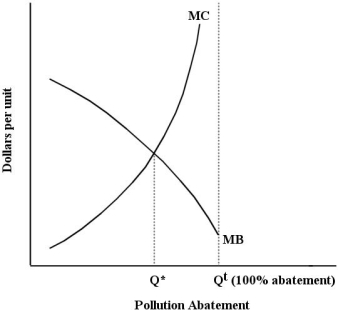 FIGURE 17-3
-Refer to Figure 17-3.The socially optimal amount of pollution is
A) Q* + Qt.
B) Qt - Q*.
C) Q*.
D) Qt.
E) 0.
Correct Answer:
Verified
Q30: An upward-sloping marginal cost curve for pollution
Q40: The diagram below shows the private and
Q43: The table below shows the marginal costs
Q46: The figure below shows the demand and
Q48: The marginal benefit of reducing pollution and
Q54: The figure below shows the demand and
Q56: The figure below shows the demand and
Q57: Suppose a farm that is polluting an
Q60: Suppose a farm that is polluting an
Q66: The table below shows the marginal costs
Unlock this Answer For Free Now!
View this answer and more for free by performing one of the following actions

Scan the QR code to install the App and get 2 free unlocks

Unlock quizzes for free by uploading documents