The graphs below show the results of simulations of the effect of selection on deleterious alleles. Population size is infinite in both simulations, and the starting frequency and the strength of selection are the same. 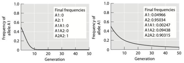 (a) Based on the shape of the curves, why do the results of the simulations differ? Explain your answer.
(b) The allele in the second simulation is not eliminated entirely from the population. Would this change if the population was finite in size? Why or why not?
Correct Answer:
Verified
Q50: In which of the scenarios below is
Q51: Which of the following is/are true regarding
Q52: How do gene frequencies behave in Hardy-Weinberg
Q53: Please describe two factors that would increase
Q54: In a population of ground beetles, a
Q56: The graph below depicts the change in
Q57: You collect the following data on genotypes
Q58: When FST ≈ 0, a population
A) has
Q59: The graph below shows results of two
Q60: Some Drosophila melanogaster larvae use a "sitting"
Unlock this Answer For Free Now!
View this answer and more for free by performing one of the following actions

Scan the QR code to install the App and get 2 free unlocks

Unlock quizzes for free by uploading documents