Statistics Canada report 2010 results in the following chart. 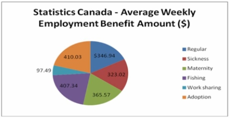 Is the data quantitative or qualitative? What is the name of the table shown?
A) quantitative, simple table
B) quantitative, pie chart
C) qualitative, frequency table
D) qualitative, pie chart
E) quantitative, bar chart
Correct Answer:
Verified
Q3: The monthly incomes of a small sample
Q5: (i. Bar charts are useful for showing
Q7: (i. Pie charts are useful for showing
Q17: A group of 100 students were surveyed
Q18: A group of 100 students were surveyed
Q19: When a class interval is expressed as:
Q20: (i. A frequency table is a grouping
Q21: What are the class limits for the
Q24: The chart below can be best described
Q35: Why are unequal class intervals sometimes used
Unlock this Answer For Free Now!
View this answer and more for free by performing one of the following actions

Scan the QR code to install the App and get 2 free unlocks

Unlock quizzes for free by uploading documents