Figure: Unemployment Rate over Time
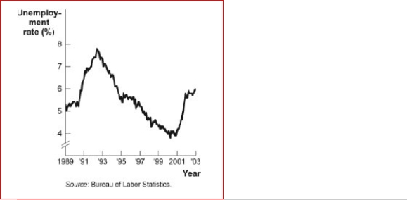 (Figure: Unemployment Rate over Time) Look again at the figure Unemployment Rate over Time.In the time-series graph, as we move from 1997 to 2001, we see that the unemployment rate has:
A.decreased from approximately 5% to approximately 4%.
B.increased from approximately 5.3% to approximately 7.3%.
C.decreased from approximately 7.8% to approximately 5.5%.
D.increased from approximately 4% to approximately 6.3%.
Correct Answer:
Verified
View Answer
Unlock this answer now
Get Access to more Verified Answers free of charge
Q45: A linear curve has the same slope
Q46: A scatter diagram shows:
A)how far apart dependent
Q50: The fact that two variables always move
Q60: Figure: Seasonally Adjusted Unemployment Rate
(Figure: Seasonally Adjusted
Q61: The scaling of the axes of a
Q64: A graph shows how the value of
Q69: Figure: Consumption of Pizza and Tacos
(Figure: Consumption
Q70: In a time-series graph, large changes can
Q70: In looking at a chart of the
Q73: An economist wishes to build a model
Unlock this Answer For Free Now!
View this answer and more for free by performing one of the following actions

Scan the QR code to install the App and get 2 free unlocks

Unlock quizzes for free by uploading documents