Use the figure to answer the following question. 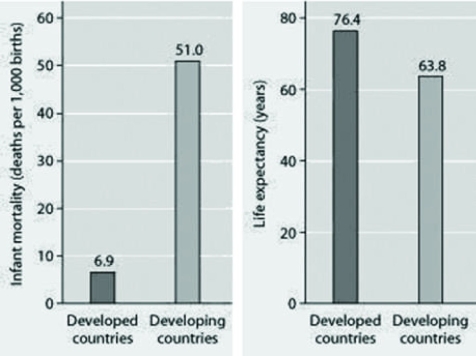 Infant mortality and life expectancy at birth in developed and
Developing countries (data as of 2005) .
What is a logical conclusion that can be drawn from the graphs about developed countries?
A) lower infant mortality rates and lower life expectancy than developing countries
B) higher infant mortality rates and lower life expectancy than developing countries
C) lower infant mortality rates and higher life expectancy than developing countries
D) higher infant mortality rates and higher life expectancy than developing countries
Correct Answer:
Verified
Q45: Use the graph to answer the following
Q46: Two breeding female fish of the same
Q47: Which of the following graphs illustrates the
Q48: Use the graphs to answer the following
Q49: Often the growth cycle of one population
Q51: Use the figures to answer the following
Q52: Use the figure to answer the following
Q53: Which of the following is most consistent
Q54: Use the graph to answer the following
Q55: Use the graph to answer the following
Unlock this Answer For Free Now!
View this answer and more for free by performing one of the following actions

Scan the QR code to install the App and get 2 free unlocks

Unlock quizzes for free by uploading documents