The graph shows the relationship between the percent P of those surveyed who rated their senator's job performance as satisfactory or better and the time t she had been in office. 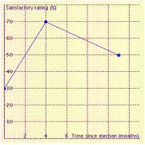 When did her job performance rating reach a maximum? __________ months after election
Correct Answer:
Verified
Q11: The graph below shows the value y
Q12: Complete the solution of equation.
Q13: The graph below gives the heart rate
Q14: Complete the solution of equation.
Q15: To correct her swing, a golfer
Q17: The charges for renting a video are
Q18: The graph shown gives the first-class postage
Q19: The graph below shows how the
Q20: The graph, given below, shows the relationship
Q21: Graph the equation.
Unlock this Answer For Free Now!
View this answer and more for free by performing one of the following actions

Scan the QR code to install the App and get 2 free unlocks

Unlock quizzes for free by uploading documents