Figure 3.2 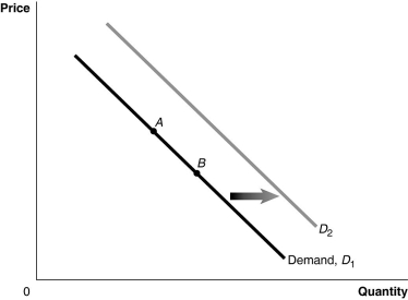 Alt text for Figure 3.2: In figure 3.2, a graph of the effect of an increase in the price of a complement on demand curve.
Long description for Figure 3.2: The x-axis is labelled, Quantity, and y-axis is labelled, Price.Curve Demand, D1, is a straight line which slopes down from the top left corner to the bottom right corner.Curve D2 follows the same slope as curve D1, but is plotted to the right.2 points, A and B, are plotted in the middle of curve D1.A right pointing arrow indicates the change from curve D1 to curve D2.
-Refer to Figure 3.2.A decrease in the expected future price of the product would be represented by a movement from
A) A to B.
B) B to A.
C) D1 to D2.
D) D2 to D1.
Correct Answer:
Verified
Q20: A change in which variable will change
Q30: The income effect of a price change
Q37: If a decrease in income leads to
Q73: How has the growing popularity of on-line

