Figure 9.3 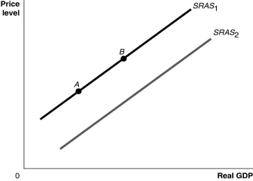 Alt text for Figure 9.3: In figure 9.3, a graph comparing real GDP and price level.
Long description for Figure 9.3: The x-axis is labelled, real GDP, with 0 at the vertex, and the y-axis is labelled, price level.2 lines are shown; SRAS1 and SRAS2.Line SRAS1 begins a little above the vertex and slopes up to the top right corner.Line SRAS2 follows the same slope as line SRAS1, but is plotted to the right.Points A and B are plotted on line SRAS1.Point A is near the left end of the line and point B is near the center of the line.
-Refer to Figure 9.3.Ceteris paribus, an increase in the labour force would be represented by a movement from
A) SRAS1 to SRAS2.
B) SRAS2 to SRAS1.
C) point A to point B.
D) point B to point A.
Correct Answer:
Verified
Q82: Which aggregate supply curve has a positive
Q93: All of the following are reasons why
Q93: If, due to a recession, workers begin
Q95: Workers expect inflation to rise from 3%
Unlock this Answer For Free Now!
View this answer and more for free by performing one of the following actions

Scan the QR code to install the App and get 2 free unlocks

Unlock quizzes for free by uploading documents