What does the graph below (profit/sales ratios for 25 Fortune 500 companies) reveal? 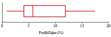
A) That the median exceeds the mean.
B) That the data are slightly left-skewed.
C) That the interquartile range is about 8.
D) That the distribution is bell-shaped.
Correct Answer:
Verified
Q101: A reporter for the campus paper asked
Q102: Estimate the mean exam score for
Q103: Which statement is false? Explain.
A)If μ =
Q104: A smooth distribution with one mode is
Q105: Which is not a measure of variability?
A)Mean
Q107: The mode is least appropriate for:
A)continuous data.
B)categorical
Q108: The following frequency distribution shows the
Q109: Find the sample correlation coefficient for
Q110: Five homes were recently sold in Oxnard
Q111: The following table is the frequency
Unlock this Answer For Free Now!
View this answer and more for free by performing one of the following actions

Scan the QR code to install the App and get 2 free unlocks

Unlock quizzes for free by uploading documents