The two graphs show the change in allele frequency, p, over 100 generations. Each graph shows 10 different populations, all experiencing the same evolutionary forces. What is the most likely difference between the populations shown in the top graph compared to the populations in the bottom graph? 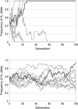
A) There is no difference between the populations; the differences in the graphs are due to chance.
B) The populations in the graph on top have a longer generation time than the populations in the bottom graph.
C) The populations in the graph on top are experiencing genetic drift; the populations in the graph on bottom are experiencing directional selection.
D) The population sizes in the graph on top are smaller than the population sizes in the graph on the bottom.
Correct Answer:
Verified
Q8: Population bottlenecks can result in rapid fixation
Q9: A new mutation arises in a population
Q10: Genetic drift causes changes in
A) the strength
Q11: What is the effect of small population
Q12: Which of the following is true of
Q14: A rancher genotypes all of her 150
Q15: Consider a collection of 50 distinct alleles,
Q16: If we trace the genealogies of two
Q17: The effective population size is often lower
Q18: Imagine an island archipelago where all of
Unlock this Answer For Free Now!
View this answer and more for free by performing one of the following actions

Scan the QR code to install the App and get 2 free unlocks

Unlock quizzes for free by uploading documents