Principles of Environmental Science 7th Edition by William Cunningham,Mary Cunningham
النسخة 7الرقم المعياري الدولي: 978-0071314947Principles of Environmental Science 7th Edition by William Cunningham,Mary Cunningham
النسخة 7الرقم المعياري الدولي: 978-0071314947 تمرين 11
Working with Graphs
To understand trends and compare values in environmental science, we need to examine a great many numbers. Most people find it hard to quickly assess large amounts of data in a table. Graphing a set of data makes it easier to see patterns, trends, and relationships. For example, scatter plots show relationships between two variables, while bar graphs show the range of values in a set (figures 1 and 2). Reading graphs takes practice, but it is an essential skill that will serve you well in this course and others.
You will encounter several common types of graphs in this book. Go to the Data Analysis exercise on Connect to practice these skills and demonstrate your knowledge of how to read and use graphs.
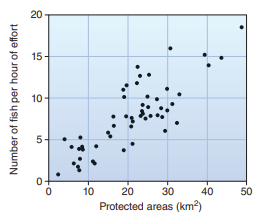
Figure 1 A scatter plot shows the relationship of x and y for many observations. Here each observation is a village.

Figure 2 A bar graph shows values by groups or classes.
To understand trends and compare values in environmental science, we need to examine a great many numbers. Most people find it hard to quickly assess large amounts of data in a table. Graphing a set of data makes it easier to see patterns, trends, and relationships. For example, scatter plots show relationships between two variables, while bar graphs show the range of values in a set (figures 1 and 2). Reading graphs takes practice, but it is an essential skill that will serve you well in this course and others.
You will encounter several common types of graphs in this book. Go to the Data Analysis exercise on Connect to practice these skills and demonstrate your knowledge of how to read and use graphs.
Figure 1 A scatter plot shows the relationship of x and y for many observations. Here each observation is a village.
Figure 2 A bar graph shows values by groups or classes.
التوضيح

هذا السؤال ليس له إجابة موثقة من أحد الخبراء بعد، دع الذكاء الاصطناعي Copilot في كويز بلس يساعدك في إيجاد الحل.
Principles of Environmental Science 7th Edition by William Cunningham,Mary Cunningham
لماذا لم يعجبك هذا التمرين؟
أخرى 8 أحرف كحد أدنى و 255 حرفاً كحد أقصى
حرف 255


