Deck 4: Graphical Descriptive Techniques Numerical Data
Full screen (f)
Question
Which of the following statements best describes a stem-and-leaf display? 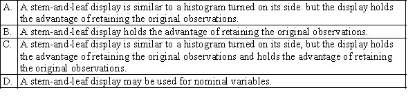
Question
Which of the following graphical display is can be used to describe relationship between two numerical (quantitative) variables? 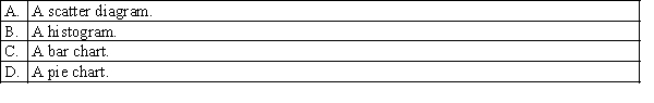
Question
Which of the following is the best type of chart for illustrating the GDP of Australia from 1960 to 2010? 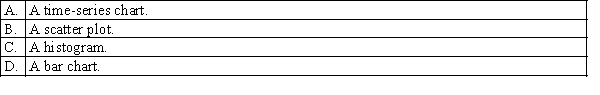
Question
Which of the following is the most important and commonly used graphical presentation of numerical (quantitative) data? 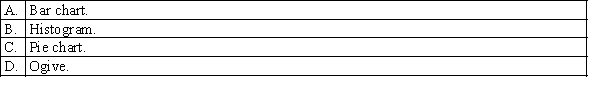
Question
Question
Question
Question
Question
Which of the following is the sum of the relative frequencies for all classes? 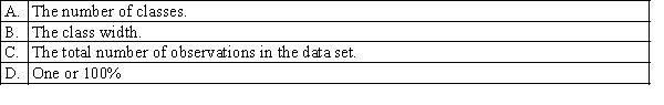
Question
Question
Question
Which of the following may be determined from the height of the bar in a relative frequency histogram? 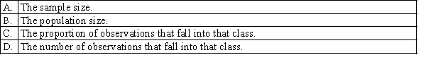
Question
Question
Which of the following best describes the modal class? 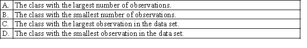
Question
Question
Question
Which of the following is the most appropriate type of chart for determining the number of observations at or below a specific value? 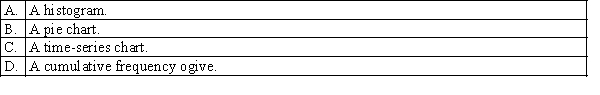
Question
When income increases, expenditure on imports tend to increase. Which of the following best describes this relationship? 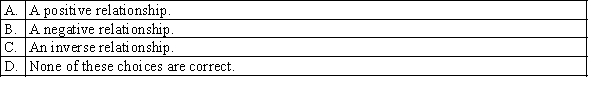
Question
Which of the following best describes the shape of the distribution of incomes of all employees in large company? 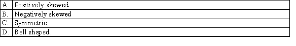
Question
Question
Question
Question
Question
Question
Question
Question
Question
Question
Question
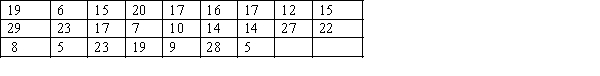
Question
Question
Question
Question
Question
Question
Question
Question
Question
Question
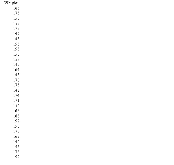
Question
Question
Construct a cumulative relative frequency distribution for the number of years of service for 100 employees, given the frequency distribution of the number of years of service for 100 employees is shown below. 
Question
The frequency distribution of the number of years of service for 100 employees is shown below. 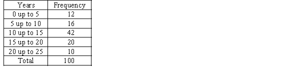 a. Estimate the proportion of employees who have fewer than 10 years of service.
b. Estimate the proportion of employees who have more than 20 years of service.
c. Estimate the proportion of employees who have between 10 and 20 years of service.
a. Estimate the proportion of employees who have fewer than 10 years of service.b. Estimate the proportion of employees who have more than 20 years of service.
c. Estimate the proportion of employees who have between 10 and 20 years of service.
Question
The following data are test grades for a university business statistics class.  a. Construct a cumulative frequency distribution and a cumulative relative frequency distribution for the data.
b. What proportion of the grades is less than 60?
c. What proportion of the grades is more than 70?
a. Construct a cumulative frequency distribution and a cumulative relative frequency distribution for the data.b. What proportion of the grades is less than 60?
c. What proportion of the grades is more than 70?
Question
The ages of 25 salespersons in an organisation are given below. 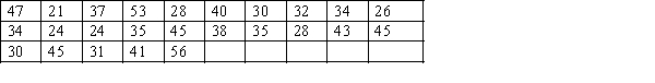 Construct an ogive for the data, and estimate the proportion of salespersons that are:
a. less than 30 years of age.
b. more than 40 years of age.
c. between 40 and 50 years of age.
Construct an ogive for the data, and estimate the proportion of salespersons that are:a. less than 30 years of age.
b. more than 40 years of age.
c. between 40 and 50 years of age.
Question
Construct a stem-and-leaf display of the test grades for a university business statistics class, given below. 
Question
Question
Describe briefly what the histogram and the stem-and-leaf displays tell you about the test grades for a university business statistics class. 
Question
The numbers of defective items produced by a machine over the last 25 days are as follows:
 a. Construct a frequency distribution and a relative frequency distribution for these data. Use five class intervals, with the lower boundary of the first class being five items.
b. Construct a relative frequency histogram for these data.
c. What is the relationship between the total area under the histogram you have constructed and the relative frequencies of observations?
a. Construct a frequency distribution and a relative frequency distribution for these data. Use five class intervals, with the lower boundary of the first class being five items.b. Construct a relative frequency histogram for these data.
c. What is the relationship between the total area under the histogram you have constructed and the relative frequencies of observations?
Question
Question
Question
The weights in kilograms of a sample of 30 horses are given below:
 a. Construct a cumulative relative frequency distribution for the data.
b. Construct an ogive for the data.
c. What proportion of horses weighs less than 160kgs?
d. What proportion of horses weighs between 145 and 165kgs?
a. Construct a cumulative relative frequency distribution for the data.b. Construct an ogive for the data.
c. What proportion of horses weighs less than 160kgs?
d. What proportion of horses weighs between 145 and 165kgs?
Question
The table below shows the number of licensed hotels with at least 15 rooms in New South Wales from March 1998 to December 2009. 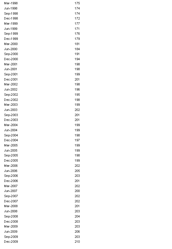 a. Plot the time series.
b. When did the number of licensed hotels with at least 15 rooms in New South Wales grow fastest?
a. Plot the time series.b. When did the number of licensed hotels with at least 15 rooms in New South Wales grow fastest?
Question
Construct a relative frequency histogram for the test grades for a university business statistics class. 
Question
Consider the following cumulative frequency distribution. 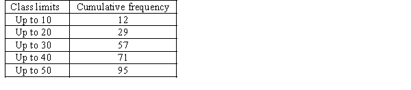 Find the frequency for each of the following classes.
a. 0 up to 10.
b. 10 up to 20.
c. 20 up to 30.
d. 30 up to 40.
e. 40 up to 50.
Find the frequency for each of the following classes.a. 0 up to 10.
b. 10 up to 20.
c. 20 up to 30.
d. 30 up to 40.
e. 40 up to 50.
Question
Question
Construct an ogive for the test grades for a university business statistics class, and estimate the proportion of grades that are between 80 and 90. 
Question
Construct a frequency distribution and relative frequency distribution for the test grades for a university business statistics class, data given in the following table. Use seven class intervals. 
Question
Question
Question
The bar chart below is of the colour of motor vehicles in a random sample. A student commented that the distribution was negatively skewed. Explain what is wrong with this statement.
Motor Vehicle Colour Relative Frequency Bar Chart
Motor Vehicle Colour Relative Frequency Bar Chart
Question
The number of houses sold in a suburb in Sydney and the average monthly mortgage rates for 18 months randomly selected are shown in the following table. 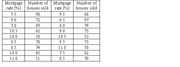 a. Draw a scatter diagram with the number of houses sold on the vertical axis.
b. Describe the relationship between mortgage rate and number of houses sold.
a. Draw a scatter diagram with the number of houses sold on the vertical axis.b. Describe the relationship between mortgage rate and number of houses sold.
Question
The following table shows the annual incomes (in thousands of dollars) and weekly rent payments (dollars) of a sample of 10 individuals in country New South Wales:
 a. Draw a scatter diagram for these data with rent payment on the vertical axis.
b. Describe the relationship between rent payment and income.
a. Draw a scatter diagram for these data with rent payment on the vertical axis.b. Describe the relationship between rent payment and income.
Question
The number of faulty items returned to a manufacturer of electric goods in the last 15 years is as follows: 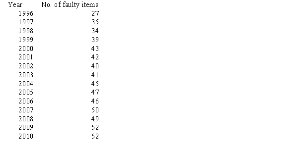 a. Construct a relative frequency bar chart for these data.
b. Construct a line chart.
a. Construct a relative frequency bar chart for these data.b. Construct a line chart.

Unlock Deck
Sign up to unlock the cards in this deck!
Unlock Deck
Unlock Deck
1/64
Play
Full screen (f)
Deck 4: Graphical Descriptive Techniques Numerical Data
1
Which of the following statements best describes a stem-and-leaf display?
C
2
Which of the following graphical display is can be used to describe relationship between two numerical (quantitative) variables?
A
3
Which of the following is the best type of chart for illustrating the GDP of Australia from 1960 to 2010?
A
4
Which of the following is the most important and commonly used graphical presentation of numerical (quantitative) data?
Unlock Deck
Unlock for access to all 64 flashcards in this deck.
Unlock Deck
k this deck
5
A relative frequency distribution describes the number of data values that fall within each class, and may be presented in histogram form.
Unlock Deck
Unlock for access to all 64 flashcards in this deck.
Unlock Deck
k this deck
6
Compared to the frequency distribution, the stem-and-leaf display provides more details, since it can describe the individual data values as well as show how many are in each group, or stem.
Unlock Deck
Unlock for access to all 64 flashcards in this deck.
Unlock Deck
k this deck
7
A relative frequency distribution describes the proportion of data values that fall within each category.
Unlock Deck
Unlock for access to all 64 flashcards in this deck.
Unlock Deck
k this deck
8
The stem-and-leaf display reveals far more information about individual values than does the histogram.
Unlock Deck
Unlock for access to all 64 flashcards in this deck.
Unlock Deck
k this deck
9
Which of the following is the sum of the relative frequencies for all classes?
Unlock Deck
Unlock for access to all 64 flashcards in this deck.
Unlock Deck
k this deck
10
Which of the following statements about histograms is true?
Unlock Deck
Unlock for access to all 64 flashcards in this deck.
Unlock Deck
k this deck
11
Individual observations within each class may be found in a frequency distribution.
Unlock Deck
Unlock for access to all 64 flashcards in this deck.
Unlock Deck
k this deck
12
Which of the following may be determined from the height of the bar in a relative frequency histogram?
Unlock Deck
Unlock for access to all 64 flashcards in this deck.
Unlock Deck
k this deck
13
A cumulative frequency distribution lists the proportion of observations that are within or below each of the classes.
Unlock Deck
Unlock for access to all 64 flashcards in this deck.
Unlock Deck
k this deck
14
Which of the following best describes the modal class?
Unlock Deck
Unlock for access to all 64 flashcards in this deck.
Unlock Deck
k this deck
15
Which of the following statements is false?
Unlock Deck
Unlock for access to all 64 flashcards in this deck.
Unlock Deck
k this deck
16
Which of the following statements is true?
Unlock Deck
Unlock for access to all 64 flashcards in this deck.
Unlock Deck
k this deck
17
Which of the following is the most appropriate type of chart for determining the number of observations at or below a specific value?
Unlock Deck
Unlock for access to all 64 flashcards in this deck.
Unlock Deck
k this deck
18
When income increases, expenditure on imports tend to increase. Which of the following best describes this relationship?
Unlock Deck
Unlock for access to all 64 flashcards in this deck.
Unlock Deck
k this deck
19
Which of the following best describes the shape of the distribution of incomes of all employees in large company?
Unlock Deck
Unlock for access to all 64 flashcards in this deck.
Unlock Deck
k this deck
20
Which of the following statements is false?
Unlock Deck
Unlock for access to all 64 flashcards in this deck.
Unlock Deck
k this deck
21
A histogram is said to be symmetric if, when we draw a vertical line down the center of the histogram, the two sides are mirror images of each other.
Unlock Deck
Unlock for access to all 64 flashcards in this deck.
Unlock Deck
k this deck
22
Frequency polygons are useful for obtaining a general idea of the shape of the distribution, because they are a bar chart.
Unlock Deck
Unlock for access to all 64 flashcards in this deck.
Unlock Deck
k this deck
23
The modal class (classes) of a frequency distribution is the class (are the classes) with the highest frequency.
Unlock Deck
Unlock for access to all 64 flashcards in this deck.
Unlock Deck
k this deck
24
In any relative frequency distribution, the sum of all the relative frequencies is always equal to 1.
Unlock Deck
Unlock for access to all 64 flashcards in this deck.
Unlock Deck
k this deck
25
When choosing between a line chart and a bar chart to display a time-series of data, if the main objective is to display the overall general movement, or trend, in the time-series, a line chart is best.
Unlock Deck
Unlock for access to all 64 flashcards in this deck.
Unlock Deck
k this deck
26
The lowest value in a set of data is 140, and the largest value is 270. If the resulting frequency distribution is to have ten classes of equal width, the common class width will be 27.
Unlock Deck
Unlock for access to all 64 flashcards in this deck.
Unlock Deck
k this deck
27
A scatter diagram which has points widely dispersed, where no clear line is visible, indicates no linear relationship between the variables.
Unlock Deck
Unlock for access to all 64 flashcards in this deck.
Unlock Deck
k this deck
28
If we draw a straight line through the points in a scatter diagram and most of the points fall relatively close to the line, we say that there is a linear relationship between the two variables.
Unlock Deck
Unlock for access to all 64 flashcards in this deck.
Unlock Deck
k this deck
29
The difference between a histogram and a bar chart is that the histogram represents numerical (quantitative) data while the bar chart represents nominal (categorical) data.
Unlock Deck
Unlock for access to all 64 flashcards in this deck.
Unlock Deck
k this deck
30
A stem-and-leaf display describes two-digit integers between 20 and 70. For one of the classes displayed, the row appears as 4 | 2 5 6. The numerical values being described are 42, 45 and 46.
Unlock Deck
Unlock for access to all 64 flashcards in this deck.
Unlock Deck
k this deck
31
A frequency distribution shows the number of data values falling within each class.
Unlock Deck
Unlock for access to all 64 flashcards in this deck.
Unlock Deck
k this deck
32
Class intervals of equal width make the interpretation of a frequency distribution easier.
Unlock Deck
Unlock for access to all 64 flashcards in this deck.
Unlock Deck
k this deck
33
A list of share prices of 20 Australian companies at the end of a trading day would be an example of time-series data.
Unlock Deck
Unlock for access to all 64 flashcards in this deck.
Unlock Deck
k this deck
34
The strength of a linear relationship between two numerical variables may be illustrated by a line graph, where the closer the points form a line, the stronger the linear relationship between the two variables.
Unlock Deck
Unlock for access to all 64 flashcards in this deck.
Unlock Deck
k this deck
35
The graphical format used to display the relationship between two numerical (quantitative) variables is the scatter diagram.
Unlock Deck
Unlock for access to all 64 flashcards in this deck.
Unlock Deck
k this deck
36
A cumulative frequency distribution presented in graphical form is called an ogive.
Unlock Deck
Unlock for access to all 64 flashcards in this deck.
Unlock Deck
k this deck
37
A skewed histogram is one with a long tail extending either to the right or left. The former is called negatively skewed, and the latter is called positively skewed.
Unlock Deck
Unlock for access to all 64 flashcards in this deck.
Unlock Deck
k this deck
38
A frequency distribution is a listing of the individual observations arranged in ascending or descending order.
Unlock Deck
Unlock for access to all 64 flashcards in this deck.
Unlock Deck
k this deck
39
A list of share prices of one Australian company, at the end of a trading day for the period of 30 trading days, would be an example of time-series data.
Unlock Deck
Unlock for access to all 64 flashcards in this deck.
Unlock Deck
k this deck
40
Time-series data may be graphically depicted on a line chart or a bar chart.
Unlock Deck
Unlock for access to all 64 flashcards in this deck.
Unlock Deck
k this deck
41
Graphical excellence is displayed when a graph has a proper scale, the axis are marked correctly are the graph chosen appropriately tells the truth about the data.
Unlock Deck
Unlock for access to all 64 flashcards in this deck.
Unlock Deck
k this deck
42
Construct a cumulative relative frequency distribution for the number of years of service for 100 employees, given the frequency distribution of the number of years of service for 100 employees is shown below.
Unlock Deck
Unlock for access to all 64 flashcards in this deck.
Unlock Deck
k this deck
43
The frequency distribution of the number of years of service for 100 employees is shown below. a. Estimate the proportion of employees who have fewer than 10 years of service.
b. Estimate the proportion of employees who have more than 20 years of service.
c. Estimate the proportion of employees who have between 10 and 20 years of service.
a. Estimate the proportion of employees who have fewer than 10 years of service.b. Estimate the proportion of employees who have more than 20 years of service.
c. Estimate the proportion of employees who have between 10 and 20 years of service.
Unlock Deck
Unlock for access to all 64 flashcards in this deck.
Unlock Deck
k this deck
44
The following data are test grades for a university business statistics class. a. Construct a cumulative frequency distribution and a cumulative relative frequency distribution for the data.
b. What proportion of the grades is less than 60?
c. What proportion of the grades is more than 70?
a. Construct a cumulative frequency distribution and a cumulative relative frequency distribution for the data.b. What proportion of the grades is less than 60?
c. What proportion of the grades is more than 70?
Unlock Deck
Unlock for access to all 64 flashcards in this deck.
Unlock Deck
k this deck
45
The ages of 25 salespersons in an organisation are given below. Construct an ogive for the data, and estimate the proportion of salespersons that are:
a. less than 30 years of age.
b. more than 40 years of age.
c. between 40 and 50 years of age.
Construct an ogive for the data, and estimate the proportion of salespersons that are:a. less than 30 years of age.
b. more than 40 years of age.
c. between 40 and 50 years of age.
Unlock Deck
Unlock for access to all 64 flashcards in this deck.
Unlock Deck
k this deck
46
Construct a stem-and-leaf display of the test grades for a university business statistics class, given below.
Unlock Deck
Unlock for access to all 64 flashcards in this deck.
Unlock Deck
k this deck
47
The relationship between expenditure on imports and household income may be described as a positive linear relationship.
Unlock Deck
Unlock for access to all 64 flashcards in this deck.
Unlock Deck
k this deck
48
Describe briefly what the histogram and the stem-and-leaf displays tell you about the test grades for a university business statistics class.
Unlock Deck
Unlock for access to all 64 flashcards in this deck.
Unlock Deck
k this deck
49
The numbers of defective items produced by a machine over the last 25 days are as follows:
a. Construct a frequency distribution and a relative frequency distribution for these data. Use five class intervals, with the lower boundary of the first class being five items.
b. Construct a relative frequency histogram for these data.
c. What is the relationship between the total area under the histogram you have constructed and the relative frequencies of observations?
a. Construct a frequency distribution and a relative frequency distribution for these data. Use five class intervals, with the lower boundary of the first class being five items.b. Construct a relative frequency histogram for these data.
c. What is the relationship between the total area under the histogram you have constructed and the relative frequencies of observations?
Unlock Deck
Unlock for access to all 64 flashcards in this deck.
Unlock Deck
k this deck
50
With a line graph, the horizontal axis is stretched out to get a deceptive steeper slope.
Unlock Deck
Unlock for access to all 64 flashcards in this deck.
Unlock Deck
k this deck
51
If two numerical variables are linearly related, then it means that one variable is causing the other variable to react in a particular way.
Unlock Deck
Unlock for access to all 64 flashcards in this deck.
Unlock Deck
k this deck
52
The weights in kilograms of a sample of 30 horses are given below:
a. Construct a cumulative relative frequency distribution for the data.
b. Construct an ogive for the data.
c. What proportion of horses weighs less than 160kgs?
d. What proportion of horses weighs between 145 and 165kgs?
a. Construct a cumulative relative frequency distribution for the data.b. Construct an ogive for the data.
c. What proportion of horses weighs less than 160kgs?
d. What proportion of horses weighs between 145 and 165kgs?
Unlock Deck
Unlock for access to all 64 flashcards in this deck.
Unlock Deck
k this deck
53
The table below shows the number of licensed hotels with at least 15 rooms in New South Wales from March 1998 to December 2009. a. Plot the time series.
b. When did the number of licensed hotels with at least 15 rooms in New South Wales grow fastest?
a. Plot the time series.b. When did the number of licensed hotels with at least 15 rooms in New South Wales grow fastest?
Unlock Deck
Unlock for access to all 64 flashcards in this deck.
Unlock Deck
k this deck
54
Construct a relative frequency histogram for the test grades for a university business statistics class.
Unlock Deck
Unlock for access to all 64 flashcards in this deck.
Unlock Deck
k this deck
55
Consider the following cumulative frequency distribution. Find the frequency for each of the following classes.
a. 0 up to 10.
b. 10 up to 20.
c. 20 up to 30.
d. 30 up to 40.
e. 40 up to 50.
Find the frequency for each of the following classes.a. 0 up to 10.
b. 10 up to 20.
c. 20 up to 30.
d. 30 up to 40.
e. 40 up to 50.
Unlock Deck
Unlock for access to all 64 flashcards in this deck.
Unlock Deck
k this deck
56
For a bar chart to show graphical excellence, the bars must be the same width irrespective of each bar's height.
Unlock Deck
Unlock for access to all 64 flashcards in this deck.
Unlock Deck
k this deck
57
Construct an ogive for the test grades for a university business statistics class, and estimate the proportion of grades that are between 80 and 90.
Unlock Deck
Unlock for access to all 64 flashcards in this deck.
Unlock Deck
k this deck
58
Construct a frequency distribution and relative frequency distribution for the test grades for a university business statistics class, data given in the following table. Use seven class intervals.
Unlock Deck
Unlock for access to all 64 flashcards in this deck.
Unlock Deck
k this deck
59
Graphical deception is acceptable when the graph displays what the statistician would like the reader to believe, as opposed to the truth about the data.
Unlock Deck
Unlock for access to all 64 flashcards in this deck.
Unlock Deck
k this deck
60
For each of the following numerical variables, describe if the distribution of data would be symmetrical, positively skewed or negatively skewed.
a. Annual incomes of employees in a multinational company.
b. Weights of 1kilogram labeled bags of flour, processed by a large manufacturing company.
c. Grades of students in an easy test.
a. Annual incomes of employees in a multinational company.
b. Weights of 1kilogram labeled bags of flour, processed by a large manufacturing company.
c. Grades of students in an easy test.
Unlock Deck
Unlock for access to all 64 flashcards in this deck.
Unlock Deck
k this deck
61
The bar chart below is of the colour of motor vehicles in a random sample. A student commented that the distribution was negatively skewed. Explain what is wrong with this statement.
Motor Vehicle Colour Relative Frequency Bar Chart
Motor Vehicle Colour Relative Frequency Bar Chart
Unlock Deck
Unlock for access to all 64 flashcards in this deck.
Unlock Deck
k this deck
62
The number of houses sold in a suburb in Sydney and the average monthly mortgage rates for 18 months randomly selected are shown in the following table. a. Draw a scatter diagram with the number of houses sold on the vertical axis.
b. Describe the relationship between mortgage rate and number of houses sold.
a. Draw a scatter diagram with the number of houses sold on the vertical axis.b. Describe the relationship between mortgage rate and number of houses sold.
Unlock Deck
Unlock for access to all 64 flashcards in this deck.
Unlock Deck
k this deck
63
The following table shows the annual incomes (in thousands of dollars) and weekly rent payments (dollars) of a sample of 10 individuals in country New South Wales:
a. Draw a scatter diagram for these data with rent payment on the vertical axis.
b. Describe the relationship between rent payment and income.
a. Draw a scatter diagram for these data with rent payment on the vertical axis.b. Describe the relationship between rent payment and income.
Unlock Deck
Unlock for access to all 64 flashcards in this deck.
Unlock Deck
k this deck
64
The number of faulty items returned to a manufacturer of electric goods in the last 15 years is as follows: a. Construct a relative frequency bar chart for these data.
b. Construct a line chart.
a. Construct a relative frequency bar chart for these data.b. Construct a line chart.
Unlock Deck
Unlock for access to all 64 flashcards in this deck.
Unlock Deck
k this deck
Unlock Deck
Unlock for access to all 64 flashcards in this deck.


