Deck 2: Exploring Data With Tables and Graphs
Full screen (f)
Question
Analysis of the data from 25 mothers indicates that an infant's birth weight  can be estimated by a mother's weight (kg), x , using the regression equation
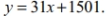
If a mother's weight is 70 kg the infant's birth weight can be estimated as
A) 48,701
B) 1718
C) 46
D) 3671
can be estimated by a mother's weight (kg), x , using the regression equation If a mother's weight is 70 kg the infant's birth weight can be estimated as
A) 48,701
B) 1718
C) 46
D) 3671
Question
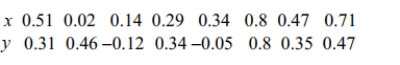 Which of these choices display the correct scatterplot?
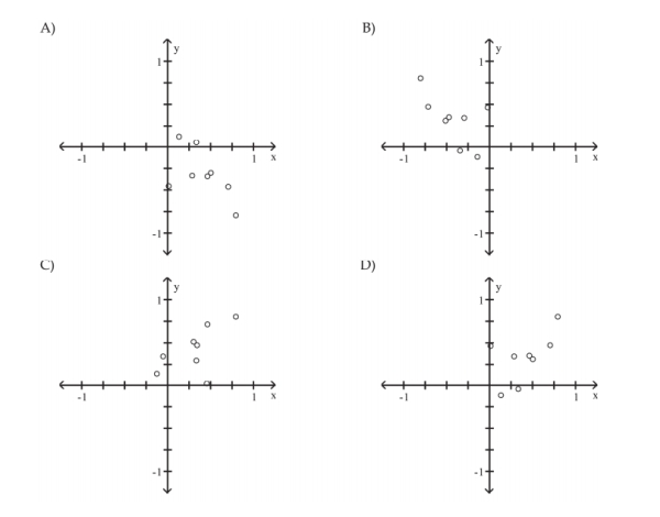
Question
A store manager counts the number of customers who make a purchase in his store each_ day. The data are as follows. 
Question
Question
A nurse measured the blood pressure of each person who visited her clinic. Following is a_ relative-frequency histogram for the systolic blood pressure readings for those people
Aged between 25 and 40 years. The blood pressure readings were given to the nearest
Whole number. Approximately what percentage of the people aged 25 -40 had a systolic
Blood pressure reading between 110 and 119 mm Hg inclusive?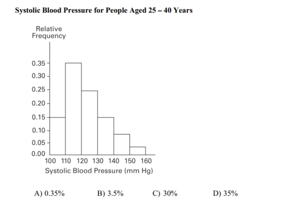
Aged between 25 and 40 years. The blood pressure readings were given to the nearest
Whole number. Approximately what percentage of the people aged 25 -40 had a systolic
Blood pressure reading between 110 and 119 mm Hg inclusive?
Question
Question
The histogram below represents the number of television sets per household for a sample of U.S. households. What is the sample size? 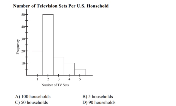
Question
A nurse measured the blood pressure of each person who visited her clinic. Following is a_ relative-frequency histogram for the systolic blood pressure readings for those people
Aged between 25 and 40 years. The blood pressure readings were given to the nearest
Whole number. Approximately what percentage of the people aged 25 -40 had a systolic
Blood pressure reading between 110 and 139 mm Hg inclusive?
Systolic Blood Pressure for People Aged 25 - 40 Years A )7 5 % B )8 9 % C )5 9 % D )39%
Aged between 25 and 40 years. The blood pressure readings were given to the nearest
Whole number. Approximately what percentage of the people aged 25 -40 had a systolic
Blood pressure reading between 110 and 139 mm Hg inclusive?
Systolic Blood Pressure for People Aged 25 - 40 Years
A )7 5 % B )8 9 % C )5 9 % D )39% Question
The following frequency distribution represents the scores on a math test. Find the class_ midpoint of scores for the interval 40-59. 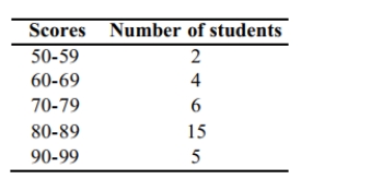
A)50.5
B)48.5
C)49.5
D)49.0
A)50.5
B)48.5
C)49.5
D)49.0
Question
The frequency distribution below summarizes employee years of service for Alpha Corporation. Find the class midpoint for class 1 -5. 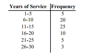
A)3.5 years
B)3.0 years
C)5.0 years
D)2.5 years
A)3.5 years
B)3.0 years
C)5.0 years
D)2.5 years
Question
Question
The Kappa Iota Sigma Fraternity polled its members on the weekend party theme. The_ vote was as follows: six for toga, four for hayride, eight for luau, and two for masquerade.
Display the vote count in a Pareto chart.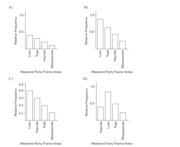
Display the vote count in a Pareto chart.
Question
Question
A nurse measured the blood pressure of each person who visited her clinic. Following is a relative-frequency histogram for the systolic blood pressure readings for those people
Aged between 25 and 40 years. The blood pressure readings (in mm Hg)were given to the
Nearest whole number. What class width was used to construct the relative frequency
Distribution?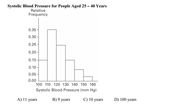
Aged between 25 and 40 years. The blood pressure readings (in mm Hg)were given to the
Nearest whole number. What class width was used to construct the relative frequency
Distribution?
Question
Question
The following frequency distribution analyzes the scores on a math test. Find the class boundaries of scores interval 90-99. 
A)89.5, 100.5
B)89.5, 100.5
C)90.5, 99.5
D)89.5, 99.5
A)89.5, 100.5
B)89.5, 100.5
C)90.5, 99.5
D)89.5, 99.5
Question
Question
The scatterplot below displays the amount of nitrous oxide (NO)explained by the amount of_ carbon monoxide (CO)emissions in million metric tons over a ten year period in the United
States. Select the choice that best describes any relationship between the variables.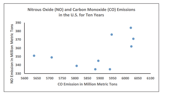
A)There is a negative linear association between NO and CO.
B)There is a positive linear association between NO and CO.
C)Overall, there is no noticeable relationship between NO and CO.
D)NO can be explained by CO.
Question
Question
Which choice displays the best graphic display of the amount of nitrous oxide (NO)1)____________ explained by the amount of carbon monoxide (CO)emissions in million metric tons over a
Ten year period in the United States? The data set is below:
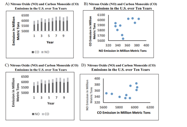
Ten year period in the United States? The data set is below:
Question
The frequency distribution below summarizes employee years of service for Alpha Corporation. Determine the width of each class. 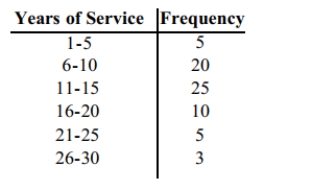
A)5 years
B)6 years
C)4 years
D)10 years
A)5 years
B)6 years
C)4 years
D)10 years
Question
Question
A nurse measured the blood pressure of each person who visited her clinic. Following is a_ relative-frequency histogram for the systolic blood pressure readings for those people
Aged between 25 and 40 years. The blood pressure readings were given to the nearest
Whole number. Approximately what percentage of the people aged 25 -40 had a systolic
Blood pressure reading between 110 and 139 mm Hg inclusive?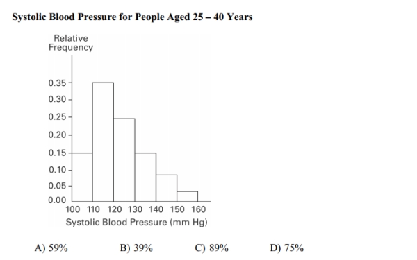
Aged between 25 and 40 years. The blood pressure readings were given to the nearest
Whole number. Approximately what percentage of the people aged 25 -40 had a systolic
Blood pressure reading between 110 and 139 mm Hg inclusive?
Question
Identify the cumulative frequency distribution that corresponds to the given frequency distribution. 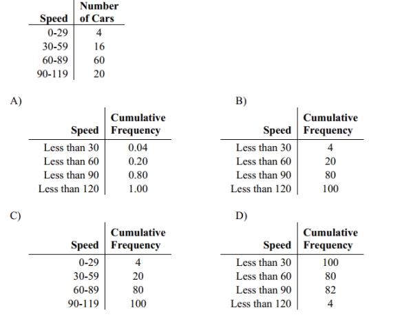
Question
The following frequency distribution depicts the scores on a math test. Find the class_ midpoint of scores for the interval 95-99. 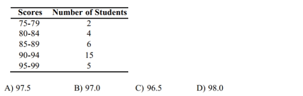
Question
Question
Question
A manufacturer records the number of errors each work station makes during the week. The data are as follows. 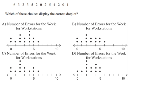
Question
A nurse measured the blood pressure of each person who visited her clinic. Following is_ a relative-frequency histogram for the systolic blood pressure readings for those people
Aged between 25 and 40 years. The blood pressure readings were given to the nearest
Whole number. Approximately what percentage of the people aged 25 -40 had a systolic
Blood pressure reading between 110 and 119 mm Hg inclusive?
Systolic Blood Pressure for People Aged 25 - 40 Years
A)35%
B)0.35%
C)3.5%
D)30%
Question
Attendance records at a school show the number of days each student was absent during the_ year. The days absent for each student were as follows. 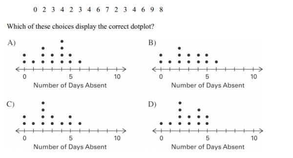
Question
The following data consists of the weights (in pounds)of 15 randomly selected women and_ the weights of 15 randomly selected men. Which of these choices display the correct back-
To-back stemplot?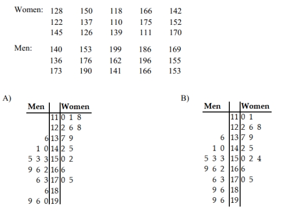
To-back stemplot?
Question
The following data represent the number of cars passing through a toll booth during a certain time period over a number of days. 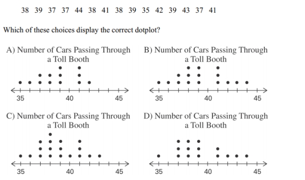
Question
The frequency distribution below summarizes the home sale prices in the city of_ Summerhill for the month of June. Determine the width of each class. 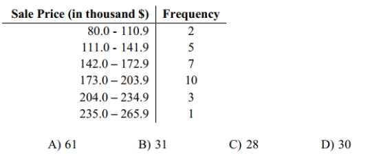
Question
Wagenlucht Ice Cream Company is always trying to create new flavors of ice cream. They are market testing three kinds to find out which one has the best chance of becoming
Popular. They give small samples of each to 20 people at a grocery store. Four ice cream
Tasters preferred the Strawberry Cream, 12 preferred Choco-Nuts, and four loved the
Orange Mint. Construct a Pareto chart to represent these preferences. Choose the vertical
Scale so that the relative frequencies are represented.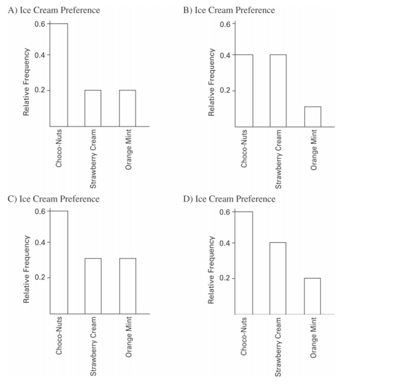
Question
The histogram below represents the number of television sets per household for a sample of_ U.S. households. What is the sample size? 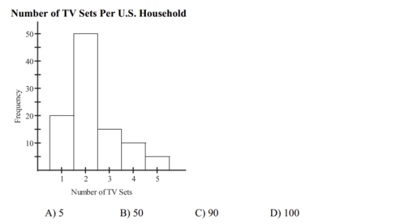
Question
The frequency distribution below summarizes the home sale prices in the city of Summerhill for the month of June. Determine the class midpoint (in thousand $)for the
Class 235.0 -265.9.
A)250.4
B)250.55
C)250.45
D)250.5
Class 235.0 -265.9.
A)250.4
B)250.55
C)250.45
D)250.5
Question
Question
The Kappa Iota Sigma Fraternity polled its members on the weekend party theme. The vote was as follows: six for toga, four for hayride, eight for luau, and two for masquerade.
Which of these choices display the correct Pareto chart?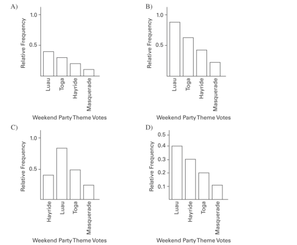 27
27
Which of these choices display the correct Pareto chart?
27 Question
The following frequency distribution displays the scores on a math test. Find the class boundaries of scores interval 40-59. 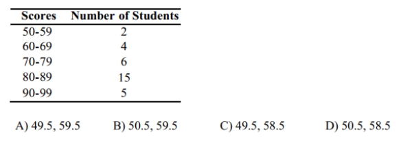
Question
Question
The graph below shows the number of car accidents occurring in one city in each of the_
years 2011 through 2016. The number of accidents dropped in 2013 after a new speed limit
was imposed. Does the graph distort the data? How would you redesign the graph to be less
misleading?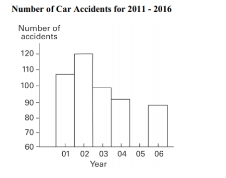
years 2011 through 2016. The number of accidents dropped in 2013 after a new speed limit
was imposed. Does the graph distort the data? How would you redesign the graph to be less
misleading?
Question
A school district performed a study to find the main causes leading to its students_
dropping out of school. Thirty cases were analyzed, and a primary cause was assigned to
each case. The causes included unexcused absences (U), illness (I), family problems (F), and
other causes (O). The results for the thirty cases are listed below: Construct a table summarizing the frequency distribution of the primary causes leading to
student dropout.
dropping out of school. Thirty cases were analyzed, and a primary cause was assigned to
each case. The causes included unexcused absences (U), illness (I), family problems (F), and
other causes (O). The results for the thirty cases are listed below:
Construct a table summarizing the frequency distribution of the primary causes leading tostudent dropout.
Question
Question
The frequency distribution below summarizes the home sale prices in the city of Summerhill
for the month of June. Determine the class width, class midpoint, and the class boundaries
for the class 235.0-265.9.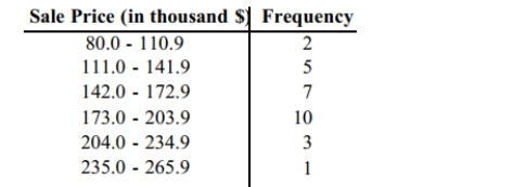
for the month of June. Determine the class width, class midpoint, and the class boundaries
for the class 235.0-265.9.
Question
Question
The following data set represents Heather's average monthly charges (in $)for cable TV for the
past 12 months.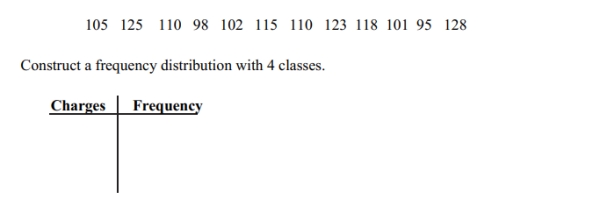
past 12 months.
Question
In a survey, 26 voters were asked their ages. The results are shown below. Construct a_
histogram to represent the data (with 5 classes beginning with a lower class limit of 19.5 and a
class width of 10). What is the approximate age at the center?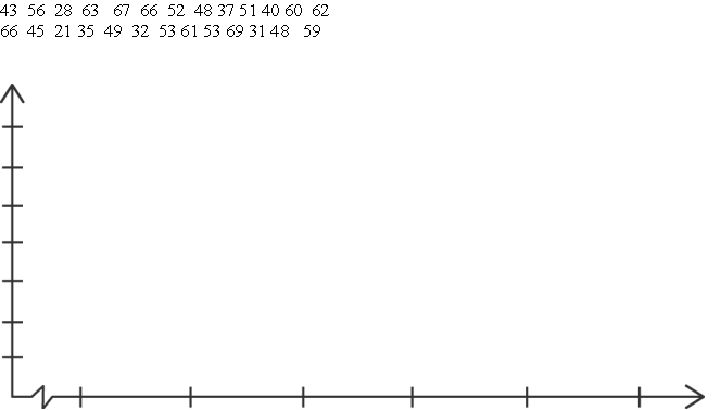
histogram to represent the data (with 5 classes beginning with a lower class limit of 19.5 and a
class width of 10). What is the approximate age at the center?
Question
The following data set represents Heather's average monthly charges (in $)for cable TV for the_
past 24 months.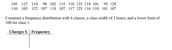
past 24 months.
Question
Question
The following figures represent Latisha's monthly charges (in $)for long distance telephone_
calls for the past twelve months.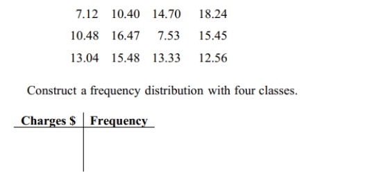
calls for the past twelve months.
Question
Question
Use the high closing values of Statstar Inc. stock from the years 2005-2016 to construct a_
time-series graph. (Let x = 0 represent 2005 and so on.)Identify a trend.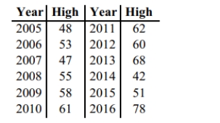
time-series graph. (Let x = 0 represent 2005 and so on.)Identify a trend.
Question
Question
In a survey, 20 people were asked how many magazines they had purchased during the
previous year. The results are shown below. Construct a histogram to represent the data.
Use 4 classes with a class width of 10, and begin with a lower class limit of -0.5. What is the
approximate amount at the center?
previous year. The results are shown below. Construct a histogram to represent the data.
Use 4 classes with a class width of 10, and begin with a lower class limit of -0.5. What is the
approximate amount at the center?
Question
Question
The frequency table below shows the amount of weight loss during the first month of a
diet program for a group of men. Constructing a frequency polygon. Applying a loose
interpretation of the requirements for a normal distribution, do the pounds of weight loss appear
to be normally distributed? Why or why not?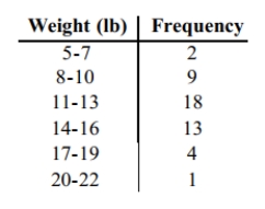
 20-22 1
diet program for a group of men. Constructing a frequency polygon. Applying a loose
interpretation of the requirements for a normal distribution, do the pounds of weight loss appear
to be normally distributed? Why or why not?
20-22 1 Question
The data shows the roundtrip mileage that 43 randomly selected students drive to school_
each day. Construct a frequency polygon. Applying a loose interpretation of the requirements
for a normal distribution, do the mileages appear to be normally distributed? Why or why not?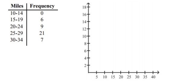
each day. Construct a frequency polygon. Applying a loose interpretation of the requirements
for a normal distribution, do the mileages appear to be normally distributed? Why or why not?
Question
Question
Kevin asked some of his friends how many hours they had worked during the previous
week at their after-school jobs. The results are shown below.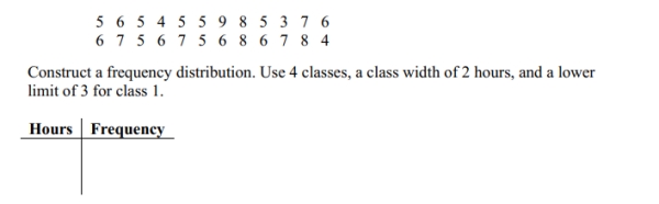
week at their after-school jobs. The results are shown below.

Unlock Deck
Sign up to unlock the cards in this deck!
Unlock Deck
Unlock Deck
1/59
Play
Full screen (f)
Deck 2: Exploring Data With Tables and Graphs
1
Analysis of the data from 25 mothers indicates that an infant's birth weight can be estimated by a mother's weight (kg), x , using the regression equation
If a mother's weight is 70 kg the infant's birth weight can be estimated as
A) 48,701
B) 1718
C) 46
D) 3671
can be estimated by a mother's weight (kg), x , using the regression equation If a mother's weight is 70 kg the infant's birth weight can be estimated as
A) 48,701
B) 1718
C) 46
D) 3671
3671
2
Which of these choices display the correct scatterplot? D
3
A store manager counts the number of customers who make a purchase in his store each_ day. The data are as follows.
A
4
The weights (in pounds)of 22 members of the junior varsity football team are listed below.
Which of these choices display the correct stemplot?
A)
B)
Which of these choices display the correct stemplot?
A)
B)
Unlock Deck
Unlock for access to all 59 flashcards in this deck.
Unlock Deck
k this deck
5
A nurse measured the blood pressure of each person who visited her clinic. Following is a_ relative-frequency histogram for the systolic blood pressure readings for those people
Aged between 25 and 40 years. The blood pressure readings were given to the nearest
Whole number. Approximately what percentage of the people aged 25 -40 had a systolic
Blood pressure reading between 110 and 119 mm Hg inclusive?
Aged between 25 and 40 years. The blood pressure readings were given to the nearest
Whole number. Approximately what percentage of the people aged 25 -40 had a systolic
Blood pressure reading between 110 and 119 mm Hg inclusive?
Unlock Deck
Unlock for access to all 59 flashcards in this deck.
Unlock Deck
k this deck
6
The attendance counts for this season's basketball games are listed below. Which of these choices display the correct stemplot?
A)
B)
A)
B)
Unlock Deck
Unlock for access to all 59 flashcards in this deck.
Unlock Deck
k this deck
7
The histogram below represents the number of television sets per household for a sample of U.S. households. What is the sample size?
Unlock Deck
Unlock for access to all 59 flashcards in this deck.
Unlock Deck
k this deck
8
A nurse measured the blood pressure of each person who visited her clinic. Following is a_ relative-frequency histogram for the systolic blood pressure readings for those people
Aged between 25 and 40 years. The blood pressure readings were given to the nearest
Whole number. Approximately what percentage of the people aged 25 -40 had a systolic
Blood pressure reading between 110 and 139 mm Hg inclusive?
Systolic Blood Pressure for People Aged 25 - 40 Years A )7 5 % B )8 9 % C )5 9 % D )39%
Aged between 25 and 40 years. The blood pressure readings were given to the nearest
Whole number. Approximately what percentage of the people aged 25 -40 had a systolic
Blood pressure reading between 110 and 139 mm Hg inclusive?
Systolic Blood Pressure for People Aged 25 - 40 Years
A )7 5 % B )8 9 % C )5 9 % D )39% Unlock Deck
Unlock for access to all 59 flashcards in this deck.
Unlock Deck
k this deck
9
The following frequency distribution represents the scores on a math test. Find the class_ midpoint of scores for the interval 40-59.
A)50.5
B)48.5
C)49.5
D)49.0
A)50.5
B)48.5
C)49.5
D)49.0
Unlock Deck
Unlock for access to all 59 flashcards in this deck.
Unlock Deck
k this deck
10
The frequency distribution below summarizes employee years of service for Alpha Corporation. Find the class midpoint for class 1 -5.
A)3.5 years
B)3.0 years
C)5.0 years
D)2.5 years
A)3.5 years
B)3.0 years
C)5.0 years
D)2.5 years
Unlock Deck
Unlock for access to all 59 flashcards in this deck.
Unlock Deck
k this deck
11
The two key parts of a regression equation involve the ____________ and the y-____________.
A)slope; intercept
B)asymptote; intercept
C)slope; axis
D)asymptote; axis
A)slope; intercept
B)asymptote; intercept
C)slope; axis
D)asymptote; axis
Unlock Deck
Unlock for access to all 59 flashcards in this deck.
Unlock Deck
k this deck
12
The Kappa Iota Sigma Fraternity polled its members on the weekend party theme. The_ vote was as follows: six for toga, four for hayride, eight for luau, and two for masquerade.
Display the vote count in a Pareto chart.
Display the vote count in a Pareto chart.
Unlock Deck
Unlock for access to all 59 flashcards in this deck.
Unlock Deck
k this deck
13
Which of the following cumulative frequency distribution corresponds to the given frequency distribution?
A)
B)
C)
D)
A)
B)
C)
D)
Unlock Deck
Unlock for access to all 59 flashcards in this deck.
Unlock Deck
k this deck
14
A nurse measured the blood pressure of each person who visited her clinic. Following is a relative-frequency histogram for the systolic blood pressure readings for those people
Aged between 25 and 40 years. The blood pressure readings (in mm Hg)were given to the
Nearest whole number. What class width was used to construct the relative frequency
Distribution?
Aged between 25 and 40 years. The blood pressure readings (in mm Hg)were given to the
Nearest whole number. What class width was used to construct the relative frequency
Distribution?
Unlock Deck
Unlock for access to all 59 flashcards in this deck.
Unlock Deck
k this deck
15
The following data show the number of laps run by each participant in a marathon._
Which of these choices display the correct stemplot?
A)
B)
Which of these choices display the correct stemplot?
A)
B)
Unlock Deck
Unlock for access to all 59 flashcards in this deck.
Unlock Deck
k this deck
16
The following frequency distribution analyzes the scores on a math test. Find the class boundaries of scores interval 90-99.
A)89.5, 100.5
B)89.5, 100.5
C)90.5, 99.5
D)89.5, 99.5
A)89.5, 100.5
B)89.5, 100.5
C)90.5, 99.5
D)89.5, 99.5
Unlock Deck
Unlock for access to all 59 flashcards in this deck.
Unlock Deck
k this deck
17
Analysis of the data from 25 mothers indicates that an infant's birth weight (g), y , can be estimated by a mother's weight (kg), x , using the regression equation y=31 x+1501 . For every
(kg) increase in a mother's weight, the infant's birth weight increases by
g.
A) 31 ; 1501
B) 1 ; 31
C) 31 ; 1
D) 1501 ; 31
(kg) increase in a mother's weight, the infant's birth weight increases by
g.
A) 31 ; 1501
B) 1 ; 31
C) 31 ; 1
D) 1501 ; 31
Unlock Deck
Unlock for access to all 59 flashcards in this deck.
Unlock Deck
k this deck
18
The scatterplot below displays the amount of nitrous oxide (NO)explained by the amount of_ carbon monoxide (CO)emissions in million metric tons over a ten year period in the United
States. Select the choice that best describes any relationship between the variables.
A)There is a negative linear association between NO and CO.
B)There is a positive linear association between NO and CO.
C)Overall, there is no noticeable relationship between NO and CO.
D)NO can be explained by CO.
States. Select the choice that best describes any relationship between the variables.
A)There is a negative linear association between NO and CO.
B)There is a positive linear association between NO and CO.
C)Overall, there is no noticeable relationship between NO and CO.
D)NO can be explained by CO.
Unlock Deck
Unlock for access to all 59 flashcards in this deck.
Unlock Deck
k this deck
19
Identify the cumulative frequency distribution that corresponds to the given frequency_ distribution.
A)
B)
C)
D)
A)
B)
C)
D)
Unlock Deck
Unlock for access to all 59 flashcards in this deck.
Unlock Deck
k this deck
20
Which choice displays the best graphic display of the amount of nitrous oxide (NO)1)____________ explained by the amount of carbon monoxide (CO)emissions in million metric tons over a
Ten year period in the United States? The data set is below:
Ten year period in the United States? The data set is below:
Unlock Deck
Unlock for access to all 59 flashcards in this deck.
Unlock Deck
k this deck
21
The frequency distribution below summarizes employee years of service for Alpha Corporation. Determine the width of each class.
A)5 years
B)6 years
C)4 years
D)10 years
A)5 years
B)6 years
C)4 years
D)10 years
Unlock Deck
Unlock for access to all 59 flashcards in this deck.
Unlock Deck
k this deck
22
Smoking and the episodes of lung cancer have a high correlation, but it does not prove _________.
A)causation
B)correlation
C)exponentiation
D)a linear relationship
A)causation
B)correlation
C)exponentiation
D)a linear relationship
Unlock Deck
Unlock for access to all 59 flashcards in this deck.
Unlock Deck
k this deck
23
A nurse measured the blood pressure of each person who visited her clinic. Following is a_ relative-frequency histogram for the systolic blood pressure readings for those people
Aged between 25 and 40 years. The blood pressure readings were given to the nearest
Whole number. Approximately what percentage of the people aged 25 -40 had a systolic
Blood pressure reading between 110 and 139 mm Hg inclusive?
Aged between 25 and 40 years. The blood pressure readings were given to the nearest
Whole number. Approximately what percentage of the people aged 25 -40 had a systolic
Blood pressure reading between 110 and 139 mm Hg inclusive?
Unlock Deck
Unlock for access to all 59 flashcards in this deck.
Unlock Deck
k this deck
24
Identify the cumulative frequency distribution that corresponds to the given frequency distribution.
Unlock Deck
Unlock for access to all 59 flashcards in this deck.
Unlock Deck
k this deck
25
The following frequency distribution depicts the scores on a math test. Find the class_ midpoint of scores for the interval 95-99.
Unlock Deck
Unlock for access to all 59 flashcards in this deck.
Unlock Deck
k this deck
26
According to USA Today, the largest categories of sports equipment sales are as follows:_ fishing ($2.0 billion); firearms and hunting ($3.1 billion); camping ($1.7 billion); golf ($2.5
Billion). What type of graph would depict these different categories and their relative
Amounts the best?
A)A pie chart
B)A bar chart
C)A column chart
D)A Pareto chart
Billion). What type of graph would depict these different categories and their relative
Amounts the best?
A)A pie chart
B)A bar chart
C)A column chart
D)A Pareto chart
Unlock Deck
Unlock for access to all 59 flashcards in this deck.
Unlock Deck
k this deck
27
The linear __________ coefficient denoted by r measures the __________ of the linear association between two variables.
A)correlation; strength
B)probability; likelihood
C)exponential; exponent
D)squares; weakness
A)correlation; strength
B)probability; likelihood
C)exponential; exponent
D)squares; weakness
Unlock Deck
Unlock for access to all 59 flashcards in this deck.
Unlock Deck
k this deck
28
A manufacturer records the number of errors each work station makes during the week. The data are as follows.
Unlock Deck
Unlock for access to all 59 flashcards in this deck.
Unlock Deck
k this deck
29
A nurse measured the blood pressure of each person who visited her clinic. Following is_ a relative-frequency histogram for the systolic blood pressure readings for those people
Aged between 25 and 40 years. The blood pressure readings were given to the nearest
Whole number. Approximately what percentage of the people aged 25 -40 had a systolic
Blood pressure reading between 110 and 119 mm Hg inclusive?
Systolic Blood Pressure for People Aged 25 - 40 Years
A)35%
B)0.35%
C)3.5%
D)30%
Aged between 25 and 40 years. The blood pressure readings were given to the nearest
Whole number. Approximately what percentage of the people aged 25 -40 had a systolic
Blood pressure reading between 110 and 119 mm Hg inclusive?
Systolic Blood Pressure for People Aged 25 - 40 Years
A)35%
B)0.35%
C)3.5%
D)30%
Unlock Deck
Unlock for access to all 59 flashcards in this deck.
Unlock Deck
k this deck
30
Attendance records at a school show the number of days each student was absent during the_ year. The days absent for each student were as follows.
Unlock Deck
Unlock for access to all 59 flashcards in this deck.
Unlock Deck
k this deck
31
The following data consists of the weights (in pounds)of 15 randomly selected women and_ the weights of 15 randomly selected men. Which of these choices display the correct back-
To-back stemplot?
To-back stemplot?
Unlock Deck
Unlock for access to all 59 flashcards in this deck.
Unlock Deck
k this deck
32
The following data represent the number of cars passing through a toll booth during a certain time period over a number of days.
Unlock Deck
Unlock for access to all 59 flashcards in this deck.
Unlock Deck
k this deck
33
The frequency distribution below summarizes the home sale prices in the city of_ Summerhill for the month of June. Determine the width of each class.
Unlock Deck
Unlock for access to all 59 flashcards in this deck.
Unlock Deck
k this deck
34
Wagenlucht Ice Cream Company is always trying to create new flavors of ice cream. They are market testing three kinds to find out which one has the best chance of becoming
Popular. They give small samples of each to 20 people at a grocery store. Four ice cream
Tasters preferred the Strawberry Cream, 12 preferred Choco-Nuts, and four loved the
Orange Mint. Construct a Pareto chart to represent these preferences. Choose the vertical
Scale so that the relative frequencies are represented.
Popular. They give small samples of each to 20 people at a grocery store. Four ice cream
Tasters preferred the Strawberry Cream, 12 preferred Choco-Nuts, and four loved the
Orange Mint. Construct a Pareto chart to represent these preferences. Choose the vertical
Scale so that the relative frequencies are represented.
Unlock Deck
Unlock for access to all 59 flashcards in this deck.
Unlock Deck
k this deck
35
The histogram below represents the number of television sets per household for a sample of_ U.S. households. What is the sample size?
Unlock Deck
Unlock for access to all 59 flashcards in this deck.
Unlock Deck
k this deck
36
The frequency distribution below summarizes the home sale prices in the city of Summerhill for the month of June. Determine the class midpoint (in thousand $)for the
Class 235.0 -265.9.
A)250.4
B)250.55
C)250.45
D)250.5
Class 235.0 -265.9.
A)250.4
B)250.55
C)250.45
D)250.5
Unlock Deck
Unlock for access to all 59 flashcards in this deck.
Unlock Deck
k this deck
37
The ages of the 45 members of a track and field team are listed below. Which of these_ choices display the correct stemplot?
A)
B)
A)
B)
Unlock Deck
Unlock for access to all 59 flashcards in this deck.
Unlock Deck
k this deck
38
The Kappa Iota Sigma Fraternity polled its members on the weekend party theme. The vote was as follows: six for toga, four for hayride, eight for luau, and two for masquerade.
Which of these choices display the correct Pareto chart? 27
Which of these choices display the correct Pareto chart?
27 Unlock Deck
Unlock for access to all 59 flashcards in this deck.
Unlock Deck
k this deck
39
The following frequency distribution displays the scores on a math test. Find the class boundaries of scores interval 40-59.
Unlock Deck
Unlock for access to all 59 flashcards in this deck.
Unlock Deck
k this deck
40
The following data show the number of laps run by each participant in a marathon.
Which of these choices display the correct stemplot?
A)
B)
Which of these choices display the correct stemplot?
A)
B)
Unlock Deck
Unlock for access to all 59 flashcards in this deck.
Unlock Deck
k this deck
41
The graph below shows the number of car accidents occurring in one city in each of the_
years 2011 through 2016. The number of accidents dropped in 2013 after a new speed limit
was imposed. Does the graph distort the data? How would you redesign the graph to be less
misleading?
years 2011 through 2016. The number of accidents dropped in 2013 after a new speed limit
was imposed. Does the graph distort the data? How would you redesign the graph to be less
misleading?
Unlock Deck
Unlock for access to all 59 flashcards in this deck.
Unlock Deck
k this deck
42
A school district performed a study to find the main causes leading to its students_
dropping out of school. Thirty cases were analyzed, and a primary cause was assigned to
each case. The causes included unexcused absences (U), illness (I), family problems (F), and
other causes (O). The results for the thirty cases are listed below: Construct a table summarizing the frequency distribution of the primary causes leading to
student dropout.
dropping out of school. Thirty cases were analyzed, and a primary cause was assigned to
each case. The causes included unexcused absences (U), illness (I), family problems (F), and
other causes (O). The results for the thirty cases are listed below:
Construct a table summarizing the frequency distribution of the primary causes leading tostudent dropout.
Unlock Deck
Unlock for access to all 59 flashcards in this deck.
Unlock Deck
k this deck
43
Describe how a data point labeled as an outlier can affect the analysis of a data set in a
frequency distribution or histogram.
frequency distribution or histogram.
Unlock Deck
Unlock for access to all 59 flashcards in this deck.
Unlock Deck
k this deck
44
The frequency distribution below summarizes the home sale prices in the city of Summerhill
for the month of June. Determine the class width, class midpoint, and the class boundaries
for the class 235.0-265.9.
for the month of June. Determine the class width, class midpoint, and the class boundaries
for the class 235.0-265.9.
Unlock Deck
Unlock for access to all 59 flashcards in this deck.
Unlock Deck
k this deck
45
Explain in your own words why a bar graph can be misleading if one or both of the scales
begin at some value other than zero.
begin at some value other than zero.
Unlock Deck
Unlock for access to all 59 flashcards in this deck.
Unlock Deck
k this deck
46
The following data set represents Heather's average monthly charges (in $)for cable TV for the
past 12 months.
past 12 months.
Unlock Deck
Unlock for access to all 59 flashcards in this deck.
Unlock Deck
k this deck
47
In a survey, 26 voters were asked their ages. The results are shown below. Construct a_
histogram to represent the data (with 5 classes beginning with a lower class limit of 19.5 and a
class width of 10). What is the approximate age at the center?
histogram to represent the data (with 5 classes beginning with a lower class limit of 19.5 and a
class width of 10). What is the approximate age at the center?
Unlock Deck
Unlock for access to all 59 flashcards in this deck.
Unlock Deck
k this deck
48
The following data set represents Heather's average monthly charges (in $)for cable TV for the_
past 24 months.
past 24 months.
Unlock Deck
Unlock for access to all 59 flashcards in this deck.
Unlock Deck
k this deck
49
Graphs should be constructed in a way that is fair and objective. A common deceptive graph
alters the axes of the graph in what way?
alters the axes of the graph in what way?
Unlock Deck
Unlock for access to all 59 flashcards in this deck.
Unlock Deck
k this deck
50
The following figures represent Latisha's monthly charges (in $)for long distance telephone_
calls for the past twelve months.
calls for the past twelve months.
Unlock Deck
Unlock for access to all 59 flashcards in this deck.
Unlock Deck
k this deck
51
Suppose that a data set has a minimum value of 24 and a maximum of 79 and that you
want 5 classes. Explain how to find the class width for this frequency table. What happens if
you mistakenly use a class width of 11 instead of 12?
want 5 classes. Explain how to find the class width for this frequency table. What happens if
you mistakenly use a class width of 11 instead of 12?
Unlock Deck
Unlock for access to all 59 flashcards in this deck.
Unlock Deck
k this deck
52
Use the high closing values of Statstar Inc. stock from the years 2005-2016 to construct a_
time-series graph. (Let x = 0 represent 2005 and so on.)Identify a trend.
time-series graph. (Let x = 0 represent 2005 and so on.)Identify a trend.
Unlock Deck
Unlock for access to all 59 flashcards in this deck.
Unlock Deck
k this deck
53
Describe the differences between a histogram and a stemplot and discuss the advantages and
disadvantages of each.
disadvantages of each.
Unlock Deck
Unlock for access to all 59 flashcards in this deck.
Unlock Deck
k this deck
54
In a survey, 20 people were asked how many magazines they had purchased during the
previous year. The results are shown below. Construct a histogram to represent the data.
Use 4 classes with a class width of 10, and begin with a lower class limit of -0.5. What is the
approximate amount at the center?
previous year. The results are shown below. Construct a histogram to represent the data.
Use 4 classes with a class width of 10, and begin with a lower class limit of -0.5. What is the
approximate amount at the center?
Unlock Deck
Unlock for access to all 59 flashcards in this deck.
Unlock Deck
k this deck
55
A bar chart and a Pareto chart both use bars to show frequencies of categories of categorical_
data. What characteristic distinguishes a Pareto chart from a bar chart and how does that
characteristic help us in understanding the data?
data. What characteristic distinguishes a Pareto chart from a bar chart and how does that
characteristic help us in understanding the data?
Unlock Deck
Unlock for access to all 59 flashcards in this deck.
Unlock Deck
k this deck
56
The frequency table below shows the amount of weight loss during the first month of a
diet program for a group of men. Constructing a frequency polygon. Applying a loose
interpretation of the requirements for a normal distribution, do the pounds of weight loss appear
to be normally distributed? Why or why not? 20-22 1
diet program for a group of men. Constructing a frequency polygon. Applying a loose
interpretation of the requirements for a normal distribution, do the pounds of weight loss appear
to be normally distributed? Why or why not?
20-22 1 Unlock Deck
Unlock for access to all 59 flashcards in this deck.
Unlock Deck
k this deck
57
The data shows the roundtrip mileage that 43 randomly selected students drive to school_
each day. Construct a frequency polygon. Applying a loose interpretation of the requirements
for a normal distribution, do the mileages appear to be normally distributed? Why or why not?
each day. Construct a frequency polygon. Applying a loose interpretation of the requirements
for a normal distribution, do the mileages appear to be normally distributed? Why or why not?
Unlock Deck
Unlock for access to all 59 flashcards in this deck.
Unlock Deck
k this deck
58
Define the difference between a Relative Frequency Distribution and a Cumulative Frequency
Distribution.
Distribution.
Unlock Deck
Unlock for access to all 59 flashcards in this deck.
Unlock Deck
k this deck
59
Kevin asked some of his friends how many hours they had worked during the previous
week at their after-school jobs. The results are shown below.
week at their after-school jobs. The results are shown below.
Unlock Deck
Unlock for access to all 59 flashcards in this deck.
Unlock Deck
k this deck
Unlock Deck
Unlock for access to all 59 flashcards in this deck.


