Deck 2: Organizing Data
Full screen (f)
Question
Given the following "data scenario," decide which type of grouping (single-value, limit, or cutpoint) is probably the best.
The table contains the frequency and relative-frequency distributions for the ages of the
employees in a particular company department.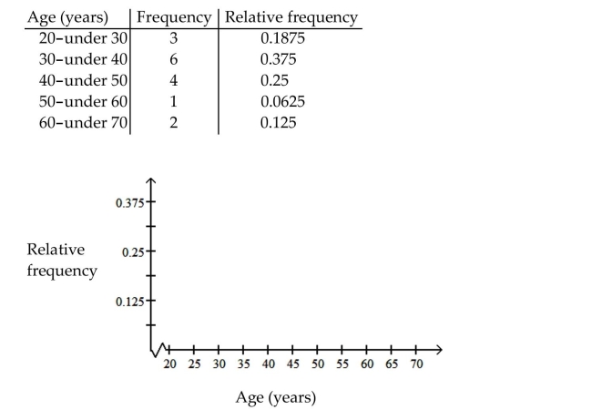
The table contains the frequency and relative-frequency distributions for the ages of the
employees in a particular company department.
Question
Construct the requested histogram.
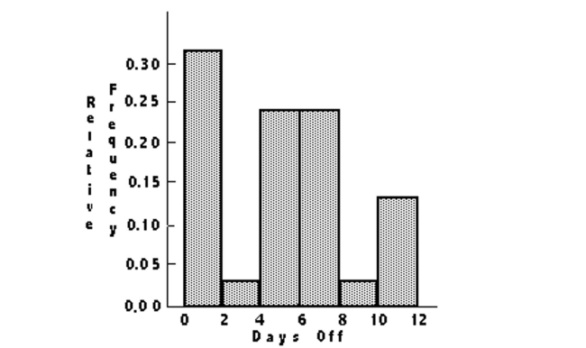
The table below shows the number of days off in a given year for 30 police detectives.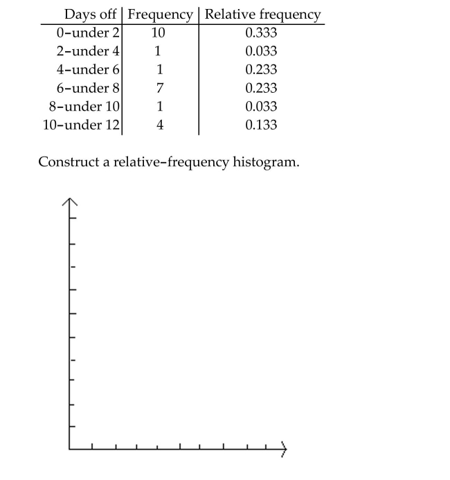
The table below shows the number of days off in a given year for 30 police detectives.
Question
Use cutpoint grouping to organize these data into a frequency distribution.
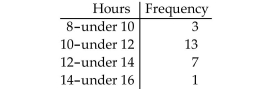
Lori asked 24 students how many hours they had spent doing homework during the
previous week. The results are shown below.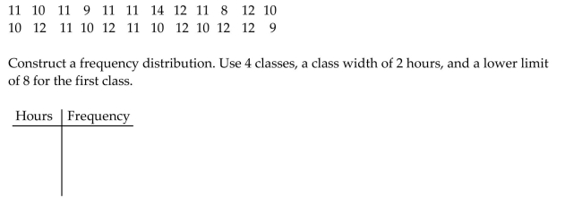
Lori asked 24 students how many hours they had spent doing homework during the
previous week. The results are shown below.
Question
Use cutpoint grouping to organize these data into a frequency distribution.
Kevin asked some of his friends how many hours they had worked during the previous
week at their after-school jobs. The results are shown below.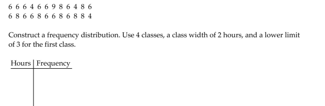
Kevin asked some of his friends how many hours they had worked during the previous
week at their after-school jobs. The results are shown below.
Question
Provide an appropriate response.
A television manufacturer sold three times as many televisions in 1995 as it did in 1985. To
illustrate this fact, the manufacturer draws a pictogram as shown below. The television on
the right is three times as tall and three times as wide as the television on the left.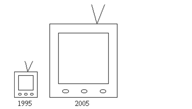 This pictogram is misleading because it actually gives the visual impression that nine times
as many televisions were sold in 2005 as in 1995. How can the manufacturer correctly
illustrate the fact that sales in 2005 were three times sales in 1995?
A television manufacturer sold three times as many televisions in 1995 as it did in 1985. To
illustrate this fact, the manufacturer draws a pictogram as shown below. The television on
the right is three times as tall and three times as wide as the television on the left.
This pictogram is misleading because it actually gives the visual impression that nine timesas many televisions were sold in 2005 as in 1995. How can the manufacturer correctly
illustrate the fact that sales in 2005 were three times sales in 1995?
Question
Question
Provide an appropriate response.
The bar graph below shows the average cost of renting a studio in one city in each of the
years 2002 through 2006.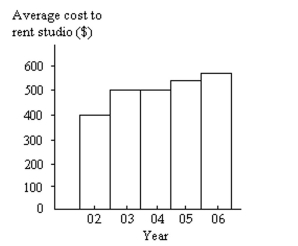 By what percentage does the average price increase from 2002 to 2003? Obtain a truncated
version of the graph by sliding a piece of paper over the bottom of the graph so that the
bars start at 300. In the truncated graph, by what percentage does the price appear to
increase from 2002 to 2003? Why is the truncated graph misleading?
The bar graph below shows the average cost of renting a studio in one city in each of the
years 2002 through 2006.
By what percentage does the average price increase from 2002 to 2003? Obtain a truncatedversion of the graph by sliding a piece of paper over the bottom of the graph so that the
bars start at 300. In the truncated graph, by what percentage does the price appear to
increase from 2002 to 2003? Why is the truncated graph misleading?
Question
Use cutpoint grouping to organize these data into a frequency distribution.
On a math test, the scores of 24 students were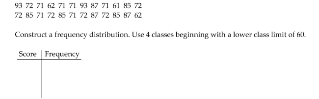
On a math test, the scores of 24 students were
Question
Question
Provide an appropriate response.
Maria constructed the frequency distribution shown below. The data represent the heights
of 60 randomly selected women.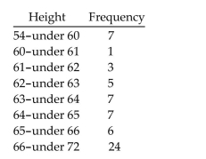 She concluded from her frequency distribution that the heights 66, 67, 68, 69, 70,
and 71 inches are the most common for women. What is wrong with her conclusion? How
is her frequency distribution misleading and how could the table be improved?
Maria constructed the frequency distribution shown below. The data represent the heights
of 60 randomly selected women.
She concluded from her frequency distribution that the heights 66, 67, 68, 69, 70,and 71 inches are the most common for women. What is wrong with her conclusion? How
is her frequency distribution misleading and how could the table be improved?
Question
Question
Provide an appropriate response.
Which type of graph, a stem-and-leaf diagram or a frequency histogram, would be more
useful for the data set below? Explain your thinking.
Which type of graph, a stem-and-leaf diagram or a frequency histogram, would be more
useful for the data set below? Explain your thinking.
Question
Question
Construct the requested histogram.
The table gives the frequency distribution for the data involving the number of radios per
household for a sample of 80 U.S. households.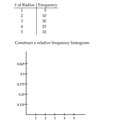
The table gives the frequency distribution for the data involving the number of radios per
household for a sample of 80 U.S. households.
Question
Question
Provide an appropriate response.
A television manufacturer sold three times as many televisions in 2005 as it did in 1995. To
illustrate this fact, the manufacturer draws a pictogram as shown below. The television on
the right is three times as tall and three times as wide as the television on the left.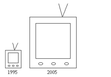 Why is this pictogram misleading? What visual impression is portrayed by the pictogram?
A television manufacturer sold three times as many televisions in 2005 as it did in 1995. To
illustrate this fact, the manufacturer draws a pictogram as shown below. The television on
the right is three times as tall and three times as wide as the television on the left.
Why is this pictogram misleading? What visual impression is portrayed by the pictogram? Question
Use limit grouping to organize these data into a frequency distribution.
Kevin asked some of his friends how many hours they had worked during the previous
week at their after-school jobs. The results are shown below.
Kevin asked some of his friends how many hours they had worked during the previous
week at their after-school jobs. The results are shown below.
Question
Provide an appropriate response.
The preschool children at Elmwood Elementary School were asked to name their favorite
color. The results are listed below. Construct a frequency distribution and a relative
frequency distribution.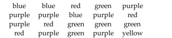
The preschool children at Elmwood Elementary School were asked to name their favorite
color. The results are listed below. Construct a frequency distribution and a relative
frequency distribution.
Question
Question
Provide an appropriate response.
Suppose that you wish to construct a stem-and-leaf diagram for the data set below. What
would the stems be?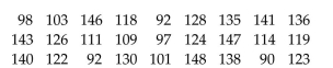
Suppose that you wish to construct a stem-and-leaf diagram for the data set below. What
would the stems be?
Question
Provide an appropriate response.
The results of a survey about a recent judicial appointment are given in the table below.
Construct a relative frequency distribution.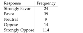
The results of a survey about a recent judicial appointment are given in the table below.
Construct a relative frequency distribution.
Question
Construct the requested histogram.
During the quality control process at a manufacturing plant, 142 finished items are
randomly selected and weighed. The results are summarized in the table below. Construct
a relative-frequency histogram corresponding to data below.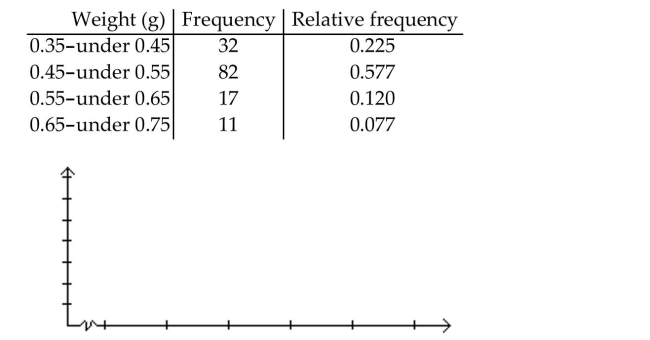
During the quality control process at a manufacturing plant, 142 finished items are
randomly selected and weighed. The results are summarized in the table below. Construct
a relative-frequency histogram corresponding to data below.
Question
Use cutpoint grouping to organize these data into a frequency distribution.
The following figures represent Jennifer's monthly charges for long distance telephone
calls for the past twelve months.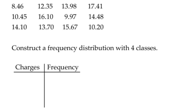
The following figures represent Jennifer's monthly charges for long distance telephone
calls for the past twelve months.
Question
Question
Provide an appropriate response.
A parcel delivery service lowered its prices and finds that it has delivered twice as many
parcels this year as it did last year. To illustrate this fact, the manager draws a pictogram
as shown below. Each cube depicts a parcel. The side length of the "parcel" on the right is
twice the side length of the "parcel" on the left.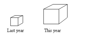 Why is this pictogram misleading? What visual impression is portrayed by the pictogram?
A parcel delivery service lowered its prices and finds that it has delivered twice as many
parcels this year as it did last year. To illustrate this fact, the manager draws a pictogram
as shown below. Each cube depicts a parcel. The side length of the "parcel" on the right is
twice the side length of the "parcel" on the left.
Why is this pictogram misleading? What visual impression is portrayed by the pictogram? Question
Construct the requested histogram.
The table gives the frequency distribution for the data involving the number of television
sets per household for a sample of 100 U.S. households.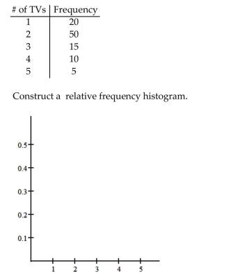
The table gives the frequency distribution for the data involving the number of television
sets per household for a sample of 100 U.S. households.
Question
Provide an appropriate response.
The bar graph below shows the number of car accidents occurring in one city in each of the
years 2001 through 2006. The vertical axis is truncated and as a result the graph is
misleading. Construct an improved version of the graph which is less misleading. Use the
symbol // in your graph. Explain what the symbol // means.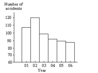
Question
Use limit grouping to organize these data into a frequency distribution.
Lori asked 24 students how many hours they had spent doing homework during the
previous week. The results are shown below.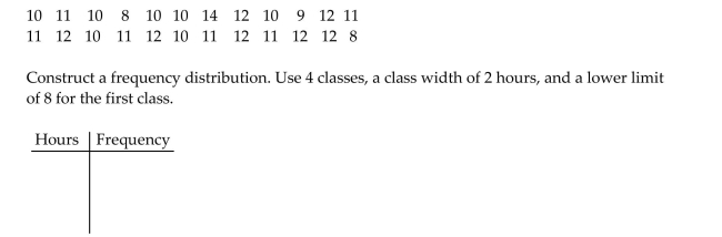
Lori asked 24 students how many hours they had spent doing homework during the
previous week. The results are shown below.
Question
Use cutpoint grouping to organize these data into a frequency distribution.
A medical research team studied the ages of patients who had strokes caused by stress. The
ages of 34 patients who suffered stress strokes were as follows.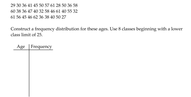
A medical research team studied the ages of patients who had strokes caused by stress. The
ages of 34 patients who suffered stress strokes were as follows.
Question
Provide an appropriate response.
Shortly before a mayoral election, a market research firm took a poll to find out which
candidate people were planning to vote for. The results are shown below.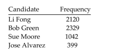 You wish to construct a graph to represent the data. It should be easy to see from your
graph which candidate is in the lead. Which graph would be more useful, a bar graph or a
pie chart? Explain your thinking.
Shortly before a mayoral election, a market research firm took a poll to find out which
candidate people were planning to vote for. The results are shown below.
You wish to construct a graph to represent the data. It should be easy to see from yourgraph which candidate is in the lead. Which graph would be more useful, a bar graph or a
pie chart? Explain your thinking.
Question
Question
Question
Provide an appropriate response.
Anna set up a frequency distribution with the following classes: What is wrong with these classes? Describe two ways the classes could have been correctly
depicted.
Anna set up a frequency distribution with the following classes:
What is wrong with these classes? Describe two ways the classes could have been correctlydepicted.
Question
Use limit grouping to organize these data into a frequency distribution.
On a math test, the scores of 24 students were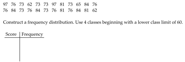
On a math test, the scores of 24 students were
Question
Construct the requested histogram.
The table below shows the number of days off in a given year for 30 police detectives.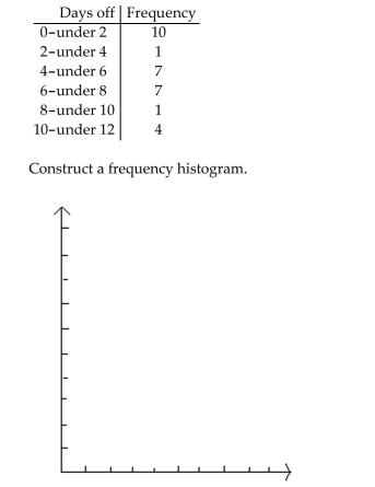
The table below shows the number of days off in a given year for 30 police detectives.
Question
Provide an appropriate response.
Suppose that you want to construct a pie chart to represent the following data. Explain how you would calculate the angle for the pie-shaped piece corresponding to the
blood type O.
Suppose that you want to construct a pie chart to represent the following data.
Explain how you would calculate the angle for the pie-shaped piece corresponding to theblood type O.
Question
Question
Question
Question
Construct the requested histogram.
The table gives the frequency distribution for the data involving the number of television
sets per household for a sample of 100 U.S. households.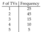
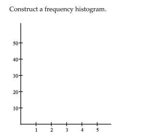
The table gives the frequency distribution for the data involving the number of television
sets per household for a sample of 100 U.S. households.
Question
Use cutpoint grouping to organize these data into a frequency distribution.
A government researcher was interested in the starting salaries of humanities graduates. A
random sample of 30 humanities graduates yielded the following annual salaries. Data are
in thousands of dollars, rounded to the nearest hundred dollars.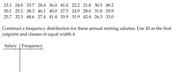
A government researcher was interested in the starting salaries of humanities graduates. A
random sample of 30 humanities graduates yielded the following annual salaries. Data are
in thousands of dollars, rounded to the nearest hundred dollars.
Question
Provide an appropriate response.
Suppose that you want to construct a graph to represent the following data.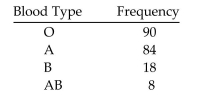 If you are mostly interested in the number of people in each category as a percentage of the
total number of people, would a bar chart or a pie chart be more useful? Explain your
thinking.
Suppose that you want to construct a graph to represent the following data.
If you are mostly interested in the number of people in each category as a percentage of thetotal number of people, would a bar chart or a pie chart be more useful? Explain your
thinking.
Question
Question
Question
Construct the requested histogram.
In a survey, 20 voters were asked their age. The results are summarized in the table below.
Construct a frequency histogram corresponding to data below.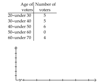
In a survey, 20 voters were asked their age. The results are summarized in the table below.
Construct a frequency histogram corresponding to data below.
Question
Provide an appropriate response.
Question
Use limit grouping to organize these data into a frequency distribution.
A medical research team studied the ages of patients who had strokes caused by stress. The
ages of 34 patients who suffered stress strokes were as follows.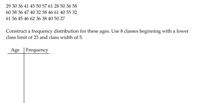
A medical research team studied the ages of patients who had strokes caused by stress. The
ages of 34 patients who suffered stress strokes were as follows.
Question
Provide an appropriate response.
Suppose you wanted to construct a stem-and-leaf diagram for the data set below. What
leaf unit would you use? What numbers would the stems represent and how many stems
would there be?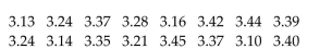
Suppose you wanted to construct a stem-and-leaf diagram for the data set below. What
leaf unit would you use? What numbers would the stems represent and how many stems
would there be?
Question
Provide an appropriate response.
The bar graph below shows the number of car accidents occurring in one city in each of the
years 2001 through 2006. The number of accidents dropped in 2003 after a new speed limit
was imposed. Why is the graph misleading? How would you redesign the graph to be less
misleading?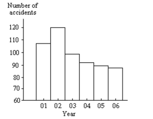
The bar graph below shows the number of car accidents occurring in one city in each of the
years 2001 through 2006. The number of accidents dropped in 2003 after a new speed limit
was imposed. Why is the graph misleading? How would you redesign the graph to be less
misleading?
Question
Question
Provide an appropriate response.
Shortly before an election, a market research firm took a poll to find out whether people
were planning to vote for or against a particular ballot measure. The results are shown
below.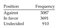 The ballot measure will pass if a simple majority (more than 50%)vote in favor of the
measure. You wish to construct a graph to represent the data. It should be easy to see from
your graph whether more than 50% of the people are planning to vote in favor of the
measure. Which graph would be more useful, a bar graph or a pie chart? Explain your
thinking.
Shortly before an election, a market research firm took a poll to find out whether people
were planning to vote for or against a particular ballot measure. The results are shown
below.
The ballot measure will pass if a simple majority (more than 50%)vote in favor of themeasure. You wish to construct a graph to represent the data. It should be easy to see from
your graph whether more than 50% of the people are planning to vote in favor of the
measure. Which graph would be more useful, a bar graph or a pie chart? Explain your
thinking.
Question
Use cutpoint grouping to organize these data into a frequency distribution.
The table shows the closing share price, in dollars, for each of the 32 stock holdings of a
mutual fund.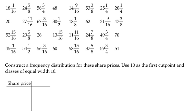
The table shows the closing share price, in dollars, for each of the 32 stock holdings of a
mutual fund.
Question
Construct a relative-frequency polygon for the given data.
The table contains the frequency and relative-frequency distributions for the ages of the
employees in a particular company department.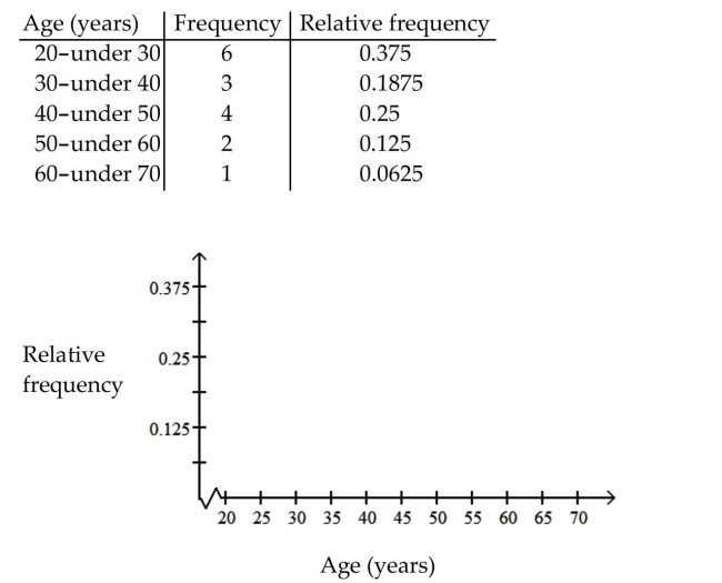
The table contains the frequency and relative-frequency distributions for the ages of the
employees in a particular company department.
Question
Question
Provide an appropriate response.
Construct a stem-and-leaf diagram for the data set below. Round each number to the
nearest whole number before constructing the diagram. Why is it necessary to first round
the numbers?
Construct a stem-and-leaf diagram for the data set below. Round each number to the
nearest whole number before constructing the diagram. Why is it necessary to first round
the numbers?
Question
Question
Construct the requested histogram.
The table gives the frequency distribution for the data involving the number of radios per
household for a sample of 80 U.S. households.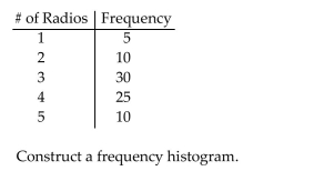
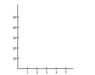
The table gives the frequency distribution for the data involving the number of radios per
household for a sample of 80 U.S. households.
Question
Question
Provide an appropriate response.
Raul set up a frequency distribution with the following classes: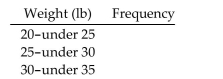 Give an alternate way of depicting these classes if the original data are given:
a. To the nearest whole number
b. To one decimal place
c. To two decimal places
Raul set up a frequency distribution with the following classes:
Give an alternate way of depicting these classes if the original data are given:a. To the nearest whole number
b. To one decimal place
c. To two decimal places
Question
Provide an appropriate response.
Scott Tarnowski owns a pet grooming shop. His prices for grooming dogs are based on the
size of the dog. His records from last year are summarized below. Construct a relative
frequency distribution.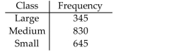
Scott Tarnowski owns a pet grooming shop. His prices for grooming dogs are based on the
size of the dog. His records from last year are summarized below. Construct a relative
frequency distribution.
Question
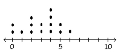
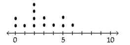
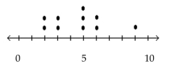
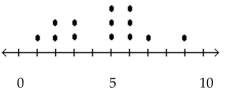
Construct a dotplot for the given data.
-The following data represent the number of cars passing through a toll booth during a certain time period over a number of days.
A)
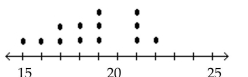
B)
C)
D)
-The following data represent the number of cars passing through a toll booth during a certain time period over a number of days.
A)
B)
C)
D)
Question
Complete the contingency table and use it to solve the problem.
The partially filled contingency table gives the relative frequencies of the data on age (in years)and sex from the residents of a retirement home. What percentage of residents are males in the age group 60-79?
A)27%
B)29%
C)28.5%
D)26%
The partially filled contingency table gives the relative frequencies of the data on age (in years)and sex from the residents of a retirement home.
What percentage of residents are males in the age group 60-79?A)27%
B)29%
C)28.5%
D)26%
Question
Complete the contingency table and use it to solve the problem.
The partially filled contingency table gives the frequencies of the data on age (in years)and sex from the residents of a retirement home.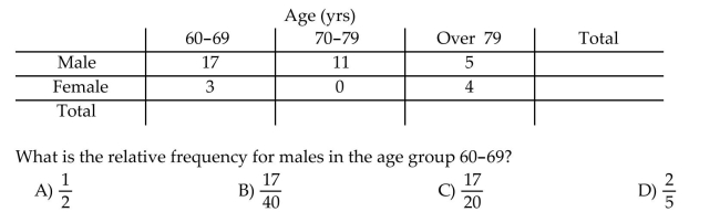
The partially filled contingency table gives the frequencies of the data on age (in years)and sex from the residents of a retirement home.
Question
Construct a pie chart representing the given data set.
The following data give the distribution of the types of houses in a town containing 26,000 houses.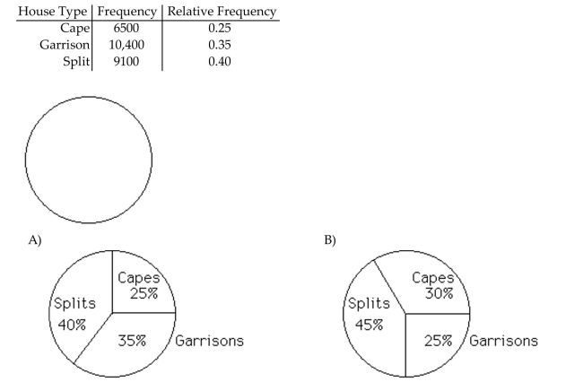
The following data give the distribution of the types of houses in a town containing 26,000 houses.
Question
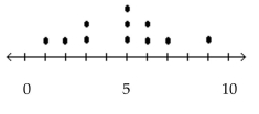
Construct a dotplot for the given data.
-A manufacturer records the number of errors each work station makes during the week. The data are as follows.
A)
B)
C)
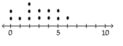
D)
-A manufacturer records the number of errors each work station makes during the week. The data are as follows.
A)
B)
C)
D)
Question
Question
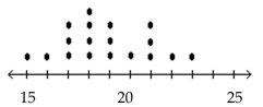
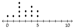
Construct a dotplot for the given data.
-A store manager counts the number of customers who make a purchase in his store each day. The data are as follows.
A)
B)
C)
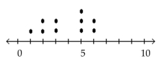
D)
-A store manager counts the number of customers who make a purchase in his store each day. The data are as follows.
A)
B)
C)
D)
Question
A graphical display of a data set is given. Identify the overall shape of the distribution as (roughly)bell-shaped,triangular, uniform, reverse J-shaped, J-shaped, right skewed, left skewed, bimodal, or multimodal.
The ages of a group of patients being treated at one hospital for osteoporosis are summarized in the frequency histogram below.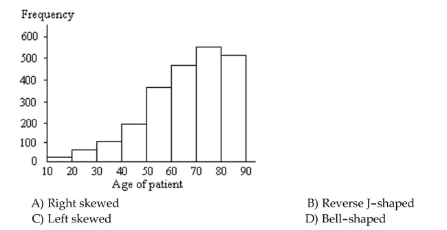
The ages of a group of patients being treated at one hospital for osteoporosis are summarized in the frequency histogram below.
Question
A graphical display of a data set is given. Identify the overall shape of the distribution as (roughly)bell-shaped,triangular, uniform, reverse J-shaped, J-shaped, right skewed, left skewed, bimodal, or multimodal.
A stem-and-leaf diagram is given below for the ages of the patients at a hospital.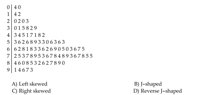
A stem-and-leaf diagram is given below for the ages of the patients at a hospital.
Question
Question
A nurse measured the blood pressure of each person who visited her clinic. Following is a relative-frequency histogramfor the systolic blood pressure readings for those people aged between 25 and 40. Use the histogram to answer thequestion. The blood pressure readings were given to the nearest whole number. 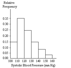
Approximately what percentage of the people aged 25-40 had a systolic blood pressure reading between 110 and 119 inclusive?
A)35%
B)3.5%
C)0.35%
D)30%
Approximately what percentage of the people aged 25-40 had a systolic blood pressure reading between 110 and 119 inclusive?
A)35%
B)3.5%
C)0.35%
D)30%
Question
Use single-value grouping to organize these data into a frequency distribution.
The following data represent the total number of years of formal education for 40 employees of a bank.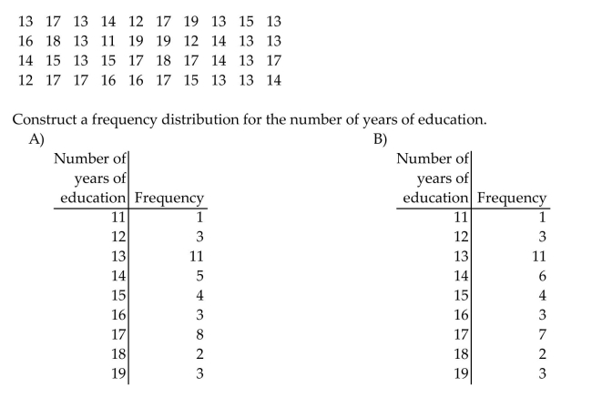
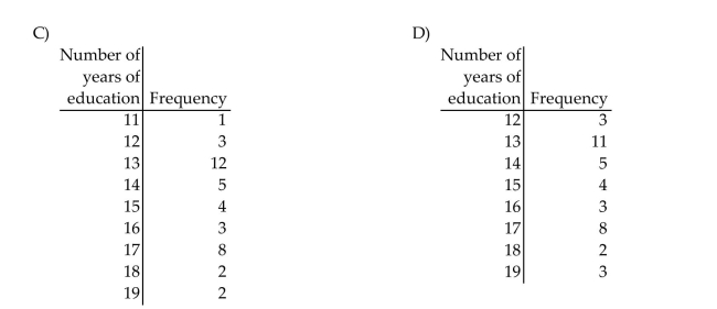
The following data represent the total number of years of formal education for 40 employees of a bank.
Question
Provide the requested response.
The table contains data from a study of daily study time for 40 students from Statistics 101. Construct an ogive from the data.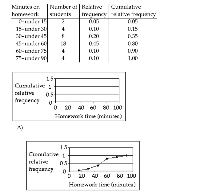
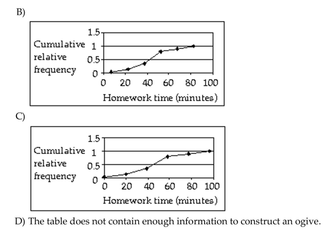
The table contains data from a study of daily study time for 40 students from Statistics 101. Construct an ogive from the data.
Question
Question
Complete the contingency table and use it to solve the problem.
The partially filled contingency table gives the frequencies of the data on age (in years)and sex from the residents of a retirement home.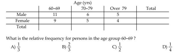
The partially filled contingency table gives the frequencies of the data on age (in years)and sex from the residents of a retirement home.
Question
Question
Question
Question
Construct a pie chart representing the given data set.
The following figures give the distribution of land (in acres)for a county containing 86,000 acres.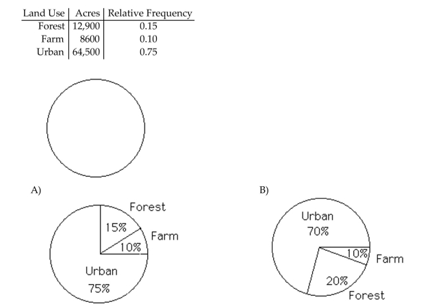
The following figures give the distribution of land (in acres)for a county containing 86,000 acres.
Question

Unlock Deck
Sign up to unlock the cards in this deck!
Unlock Deck
Unlock Deck
1/169
Play
Full screen (f)
Deck 2: Organizing Data
1
Given the following "data scenario," decide which type of grouping (single-value, limit, or cutpoint) is probably the best.
The table contains the frequency and relative-frequency distributions for the ages of the
employees in a particular company department.
The table contains the frequency and relative-frequency distributions for the ages of the
employees in a particular company department.
2
Construct the requested histogram.
The table below shows the number of days off in a given year for 30 police detectives.
The table below shows the number of days off in a given year for 30 police detectives.
3
Use cutpoint grouping to organize these data into a frequency distribution.
Lori asked 24 students how many hours they had spent doing homework during the
previous week. The results are shown below.
Lori asked 24 students how many hours they had spent doing homework during the
previous week. The results are shown below.
4
Use cutpoint grouping to organize these data into a frequency distribution.
Kevin asked some of his friends how many hours they had worked during the previous
week at their after-school jobs. The results are shown below.
Kevin asked some of his friends how many hours they had worked during the previous
week at their after-school jobs. The results are shown below.
Unlock Deck
Unlock for access to all 169 flashcards in this deck.
Unlock Deck
k this deck
5
Provide an appropriate response.
A television manufacturer sold three times as many televisions in 1995 as it did in 1985. To
illustrate this fact, the manufacturer draws a pictogram as shown below. The television on
the right is three times as tall and three times as wide as the television on the left. This pictogram is misleading because it actually gives the visual impression that nine times
as many televisions were sold in 2005 as in 1995. How can the manufacturer correctly
illustrate the fact that sales in 2005 were three times sales in 1995?
A television manufacturer sold three times as many televisions in 1995 as it did in 1985. To
illustrate this fact, the manufacturer draws a pictogram as shown below. The television on
the right is three times as tall and three times as wide as the television on the left.
This pictogram is misleading because it actually gives the visual impression that nine timesas many televisions were sold in 2005 as in 1995. How can the manufacturer correctly
illustrate the fact that sales in 2005 were three times sales in 1995?
Unlock Deck
Unlock for access to all 169 flashcards in this deck.
Unlock Deck
k this deck
6
Given the following "data scenario," decide which type of grouping (single-value, limit, or cutpoint) is probably the best.
Number of Pets: The number of pets per family.
A)Limit grouping
B)Cutpoint grouping
C)None of these
D)Single-value grouping
Number of Pets: The number of pets per family.
A)Limit grouping
B)Cutpoint grouping
C)None of these
D)Single-value grouping
Unlock Deck
Unlock for access to all 169 flashcards in this deck.
Unlock Deck
k this deck
7
Provide an appropriate response.
The bar graph below shows the average cost of renting a studio in one city in each of the
years 2002 through 2006. By what percentage does the average price increase from 2002 to 2003? Obtain a truncated
version of the graph by sliding a piece of paper over the bottom of the graph so that the
bars start at 300. In the truncated graph, by what percentage does the price appear to
increase from 2002 to 2003? Why is the truncated graph misleading?
The bar graph below shows the average cost of renting a studio in one city in each of the
years 2002 through 2006.
By what percentage does the average price increase from 2002 to 2003? Obtain a truncatedversion of the graph by sliding a piece of paper over the bottom of the graph so that the
bars start at 300. In the truncated graph, by what percentage does the price appear to
increase from 2002 to 2003? Why is the truncated graph misleading?
Unlock Deck
Unlock for access to all 169 flashcards in this deck.
Unlock Deck
k this deck
8
Use cutpoint grouping to organize these data into a frequency distribution.
On a math test, the scores of 24 students were
On a math test, the scores of 24 students were
Unlock Deck
Unlock for access to all 169 flashcards in this deck.
Unlock Deck
k this deck
9
Given the following "data scenario," decide which type of grouping (single-value, limit, or cutpoint) is probably the best.
Exam Scores: The exam scores, rounded to the nearest whole number, of all students in a given math course.
A)Limit grouping
B)Single-value grouping
C)None of these
D)Cutpoint grouping
Exam Scores: The exam scores, rounded to the nearest whole number, of all students in a given math course.
A)Limit grouping
B)Single-value grouping
C)None of these
D)Cutpoint grouping
Unlock Deck
Unlock for access to all 169 flashcards in this deck.
Unlock Deck
k this deck
10
Provide an appropriate response.
Maria constructed the frequency distribution shown below. The data represent the heights
of 60 randomly selected women. She concluded from her frequency distribution that the heights 66, 67, 68, 69, 70,
and 71 inches are the most common for women. What is wrong with her conclusion? How
is her frequency distribution misleading and how could the table be improved?
Maria constructed the frequency distribution shown below. The data represent the heights
of 60 randomly selected women.
She concluded from her frequency distribution that the heights 66, 67, 68, 69, 70,and 71 inches are the most common for women. What is wrong with her conclusion? How
is her frequency distribution misleading and how could the table be improved?
Unlock Deck
Unlock for access to all 169 flashcards in this deck.
Unlock Deck
k this deck
11
Provide an appropriate response.
When organizing data into tables, what is the disadvantage of having too many classes?
What is the disadvantage of having too few classes?
When organizing data into tables, what is the disadvantage of having too many classes?
What is the disadvantage of having too few classes?
Unlock Deck
Unlock for access to all 169 flashcards in this deck.
Unlock Deck
k this deck
12
Provide an appropriate response.
Which type of graph, a stem-and-leaf diagram or a frequency histogram, would be more
useful for the data set below? Explain your thinking.
Which type of graph, a stem-and-leaf diagram or a frequency histogram, would be more
useful for the data set below? Explain your thinking.
Unlock Deck
Unlock for access to all 169 flashcards in this deck.
Unlock Deck
k this deck
13
Provide an appropriate response.
Give an example of a data set whose distribution is likely to be bimodal. Describe the
population from which the sample is selected and the variable that is measured for each
person. Explain why you think the distribution will be bimodal.
Give an example of a data set whose distribution is likely to be bimodal. Describe the
population from which the sample is selected and the variable that is measured for each
person. Explain why you think the distribution will be bimodal.
Unlock Deck
Unlock for access to all 169 flashcards in this deck.
Unlock Deck
k this deck
14
Construct the requested histogram.
The table gives the frequency distribution for the data involving the number of radios per
household for a sample of 80 U.S. households.
The table gives the frequency distribution for the data involving the number of radios per
household for a sample of 80 U.S. households.
Unlock Deck
Unlock for access to all 169 flashcards in this deck.
Unlock Deck
k this deck
15
Provide an appropriate response.
For a given data set, why might a researcher prefer to study organized data rather than the
original data? Can you think of any circumstances in which a researcher may prefer to use
the original data rather than organized data?
For a given data set, why might a researcher prefer to study organized data rather than the
original data? Can you think of any circumstances in which a researcher may prefer to use
the original data rather than organized data?
Unlock Deck
Unlock for access to all 169 flashcards in this deck.
Unlock Deck
k this deck
16
Provide an appropriate response.
A television manufacturer sold three times as many televisions in 2005 as it did in 1995. To
illustrate this fact, the manufacturer draws a pictogram as shown below. The television on
the right is three times as tall and three times as wide as the television on the left. Why is this pictogram misleading? What visual impression is portrayed by the pictogram?
A television manufacturer sold three times as many televisions in 2005 as it did in 1995. To
illustrate this fact, the manufacturer draws a pictogram as shown below. The television on
the right is three times as tall and three times as wide as the television on the left.
Why is this pictogram misleading? What visual impression is portrayed by the pictogram? Unlock Deck
Unlock for access to all 169 flashcards in this deck.
Unlock Deck
k this deck
17
Use limit grouping to organize these data into a frequency distribution.
Kevin asked some of his friends how many hours they had worked during the previous
week at their after-school jobs. The results are shown below.
Kevin asked some of his friends how many hours they had worked during the previous
week at their after-school jobs. The results are shown below.
Unlock Deck
Unlock for access to all 169 flashcards in this deck.
Unlock Deck
k this deck
18
Provide an appropriate response.
The preschool children at Elmwood Elementary School were asked to name their favorite
color. The results are listed below. Construct a frequency distribution and a relative
frequency distribution.
The preschool children at Elmwood Elementary School were asked to name their favorite
color. The results are listed below. Construct a frequency distribution and a relative
frequency distribution.
Unlock Deck
Unlock for access to all 169 flashcards in this deck.
Unlock Deck
k this deck
19
Given the following "data scenario," decide which type of grouping (single-value, limit, or cutpoint) is probably the best.
Wingspan of Cardinal: The wingspan lengths, to the nearest hundredth of a millimeter, of a sample of 35 cardinals.
A)Cutpoint grouping
B)Single-value grouping
C)Limit grouping
D)None of these
Wingspan of Cardinal: The wingspan lengths, to the nearest hundredth of a millimeter, of a sample of 35 cardinals.
A)Cutpoint grouping
B)Single-value grouping
C)Limit grouping
D)None of these
Unlock Deck
Unlock for access to all 169 flashcards in this deck.
Unlock Deck
k this deck
20
Provide an appropriate response.
Suppose that you wish to construct a stem-and-leaf diagram for the data set below. What
would the stems be?
Suppose that you wish to construct a stem-and-leaf diagram for the data set below. What
would the stems be?
Unlock Deck
Unlock for access to all 169 flashcards in this deck.
Unlock Deck
k this deck
21
Provide an appropriate response.
The results of a survey about a recent judicial appointment are given in the table below.
Construct a relative frequency distribution.
The results of a survey about a recent judicial appointment are given in the table below.
Construct a relative frequency distribution.
Unlock Deck
Unlock for access to all 169 flashcards in this deck.
Unlock Deck
k this deck
22
Construct the requested histogram.
During the quality control process at a manufacturing plant, 142 finished items are
randomly selected and weighed. The results are summarized in the table below. Construct
a relative-frequency histogram corresponding to data below.
During the quality control process at a manufacturing plant, 142 finished items are
randomly selected and weighed. The results are summarized in the table below. Construct
a relative-frequency histogram corresponding to data below.
Unlock Deck
Unlock for access to all 169 flashcards in this deck.
Unlock Deck
k this deck
23
Use cutpoint grouping to organize these data into a frequency distribution.
The following figures represent Jennifer's monthly charges for long distance telephone
calls for the past twelve months.
The following figures represent Jennifer's monthly charges for long distance telephone
calls for the past twelve months.
Unlock Deck
Unlock for access to all 169 flashcards in this deck.
Unlock Deck
k this deck
24
Provide an appropriate response.
A high school teacher keeps a record of the number of days that each student attended
school last year and then she constructs a relative frequency histogram. What do you think
the shape of the distribution will be? Why?
A high school teacher keeps a record of the number of days that each student attended
school last year and then she constructs a relative frequency histogram. What do you think
the shape of the distribution will be? Why?
Unlock Deck
Unlock for access to all 169 flashcards in this deck.
Unlock Deck
k this deck
25
Provide an appropriate response.
A parcel delivery service lowered its prices and finds that it has delivered twice as many
parcels this year as it did last year. To illustrate this fact, the manager draws a pictogram
as shown below. Each cube depicts a parcel. The side length of the "parcel" on the right is
twice the side length of the "parcel" on the left. Why is this pictogram misleading? What visual impression is portrayed by the pictogram?
A parcel delivery service lowered its prices and finds that it has delivered twice as many
parcels this year as it did last year. To illustrate this fact, the manager draws a pictogram
as shown below. Each cube depicts a parcel. The side length of the "parcel" on the right is
twice the side length of the "parcel" on the left.
Why is this pictogram misleading? What visual impression is portrayed by the pictogram? Unlock Deck
Unlock for access to all 169 flashcards in this deck.
Unlock Deck
k this deck
26
Construct the requested histogram.
The table gives the frequency distribution for the data involving the number of television
sets per household for a sample of 100 U.S. households.
The table gives the frequency distribution for the data involving the number of television
sets per household for a sample of 100 U.S. households.
Unlock Deck
Unlock for access to all 169 flashcards in this deck.
Unlock Deck
k this deck
27
Provide an appropriate response.
The bar graph below shows the number of car accidents occurring in one city in each of the
years 2001 through 2006. The vertical axis is truncated and as a result the graph is
misleading. Construct an improved version of the graph which is less misleading. Use the
symbol // in your graph. Explain what the symbol // means.
Unlock Deck
Unlock for access to all 169 flashcards in this deck.
Unlock Deck
k this deck
28
Use limit grouping to organize these data into a frequency distribution.
Lori asked 24 students how many hours they had spent doing homework during the
previous week. The results are shown below.
Lori asked 24 students how many hours they had spent doing homework during the
previous week. The results are shown below.
Unlock Deck
Unlock for access to all 169 flashcards in this deck.
Unlock Deck
k this deck
29
Use cutpoint grouping to organize these data into a frequency distribution.
A medical research team studied the ages of patients who had strokes caused by stress. The
ages of 34 patients who suffered stress strokes were as follows.
A medical research team studied the ages of patients who had strokes caused by stress. The
ages of 34 patients who suffered stress strokes were as follows.
Unlock Deck
Unlock for access to all 169 flashcards in this deck.
Unlock Deck
k this deck
30
Provide an appropriate response.
Shortly before a mayoral election, a market research firm took a poll to find out which
candidate people were planning to vote for. The results are shown below. You wish to construct a graph to represent the data. It should be easy to see from your
graph which candidate is in the lead. Which graph would be more useful, a bar graph or a
pie chart? Explain your thinking.
Shortly before a mayoral election, a market research firm took a poll to find out which
candidate people were planning to vote for. The results are shown below.
You wish to construct a graph to represent the data. It should be easy to see from yourgraph which candidate is in the lead. Which graph would be more useful, a bar graph or a
pie chart? Explain your thinking.
Unlock Deck
Unlock for access to all 169 flashcards in this deck.
Unlock Deck
k this deck
31
Provide an appropriate response.
Suppose you are comparing frequency data for two different groups, 25 managers and 150
blue collar workers. Why would a relative frequency distribution be better than a
frequency distribution?
Suppose you are comparing frequency data for two different groups, 25 managers and 150
blue collar workers. Why would a relative frequency distribution be better than a
frequency distribution?
Unlock Deck
Unlock for access to all 169 flashcards in this deck.
Unlock Deck
k this deck
32
Provide an appropriate response.
Hospital records show the age at death of patients who die while in the hospital. A
frequency histogram is constructed for the age at death of the people who have died at the
hospital in the past five years. Roughly what shape would you expect for the distribution?
Why?
Hospital records show the age at death of patients who die while in the hospital. A
frequency histogram is constructed for the age at death of the people who have died at the
hospital in the past five years. Roughly what shape would you expect for the distribution?
Why?
Unlock Deck
Unlock for access to all 169 flashcards in this deck.
Unlock Deck
k this deck
33
Provide an appropriate response.
Anna set up a frequency distribution with the following classes: What is wrong with these classes? Describe two ways the classes could have been correctly
depicted.
Anna set up a frequency distribution with the following classes:
What is wrong with these classes? Describe two ways the classes could have been correctlydepicted.
Unlock Deck
Unlock for access to all 169 flashcards in this deck.
Unlock Deck
k this deck
34
Use limit grouping to organize these data into a frequency distribution.
On a math test, the scores of 24 students were
On a math test, the scores of 24 students were
Unlock Deck
Unlock for access to all 169 flashcards in this deck.
Unlock Deck
k this deck
35
Construct the requested histogram.
The table below shows the number of days off in a given year for 30 police detectives.
The table below shows the number of days off in a given year for 30 police detectives.
Unlock Deck
Unlock for access to all 169 flashcards in this deck.
Unlock Deck
k this deck
36
Provide an appropriate response.
Suppose that you want to construct a pie chart to represent the following data. Explain how you would calculate the angle for the pie-shaped piece corresponding to the
blood type O.
Suppose that you want to construct a pie chart to represent the following data.
Explain how you would calculate the angle for the pie-shaped piece corresponding to theblood type O.
Unlock Deck
Unlock for access to all 169 flashcards in this deck.
Unlock Deck
k this deck
37
Provide an appropriate response.
Explain the difference between a frequency distribution and a relative frequency
distribution. Comment on the differences on the vertical axis scale. Given the same data set
and the same classes, will the shapes of the frequency distribution and the relative
frequency distribution be the same? You may draw a diagram to support your answer.
Unlock Deck
Unlock for access to all 169 flashcards in this deck.
Unlock Deck
k this deck
38
Provide an appropriate response.
The heights of adult women have a bell-shaped distribution. Give examples of three other
data sets whose distributions are likely to be bell-shaped.
The heights of adult women have a bell-shaped distribution. Give examples of three other
data sets whose distributions are likely to be bell-shaped.
Unlock Deck
Unlock for access to all 169 flashcards in this deck.
Unlock Deck
k this deck
39
Provide an appropriate response.
Explain in your own words the difference between a bar graph and a histogram. Give an
example of data for which you might use a histogram and an example of data for which
you might use a bar graph.
Explain in your own words the difference between a bar graph and a histogram. Give an
example of data for which you might use a histogram and an example of data for which
you might use a bar graph.
Unlock Deck
Unlock for access to all 169 flashcards in this deck.
Unlock Deck
k this deck
40
Construct the requested histogram.
The table gives the frequency distribution for the data involving the number of television
sets per household for a sample of 100 U.S. households.
The table gives the frequency distribution for the data involving the number of television
sets per household for a sample of 100 U.S. households.
Unlock Deck
Unlock for access to all 169 flashcards in this deck.
Unlock Deck
k this deck
41
Use cutpoint grouping to organize these data into a frequency distribution.
A government researcher was interested in the starting salaries of humanities graduates. A
random sample of 30 humanities graduates yielded the following annual salaries. Data are
in thousands of dollars, rounded to the nearest hundred dollars.
A government researcher was interested in the starting salaries of humanities graduates. A
random sample of 30 humanities graduates yielded the following annual salaries. Data are
in thousands of dollars, rounded to the nearest hundred dollars.
Unlock Deck
Unlock for access to all 169 flashcards in this deck.
Unlock Deck
k this deck
42
Provide an appropriate response.
Suppose that you want to construct a graph to represent the following data. If you are mostly interested in the number of people in each category as a percentage of the
total number of people, would a bar chart or a pie chart be more useful? Explain your
thinking.
Suppose that you want to construct a graph to represent the following data.
If you are mostly interested in the number of people in each category as a percentage of thetotal number of people, would a bar chart or a pie chart be more useful? Explain your
thinking.
Unlock Deck
Unlock for access to all 169 flashcards in this deck.
Unlock Deck
k this deck
43
Provide an appropriate response.
Explain in your own words why a truncated bar graph can be misleading.
Explain in your own words why a truncated bar graph can be misleading.
Unlock Deck
Unlock for access to all 169 flashcards in this deck.
Unlock Deck
k this deck
44
Provide an appropriate response.
A table of random numbers is used to generate 100 random integers between 0 and 9. Do
you think that the distribution of the numbers will be roughly uniform? Why or why not?
In a second experiment, a table of random numbers is used to generate two random
integers between 0 and 9 and the sum of the two numbers is recorded. This procedure is
repeated 100 times. Do you think that the distribution of the sums will be roughly
uniform? Why or why not?
Unlock Deck
Unlock for access to all 169 flashcards in this deck.
Unlock Deck
k this deck
45
Construct the requested histogram.
In a survey, 20 voters were asked their age. The results are summarized in the table below.
Construct a frequency histogram corresponding to data below.
In a survey, 20 voters were asked their age. The results are summarized in the table below.
Construct a frequency histogram corresponding to data below.
Unlock Deck
Unlock for access to all 169 flashcards in this deck.
Unlock Deck
k this deck
46
Provide an appropriate response.
Unlock Deck
Unlock for access to all 169 flashcards in this deck.
Unlock Deck
k this deck
47
Use limit grouping to organize these data into a frequency distribution.
A medical research team studied the ages of patients who had strokes caused by stress. The
ages of 34 patients who suffered stress strokes were as follows.
A medical research team studied the ages of patients who had strokes caused by stress. The
ages of 34 patients who suffered stress strokes were as follows.
Unlock Deck
Unlock for access to all 169 flashcards in this deck.
Unlock Deck
k this deck
48
Provide an appropriate response.
Suppose you wanted to construct a stem-and-leaf diagram for the data set below. What
leaf unit would you use? What numbers would the stems represent and how many stems
would there be?
Suppose you wanted to construct a stem-and-leaf diagram for the data set below. What
leaf unit would you use? What numbers would the stems represent and how many stems
would there be?
Unlock Deck
Unlock for access to all 169 flashcards in this deck.
Unlock Deck
k this deck
49
Provide an appropriate response.
The bar graph below shows the number of car accidents occurring in one city in each of the
years 2001 through 2006. The number of accidents dropped in 2003 after a new speed limit
was imposed. Why is the graph misleading? How would you redesign the graph to be less
misleading?
The bar graph below shows the number of car accidents occurring in one city in each of the
years 2001 through 2006. The number of accidents dropped in 2003 after a new speed limit
was imposed. Why is the graph misleading? How would you redesign the graph to be less
misleading?
Unlock Deck
Unlock for access to all 169 flashcards in this deck.
Unlock Deck
k this deck
50
Provide an appropriate response.
The heights of adult women have a bell-shaped distribution. Give an example of a data set
whose distribution is likely to be right skewed. Explain why you think the distribution will
be skewed to the right.
The heights of adult women have a bell-shaped distribution. Give an example of a data set
whose distribution is likely to be right skewed. Explain why you think the distribution will
be skewed to the right.
Unlock Deck
Unlock for access to all 169 flashcards in this deck.
Unlock Deck
k this deck
51
Provide an appropriate response.
Shortly before an election, a market research firm took a poll to find out whether people
were planning to vote for or against a particular ballot measure. The results are shown
below. The ballot measure will pass if a simple majority (more than 50%)vote in favor of the
measure. You wish to construct a graph to represent the data. It should be easy to see from
your graph whether more than 50% of the people are planning to vote in favor of the
measure. Which graph would be more useful, a bar graph or a pie chart? Explain your
thinking.
Shortly before an election, a market research firm took a poll to find out whether people
were planning to vote for or against a particular ballot measure. The results are shown
below.
The ballot measure will pass if a simple majority (more than 50%)vote in favor of themeasure. You wish to construct a graph to represent the data. It should be easy to see from
your graph whether more than 50% of the people are planning to vote in favor of the
measure. Which graph would be more useful, a bar graph or a pie chart? Explain your
thinking.
Unlock Deck
Unlock for access to all 169 flashcards in this deck.
Unlock Deck
k this deck
52
Use cutpoint grouping to organize these data into a frequency distribution.
The table shows the closing share price, in dollars, for each of the 32 stock holdings of a
mutual fund.
The table shows the closing share price, in dollars, for each of the 32 stock holdings of a
mutual fund.
Unlock Deck
Unlock for access to all 169 flashcards in this deck.
Unlock Deck
k this deck
53
Construct a relative-frequency polygon for the given data.
The table contains the frequency and relative-frequency distributions for the ages of the
employees in a particular company department.
The table contains the frequency and relative-frequency distributions for the ages of the
employees in a particular company department.
Unlock Deck
Unlock for access to all 169 flashcards in this deck.
Unlock Deck
k this deck
54
Provide an appropriate response.
Suppose that a group of professional athletes consists of 100 gymnasts and 100 basketball
players. What kind of distribution do you think the heights of the athletes would have?
Explain your thinking.
Suppose that a group of professional athletes consists of 100 gymnasts and 100 basketball
players. What kind of distribution do you think the heights of the athletes would have?
Explain your thinking.
Unlock Deck
Unlock for access to all 169 flashcards in this deck.
Unlock Deck
k this deck
55
Provide an appropriate response.
Construct a stem-and-leaf diagram for the data set below. Round each number to the
nearest whole number before constructing the diagram. Why is it necessary to first round
the numbers?
Construct a stem-and-leaf diagram for the data set below. Round each number to the
nearest whole number before constructing the diagram. Why is it necessary to first round
the numbers?
Unlock Deck
Unlock for access to all 169 flashcards in this deck.
Unlock Deck
k this deck
56
Construct a relative-frequency polygon for the given data.
An athlete runs 100 meters in 10.7 seconds.
A)Discrete
B)Continuous
An athlete runs 100 meters in 10.7 seconds.
A)Discrete
B)Continuous
Unlock Deck
Unlock for access to all 169 flashcards in this deck.
Unlock Deck
k this deck
57
Construct the requested histogram.
The table gives the frequency distribution for the data involving the number of radios per
household for a sample of 80 U.S. households.
The table gives the frequency distribution for the data involving the number of radios per
household for a sample of 80 U.S. households.
Unlock Deck
Unlock for access to all 169 flashcards in this deck.
Unlock Deck
k this deck
58
Provide an appropriate response.
A population has a J-shaped distribution. Two different samples of size 12 are picked from
the population. Two different samples of size 1000 are then picked from the population.
Do you think that the distribution of the two samples of size 12 will have roughly the same
shape? Do you think that the distribution of the two samples of size 1000 will have roughly
the same shape? Explain your thinking.
Unlock Deck
Unlock for access to all 169 flashcards in this deck.
Unlock Deck
k this deck
59
Provide an appropriate response.
Raul set up a frequency distribution with the following classes: Give an alternate way of depicting these classes if the original data are given:
a. To the nearest whole number
b. To one decimal place
c. To two decimal places
Raul set up a frequency distribution with the following classes:
Give an alternate way of depicting these classes if the original data are given:a. To the nearest whole number
b. To one decimal place
c. To two decimal places
Unlock Deck
Unlock for access to all 169 flashcards in this deck.
Unlock Deck
k this deck
60
Provide an appropriate response.
Scott Tarnowski owns a pet grooming shop. His prices for grooming dogs are based on the
size of the dog. His records from last year are summarized below. Construct a relative
frequency distribution.
Scott Tarnowski owns a pet grooming shop. His prices for grooming dogs are based on the
size of the dog. His records from last year are summarized below. Construct a relative
frequency distribution.
Unlock Deck
Unlock for access to all 169 flashcards in this deck.
Unlock Deck
k this deck
61
Construct a dotplot for the given data.
-The following data represent the number of cars passing through a toll booth during a certain time period over a number of days.
A)
B)
C)
D)
-The following data represent the number of cars passing through a toll booth during a certain time period over a number of days.
A)
B)
C)
D)
Unlock Deck
Unlock for access to all 169 flashcards in this deck.
Unlock Deck
k this deck
62
Complete the contingency table and use it to solve the problem.
The partially filled contingency table gives the relative frequencies of the data on age (in years)and sex from the residents of a retirement home. What percentage of residents are males in the age group 60-79?
A)27%
B)29%
C)28.5%
D)26%
The partially filled contingency table gives the relative frequencies of the data on age (in years)and sex from the residents of a retirement home.
What percentage of residents are males in the age group 60-79?A)27%
B)29%
C)28.5%
D)26%
Unlock Deck
Unlock for access to all 169 flashcards in this deck.
Unlock Deck
k this deck
63
Complete the contingency table and use it to solve the problem.
The partially filled contingency table gives the frequencies of the data on age (in years)and sex from the residents of a retirement home.
The partially filled contingency table gives the frequencies of the data on age (in years)and sex from the residents of a retirement home.
Unlock Deck
Unlock for access to all 169 flashcards in this deck.
Unlock Deck
k this deck
64
Construct a pie chart representing the given data set.
The following data give the distribution of the types of houses in a town containing 26,000 houses.
The following data give the distribution of the types of houses in a town containing 26,000 houses.
Unlock Deck
Unlock for access to all 169 flashcards in this deck.
Unlock Deck
k this deck
65
Construct a dotplot for the given data.
-A manufacturer records the number of errors each work station makes during the week. The data are as follows.
A)
B)
C)
D)
-A manufacturer records the number of errors each work station makes during the week. The data are as follows.
A)
B)
C)
D)
Unlock Deck
Unlock for access to all 169 flashcards in this deck.
Unlock Deck
k this deck
66
Tell whether the statement is true or false.
The set of possible values that a variable can take constitutes the data.
The set of possible values that a variable can take constitutes the data.
Unlock Deck
Unlock for access to all 169 flashcards in this deck.
Unlock Deck
k this deck
67
Construct a dotplot for the given data.
-A store manager counts the number of customers who make a purchase in his store each day. The data are as follows.
A)
B)
C)
D)
-A store manager counts the number of customers who make a purchase in his store each day. The data are as follows.
A)
B)
C)
D)
Unlock Deck
Unlock for access to all 169 flashcards in this deck.
Unlock Deck
k this deck
68
A graphical display of a data set is given. Identify the overall shape of the distribution as (roughly)bell-shaped,triangular, uniform, reverse J-shaped, J-shaped, right skewed, left skewed, bimodal, or multimodal.
The ages of a group of patients being treated at one hospital for osteoporosis are summarized in the frequency histogram below.
The ages of a group of patients being treated at one hospital for osteoporosis are summarized in the frequency histogram below.
Unlock Deck
Unlock for access to all 169 flashcards in this deck.
Unlock Deck
k this deck
69
A graphical display of a data set is given. Identify the overall shape of the distribution as (roughly)bell-shaped,triangular, uniform, reverse J-shaped, J-shaped, right skewed, left skewed, bimodal, or multimodal.
A stem-and-leaf diagram is given below for the ages of the patients at a hospital.
A stem-and-leaf diagram is given below for the ages of the patients at a hospital.
Unlock Deck
Unlock for access to all 169 flashcards in this deck.
Unlock Deck
k this deck
70
Construct a stem-and-leaf diagram for the given data.
-The average weekly temperatures (in degrees Fahrenheit)in Orlando, Florida over a 6-month span are given below. Round each observation to the nearest degree and then construct a stem-and-leaf
Diagram of the rounded data using two lines per stem.
A)
B)
-The average weekly temperatures (in degrees Fahrenheit)in Orlando, Florida over a 6-month span are given below. Round each observation to the nearest degree and then construct a stem-and-leaf
Diagram of the rounded data using two lines per stem.
A)
B)
Unlock Deck
Unlock for access to all 169 flashcards in this deck.
Unlock Deck
k this deck
71
A nurse measured the blood pressure of each person who visited her clinic. Following is a relative-frequency histogramfor the systolic blood pressure readings for those people aged between 25 and 40. Use the histogram to answer thequestion. The blood pressure readings were given to the nearest whole number.
Approximately what percentage of the people aged 25-40 had a systolic blood pressure reading between 110 and 119 inclusive?
A)35%
B)3.5%
C)0.35%
D)30%
Approximately what percentage of the people aged 25-40 had a systolic blood pressure reading between 110 and 119 inclusive?
A)35%
B)3.5%
C)0.35%
D)30%
Unlock Deck
Unlock for access to all 169 flashcards in this deck.
Unlock Deck
k this deck
72
Use single-value grouping to organize these data into a frequency distribution.
The following data represent the total number of years of formal education for 40 employees of a bank.
The following data represent the total number of years of formal education for 40 employees of a bank.
Unlock Deck
Unlock for access to all 169 flashcards in this deck.
Unlock Deck
k this deck
73
Provide the requested response.
The table contains data from a study of daily study time for 40 students from Statistics 101. Construct an ogive from the data.
The table contains data from a study of daily study time for 40 students from Statistics 101. Construct an ogive from the data.
Unlock Deck
Unlock for access to all 169 flashcards in this deck.
Unlock Deck
k this deck
74
Tell whether the statement is true or false.
A discrete variable can only yield whole-number values.
A discrete variable can only yield whole-number values.
Unlock Deck
Unlock for access to all 169 flashcards in this deck.
Unlock Deck
k this deck
75
Complete the contingency table and use it to solve the problem.
The partially filled contingency table gives the frequencies of the data on age (in years)and sex from the residents of a retirement home.
The partially filled contingency table gives the frequencies of the data on age (in years)and sex from the residents of a retirement home.
Unlock Deck
Unlock for access to all 169 flashcards in this deck.
Unlock Deck
k this deck
76
Construct a stem-and-leaf diagram for the given data.
-The following data show the number of laps run by each participant in a marathon.
A)
B)
-The following data show the number of laps run by each participant in a marathon.
A)
B)
Unlock Deck
Unlock for access to all 169 flashcards in this deck.
Unlock Deck
k this deck
77
Classify the data as either discrete or continuous.
The average speed of cars passing a busy intersection between 4:30 P.M. and 6:30 P.M. on a Friday is 32.3 mi/h.
A)Discrete
B)Continuous
The average speed of cars passing a busy intersection between 4:30 P.M. and 6:30 P.M. on a Friday is 32.3 mi/h.
A)Discrete
B)Continuous
Unlock Deck
Unlock for access to all 169 flashcards in this deck.
Unlock Deck
k this deck
78
Construct a stem-and-leaf diagram for the given data.
-The normal monthly precipitation (in inches)for August is listed for 39 different U.S. cities. Construct an ordered stem-and-leaf diagram using two lines per stem.
A)
B)
-The normal monthly precipitation (in inches)for August is listed for 39 different U.S. cities. Construct an ordered stem-and-leaf diagram using two lines per stem.
A)
B)
Unlock Deck
Unlock for access to all 169 flashcards in this deck.
Unlock Deck
k this deck
79
Construct a pie chart representing the given data set.
The following figures give the distribution of land (in acres)for a county containing 86,000 acres.
The following figures give the distribution of land (in acres)for a county containing 86,000 acres.
Unlock Deck
Unlock for access to all 169 flashcards in this deck.
Unlock Deck
k this deck
80
Provide an appropriate response.
-The data in the following table show the results of a survey of college students asking which vacation destination they would choose given the eight choices shown. Determine the value that
Should be entered in the relative frequency column for Florida.
A)
B)
C)
D) 30
-The data in the following table show the results of a survey of college students asking which vacation destination they would choose given the eight choices shown. Determine the value that
Should be entered in the relative frequency column for Florida.
A)
B)
C)
D) 30
Unlock Deck
Unlock for access to all 169 flashcards in this deck.
Unlock Deck
k this deck
Unlock Deck
Unlock for access to all 169 flashcards in this deck.


