Deck 2: Summarizing and Graphing Data
Full screen (f)
Question
Question
Question
Use the high closing values of Naristar Inc. stock from the years 1992 - 2003 to constru time-series graph. (Let represent 1992 and so on.) Identify a trend.
Question
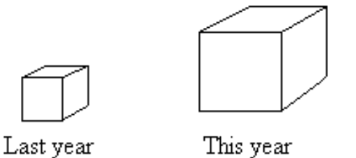
A parcel delivery service lowered its prices and finds that it has delivered twice as many parcels this year as it did last year. To illustrate this fact, the manager draws a graph as shown below. Each cube depicts a parcel. The side length of the "parcel" on the right is twice the side length of the "parcel" on the left. Why is this graph misleading? What visual impression is created by the graph?
Question
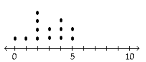
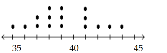
Using a strict interpretation of the relevant criteria characterizing a normal
distribution,does the frequency distribution below appear to have a normal distribution?
Does the distribution appear to be normal if the criteria are interpreted very loosely?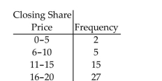
distribution,does the frequency distribution below appear to have a normal distribution?
Does the distribution appear to be normal if the criteria are interpreted very loosely?
Question
Question
Question
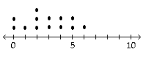
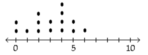
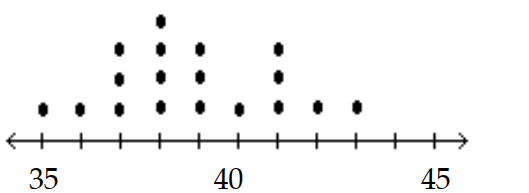
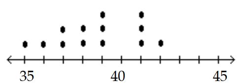
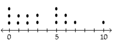
The data shows the roundtrip mileage that 43 randomly selected students drive to school each day. Construct a frequency polygon. Applying a loose interpretation of the requirements for a normal distribution, do the mileages appear to be normally distributed? Why or why not?
Question
Question
In a survey, 20 people were asked how many magazines they had purchased during the previous year. The results are shown below. Construct a histogram to represent the data.
Use 4 classes with a class width of 10, and begin with a lower class limit of -0.5. What is the approximate amount at the center?
Use 4 classes with a class width of 10, and begin with a lower class limit of -0.5. What is the approximate amount at the center?
Question
Question
A television manufacturer sold three times as many televisions in 2005 as it did in 1995. To illustrate this fact, the manufacturer draws a graph as shown below. The television on the right is three times as tall and three times as wide as the television on the left. Why is this graph misleading? What visual impression is created by the graph? 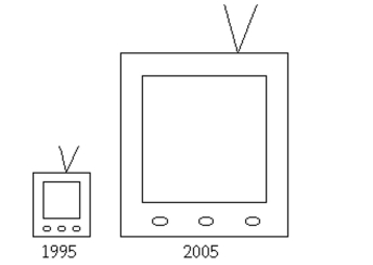
Question
On a math test, the scores of 24 students were 
Question
In a survey, 26 voters were asked their ages. The results are shown below. Construct a histogram to represent the data (with 5 classes beginning with a lower class limit of 19.5 and a class width of 10). What is the approximate age at the center?

Question
Question
Question
Question
Question
The following histogram shows average SO2 (sulfur dioxide) boiler emission rates from selected utility companies. The data was collected from a voluntary response sample of utility companies. Does the distribution depicted in the histogram reflect the true distribution of the population? Why or why not? 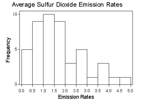
Question
Question
Question
Question
Question
The graph below shows the average cost of renting a studio in one city in each of the years 2002 through 2006. By what percentage does the average price increase from 2002 to 2003?
Obtain a second version of the graph by sliding a piece of paper over the bottom of the graph so that the bars start at 300. In this new graph, by what percentage does the price appear to increase from 2002 to 2003? Is the second graph misleading?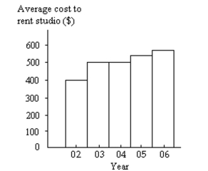
Obtain a second version of the graph by sliding a piece of paper over the bottom of the graph so that the bars start at 300. In this new graph, by what percentage does the price appear to increase from 2002 to 2003? Is the second graph misleading?
Question
Use the high closing values of Naristar Inc. stock from the years to construct a time-series graph. (Let represent 1990 and so on.) Identify a trend.
Question
The frequency table below shows the number of days off in a given year for 30 police detectives.
Construct a histogram. Use the class midpoints for the horizontal scale. Does the result appear to be a normal distribution? Why or why not?
Construct a histogram. Use the class midpoints for the horizontal scale. Does the result appear to be a normal distribution? Why or why not?
Question
Question
Question
The graph below shows the number of car accidents occurring in one city in each of the years 2001 through 2006. The number of accidents dropped in 2003 after a new speed limit was imposed. Does the graph distort the data? How would you redesign the graph to be less misleading? 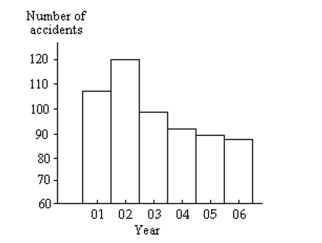
Question
Question
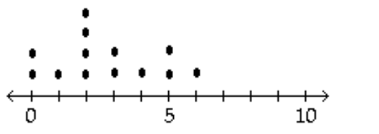
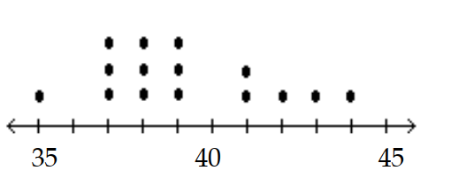
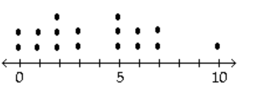
The frequency table below shows the amount of weight loss during the first month of a diet program for a group of men. Constructing a frequency polygon. Applying a loose interpretation of the requirements for a normal distribution, do the pounds of weight loss appear to be normally distributed?
Why or why not?
Why or why not?
Question
Question
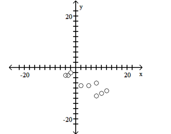
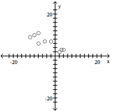
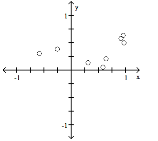
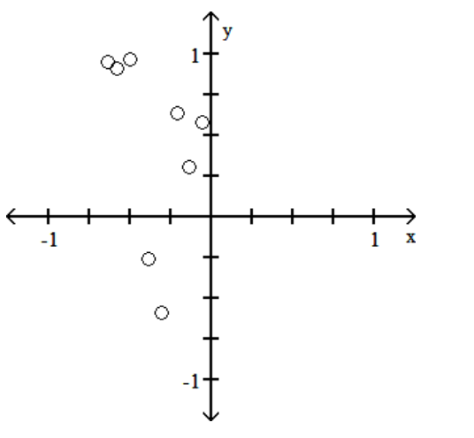
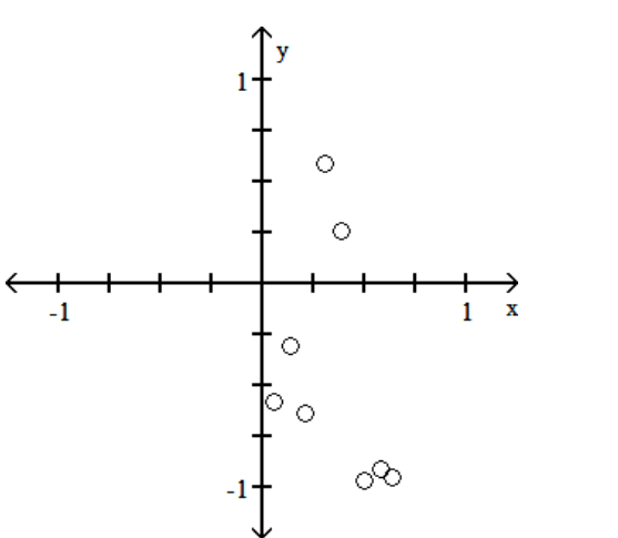
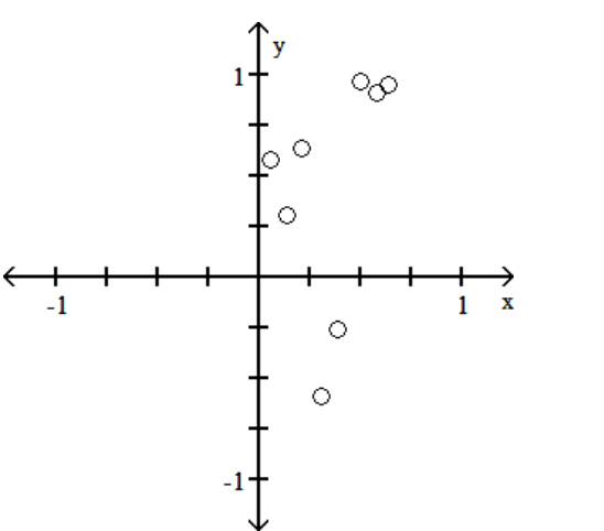
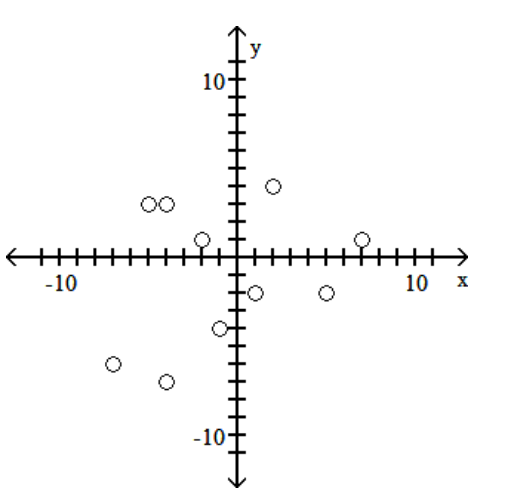
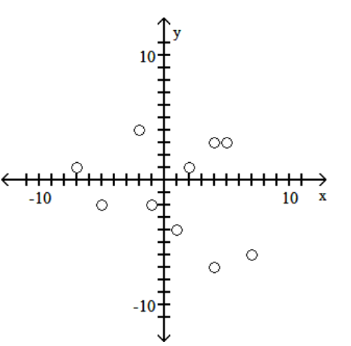
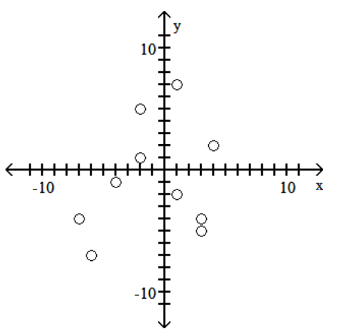
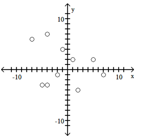
Use the given paired data to construct a scatterplot.
-
A)
B)
C)
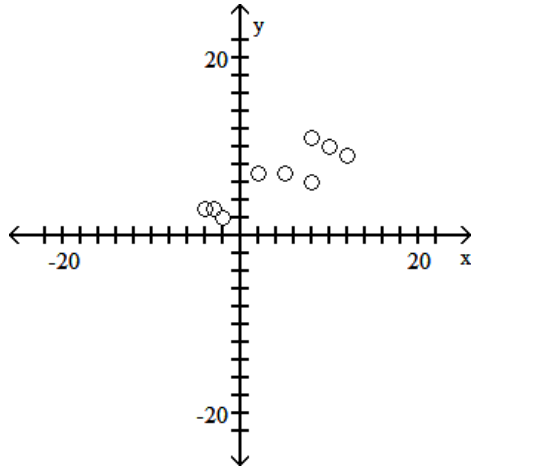
D)
-
A)
B)
C)
D)
Question
Question
The histogram below shows the distribution of the assets (in millions of dollars) of 71 companies. Does the distribution appear to be normal? 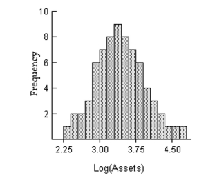
Question
Question
Question
Question
Question
A)
B)
C)
D)
Question
Question
A manufacturer records the number of errors each work station makes during the week. The data are as follows.
A)
B)
C)
D)
A)
B)
C)
D)
Question
Question
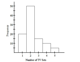
The histogram below represents the number of television sets per household for a sample of U.S. households. How many households are included in the histogram? 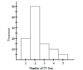
A) 100
B) 110
C) 95
D) 90
A) 100
B) 110
C) 95
D) 90
Question
Question
Question
Question
Question
Question
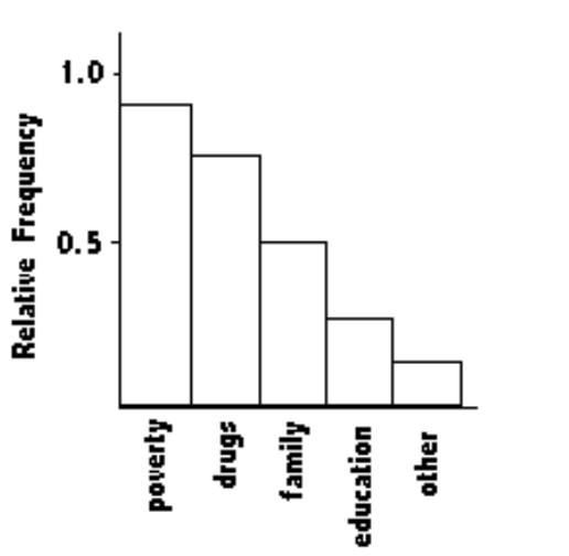
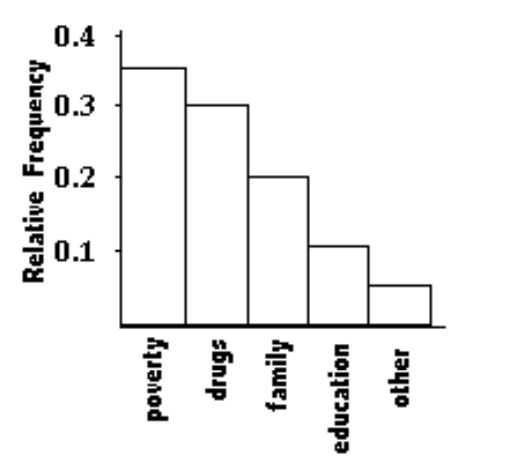
At the National Criminologists Association's annual convention, participants filled out a questionnaire asking what they thought was the most important cause for criminal behavior. The Tally was as follows.
Construct a Pareto chart to display these findings.
A)
B)
C)
D)
Construct a Pareto chart to display these findings.
A)
B)
C)
D)
Question
Question
Question
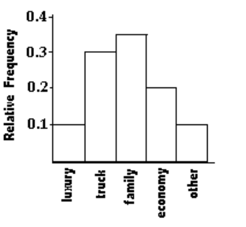
A car dealer is deciding what kinds of vehicles he should order from the factory. He looks at his sales report for the preceding period. Choose the vertical scale so that the relative frequencies are represented.
 Construct a Pareto chart to help him decide.
A)
B)
C)
D)
Construct a Pareto chart to help him decide. A)
B)
C)
D)
Question
A nurse measured the blood pressure of each person who visited her clinic. Following is a relative-frequency histogram for the systolic blood pressure readings for those people aged between 25 and 40. The blood pressure readings were given to the nearest whole number. What class width was used to construct the relative frequency distribution?
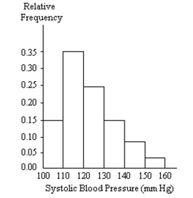
A) 9
B) 11
C) 100
D) 10
A) 9
B) 11
C) 100
D) 10
Question
The following data represent the number of cars passing through a toll booth during a certain time period over a number of days.
A)
B)
C)
D)
A)
B)
C)
D)
Question
Question
Question
Attendance records at a school show the number of days each student was absent during the year. The days absent for each student were as follows.
A)
B)
C)
D)
A)
B)
C)
D)
Question
Question
A nurse measured the blood pressure of each person who visited her clinic. Following is a relative-frequency histogram for the systolic blood pressure readings for those people aged between 25 and 40. The blood pressure readings were given to the nearest whole number.
Approximately what percentage of the people aged 25-40 had a systolic blood pressure reading between 110 and 119 inclusive?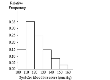
A) 3.5%
B) 35%
C) 30%
D) 0.35%
Approximately what percentage of the people aged 25-40 had a systolic blood pressure reading between 110 and 119 inclusive?
A) 3.5%
B) 35%
C) 30%
D) 0.35%
Question
A nurse measured the blood pressure of each person who visited her clinic. Following is a relative-frequency histogram for the systolic blood pressure readings for those people aged between 25 and 40. The blood pressure readings were given to the nearest whole number. Identify the center of the third class. 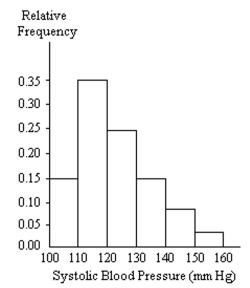
A) 125
B) 130
C) 120
D) 124
A) 125
B) 130
C) 120
D) 124
Question
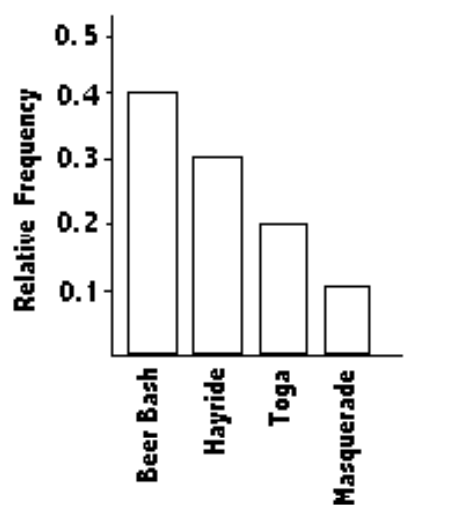
The Kappa Iota Sigma Fraternity polled its members on the weekend party theme. The vote was as follows: six for toga, four for hayride, eight for beer bash, and two for masquerade. Display the vote count in a Pareto chart.
A)
B)
C)
D)
A)
B)
C)
D)
Question
Question
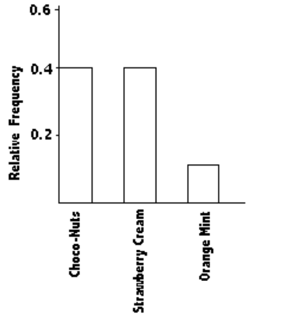
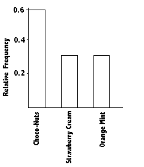
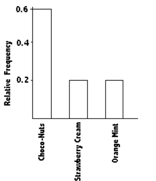
Wagenlucht Ice Cream Company is always trying to create new flavors of ice cream. They are market testing three kinds to find out which one has the best chance of becoming popular. They give small samples of each to 40 people at a grocery store. 8 ice cream tasters preferred the strawberry Cream, 24 preferred Choco-Nuts, and 8 loved the Orange Mint. Construct a Pareto chart to represent these preferences. Choose the vertical scale so that the relative frequencies are represented.
A)
B)
C)
D)
A)
B)
C)
D)
Question
Question
Question
Question
The histogram below represents the number of television sets per household for a sample of U.S. households. What is the maximum number of households having the same number of television
Sets?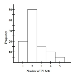
A) 100
B) 25
C) 20
D) 50
Sets?
A) 100
B) 25
C) 20
D) 50
Question
Question
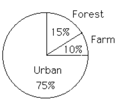
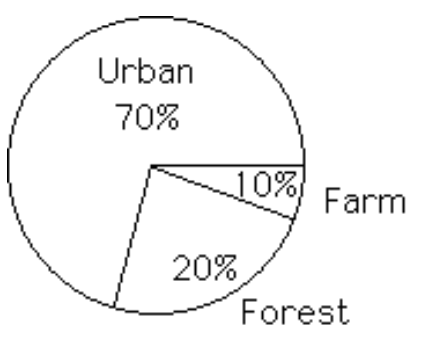
Construct a pie chart representing the given data set.
-The following data give the distribution of the types of houses in a town containing 43,000 houses.
A)
B)
-The following data give the distribution of the types of houses in a town containing 43,000 houses.
A)
B)
Question
Question
A nurse measured the blood pressure of each person who visited her clinic. Following is a relative-frequency histogram for the systolic blood pressure readings for those people aged between 25 and 40. The blood pressure readings were given to the nearest whole number.
Approximately what percentage of the people aged 25-40 had a systolic blood pressure reading between 110 and 139 inclusive?
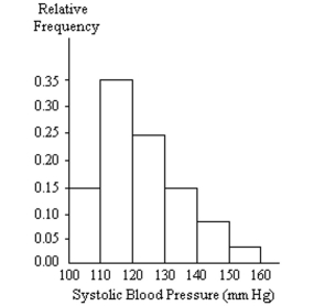
A) 39%
B) 75%
C) 89%
D) 59%
Approximately what percentage of the people aged 25-40 had a systolic blood pressure reading between 110 and 139 inclusive?
A) 39%
B) 75%
C) 89%
D) 59%
Question
The histogram below represents the number of television sets per household for a sample of U.S. households. What is the minimum number of households having the same number of television sets?
A) 20
B) 1
C) 100
D) 5
A) 20
B) 1
C) 100
D) 5
Question
Question
Construct a pie chart representing the given data set.
-The following figures give the distribution of land (in acres) for a county containing 98,000 acres.
A)
B)
-The following figures give the distribution of land (in acres) for a county containing 98,000 acres.
A)
B)
Question
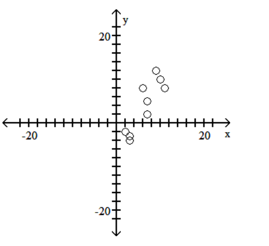
Use the given paired data to construct a scatterplot.
-
A)
B)
C)
D)
-
A)
B)
C)
D)
Question
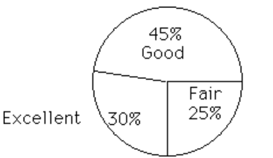
Construct a pie chart representing the given data set.
-After reviewing a movie, 700 people rated the movie as excellent, good, or fair. The following data give the rating distribution.
A)
B)
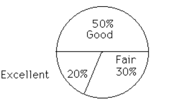
-After reviewing a movie, 700 people rated the movie as excellent, good, or fair. The following data give the rating distribution.
A)
B)
Question
Question
Question
The histogram below represents the number of television sets per household for a sample of U.S. households. What is the class width? 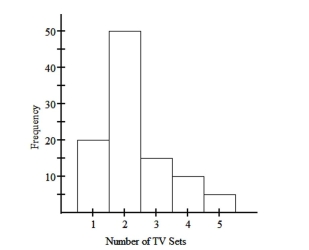
A) 0.5
B) 5
C) 1
D) 2
A) 0.5
B) 5
C) 1
D) 2

Unlock Deck
Sign up to unlock the cards in this deck!
Unlock Deck
Unlock Deck
1/85
Play
Full screen (f)
Deck 2: Summarizing and Graphing Data
1
Construct one table that includes relative frequencies based on the two frequency distributions below. Do those weights appear to be about the same or are they substantially different.? Round to the nearest tenth of a percent if necessary.
The weights are different, but they do not appear to be substantially different.
2
Use the given data to construct a frequency distribution.
-A medical research team studied the ages of patients who had strokes caused by stress. The ages of 34 patients who suffered stress strokes were as follows.
Construct a frequency distribution for these ages. Use 8 classes beginning with a lower class limit of 25.
-A medical research team studied the ages of patients who had strokes caused by stress. The ages of 34 patients who suffered stress strokes were as follows.
Construct a frequency distribution for these ages. Use 8 classes beginning with a lower class limit of 25.
3
Use the high closing values of Naristar Inc. stock from the years 1992 - 2003 to constru time-series graph. (Let represent 1992 and so on.) Identify a trend.
Except for a drop in high closing value
in 1994, there was a steady rise through 2000, after which there was a sharp drop in 2001 followed by increases through 2003.
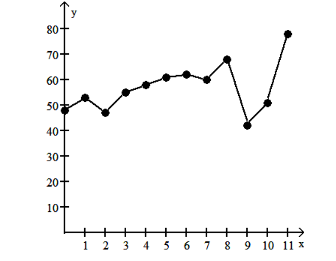
in 1994, there was a steady rise through 2000, after which there was a sharp drop in 2001 followed by increases through 2003.
4
A parcel delivery service lowered its prices and finds that it has delivered twice as many parcels this year as it did last year. To illustrate this fact, the manager draws a graph as shown below. Each cube depicts a parcel. The side length of the "parcel" on the right is twice the side length of the "parcel" on the left. Why is this graph misleading? What visual impression is created by the graph?
Unlock Deck
Unlock for access to all 85 flashcards in this deck.
Unlock Deck
k this deck
5
Using a strict interpretation of the relevant criteria characterizing a normal
distribution,does the frequency distribution below appear to have a normal distribution?
Does the distribution appear to be normal if the criteria are interpreted very loosely?
distribution,does the frequency distribution below appear to have a normal distribution?
Does the distribution appear to be normal if the criteria are interpreted very loosely?
Unlock Deck
Unlock for access to all 85 flashcards in this deck.
Unlock Deck
k this deck
6
Suppose you are comparing frequency data for two different groups, 25 managers and 150 blue collar workers. Why would a relative frequency distribution be better than a frequency distribution?
Unlock Deck
Unlock for access to all 85 flashcards in this deck.
Unlock Deck
k this deck
7
A medical research team studied the ages of 34 patients who had strokes caused by stress.
The frequency distribution below summarizes the results. When trying to understand the stroke data, what would be the advantage of looking at a histogram instead of this frequency distribution?
The frequency distribution below summarizes the results. When trying to understand the stroke data, what would be the advantage of looking at a histogram instead of this frequency distribution?
Unlock Deck
Unlock for access to all 85 flashcards in this deck.
Unlock Deck
k this deck
8
The data shows the roundtrip mileage that 43 randomly selected students drive to school each day. Construct a frequency polygon. Applying a loose interpretation of the requirements for a normal distribution, do the mileages appear to be normally distributed? Why or why not?
Unlock Deck
Unlock for access to all 85 flashcards in this deck.
Unlock Deck
k this deck
9
Explain in your own words why a bar graph can be misleading if one or both of the scales begin at some value other than zero.
Unlock Deck
Unlock for access to all 85 flashcards in this deck.
Unlock Deck
k this deck
10
In a survey, 20 people were asked how many magazines they had purchased during the previous year. The results are shown below. Construct a histogram to represent the data.
Use 4 classes with a class width of 10, and begin with a lower class limit of -0.5. What is the approximate amount at the center?
Use 4 classes with a class width of 10, and begin with a lower class limit of -0.5. What is the approximate amount at the center?
Unlock Deck
Unlock for access to all 85 flashcards in this deck.
Unlock Deck
k this deck
11
A college student wants to purchase one of two stocks. She has the average annual high values for each of these stocks over the most recent ten-year period. For comparison, she decides to sketch a time-series graph. How should she prepare her graph, and what should she look for?
Unlock Deck
Unlock for access to all 85 flashcards in this deck.
Unlock Deck
k this deck
12
A television manufacturer sold three times as many televisions in 2005 as it did in 1995. To illustrate this fact, the manufacturer draws a graph as shown below. The television on the right is three times as tall and three times as wide as the television on the left. Why is this graph misleading? What visual impression is created by the graph?
Unlock Deck
Unlock for access to all 85 flashcards in this deck.
Unlock Deck
k this deck
13
On a math test, the scores of 24 students were
Unlock Deck
Unlock for access to all 85 flashcards in this deck.
Unlock Deck
k this deck
14
In a survey, 26 voters were asked their ages. The results are shown below. Construct a histogram to represent the data (with 5 classes beginning with a lower class limit of 19.5 and a class width of 10). What is the approximate age at the center?
Unlock Deck
Unlock for access to all 85 flashcards in this deck.
Unlock Deck
k this deck
15
Suppose that a histogram is constructed for the frequency distribution shown below: The class 60-69 has twice the frequency of the class 70-89. In the histogram, will the area of the bar for the class 60-69 be twice the area of the bar for the class 70-89? In other words, will areas be proportional to frequencies in this histogram? Explain your thinking. Are there any conditions under which areas are proportional to frequencies in histograms?
Unlock Deck
Unlock for access to all 85 flashcards in this deck.
Unlock Deck
k this deck
16
One purpose of displaying data graphically is to provide clues about trends. The given values are weights (ounces) of steaks listed on a restaurant menu as "20 ounce porterhouse" steaks. The weights are supposed to be 21 ounces because they supposedly lose an ounce when cooked. Create a frequency distribution with 5 classes. Based on your distribution, comment on the advertised "20 ounce" steaks.
Unlock Deck
Unlock for access to all 85 flashcards in this deck.
Unlock Deck
k this deck
17
Describe at least two advantages to using stemplots rather than frequency distributions.
Unlock Deck
Unlock for access to all 85 flashcards in this deck.
Unlock Deck
k this deck
18
An airline checked 7 of its flights into a regional airport and found that 1 was early, 4 were on time, and 2 were late. Why does it not make sense to construct a histogram for this data set?
Unlock Deck
Unlock for access to all 85 flashcards in this deck.
Unlock Deck
k this deck
19
The following histogram shows average SO2 (sulfur dioxide) boiler emission rates from selected utility companies. The data was collected from a voluntary response sample of utility companies. Does the distribution depicted in the histogram reflect the true distribution of the population? Why or why not?
Unlock Deck
Unlock for access to all 85 flashcards in this deck.
Unlock Deck
k this deck
20
Create an example displaying data in a pie chart. Display the same data in a Pareto chart.
Which graph is more effective? List at least two reasons in support of your choice.
Which graph is more effective? List at least two reasons in support of your choice.
Unlock Deck
Unlock for access to all 85 flashcards in this deck.
Unlock Deck
k this deck
21
Use the given data to construct a frequency distribution.
-Kevin asked some of his friends how many hours they had worked during the previous week at their after-school jobs. The results are shown below.
Construct a frequency distribution. Use 4 classes, a class width of 2 hours, and a lower limit of 3 for class 1.
-Kevin asked some of his friends how many hours they had worked during the previous week at their after-school jobs. The results are shown below.
Construct a frequency distribution. Use 4 classes, a class width of 2 hours, and a lower limit of 3 for class 1.
Unlock Deck
Unlock for access to all 85 flashcards in this deck.
Unlock Deck
k this deck
22
Histograms and Pareto charts are both bar charts. What is the significant difference between the two?
Unlock Deck
Unlock for access to all 85 flashcards in this deck.
Unlock Deck
k this deck
23
Use the given data to construct a frequency distribution.
-The following figures represent Jennifer's monthly charges for long distance telephone calls for the past twelve months.
Construct a frequency distribution with 4 classes.
-The following figures represent Jennifer's monthly charges for long distance telephone calls for the past twelve months.
Construct a frequency distribution with 4 classes.
Unlock Deck
Unlock for access to all 85 flashcards in this deck.
Unlock Deck
k this deck
24
The graph below shows the average cost of renting a studio in one city in each of the years 2002 through 2006. By what percentage does the average price increase from 2002 to 2003?
Obtain a second version of the graph by sliding a piece of paper over the bottom of the graph so that the bars start at 300. In this new graph, by what percentage does the price appear to increase from 2002 to 2003? Is the second graph misleading?
Obtain a second version of the graph by sliding a piece of paper over the bottom of the graph so that the bars start at 300. In this new graph, by what percentage does the price appear to increase from 2002 to 2003? Is the second graph misleading?
Unlock Deck
Unlock for access to all 85 flashcards in this deck.
Unlock Deck
k this deck
25
Use the high closing values of Naristar Inc. stock from the years to construct a time-series graph. (Let represent 1990 and so on.) Identify a trend.
Unlock Deck
Unlock for access to all 85 flashcards in this deck.
Unlock Deck
k this deck
26
The frequency table below shows the number of days off in a given year for 30 police detectives.
Construct a histogram. Use the class midpoints for the horizontal scale. Does the result appear to be a normal distribution? Why or why not?
Construct a histogram. Use the class midpoints for the horizontal scale. Does the result appear to be a normal distribution? Why or why not?
Unlock Deck
Unlock for access to all 85 flashcards in this deck.
Unlock Deck
k this deck
27
The following frequency distribution analyzes the scores on a math test. Find the class boundaries of scores interval 40-59.
A) 39.5, 58.5
B) 40.5, 58.5
C) 40.5, 59.5
D) 39.5, 59.5
A) 39.5, 58.5
B) 40.5, 58.5
C) 40.5, 59.5
D) 39.5, 59.5
Unlock Deck
Unlock for access to all 85 flashcards in this deck.
Unlock Deck
k this deck
28
Use the given data to construct a frequency distribution.
-A school district performed a study to find the main causes leading to its students dropping out of school. Thirty cases were analyzed, and a primary cause was assigned to each case. The causes included unexcused absences (U), illness (I), family problems (F), and other causes (O). The results for the thirty cases are listed below:
Construct a table summarizing the frequency distribution of the primary causes leading to student dropout.
Unlock Deck
Unlock for access to all 85 flashcards in this deck.
Unlock Deck
k this deck
29
The graph below shows the number of car accidents occurring in one city in each of the years 2001 through 2006. The number of accidents dropped in 2003 after a new speed limit was imposed. Does the graph distort the data? How would you redesign the graph to be less misleading?
Unlock Deck
Unlock for access to all 85 flashcards in this deck.
Unlock Deck
k this deck
30
Suppose that you construct a histogram and a relative frequency histogram corresponding to a particular frequency table. In what ways will the two histograms be similar? In what ways will they differ?
Unlock Deck
Unlock for access to all 85 flashcards in this deck.
Unlock Deck
k this deck
31
The frequency table below shows the amount of weight loss during the first month of a diet program for a group of men. Constructing a frequency polygon. Applying a loose interpretation of the requirements for a normal distribution, do the pounds of weight loss appear to be normally distributed?
Why or why not?
Why or why not?
Unlock Deck
Unlock for access to all 85 flashcards in this deck.
Unlock Deck
k this deck
32
Construct a frequency distribution that includes an outlier. Construct the corresponding histogram. Then, construct the corresponding histogram without including the outlier.
How much does the outlier affect the shape of the histogram?
How much does the outlier affect the shape of the histogram?
Unlock Deck
Unlock for access to all 85 flashcards in this deck.
Unlock Deck
k this deck
33
Use the given paired data to construct a scatterplot.
-
A)
B)
C)
D)
-
A)
B)
C)
D)
Unlock Deck
Unlock for access to all 85 flashcards in this deck.
Unlock Deck
k this deck
34
Construct a frequency distribution and the corresponding histogram in which the following conditions are satisfied:
- The frequency for the second class is twice the frequency of the first class.
- In the histogram, the area of the bar corresponding to the second class is four times the area of the bar corresponding to the first class.
- The frequency for the second class is twice the frequency of the first class.
- In the histogram, the area of the bar corresponding to the second class is four times the area of the bar corresponding to the first class.
Unlock Deck
Unlock for access to all 85 flashcards in this deck.
Unlock Deck
k this deck
35
The histogram below shows the distribution of the assets (in millions of dollars) of 71 companies. Does the distribution appear to be normal?
Unlock Deck
Unlock for access to all 85 flashcards in this deck.
Unlock Deck
k this deck
36
Consider the frequency distribution below, which has single values as classes:
Describe the distribution of the data. Use this frequency distribution to create two new frequency distributions for the data, one with four classes of equal width and one with six classes of equal width. Does the frequency distribution with four classes capture the distribution of the data? Does the frequency distribution with six classes capture the distribution of the data? Explain your thinking.
Describe the distribution of the data. Use this frequency distribution to create two new frequency distributions for the data, one with four classes of equal width and one with six classes of equal width. Does the frequency distribution with four classes capture the distribution of the data? Does the frequency distribution with six classes capture the distribution of the data? Explain your thinking.
Unlock Deck
Unlock for access to all 85 flashcards in this deck.
Unlock Deck
k this deck
37
Suppose that a data set has a minimum value of 18 and a maximum of 83 and that you want 5 classes. Explain how to find the class width for this frequency table. What happens if you mistakenly use a class width of 13 instead of 14?
Unlock Deck
Unlock for access to all 85 flashcards in this deck.
Unlock Deck
k this deck
38
Use the given data to construct a frequency distribution.
-Lori asked 24 students how many hours they had spent doing homework during theprevious week. The results are shown below.
Construct a frequency distribution. Use 4 classes, a class width of 2 hours, and a lower limit of 8 for
-Lori asked 24 students how many hours they had spent doing homework during theprevious week. The results are shown below.
Construct a frequency distribution. Use 4 classes, a class width of 2 hours, and a lower limit of 8 for
Unlock Deck
Unlock for access to all 85 flashcards in this deck.
Unlock Deck
k this deck
39
Consider the frequency distribution below, which has single values as classes: Construct a new frequency distribution for this data with 4 classes. Now, construct another frequency distribution for this data with 6 classes. Suppose that you construct a histogram corresponding to the original data and histograms corresponding to each of the new frequency distributions. Describe the shapes of the three histograms. Does the histogram with six classes capture the distribution of the data? Does the histogram with four classes capture the distribution of the data?
Unlock Deck
Unlock for access to all 85 flashcards in this deck.
Unlock Deck
k this deck
40
A)
B)
C)
D)
Unlock Deck
Unlock for access to all 85 flashcards in this deck.
Unlock Deck
k this deck
41
Construct the cumulative frequency distribution that corresponds to the given frequency distribution
-
A)
B)
C)
D)
-
A)
B)
C)
D)
Unlock Deck
Unlock for access to all 85 flashcards in this deck.
Unlock Deck
k this deck
42
A manufacturer records the number of errors each work station makes during the week. The data are as follows.
A)
B)
C)
D)
A)
B)
C)
D)
Unlock Deck
Unlock for access to all 85 flashcards in this deck.
Unlock Deck
k this deck
43
The frequency distribution below summarizes the home sale prices in the city of Summerhill for the month of June. Determine the width of each class.
A) 30
B) 31
C) 61
D) 28
A) 30
B) 31
C) 61
D) 28
Unlock Deck
Unlock for access to all 85 flashcards in this deck.
Unlock Deck
k this deck
44
The histogram below represents the number of television sets per household for a sample of U.S. households. How many households are included in the histogram?
A) 100
B) 110
C) 95
D) 90
A) 100
B) 110
C) 95
D) 90
Unlock Deck
Unlock for access to all 85 flashcards in this deck.
Unlock Deck
k this deck
45
The attendance counts for this season's basketball games are listed below.
A)
B)
A)
B)
Unlock Deck
Unlock for access to all 85 flashcards in this deck.
Unlock Deck
k this deck
46
The following frequency distribution analyzes the scores on a math test. Find the class midpoint of scores interval 40-59.
A) 50.5
B) 49.0
C) 49.5
D) 48.5
A) 50.5
B) 49.0
C) 49.5
D) 48.5
Unlock Deck
Unlock for access to all 85 flashcards in this deck.
Unlock Deck
k this deck
47
The frequency distribution below summarizes employee years of service for Alpha Corporation. Find the class midpoint for class 1-5.
A) 5.0
B) 2.5
C) 3.0
D) 3.5
A) 5.0
B) 2.5
C) 3.0
D) 3.5
Unlock Deck
Unlock for access to all 85 flashcards in this deck.
Unlock Deck
k this deck
48
The midterm test scores for the seventh-period typing class are listed below.
A)
B)
A)
B)
Unlock Deck
Unlock for access to all 85 flashcards in this deck.
Unlock Deck
k this deck
49
The normal monthly precipitation (in inches) for August is listed for 39 different U.S. cities. Construct an expanded stemplot with about 9 rows.
A)
B)
A)
B)
Unlock Deck
Unlock for access to all 85 flashcards in this deck.
Unlock Deck
k this deck
50
At the National Criminologists Association's annual convention, participants filled out a questionnaire asking what they thought was the most important cause for criminal behavior. The Tally was as follows.
Construct a Pareto chart to display these findings.
A)
B)
C)
D)
Construct a Pareto chart to display these findings.
A)
B)
C)
D)
Unlock Deck
Unlock for access to all 85 flashcards in this deck.
Unlock Deck
k this deck
51
The following data consists of the weights (in pounds) of 15 randomly selected women and the weights of 15 randomly selected men. Construct a back-to-back stemplot for the data.
A)
B)
A)
B)
Unlock Deck
Unlock for access to all 85 flashcards in this deck.
Unlock Deck
k this deck
52
The weights of 22 members of the varsity football team are listed below.
A)
B)
A)
B)
Unlock Deck
Unlock for access to all 85 flashcards in this deck.
Unlock Deck
k this deck
53
A car dealer is deciding what kinds of vehicles he should order from the factory. He looks at his sales report for the preceding period. Choose the vertical scale so that the relative frequencies are represented.
Construct a Pareto chart to help him decide.
A)
B)
C)
D)
Construct a Pareto chart to help him decide. A)
B)
C)
D)
Unlock Deck
Unlock for access to all 85 flashcards in this deck.
Unlock Deck
k this deck
54
A nurse measured the blood pressure of each person who visited her clinic. Following is a relative-frequency histogram for the systolic blood pressure readings for those people aged between 25 and 40. The blood pressure readings were given to the nearest whole number. What class width was used to construct the relative frequency distribution?
A) 9
B) 11
C) 100
D) 10
A) 9
B) 11
C) 100
D) 10
Unlock Deck
Unlock for access to all 85 flashcards in this deck.
Unlock Deck
k this deck
55
The following data represent the number of cars passing through a toll booth during a certain time period over a number of days.
A)
B)
C)
D)
A)
B)
C)
D)
Unlock Deck
Unlock for access to all 85 flashcards in this deck.
Unlock Deck
k this deck
56
Construct the cumulative frequency distribution that corresponds to the given frequency distribution.
-
A)
B)
C)
D)
-
A)
B)
C)
D)
Unlock Deck
Unlock for access to all 85 flashcards in this deck.
Unlock Deck
k this deck
57
Sturges' guideline suggests that when constructing a frequency distribution, the ideal number of classes can be approximated by where n is the number of data values. Use this
Guideline to find the ideal number of classes when the number of data values is 180.
A) 7
B) 10
C) 8
D) 9
Guideline to find the ideal number of classes when the number of data values is 180.
A) 7
B) 10
C) 8
D) 9
Unlock Deck
Unlock for access to all 85 flashcards in this deck.
Unlock Deck
k this deck
58
Attendance records at a school show the number of days each student was absent during the year. The days absent for each student were as follows.
A)
B)
C)
D)
A)
B)
C)
D)
Unlock Deck
Unlock for access to all 85 flashcards in this deck.
Unlock Deck
k this deck
59
The frequency distribution below summarizes employee years of service for Alpha Corporation. Determine the width of each class.
A) 4
B) 10
C) 6
D) 5
A) 4
B) 10
C) 6
D) 5
Unlock Deck
Unlock for access to all 85 flashcards in this deck.
Unlock Deck
k this deck
60
A nurse measured the blood pressure of each person who visited her clinic. Following is a relative-frequency histogram for the systolic blood pressure readings for those people aged between 25 and 40. The blood pressure readings were given to the nearest whole number.
Approximately what percentage of the people aged 25-40 had a systolic blood pressure reading between 110 and 119 inclusive?
A) 3.5%
B) 35%
C) 30%
D) 0.35%
Approximately what percentage of the people aged 25-40 had a systolic blood pressure reading between 110 and 119 inclusive?
A) 3.5%
B) 35%
C) 30%
D) 0.35%
Unlock Deck
Unlock for access to all 85 flashcards in this deck.
Unlock Deck
k this deck
61
A nurse measured the blood pressure of each person who visited her clinic. Following is a relative-frequency histogram for the systolic blood pressure readings for those people aged between 25 and 40. The blood pressure readings were given to the nearest whole number. Identify the center of the third class.
A) 125
B) 130
C) 120
D) 124
A) 125
B) 130
C) 120
D) 124
Unlock Deck
Unlock for access to all 85 flashcards in this deck.
Unlock Deck
k this deck
62
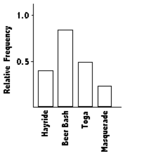
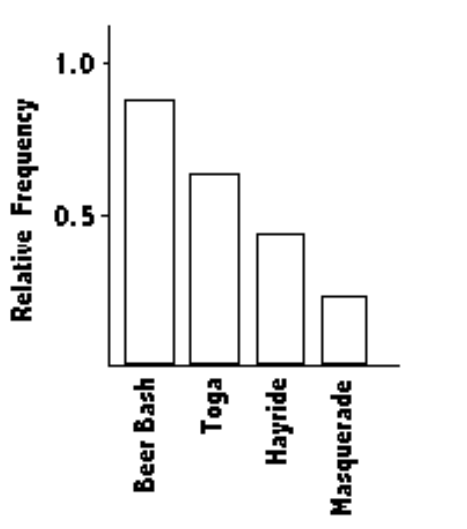
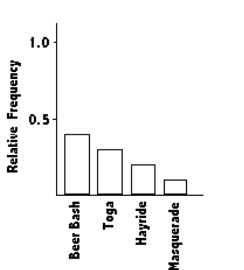
The Kappa Iota Sigma Fraternity polled its members on the weekend party theme. The vote was as follows: six for toga, four for hayride, eight for beer bash, and two for masquerade. Display the vote count in a Pareto chart.
A)
B)
C)
D)
A)
B)
C)
D)
Unlock Deck
Unlock for access to all 85 flashcards in this deck.
Unlock Deck
k this deck
63
The scores on a recent statistics test are given in the frequency distribution below. Construct the corresponding relative frequency distribution. Round relative frequencies to the nearest hundredth of a percent if necessary.
A)
B)
C)
D)
A)
B)
C)
D)
Unlock Deck
Unlock for access to all 85 flashcards in this deck.
Unlock Deck
k this deck
64
Wagenlucht Ice Cream Company is always trying to create new flavors of ice cream. They are market testing three kinds to find out which one has the best chance of becoming popular. They give small samples of each to 40 people at a grocery store. 8 ice cream tasters preferred the strawberry Cream, 24 preferred Choco-Nuts, and 8 loved the Orange Mint. Construct a Pareto chart to represent these preferences. Choose the vertical scale so that the relative frequencies are represented.
A)
B)
C)
D)
A)
B)
C)
D)
Unlock Deck
Unlock for access to all 85 flashcards in this deck.
Unlock Deck
k this deck
65
The frequency distribution below summarizes employee years of service for Alpha Corporation. Find the class boundaries for class 26-30.
A) 26.5, 30.5
B) 26.5, 29.5
C) 25.5, 30.5
D) 25.5, 20.5
A) 26.5, 30.5
B) 26.5, 29.5
C) 25.5, 30.5
D) 25.5, 20.5
Unlock Deck
Unlock for access to all 85 flashcards in this deck.
Unlock Deck
k this deck
66
The following frequency distribution analyzes the scores on a math test. Find the class midpoint of scores interval 95-99.
A) 97.0
B) 97.5
C) 98.0
D) 96.5
A) 97.0
B) 97.5
C) 98.0
D) 96.5
Unlock Deck
Unlock for access to all 85 flashcards in this deck.
Unlock Deck
k this deck
67
The following data show the number of laps run by each participant in a marathon.
A)
B)
A)
B)
Unlock Deck
Unlock for access to all 85 flashcards in this deck.
Unlock Deck
k this deck
68
The histogram below represents the number of television sets per household for a sample of U.S. households. What is the maximum number of households having the same number of television
Sets?
A) 100
B) 25
C) 20
D) 50
Sets?
A) 100
B) 25
C) 20
D) 50
Unlock Deck
Unlock for access to all 85 flashcards in this deck.
Unlock Deck
k this deck
69
The frequency distribution for the weekly incomes of students with part-time jobs is given below. Construct the corresponding relative frequency distribution. Round relative frequencies to the nearest hundredth of a percent if necessary.
A)
B)
C)
D)
A)
B)
C)
D)
Unlock Deck
Unlock for access to all 85 flashcards in this deck.
Unlock Deck
k this deck
70
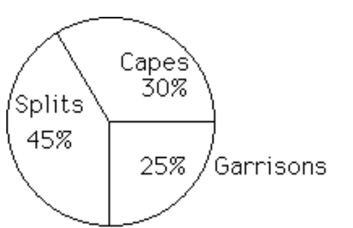
Construct a pie chart representing the given data set.
-The following data give the distribution of the types of houses in a town containing 43,000 houses.
A)
B)
-The following data give the distribution of the types of houses in a town containing 43,000 houses.
A)
B)
Unlock Deck
Unlock for access to all 85 flashcards in this deck.
Unlock Deck
k this deck
71
The frequency distribution below summarizes the home sale prices in the city of Summerhill for the month of June. Find the class boundaries for class 80.0-110.9.
A) 79.90, 111.0
B) 79.95, 110.95
C) 80.00, 110.95
D) 79.90, 110.95
A) 79.90, 111.0
B) 79.95, 110.95
C) 80.00, 110.95
D) 79.90, 110.95
Unlock Deck
Unlock for access to all 85 flashcards in this deck.
Unlock Deck
k this deck
72
A nurse measured the blood pressure of each person who visited her clinic. Following is a relative-frequency histogram for the systolic blood pressure readings for those people aged between 25 and 40. The blood pressure readings were given to the nearest whole number.
Approximately what percentage of the people aged 25-40 had a systolic blood pressure reading between 110 and 139 inclusive?
A) 39%
B) 75%
C) 89%
D) 59%
Approximately what percentage of the people aged 25-40 had a systolic blood pressure reading between 110 and 139 inclusive?
A) 39%
B) 75%
C) 89%
D) 59%
Unlock Deck
Unlock for access to all 85 flashcards in this deck.
Unlock Deck
k this deck
73
The histogram below represents the number of television sets per household for a sample of U.S. households. What is the minimum number of households having the same number of television sets?
A) 20
B) 1
C) 100
D) 5
A) 20
B) 1
C) 100
D) 5
Unlock Deck
Unlock for access to all 85 flashcards in this deck.
Unlock Deck
k this deck
74
The ages of the 45 members of a track and field team are listed below. Construct an expanded stemplot with about 8 rows.
A)
B)
A)
B)
Unlock Deck
Unlock for access to all 85 flashcards in this deck.
Unlock Deck
k this deck
75
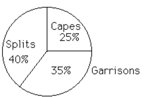
Construct a pie chart representing the given data set.
-The following figures give the distribution of land (in acres) for a county containing 98,000 acres.
A)
B)
-The following figures give the distribution of land (in acres) for a county containing 98,000 acres.
A)
B)
Unlock Deck
Unlock for access to all 85 flashcards in this deck.
Unlock Deck
k this deck
76
Use the given paired data to construct a scatterplot.
-
A)
B)
C)
D)
-
A)
B)
C)
D)
Unlock Deck
Unlock for access to all 85 flashcards in this deck.
Unlock Deck
k this deck
77
Construct a pie chart representing the given data set.
-After reviewing a movie, 700 people rated the movie as excellent, good, or fair. The following data give the rating distribution.
A)
B)
-After reviewing a movie, 700 people rated the movie as excellent, good, or fair. The following data give the rating distribution.
A)
B)
Unlock Deck
Unlock for access to all 85 flashcards in this deck.
Unlock Deck
k this deck
78
Construct the cumulative frequency distribution that corresponds to the given frequency distribution.
-
A)
B)
C)
D)
-
A)
B)
C)
D)
Unlock Deck
Unlock for access to all 85 flashcards in this deck.
Unlock Deck
k this deck
79
The following frequency distribution analyzes the scores on a math test. Find the class boundaries of scores interval 95-99.
A) 94.5, 100.5
B) 95.5, 100.5
C) 94.5, 99.5
D) 95.5, 99.5
A) 94.5, 100.5
B) 95.5, 100.5
C) 94.5, 99.5
D) 95.5, 99.5
Unlock Deck
Unlock for access to all 85 flashcards in this deck.
Unlock Deck
k this deck
80
The histogram below represents the number of television sets per household for a sample of U.S. households. What is the class width?
A) 0.5
B) 5
C) 1
D) 2
A) 0.5
B) 5
C) 1
D) 2
Unlock Deck
Unlock for access to all 85 flashcards in this deck.
Unlock Deck
k this deck
Unlock Deck
Unlock for access to all 85 flashcards in this deck.


