Deck 13: Psychological Disorders
Full screen (f)
Question
Question
Question
Question
This graph is one way of presenting data from a study. It shows the number of hours per week that people spent exercising. This type of graph is called a _____. 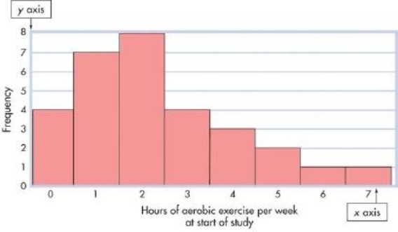
A)frequency polygon
B)scatter plot
C)standard normal curve
D)histogram
A)frequency polygon
B)scatter plot
C)standard normal curve
D)histogram
Question
Question
This graphic representation of the data from an exercise and health study shows the number of hours of aerobic exercise weekly that people did at the end of the study. This type of graph is called a _____. 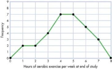
A)scatter diagram
B)histogram
C)frequency polygon
D)standard normal distribution
A)scatter diagram
B)histogram
C)frequency polygon
D)standard normal distribution
Question
This graphic representation of the data from an exercise and health study shows the association between energy level and compliance with a yoga routine. This type of graph is called a_____. 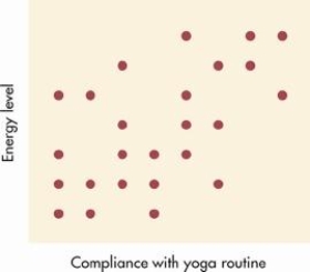
A)scatter diagram or scatter plot
B)histogram
C)frequency polygon
D)frequency distribution
A)scatter diagram or scatter plot
B)histogram
C)frequency polygon
D)frequency distribution
Question
Question
This graphic representation of the data from an exercise and health study shows the association between practicing meditation and smoking behavior. The relationship depicted here is not perfect but it shows that, in general, the morepeople meditate the less likely they are to smoke. Because there is a downward-sloping pattern of dots you can conclude that there is a _____ between meditation and smoking. 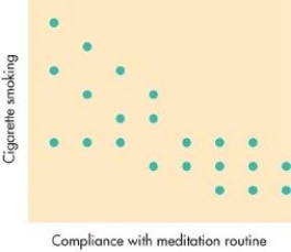
A)negative correlation
B)correlation that is close to zero
C)positive correlation
D)correlation coefficient of 1.00 or higher
A)negative correlation
B)correlation that is close to zero
C)positive correlation
D)correlation coefficient of 1.00 or higher
Question
Question
Question
This graphic representation of the data from an exercise and health study shows the association between energy level and compliance with a yoga routine. The relationship depicted isonly moderate but shows that the more people complied with the yoga routine the more energy they felt they had, which indicates a _____. 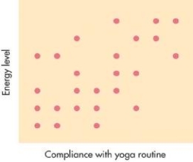
A)negative correlation
B)correlation that is close to zero
C)positive correlation
D)correlation coefficient of 1.00 or higher
A)negative correlation
B)correlation that is close to zero
C)positive correlation
D)correlation coefficient of 1.00 or higher
Question
Question
Question
Question
This graphic representation of the data from an exercise and health study shows the number of hours of aerobic exercise that people in the study did weekly before they were recruited.This type of graph is called a _____ and because most people have low scores it is _____. 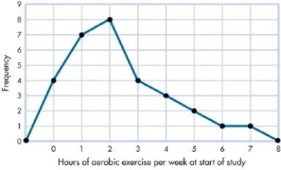
A)frequency polygon; negatively skewed
B)histogram; positively skewed
C)frequency polygon; positively skewed
D)histogram; negatively skewed
A)frequency polygon; negatively skewed
B)histogram; positively skewed
C)frequency polygon; positively skewed
D)histogram; negatively skewed
Question
This table shows the number of people who exercised for various amounts of time (from 0 to 7 hours) per week. This type of graphic representation of data is called a _____. 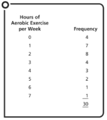
A)frequency distribution
B)frequency polygon
C)histogram
D)scatter plot
A)frequency distribution
B)frequency polygon
C)histogram
D)scatter plot
Question
Question
Question
Question
Question
Question
Question
Question
Question
Question
Question
Question
Question
Question
Question
Question
Question
Question
Question
Question
Question
Question
Question
Question
Question
Question
Question
Question
Question
Question
Question
Question
Question
Question
Question
Question
Question
Question
Question
Question
Question
Question
Question
Question
Question
Question
Question
Question
Question
Question
Question
Question
Question
Question
Question
Question
Question
Question
Question
Question
Question
Question
Question

Unlock Deck
Sign up to unlock the cards in this deck!
Unlock Deck
Unlock Deck
1/180
Play
Full screen (f)
Deck 13: Psychological Disorders
1
When Sarah created a frequency polygon, she noticed there were more scores on one side of the distribution than on the other. It would appear that Sarah's distribution is:
A)symmetrical.
B)a standard normal curve.
C)skewed.
D)a scatter plot.
A)symmetrical.
B)a standard normal curve.
C)skewed.
D)a scatter plot.
skewed.
2
If you arrange raw scores in order of magnitude and you record the number of times each score occurs, you have constructed a summary table called a:
A)histogram.
B)scatter plot.
C)frequency distribution.
D)frequency polygon.
A)histogram.
B)scatter plot.
C)frequency distribution.
D)frequency polygon.
frequency distribution.
3
Marvin gathered data on the frequency of shopping trips tothe mall as a function of various age categories. To organize the results of his research graphically, Marvin made a mark above each age category at the point corresponding to its frequency, and then connected these dots with straight lines.Marvin has constructed a:
A)frequency polygon.
B)frequency distribution.
C)histogram.
D)scatter plot.
A)frequency polygon.
B)frequency distribution.
C)histogram.
D)scatter plot.
frequency polygon.
4
This graph is one way of presenting data from a study. It shows the number of hours per week that people spent exercising. This type of graph is called a _____.
A)frequency polygon
B)scatter plot
C)standard normal curve
D)histogram
A)frequency polygon
B)scatter plot
C)standard normal curve
D)histogram
Unlock Deck
Unlock for access to all 180 flashcards in this deck.
Unlock Deck
k this deck
5
Your textbook describes a research project concerned with health issues that generated a large amount of data. In order to make sense out of this mass of information, the researchers used _____ to organize and summarize the data.
A)inferential statistics
B)population statistics
C)correlation coefficients
D)descriptive statistics
A)inferential statistics
B)population statistics
C)correlation coefficients
D)descriptive statistics
Unlock Deck
Unlock for access to all 180 flashcards in this deck.
Unlock Deck
k this deck
6
This graphic representation of the data from an exercise and health study shows the number of hours of aerobic exercise weekly that people did at the end of the study. This type of graph is called a _____.
A)scatter diagram
B)histogram
C)frequency polygon
D)standard normal distribution
A)scatter diagram
B)histogram
C)frequency polygon
D)standard normal distribution
Unlock Deck
Unlock for access to all 180 flashcards in this deck.
Unlock Deck
k this deck
7
This graphic representation of the data from an exercise and health study shows the association between energy level and compliance with a yoga routine. This type of graph is called a_____.
A)scatter diagram or scatter plot
B)histogram
C)frequency polygon
D)frequency distribution
A)scatter diagram or scatter plot
B)histogram
C)frequency polygon
D)frequency distribution
Unlock Deck
Unlock for access to all 180 flashcards in this deck.
Unlock Deck
k this deck
8
Yoshiko decided to organize the data from her frequency distribution graphically in a type of bar chart in which the bars were vertical and touched each other. Yoshiko's graph is called a:
A)scatter diagram.
B)histogram.
C)frequency polygon.
D)z score distribution.
A)scatter diagram.
B)histogram.
C)frequency polygon.
D)z score distribution.
Unlock Deck
Unlock for access to all 180 flashcards in this deck.
Unlock Deck
k this deck
9
This graphic representation of the data from an exercise and health study shows the association between practicing meditation and smoking behavior. The relationship depicted here is not perfect but it shows that, in general, the morepeople meditate the less likely they are to smoke. Because there is a downward-sloping pattern of dots you can conclude that there is a _____ between meditation and smoking.
A)negative correlation
B)correlation that is close to zero
C)positive correlation
D)correlation coefficient of 1.00 or higher
A)negative correlation
B)correlation that is close to zero
C)positive correlation
D)correlation coefficient of 1.00 or higher
Unlock Deck
Unlock for access to all 180 flashcards in this deck.
Unlock Deck
k this deck
10
A _____ is like a bar chart with two special features: The barsare always vertical, and they always touch.
A)polygon
B)correlation coefficient scatter plot
C)variability diagram
D)histogram
A)polygon
B)correlation coefficient scatter plot
C)variability diagram
D)histogram
Unlock Deck
Unlock for access to all 180 flashcards in this deck.
Unlock Deck
k this deck
11
In a graph displaying family income in Slakia, the frequency of families with low incomes was far greater than the frequency of families with medium or high incomes. It would appear that the distribution of family incomes in Slakia:
A)is negatively skewed.
B)resembles the standard normal curve.
C)is positively skewed.
D)has little or no variability.
A)is negatively skewed.
B)resembles the standard normal curve.
C)is positively skewed.
D)has little or no variability.
Unlock Deck
Unlock for access to all 180 flashcards in this deck.
Unlock Deck
k this deck
12
This graphic representation of the data from an exercise and health study shows the association between energy level and compliance with a yoga routine. The relationship depicted isonly moderate but shows that the more people complied with the yoga routine the more energy they felt they had, which indicates a _____.
A)negative correlation
B)correlation that is close to zero
C)positive correlation
D)correlation coefficient of 1.00 or higher
A)negative correlation
B)correlation that is close to zero
C)positive correlation
D)correlation coefficient of 1.00 or higher
Unlock Deck
Unlock for access to all 180 flashcards in this deck.
Unlock Deck
k this deck
13
Data from the health promotion study described in the textbook were first arranged in a frequency distribution. The researchers then graphically displayed the data in a bar chartwith vertical bars that touched. At that point, the researchers had constructed a:
A)histogram.
B)frequency polygon.
C)scatter plot.
D)means table.
A)histogram.
B)frequency polygon.
C)scatter plot.
D)means table.
Unlock Deck
Unlock for access to all 180 flashcards in this deck.
Unlock Deck
k this deck
14
The type of statistics used to organize, summarize, and interpret data is called _____ statistics.
A)inferential
B)descriptive
C)correlational
D)population
A)inferential
B)descriptive
C)correlational
D)population
Unlock Deck
Unlock for access to all 180 flashcards in this deck.
Unlock Deck
k this deck
15
A _____ distribution is a symmetrical, meaning that more scores occur on one side of the distribution than on the other.
A)variable
B)standard normal
C)z score
D)skewed
A)variable
B)standard normal
C)z score
D)skewed
Unlock Deck
Unlock for access to all 180 flashcards in this deck.
Unlock Deck
k this deck
16
This graphic representation of the data from an exercise and health study shows the number of hours of aerobic exercise that people in the study did weekly before they were recruited.This type of graph is called a _____ and because most people have low scores it is _____.
A)frequency polygon; negatively skewed
B)histogram; positively skewed
C)frequency polygon; positively skewed
D)histogram; negatively skewed
A)frequency polygon; negatively skewed
B)histogram; positively skewed
C)frequency polygon; positively skewed
D)histogram; negatively skewed
Unlock Deck
Unlock for access to all 180 flashcards in this deck.
Unlock Deck
k this deck
17
This table shows the number of people who exercised for various amounts of time (from 0 to 7 hours) per week. This type of graphic representation of data is called a _____.
A)frequency distribution
B)frequency polygon
C)histogram
D)scatter plot
A)frequency distribution
B)frequency polygon
C)histogram
D)scatter plot
Unlock Deck
Unlock for access to all 180 flashcards in this deck.
Unlock Deck
k this deck
18
When Mrs. Sanderson plotted the math test scores of her sixth graders in a frequency polygon, the distribution turned out to be positively skewed. This indicates that:
A)most students had low scores.
B)the standard deviation is extremely large.
C)most students had high scores.
D)the correlation coefficient is close to zero.
A)most students had low scores.
B)the standard deviation is extremely large.
C)most students had high scores.
D)the correlation coefficient is close to zero.
Unlock Deck
Unlock for access to all 180 flashcards in this deck.
Unlock Deck
k this deck
19
After the first quiz in Psychology 101, Professor Driscoll used a summary table to arrange the raw scores in order of magnitude and recorded the number of times each score occurred. Professor Driscoll has created a:
A)frequency polygon.
B)scatter diagram.
C)frequency distribution.
D)histogram.
A)frequency polygon.
B)scatter diagram.
C)frequency distribution.
D)histogram.
Unlock Deck
Unlock for access to all 180 flashcards in this deck.
Unlock Deck
k this deck
20
A _____ is a graphic representation of a frequency distribution in a type of bar chart that uses vertical bars that touch.
A)polygon
B)correlation coefficient scatter plot
C)variability diagram
D)histogram
A)polygon
B)correlation coefficient scatter plot
C)variability diagram
D)histogram
Unlock Deck
Unlock for access to all 180 flashcards in this deck.
Unlock Deck
k this deck
21
The _____ is an example of a symmetrical distribution.
A)normal curve
B)standard deviation
C)scatter diagram
D)modal distribution
A)normal curve
B)standard deviation
C)scatter diagram
D)modal distribution
Unlock Deck
Unlock for access to all 180 flashcards in this deck.
Unlock Deck
k this deck
22
Fifty students took the midterm exam in Dr. Axelrod's class.In order to get some idea of the most "typical" score, Dr.Axelrod added up all the scores and divided the sum by 50.The product of this calculation is called the:
A)median.
B)standard deviation.
C)mean.
D)range.
A)median.
B)standard deviation.
C)mean.
D)range.
Unlock Deck
Unlock for access to all 180 flashcards in this deck.
Unlock Deck
k this deck
23
By definition the arithmetic average of all the scores is called the:
A)z score.
B)mode.
C)median.
D)mean.
A)z score.
B)mode.
C)median.
D)mean.
Unlock Deck
Unlock for access to all 180 flashcards in this deck.
Unlock Deck
k this deck
24
Researchers gathered data on a health-enhancing program.The data indicated that the program had worked well inproducing behavioral changes. By the end of the program, the majority of the program participants were exercising more hours per week, and far fewer participants were leading inactive lives. A frequency polygon of the data at the end of the program:
A)would have very high z scores.
B)would be negatively skewed.
C)would be positively skewed.
D)would resemble the standard normal curve.
A)would have very high z scores.
B)would be negatively skewed.
C)would be positively skewed.
D)would resemble the standard normal curve.
Unlock Deck
Unlock for access to all 180 flashcards in this deck.
Unlock Deck
k this deck
25
Ramon has organized his data into both a frequency distribution and a polygon. Now he wants to summarize the data with a single number that provides information about the"typical" score, or the "center" of the distribution. Ramon would be advised to use:
A)a measure of central tendency.
B)an inferential statistic, called the t-test.
C)the analysis of variance (ANOVA) technique.
D)a correlation coefficient.
A)a measure of central tendency.
B)an inferential statistic, called the t-test.
C)the analysis of variance (ANOVA) technique.
D)a correlation coefficient.
Unlock Deck
Unlock for access to all 180 flashcards in this deck.
Unlock Deck
k this deck
26
When Carla plotted the distribution of scores in her data, she found that the score that fell exactly in the middle and divided the distribution exactly in half was 50. In this case, the score of50 is the:
A)range.
B)mode.
C)mean.
D)median.
A)range.
B)mode.
C)mean.
D)median.
Unlock Deck
Unlock for access to all 180 flashcards in this deck.
Unlock Deck
k this deck
27
The _____ is the score that falls in the middle of a distribution;the _______ is the score that occurs most frequently.
A)median; mode
B)mode; median
C)mean; range
D)range; mean
A)median; mode
B)mode; median
C)mean; range
D)range; mean
Unlock Deck
Unlock for access to all 180 flashcards in this deck.
Unlock Deck
k this deck
28
An analysis of the test scores on the first quiz showed that more students got a score of 35 than any other score. In this example, the score of 35 would be the:
A)mean.
B)median.
C)mode.
D)standard deviation.
A)mean.
B)median.
C)mode.
D)standard deviation.
Unlock Deck
Unlock for access to all 180 flashcards in this deck.
Unlock Deck
k this deck
29
In the distribution 1, 1, 1, 10, 20, 28, 30 the mean is:
A)1
B)10
C)13
D)29
A)1
B)10
C)13
D)29
Unlock Deck
Unlock for access to all 180 flashcards in this deck.
Unlock Deck
k this deck
30
The _____ is the most frequently occurring score in a distribution.
A)mean
B)mode
C)median
D)range
A)mean
B)mode
C)median
D)range
Unlock Deck
Unlock for access to all 180 flashcards in this deck.
Unlock Deck
k this deck
31
A(n) _____ is a single number that presents some information about the center of a frequency distribution.
A)inferential statistic
B)correlation coefficient
C)measure of statistical significance
D)measure of central tendency
A)inferential statistic
B)correlation coefficient
C)measure of statistical significance
D)measure of central tendency
Unlock Deck
Unlock for access to all 180 flashcards in this deck.
Unlock Deck
k this deck
32
Anthony compared the frequency distributions of two twelfth-grade classes on math test scores. He discovered that most students had low scores in the first distribution. In contrast,most of the students had high scores in the second distribution.The first distribution is _____ and the second distribution is_____.
A)symmetrical; asymmetrical
B)positively skewed; negatively skewed
C)asymmetrical; symmetrical
D)negatively skewed; positively skewed
A)symmetrical; asymmetrical
B)positively skewed; negatively skewed
C)asymmetrical; symmetrical
D)negatively skewed; positively skewed
Unlock Deck
Unlock for access to all 180 flashcards in this deck.
Unlock Deck
k this deck
33
A distribution in which scores fall equally on both sides of the graph is said to be:
A)skewed.
B)asymmetrical.
C)symmetrical.
D)statistically significant.
A)skewed.
B)asymmetrical.
C)symmetrical.
D)statistically significant.
Unlock Deck
Unlock for access to all 180 flashcards in this deck.
Unlock Deck
k this deck
34
In the distribution 1, 1, 1, 10, 20, 28, 30 the mode is:
A)1
B)10
C)13
D)29
A)1
B)10
C)13
D)29
Unlock Deck
Unlock for access to all 180 flashcards in this deck.
Unlock Deck
k this deck
35
In a health psychology study, researchers compiled data on the number of participants in the study who exercised regularly and the number of hours of exercise each person did per week.Because more people reported exercising 5 hours a week than any other category, 5 hours per week would be the _____ for this distribution.
A)median
B)range
C)average
D)mode
A)median
B)range
C)average
D)mode
Unlock Deck
Unlock for access to all 180 flashcards in this deck.
Unlock Deck
k this deck
36
In a slightly skewed distribution, the mode would be:
A)the most frequently occurring score.
B)the score that falls in the middle of the distribution.
C)the arithmetic average.
D)a number, expressed in standard deviation units, that shows a score's deviation from the mean.
A)the most frequently occurring score.
B)the score that falls in the middle of the distribution.
C)the arithmetic average.
D)a number, expressed in standard deviation units, that shows a score's deviation from the mean.
Unlock Deck
Unlock for access to all 180 flashcards in this deck.
Unlock Deck
k this deck
37
Using a frequency polygon, Sydney plotted the incomes of families living in the Ritz Crescent area of town. She discovered that very few families had low incomes, about a quarter had medium incomes, and the majority had high incomes. It would appear that the distribution of family income in Ritz Crescent:
A)is negatively skewed.
B)has little or no variability.
C)is positively skewed.
D)is symmetrical.
A)is negatively skewed.
B)has little or no variability.
C)is positively skewed.
D)is symmetrical.
Unlock Deck
Unlock for access to all 180 flashcards in this deck.
Unlock Deck
k this deck
38
The _____ is the score that is usually the most representative measure of central tendency.
A)mode
B)mean
C)correlation coefficient
D)median
A)mode
B)mean
C)correlation coefficient
D)median
Unlock Deck
Unlock for access to all 180 flashcards in this deck.
Unlock Deck
k this deck
39
When scores are arranged from lowest to highest, the _____ isthe score that divides a frequency distribution exactly in half,so that the same number of scores lies on each side of it.
A)average
B)z score
C)median
D)mode
A)average
B)z score
C)median
D)mode
Unlock Deck
Unlock for access to all 180 flashcards in this deck.
Unlock Deck
k this deck
40
The _____ is the measure of central tendency that is most affected by very extreme scores.
A)mean
B)standard deviation
C)median
D)mode
A)mean
B)standard deviation
C)median
D)mode
Unlock Deck
Unlock for access to all 180 flashcards in this deck.
Unlock Deck
k this deck
41
The _____ is a measure of variability that is computed by subtracting the lowest score in the distribution from the highest score.
A)standard deviation
B)mode
C)median
D)range
A)standard deviation
B)mode
C)median
D)range
Unlock Deck
Unlock for access to all 180 flashcards in this deck.
Unlock Deck
k this deck
42
_____ is a symmetrical distribution forming a bell-shaped curve in which the mean, median, and mode are all equal and fall in the exact middle.
A)A positively skewed polygon
B)The standard normal curve
C)A scatter diagram
D)A negatively skewed histogram
A)A positively skewed polygon
B)The standard normal curve
C)A scatter diagram
D)A negatively skewed histogram
Unlock Deck
Unlock for access to all 180 flashcards in this deck.
Unlock Deck
k this deck
43
As a measure of variability, the range provides a limited amount of information because it:
A)depends on the two most extreme scores in a distribution, the highest and the lowest.
B)reflects only one score in the distribution, the middle point.
C)depends on the average amount of variation in a distribution based on how different each score is from the mean.
D)reflects only one score in the distribution, the most frequently occurring score.
Unlock Deck
Unlock for access to all 180 flashcards in this deck.
Unlock Deck
k this deck
44
If a distribution resembles the standard normal curve, a person's _____ can tell us exactly how his or her score compares to all the other scores in the distribution.
A)correlation coefficient
B)z score
C)average score
D)modal score
A)correlation coefficient
B)z score
C)average score
D)modal score
Unlock Deck
Unlock for access to all 180 flashcards in this deck.
Unlock Deck
k this deck
45
In the distribution 1, 1, 1, 10, 20, 28, 30 the range is:
A)1
B)10
C)13
D)29
A)1
B)10
C)13
D)29
Unlock Deck
Unlock for access to all 180 flashcards in this deck.
Unlock Deck
k this deck
46
The _____ is a measure of variability expressed as the square root of the sum of the squared deviations around the mean divided by the number of scores in the distribution.
A)correlation coefficient
B)analysis of variance (ANOVA)
C)standard deviation
D)t-test
A)correlation coefficient
B)analysis of variance (ANOVA)
C)standard deviation
D)t-test
Unlock Deck
Unlock for access to all 180 flashcards in this deck.
Unlock Deck
k this deck
47
The relationship between two variables is called _____ and is numerically indicated by _____.
A)the standard deviation; a z score
B)a histogram; the median
C)a correlation; a correlation coefficient
D)the range; the standard deviation
A)the standard deviation; a z score
B)a histogram; the median
C)a correlation; a correlation coefficient
D)the range; the standard deviation
Unlock Deck
Unlock for access to all 180 flashcards in this deck.
Unlock Deck
k this deck
48
On the first test, the scores in Professor Ramirez's introductory psychology class produced a bell-shaped curve. A student who scored better than 84 percent of the other students in the class would have a z score of:
A)+0.84.
B)-1.
C)+1.
D)-0.84.
A)+0.84.
B)-1.
C)+1.
D)-0.84.
Unlock Deck
Unlock for access to all 180 flashcards in this deck.
Unlock Deck
k this deck
49
The standard deviation is to _____ as the mode is to _____.
A)variability; central tendency
B)correlation; inferential statistics
C)central tendency; variability
D)inferential statistics; correlation
A)variability; central tendency
B)correlation; inferential statistics
C)central tendency; variability
D)inferential statistics; correlation
Unlock Deck
Unlock for access to all 180 flashcards in this deck.
Unlock Deck
k this deck
50
A measure of _____ is a single number that presents information about the spread of scores in a distribution.
A)central tendency
B)correlation coefficient
C)statistical significance
D)variability
A)central tendency
B)correlation coefficient
C)statistical significance
D)variability
Unlock Deck
Unlock for access to all 180 flashcards in this deck.
Unlock Deck
k this deck
51
The _____ is a number, expressed in standard deviation units,that shows a score's deviation from the mean.
A)z score
B)mode
C)correlation coefficient
D)mean
A)z score
B)mode
C)correlation coefficient
D)mean
Unlock Deck
Unlock for access to all 180 flashcards in this deck.
Unlock Deck
k this deck
52
After collecting her data and performing a number of statistical analyses, Jana noticed that the standard deviation was very large. This indicates that:
A)there was a relatively large number of scores in the distribution.
B)the distribution was positively skewed.
C)the scores were clustered around the mean and were not spread out.
D)the scores had a great deal of variability and were not clustered around the mean.
A)there was a relatively large number of scores in the distribution.
B)the distribution was positively skewed.
C)the scores were clustered around the mean and were not spread out.
D)the scores had a great deal of variability and were not clustered around the mean.
Unlock Deck
Unlock for access to all 180 flashcards in this deck.
Unlock Deck
k this deck
53
In order to determine the variability of the scores on the midterm exam, Professor Ainslie subtracted the mean from each score, squared each of these deviations, added them,divided the result by the total number of scores, and finally took the square root of that number. Professor Ainslie has calculated the:
A)z score.
B)correlation coefficient.
C)mean.
D)standard deviation.
A)z score.
B)correlation coefficient.
C)mean.
D)standard deviation.
Unlock Deck
Unlock for access to all 180 flashcards in this deck.
Unlock Deck
k this deck
54
The range is to _____ as the mean is to _____.
A)a measure of central tendency; a measure of variability
B)descriptive statistics; inferential statistics
C)a measure of variability; a measure of central tendency
D)inferential statistics; descriptive statistics
A)a measure of central tendency; a measure of variability
B)descriptive statistics; inferential statistics
C)a measure of variability; a measure of central tendency
D)inferential statistics; descriptive statistics
Unlock Deck
Unlock for access to all 180 flashcards in this deck.
Unlock Deck
k this deck
55
The _____ is symmetrical (that is, if a line is drawn down its center, one side of the curve is a mirror image of the other side), and the mean, median, and mode fall exactly in the middle.
A)skew plot
B)standard normal curve
C)scatter plot
D)modal curve
A)skew plot
B)standard normal curve
C)scatter plot
D)modal curve
Unlock Deck
Unlock for access to all 180 flashcards in this deck.
Unlock Deck
k this deck
56
Neil had the following distribution of scores: 2, 2, 2, 4, 5, 6, 25.The _____ is the measure of central tendency that will be most affected by the one extreme score of 25.
A)correlation coefficient
B)mode
C)median
D)mean
A)correlation coefficient
B)mode
C)median
D)mean
Unlock Deck
Unlock for access to all 180 flashcards in this deck.
Unlock Deck
k this deck
57
When the midterm test scores were analyzed and the results graphed, they produced a standard normal curve. Ramón's zscore on the midterm exam was +1, which indicates that:
A)he scored better than 34.13 percent of the class.
B)he scored better than 84 percent of the class
C)50 percent of the class scored higher than Ramón.
D)34.13 percent of the class scored lower than Ramón.
A)he scored better than 34.13 percent of the class.
B)he scored better than 84 percent of the class
C)50 percent of the class scored higher than Ramón.
D)34.13 percent of the class scored lower than Ramón.
Unlock Deck
Unlock for access to all 180 flashcards in this deck.
Unlock Deck
k this deck
58
When Amanda plotted her data, the results closely resembled the standard normal curve. The data revealed a mean of 100 and a standard deviation of 10. Amanda can be confident that approximately 68 percent of the scores are between:
A)34 and 84.
B)90 and 110.
C)80 and 120.
D)66 and 134.
A)34 and 84.
B)90 and 110.
C)80 and 120.
D)66 and 134.
Unlock Deck
Unlock for access to all 180 flashcards in this deck.
Unlock Deck
k this deck
59
On the normal distribution of people's weights, Kayla had a z score of zero. This indicates that Kayla's weight _____ of all the weights in the distribution.
A)equals the mean
B)is greater than 84 percent
C)is less than 34.14 percent
D)was the lowest
A)equals the mean
B)is greater than 84 percent
C)is less than 34.14 percent
D)was the lowest
Unlock Deck
Unlock for access to all 180 flashcards in this deck.
Unlock Deck
k this deck
60
Tyler wants to know how much the scores in his data differ from each other and whether the scores are widely spread out.Tyler would be well advised to use:
A)a measure of central tendency.
B)the correlation coefficient.
C)a measure of variability.
D)the analysis of variance technique (ANOVA).
A)a measure of central tendency.
B)the correlation coefficient.
C)a measure of variability.
D)the analysis of variance technique (ANOVA).
Unlock Deck
Unlock for access to all 180 flashcards in this deck.
Unlock Deck
k this deck
61
Which of the following is NOT a possible correlation coefficient?
A)+1.00
B)-0.98
C)+1.72
D)+0.54
A)+1.00
B)-0.98
C)+1.72
D)+0.54
Unlock Deck
Unlock for access to all 180 flashcards in this deck.
Unlock Deck
k this deck
62
Ethan wants to measure the relationship between two variables, weight and height. To calculate the correlation coefficient for his data set, Ethan should first:
A)convert both variables into z scores.
B)do an inferential test for statistical significance.
C)construct a frequency polygon.
D)plot a standard normal curve.
A)convert both variables into z scores.
B)do an inferential test for statistical significance.
C)construct a frequency polygon.
D)plot a standard normal curve.
Unlock Deck
Unlock for access to all 180 flashcards in this deck.
Unlock Deck
k this deck
63
A _____ correlation coefficient indicates that as one variable increases, the other tends to increase, and a _____ correlation coefficient indicates that as one variable increases, the other tends to decrease.
A)high; low
B)negative; positive
C)low; high
D)positive; negative
A)high; low
B)negative; positive
C)low; high
D)positive; negative
Unlock Deck
Unlock for access to all 180 flashcards in this deck.
Unlock Deck
k this deck
64
A _____ correlation coefficient indicates that as one variable increases, the other tends to decrease.
A)high
B)negative
C)low
D)positive
A)high
B)negative
C)low
D)positive
Unlock Deck
Unlock for access to all 180 flashcards in this deck.
Unlock Deck
k this deck
65
When Brooke plotted her data in a graph that showed the relationship between variable A and variable B, she found that they clustered in a pattern that extended from the upper left-hand corner of the graph to the lower right-hand corner.Brooke has plotted a _____ that shows a _____.
A)scatter diagram; negative correlation
B)histogram; skewed distribution
C)scatter diagram; positive correlation
D)polygon; skewed distribution
A)scatter diagram; negative correlation
B)histogram; skewed distribution
C)scatter diagram; positive correlation
D)polygon; skewed distribution
Unlock Deck
Unlock for access to all 180 flashcards in this deck.
Unlock Deck
k this deck
66
Which of the following correlation coefficients would indicate the strongest relationship between high school grade-point average and first year college grade-point average?
A)+0.15
B)+0.72
C)-0.45
D)+0.30
A)+0.15
B)+0.72
C)-0.45
D)+0.30
Unlock Deck
Unlock for access to all 180 flashcards in this deck.
Unlock Deck
k this deck
67
A scatter diagram graphically depicts:
A)the normal distribution of scores in a set of data.
B)a number, expressed in standard deviation units, that shows a score's deviation from the mean.
C)the amount of variability in a distribution.
D)the relationship between two variables
A)the normal distribution of scores in a set of data.
B)a number, expressed in standard deviation units, that shows a score's deviation from the mean.
C)the amount of variability in a distribution.
D)the relationship between two variables
Unlock Deck
Unlock for access to all 180 flashcards in this deck.
Unlock Deck
k this deck
68
Assume that annual income is related to level of education.Which of the following correlation coefficients would indicate the strongest relationship between the two variables?
A)-0.35
B)-0.01
C)+0.65
D)+0.10
A)-0.35
B)-0.01
C)+0.65
D)+0.10
Unlock Deck
Unlock for access to all 180 flashcards in this deck.
Unlock Deck
k this deck
69
Suppose that it has been shown that the lower the family income, the higher the incidence of psychological problems.This finding would demonstrate that there is a _____ between family income and psychological problems.
A)positive correlation
B)zero correlation
C)negative correlation
D)cause-and-effect relationship
A)positive correlation
B)zero correlation
C)negative correlation
D)cause-and-effect relationship
Unlock Deck
Unlock for access to all 180 flashcards in this deck.
Unlock Deck
k this deck
70
The closer a correlation coefficient is to _____, the stronger the relationship between the two variables.
A)zero
B)+5.0
C)+10.0 or -10.0
D)+1.00 or -1.00
A)zero
B)+5.0
C)+10.0 or -10.0
D)+1.00 or -1.00
Unlock Deck
Unlock for access to all 180 flashcards in this deck.
Unlock Deck
k this deck
71
Of the following correlation coefficients, which represents the strongest relationship between two factors?
A)-0.80
B)+0.03
C)+0.36
D)-0.15
A)-0.80
B)+0.03
C)+0.36
D)-0.15
Unlock Deck
Unlock for access to all 180 flashcards in this deck.
Unlock Deck
k this deck
72
Ethan analyzed the data from his correlational research project and found a correlation coefficient of -0.15. Ethan canconclude that the two variables:
A)have a high negative correlation.
B)are weakly related.
C)have a high positive correlation.
D)are causally related.
A)have a high negative correlation.
B)are weakly related.
C)have a high positive correlation.
D)are causally related.
Unlock Deck
Unlock for access to all 180 flashcards in this deck.
Unlock Deck
k this deck
73
A _____ is a graph that represents the relationship between two variables.
A)frequency polygon
B)histogram
C)scatter diagram or scatter plot
D)standard normal curve
A)frequency polygon
B)histogram
C)scatter diagram or scatter plot
D)standard normal curve
Unlock Deck
Unlock for access to all 180 flashcards in this deck.
Unlock Deck
k this deck
74
Bailey discovered that there was a negative correlation between the amount of time spent watching TV and level of education. If the correlation coefficient is relatively high,Bailey can conclude that:
A)TV watching directly interferes with obtaining an education.
B)the more education people have, the less TV they
C)w atthe lech.
D)people who watch a great deal of TV have higher levels of education than people who watch very little TV.
A)TV watching directly interferes with obtaining an education.
B)the more education people have, the less TV they
C)w atthe lech.
D)people who watch a great deal of TV have higher levels of education than people who watch very little TV.
Unlock Deck
Unlock for access to all 180 flashcards in this deck.
Unlock Deck
k this deck
75
In her research, Dr. Bristow found that the more time students spent studying, the higher their score on the final exam. Dr.Bristow has demonstrated a _____ correlation.
A)positive
B)zero
C)negative
D)skewed
A)positive
B)zero
C)negative
D)skewed
Unlock Deck
Unlock for access to all 180 flashcards in this deck.
Unlock Deck
k this deck
76
Assume that one particular study showed that there is a relatively high negative correlation between exercise and fitness. This would indicate:
A)the less people exercise, the greater their physical fitness.
B)the more people exercise, the greater their physical fitness.
C)that there is a clear causal relationship between exercise and fitness.
D)that there is no relationship between exercise and fitness.
A)the less people exercise, the greater their physical fitness.
B)the more people exercise, the greater their physical fitness.
C)that there is a clear causal relationship between exercise and fitness.
D)that there is no relationship between exercise and fitness.
Unlock Deck
Unlock for access to all 180 flashcards in this deck.
Unlock Deck
k this deck
77
A _____ correlation coefficient indicates that as one variable increases, the other tends to increase.
A)high
B)negative
C)low
D)positive
A)high
B)negative
C)low
D)positive
Unlock Deck
Unlock for access to all 180 flashcards in this deck.
Unlock Deck
k this deck
78
A correlation coefficient of -0.88 is to _____ as a correlation coefficient of +0.15 is to _____.
A)a low negative correlation; a high positive correlation
B)a negatively skewed distribution; a positively skewed distribution
C)a high negative correlation; a low positive correlation
D)a positively skewed distribution; a negatively skewed distribution
A)a low negative correlation; a high positive correlation
B)a negatively skewed distribution; a positively skewed distribution
C)a high negative correlation; a low positive correlation
D)a positively skewed distribution; a negatively skewed distribution
Unlock Deck
Unlock for access to all 180 flashcards in this deck.
Unlock Deck
k this deck
79
After conducting a statistical analysis of responses to a survey,Professor Balbos finds a correlation of +3.14 between frequency of air travel and frequency of colds. This indicates that:
A)Professor Balbos has made a serious error in calculating the correlation coefficient.
B)a cause-and-effect relationship exists between travel by air and colds.
C)as air travel increases, the frequency of colds also increases.
D)as air travel decreases, the frequency of colds increases.
A)Professor Balbos has made a serious error in calculating the correlation coefficient.
B)a cause-and-effect relationship exists between travel by air and colds.
C)as air travel increases, the frequency of colds also increases.
D)as air travel decreases, the frequency of colds increases.
Unlock Deck
Unlock for access to all 180 flashcards in this deck.
Unlock Deck
k this deck
80
Dr. Meeney calculated correlation coefficients for two different sets of data. He found that data set X had a correlation coefficient of -0.75, and data set Y had a correlation coefficient of +0.58. Dr. Meeney can conclude that:
A)set X has a stronger correlation than set Y
B)set Y has a stronger correlation than set X.
C)the data in set X were positively skewed.
D)the data in set Y were negatively skewed.
A)set X has a stronger correlation than set Y
B)set Y has a stronger correlation than set X.
C)the data in set X were positively skewed.
D)the data in set Y were negatively skewed.
Unlock Deck
Unlock for access to all 180 flashcards in this deck.
Unlock Deck
k this deck
Unlock Deck
Unlock for access to all 180 flashcards in this deck.


