Deck 16: Exploring, Displaying, and Examining Data
Full screen (f)
Question
Question
Question
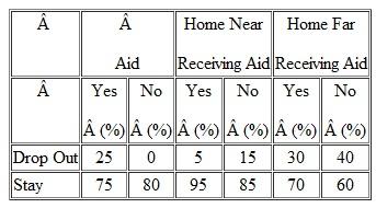
You study the attrition of entering college freshmen (those students who enter college as freshmen but don't stay to graduate.). You find the following relationships between attrition, aid, and distance of home from college. What is your interpretation Consider all variables and relationships.
Question
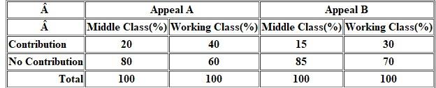
A local health agency is experimenting with two appeal letters, A and B, with which to raise funds. It sends out 400 of the A appeal and 400 of the B appeal (each subsample is divided equally among working-class and middle-class neighborhoods). The agency secures the results show in the following table.
a) Which appeal is the best
b) Which class responded better to which letter
c) Is appeal or social class a more powerful independent variable
a) Which appeal is the best
b) Which class responded better to which letter
c) Is appeal or social class a more powerful independent variable
Question
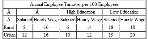
Assume you have collected data on sales associates of a large retail organization in a major metropolitan area. You analyze the data by type of work classification, education level, and whether the workers were raised in a rural or urban setting. The results are shown below. How would you interpret them
Question
Question
Question
Question

Unlock Deck
Sign up to unlock the cards in this deck!
Unlock Deck
Unlock Deck
1/9
Play
Full screen (f)
Deck 16: Exploring, Displaying, and Examining Data
1
Define or explain:
a) Marginals
b) Pareto diagram
c) Nonresistant statistics
d) Lower unit control
e) The five-number summary
a) Marginals
b) Pareto diagram
c) Nonresistant statistics
d) Lower unit control
e) The five-number summary
Marginals
The size of the table is defined by number of row cells and column cells. Marginals are defined as the total of row cells and column cells, which appear at the bottom and right of the table. It shows the sum, count and percentages of the rows and columns separately.
Pareto diagram
Pareto principle is also called as 80/20 rule, which states that 80% of the effects are from 20% of the cause. Pareto diagram is represented in the form of bar chart, in which percentages sum to 100 percent. The data can be derived from multiple choices, single or multiple response scale, frequencies from content analysis. The respondent's answers are represented using bar chart from left to right in descending order. The bar heights in the pareto chart shows the priority of each improvement area or problem to be addressed.
Non resistant Statistics
The characteristic of non resistance acts sensitive to the outliers in the data set. For instance: Consider a data set [1, 1, 2, 2, 1, 1, 1, 10], the outlier in this data is 10. The mean value for this data set is 2.3 and the median value is 1. If value 10 is replaced by 1, then mean value is around 1.25 and median value remains same. Here, mean is the non resistance statistic that is affected by outlier and median is resistance statistic that is not affected by outlier. Similarly, standard deviation is also non- resistance statistic, which gets affected by outlier.
Lower control limit
Control limits are horizontal lines drawn above and below the central line of the control chart to ensure that process is not out of control. Control limits are based on the process variation. The upper control limit is horizontal line drawn at the top of the control chart and lower control limit is horizontal line drawn at the bottom of the control chart.
The five number summary
The five number summary provides a set of descriptive statistics of the dataset. The five important percentiles are
• Sample maximum, which is the largest observation in the dataset.
• Upper quartile, which lies between the median and highest number of the dataset.
• Median, it is second quartile.
• Lower quartile, which lies between the median and smallest number of the dataset.
• Sample minimum, which is the lowest observation in the dataset.
2
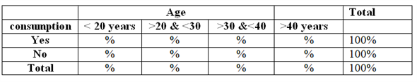
Suppose you were preparing two-way tables of percentages for the following pairs of variables. How would you run the percentages
a) Age and consumption of breakfast cereal.
b) Family income and confidence about the family's future.
c) Marital status and sports participation.
d) Crime rate and unemployment rate.
a) Age and consumption of breakfast cereal.
b) Family income and confidence about the family's future.
c) Marital status and sports participation.
d) Crime rate and unemployment rate.
Cross tabulation, which is also known as contingency table, is used to find the relationship between variables. It compares the data in tables which is represented in rows and columns.
a)
Cross tabulation can be used to calculate the percentages of two way contingency table. The age range can be column variables and consumption can be row variables (categorized into yes and no). The tabulation results show percentage values in the output that provides interpretations as "percentage of alcohol and non-alcohol people for each age group." Example output of cross tabulation result is as follows:
 b)
b)
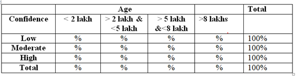
Cross tabulation can be used to calculate the percentages of two way contingency table. The family income range can be column variables and confidence can be row variables. The tabulation results show percentage values in the output that can be interpreted as "the percentage of confidence on future for each income group." Example output of cross tabulation result is as follows:
 c)
c)
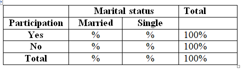
Cross tabulation can be used to calculate the percentages of two way contingency table. The marital status column variables and sports participation can be row variables (categorized into yes and no). The tabulation results show percentage values in the output that provides interpretations as "percentage of sports participation for married and single groups." Example output of cross tabulation result is as follows:
 d)
d)
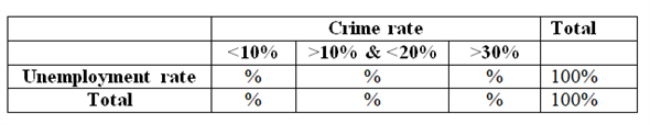
Cross tabulation can be used to calculate the percentages of two way contingency table. The crime rate range can be column variables and unemployment rate can be row variables. The tabulation results show percentage values in the output that can be interpreted as "percentage of unemployment for crime rate range." Example output of cross tabulation result is as follows:
a)
Cross tabulation can be used to calculate the percentages of two way contingency table. The age range can be column variables and consumption can be row variables (categorized into yes and no). The tabulation results show percentage values in the output that provides interpretations as "percentage of alcohol and non-alcohol people for each age group." Example output of cross tabulation result is as follows:
b)Cross tabulation can be used to calculate the percentages of two way contingency table. The family income range can be column variables and confidence can be row variables. The tabulation results show percentage values in the output that can be interpreted as "the percentage of confidence on future for each income group." Example output of cross tabulation result is as follows:
c)Cross tabulation can be used to calculate the percentages of two way contingency table. The marital status column variables and sports participation can be row variables (categorized into yes and no). The tabulation results show percentage values in the output that provides interpretations as "percentage of sports participation for married and single groups." Example output of cross tabulation result is as follows:
d)Cross tabulation can be used to calculate the percentages of two way contingency table. The crime rate range can be column variables and unemployment rate can be row variables. The tabulation results show percentage values in the output that can be interpreted as "percentage of unemployment for crime rate range." Example output of cross tabulation result is as follows:
3
You study the attrition of entering college freshmen (those students who enter college as freshmen but don't stay to graduate.). You find the following relationships between attrition, aid, and distance of home from college. What is your interpretation Consider all variables and relationships.
The percentages in data presentation are represented using 0 to 100 ranges and data is expressed into standard form witH₁00 as a base for relative comparison. In two dimension tables, the percentages should be computed in the direction of independent variable. Relative relationship in the data can be studied using percentages. Cross tabulation is also used to study the relationship between variables. A statistical test like Chi-square cannot be performed to the percentage data as it requires numerical values.
The data in the two dimension table is in percentages and moreover sample size is also not provided to convert the responses into numerical values. Hence, Chi-square test is not applicable in this case. As the data is in percentage, the sum of each row is definitely 100 percent. The interpretations among all variables and relationships are as follows:
Relationship - attrition and aid
• Among 100% of students who received aid, 75% stay to graduate and 25% were dropped out.
• Among 100% of students who did not receive aid, 80% stay to graduate and 20% were dropped out.
• It can be concluded that there is no relationship between aid and attrition as the percentage of students who did not receive aid are more to stay than the students who received and also percentage of students who dropped out more are those who received aid. So, aid does not show any impact on student decision to stay or drop out.
Relationship - attrition and home near receiving aid
• Among 100% of students who are home near receiving aid, 5% are drop outs and the rest 95% are stayed to continue graduation.
• Among 100% of students who are not home near receiving aid, 15% are drop outs and the rest 85% are stayed to continue graduation.
• It can be concluded that there is relationship between attrition, aid and distance because students whose distance is near and receiving aid are 10% more likely to continue graduation than those whose distance is near and not receiving aid.
Relationship - attrition and home far receiving aid
• Among 100% of students who are home far receiving aid, 30% are drop outs and the rest 70% are stayed to continue graduation.
• Among 100% of students who are home far and not receiving aid, 40% are drop outs and the rest 60% are stayed to continue graduation.
• It can be concluded that there is relationship between attrition, aid and distance because students whose distance is far and receiving aid are 10% more likely to continue graduation than those whose distance is far and not receiving aid.
4
A local health agency is experimenting with two appeal letters, A and B, with which to raise funds. It sends out 400 of the A appeal and 400 of the B appeal (each subsample is divided equally among working-class and middle-class neighborhoods). The agency secures the results show in the following table.
a) Which appeal is the best
b) Which class responded better to which letter
c) Is appeal or social class a more powerful independent variable
a) Which appeal is the best
b) Which class responded better to which letter
c) Is appeal or social class a more powerful independent variable
Unlock Deck
Unlock for access to all 9 flashcards in this deck.
Unlock Deck
k this deck
5
Assume you have collected data on sales associates of a large retail organization in a major metropolitan area. You analyze the data by type of work classification, education level, and whether the workers were raised in a rural or urban setting. The results are shown below. How would you interpret them
Unlock Deck
Unlock for access to all 9 flashcards in this deck.
Unlock Deck
k this deck
6
Asustek, the Taiwanese manufacturer that basically invented the netbook category, has been researching more radical design ideas, including a classy wrist-top computer, the Waveface Ultra. It is made from a bendable display that can connect to the Internet, make phone calls, and crunch data. Essentially, it's a bracelet that acts like a smartphone.
a.How might you use such a device to display stimuli for respondents
b. What is the interactive data exchange potential for researchers
a.How might you use such a device to display stimuli for respondents
b. What is the interactive data exchange potential for researchers
Unlock Deck
Unlock for access to all 9 flashcards in this deck.
Unlock Deck
k this deck
7
Identify the variables being cross-tabulated by Sammye. Identify some plausible reasons why such an exploration would be a good idea.
Unlock Deck
Unlock for access to all 9 flashcards in this deck.
Unlock Deck
k this deck
8
Use the data in Exhibit 16-5 to construct a stem-and-leaf display.
a) Where do you find the main body of the distribution
b) How many values reside outside the inner fence(s)
a) Where do you find the main body of the distribution
b) How many values reside outside the inner fence(s)
Unlock Deck
Unlock for access to all 9 flashcards in this deck.
Unlock Deck
k this deck
9
An article posted by AdAge Media News on June 18, 2012 revealed that "a study commissioned by the Online Publishers Association found that 54 percent of tablet users prefer free, ad-supported apps over paid ones, up from 40 percent a year ago. At the same time, just 19 percent of users say they prefer to pay more for apps with no ads, down from 30 percent last year."
a Which charting methods offer an accurate reflection of the data
b Which provides the most meaning Why
a Which charting methods offer an accurate reflection of the data
b Which provides the most meaning Why
Unlock Deck
Unlock for access to all 9 flashcards in this deck.
Unlock Deck
k this deck
Unlock Deck
Unlock for access to all 9 flashcards in this deck.


