Deck 22: Urbanization and Sustainable Cities
Full screen (f)
Question
We've often used very large numbers in this book. Millions of people suffer from common diseases. Hundreds of millions are moving from the country to the city. Billions of people will probably be added to the world population in the next half century. Cities that didn't exist a few decades ago now have millions of residents. How can we plot such rapid growth and such huge numbers If you use ordinary graph paper, making a scale that goes to millions or billions will run off the edge of the page unless you make the units very large.
Figure 1, for example, shows the growth of Mumbai, India, over the past 150 years plotted with an arithmetic scale (showing constant intervals) for the Y-axis. It looks as if there is very little growth in the first third of this series and then explosive growth duringthe last few decades, yet we know that the rate of growth was actually greater at the beginning than at the end of this time. How could we display this differently One way to make the graph easier to interpret is to use a logarithmic scale. A logarithmic scale, or "log scale," progresses by factor of 10. So the Y-axis would be numbered 0, 1, 10, 100, 1,000…. The effect on a graph is to spread out the smaller values and compress the larger values. In figure 2 , the same data are plotted using a log scale for the Y-axis, which makes it much easier to see what happened throughout this time period.
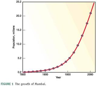
FIGURE 1 The growth of Mumbai.
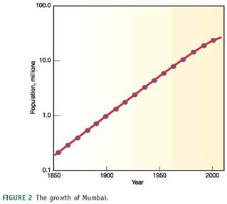
FIGURE 2 The growth of Mumbai.
Approximately how many people lived in Mumbai in 1850
Figure 1, for example, shows the growth of Mumbai, India, over the past 150 years plotted with an arithmetic scale (showing constant intervals) for the Y-axis. It looks as if there is very little growth in the first third of this series and then explosive growth duringthe last few decades, yet we know that the rate of growth was actually greater at the beginning than at the end of this time. How could we display this differently One way to make the graph easier to interpret is to use a logarithmic scale. A logarithmic scale, or "log scale," progresses by factor of 10. So the Y-axis would be numbered 0, 1, 10, 100, 1,000…. The effect on a graph is to spread out the smaller values and compress the larger values. In figure 2 , the same data are plotted using a log scale for the Y-axis, which makes it much easier to see what happened throughout this time period.
FIGURE 1 The growth of Mumbai.
FIGURE 2 The growth of Mumbai.
Approximately how many people lived in Mumbai in 1850
Question
Question
Question
We've often used very large numbers in this book. Millions of people suffer from common diseases. Hundreds of millions are moving from the country to the city. Billions of people will probably be added to the world population in the next half century. Cities that didn't exist a few decades ago now have millions of residents. How can we plot such rapid growth and such huge numbers If you use ordinary graph paper, making a scale that goes to millions or billions will run off the edge of the page unless you make the units very large.
Figure 1, for example, shows the growth of Mumbai, India, over the past 150 years plotted with an arithmetic scale (showing constant intervals) for the Y-axis. It looks as if there is very little growth in the first third of this series and then explosive growth duringthe last few decades, yet we know that the rate of growth was actually greater at the beginning than at the end of this time. How could we display this differently One way to make the graph easier to interpret is to use a logarithmic scale. A logarithmic scale, or "log scale," progresses by factor of 10. So the Y-axis would be numbered 0, 1, 10, 100, 1,000…. The effect on a graph is to spread out the smaller values and compress the larger values. In figure 2 , the same data are plotted using a log scale for the Y-axis, which makes it much easier to see what happened throughout this time period.

FIGURE 1 The growth of Mumbai.

FIGURE 2 The growth of Mumbai.
How many lived there in 2000
Figure 1, for example, shows the growth of Mumbai, India, over the past 150 years plotted with an arithmetic scale (showing constant intervals) for the Y-axis. It looks as if there is very little growth in the first third of this series and then explosive growth duringthe last few decades, yet we know that the rate of growth was actually greater at the beginning than at the end of this time. How could we display this differently One way to make the graph easier to interpret is to use a logarithmic scale. A logarithmic scale, or "log scale," progresses by factor of 10. So the Y-axis would be numbered 0, 1, 10, 100, 1,000…. The effect on a graph is to spread out the smaller values and compress the larger values. In figure 2 , the same data are plotted using a log scale for the Y-axis, which makes it much easier to see what happened throughout this time period.
FIGURE 1 The growth of Mumbai.
FIGURE 2 The growth of Mumbai.
How many lived there in 2000
Question
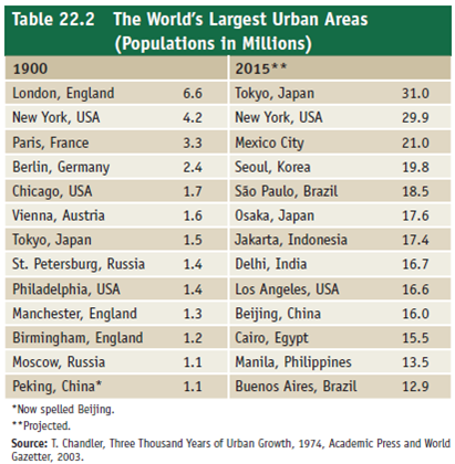
From memory, list five of the world's largest cities. Check your list against table 22.2. How many were among the largest in 1900
Question
Question
We've often used very large numbers in this book. Millions of people suffer from common diseases. Hundreds of millions are moving from the country to the city. Billions of people will probably be added to the world population in the next half century. Cities that didn't exist a few decades ago now have millions of residents. How can we plot such rapid growth and such huge numbers If you use ordinary graph paper, making a scale that goes to millions or billions will run off the edge of the page unless you make the units very large.
Figure 1, for example, shows the growth of Mumbai, India, over the past 150 years plotted with an arithmetic scale (showing constant intervals) for the Y-axis. It looks as if there is very little growth in the first third of this series and then explosive growth duringthe last few decades, yet we know that the rate of growth was actually greater at the beginning than at the end of this time. How could we display this differently One way to make the graph easier to interpret is to use a logarithmic scale. A logarithmic scale, or "log scale," progresses by factor of 10. So the Y-axis would be numbered 0, 1, 10, 100, 1,000…. The effect on a graph is to spread out the smaller values and compress the larger values. In figure 2 , the same data are plotted using a log scale for the Y-axis, which makes it much easier to see what happened throughout this time period.

FIGURE 1 The growth of Mumbai.

FIGURE 2 The growth of Mumbai.
When did growth of Mumbai begin to slow
Figure 1, for example, shows the growth of Mumbai, India, over the past 150 years plotted with an arithmetic scale (showing constant intervals) for the Y-axis. It looks as if there is very little growth in the first third of this series and then explosive growth duringthe last few decades, yet we know that the rate of growth was actually greater at the beginning than at the end of this time. How could we display this differently One way to make the graph easier to interpret is to use a logarithmic scale. A logarithmic scale, or "log scale," progresses by factor of 10. So the Y-axis would be numbered 0, 1, 10, 100, 1,000…. The effect on a graph is to spread out the smaller values and compress the larger values. In figure 2 , the same data are plotted using a log scale for the Y-axis, which makes it much easier to see what happened throughout this time period.
FIGURE 1 The growth of Mumbai.
FIGURE 2 The growth of Mumbai.
When did growth of Mumbai begin to slow
Question
Question
Question
Question
We've often used very large numbers in this book. Millions of people suffer from common diseases. Hundreds of millions are moving from the country to the city. Billions of people will probably be added to the world population in the next half century. Cities that didn't exist a few decades ago now have millions of residents. How can we plot such rapid growth and such huge numbers If you use ordinary graph paper, making a scale that goes to millions or billions will run off the edge of the page unless you make the units very large.
Figure 1, for example, shows the growth of Mumbai, India, over the past 150 years plotted with an arithmetic scale (showing constant intervals) for the Y-axis. It looks as if there is very little growth in the first third of this series and then explosive growth duringthe last few decades, yet we know that the rate of growth was actually greater at the beginning than at the end of this time. How could we display this differently One way to make the graph easier to interpret is to use a logarithmic scale. A logarithmic scale, or "log scale," progresses by factor of 10. So the Y-axis would be numbered 0, 1, 10, 100, 1,000…. The effect on a graph is to spread out the smaller values and compress the larger values. In figure 2 , the same data are plotted using a log scale for the Y-axis, which makes it much easier to see what happened throughout this time period.

FIGURE 1 The growth of Mumbai.

FIGURE 2 The growth of Mumbai.
What percentage did the population increase between 1850 and 2000
Figure 1, for example, shows the growth of Mumbai, India, over the past 150 years plotted with an arithmetic scale (showing constant intervals) for the Y-axis. It looks as if there is very little growth in the first third of this series and then explosive growth duringthe last few decades, yet we know that the rate of growth was actually greater at the beginning than at the end of this time. How could we display this differently One way to make the graph easier to interpret is to use a logarithmic scale. A logarithmic scale, or "log scale," progresses by factor of 10. So the Y-axis would be numbered 0, 1, 10, 100, 1,000…. The effect on a graph is to spread out the smaller values and compress the larger values. In figure 2 , the same data are plotted using a log scale for the Y-axis, which makes it much easier to see what happened throughout this time period.
FIGURE 1 The growth of Mumbai.
FIGURE 2 The growth of Mumbai.
What percentage did the population increase between 1850 and 2000
Question
We've often used very large numbers in this book. Millions of people suffer from common diseases. Hundreds of millions are moving from the country to the city. Billions of people will probably be added to the world population in the next half century. Cities that didn't exist a few decades ago now have millions of residents. How can we plot such rapid growth and such huge numbers If you use ordinary graph paper, making a scale that goes to millions or billions will run off the edge of the page unless you make the units very large.
Figure 1, for example, shows the growth of Mumbai, India, over the past 150 years plotted with an arithmetic scale (showing constant intervals) for the Y-axis. It looks as if there is very little growth in the first third of this series and then explosive growth duringthe last few decades, yet we know that the rate of growth was actually greater at the beginning than at the end of this time. How could we display this differently One way to make the graph easier to interpret is to use a logarithmic scale. A logarithmic scale, or "log scale," progresses by factor of 10. So the Y-axis would be numbered 0, 1, 10, 100, 1,000…. The effect on a graph is to spread out the smaller values and compress the larger values. In figure 2 , the same data are plotted using a log scale for the Y-axis, which makes it much easier to see what happened throughout this time period.

FIGURE 1 The growth of Mumbai.

FIGURE 2 The growth of Mumbai.
Do these two graphing techniques give you a different impression of what's happening in Mumbai
Figure 1, for example, shows the growth of Mumbai, India, over the past 150 years plotted with an arithmetic scale (showing constant intervals) for the Y-axis. It looks as if there is very little growth in the first third of this series and then explosive growth duringthe last few decades, yet we know that the rate of growth was actually greater at the beginning than at the end of this time. How could we display this differently One way to make the graph easier to interpret is to use a logarithmic scale. A logarithmic scale, or "log scale," progresses by factor of 10. So the Y-axis would be numbered 0, 1, 10, 100, 1,000…. The effect on a graph is to spread out the smaller values and compress the larger values. In figure 2 , the same data are plotted using a log scale for the Y-axis, which makes it much easier to see what happened throughout this time period.
FIGURE 1 The growth of Mumbai.
FIGURE 2 The growth of Mumbai.
Do these two graphing techniques give you a different impression of what's happening in Mumbai
Question
Question
Question
Question
Question
Question
We've often used very large numbers in this book. Millions of people suffer from common diseases. Hundreds of millions are moving from the country to the city. Billions of people will probably be added to the world population in the next half century. Cities that didn't exist a few decades ago now have millions of residents. How can we plot such rapid growth and such huge numbers If you use ordinary graph paper, making a scale that goes to millions or billions will run off the edge of the page unless you make the units very large.
Figure 1, for example, shows the growth of Mumbai, India, over the past 150 years plotted with an arithmetic scale (showing constant intervals) for the Y-axis. It looks as if there is very little growth in the first third of this series and then explosive growth duringthe last few decades, yet we know that the rate of growth was actually greater at the beginning than at the end of this time. How could we display this differently One way to make the graph easier to interpret is to use a logarithmic scale. A logarithmic scale, or "log scale," progresses by factor of 10. So the Y-axis would be numbered 0, 1, 10, 100, 1,000…. The effect on a graph is to spread out the smaller values and compress the larger values. In figure 2 , the same data are plotted using a log scale for the Y-axis, which makes it much easier to see what happened throughout this time period.

FIGURE 1 The growth of Mumbai.

FIGURE 2 The growth of Mumbai.
How might researchers use one or the other of these scales to convey a particular message or illustrate details in a specific part of the growth curve
Figure 1, for example, shows the growth of Mumbai, India, over the past 150 years plotted with an arithmetic scale (showing constant intervals) for the Y-axis. It looks as if there is very little growth in the first third of this series and then explosive growth duringthe last few decades, yet we know that the rate of growth was actually greater at the beginning than at the end of this time. How could we display this differently One way to make the graph easier to interpret is to use a logarithmic scale. A logarithmic scale, or "log scale," progresses by factor of 10. So the Y-axis would be numbered 0, 1, 10, 100, 1,000…. The effect on a graph is to spread out the smaller values and compress the larger values. In figure 2 , the same data are plotted using a log scale for the Y-axis, which makes it much easier to see what happened throughout this time period.
FIGURE 1 The growth of Mumbai.
FIGURE 2 The growth of Mumbai.
How might researchers use one or the other of these scales to convey a particular message or illustrate details in a specific part of the growth curve
Question
Question
Question
Question

Unlock Deck
Sign up to unlock the cards in this deck!
Unlock Deck
Unlock Deck
1/22
Play
Full screen (f)
Deck 22: Urbanization and Sustainable Cities
1
We've often used very large numbers in this book. Millions of people suffer from common diseases. Hundreds of millions are moving from the country to the city. Billions of people will probably be added to the world population in the next half century. Cities that didn't exist a few decades ago now have millions of residents. How can we plot such rapid growth and such huge numbers If you use ordinary graph paper, making a scale that goes to millions or billions will run off the edge of the page unless you make the units very large.
Figure 1, for example, shows the growth of Mumbai, India, over the past 150 years plotted with an arithmetic scale (showing constant intervals) for the Y-axis. It looks as if there is very little growth in the first third of this series and then explosive growth duringthe last few decades, yet we know that the rate of growth was actually greater at the beginning than at the end of this time. How could we display this differently One way to make the graph easier to interpret is to use a logarithmic scale. A logarithmic scale, or "log scale," progresses by factor of 10. So the Y-axis would be numbered 0, 1, 10, 100, 1,000…. The effect on a graph is to spread out the smaller values and compress the larger values. In figure 2 , the same data are plotted using a log scale for the Y-axis, which makes it much easier to see what happened throughout this time period.
FIGURE 1 The growth of Mumbai.
FIGURE 2 The growth of Mumbai.
Approximately how many people lived in Mumbai in 1850
The numbers are expressed in millions for a large population in the urban areas and billion of the people are shifting towards the urban areas from the rural areas. The graphs shown are arithmetic graph which generally has constant differences on the Y-axis. The arithmetic graph used to show the growth of Mumbai from 1850 to 2000. Another easy way to interpret the graph is Logarithmic scale, this progresses by the factor of 10. The main reason for the log scale is to spread out the small values and compress the larger values.
According to the given arithmetic and log graph, around 0.2 million people lived in the year 1850.
According to the arithmetic graph growth of the Mumbai was slow in the first decade from 1850 to 1950 but according to the log scale, the growth of Mumbai was greater at the beginning and slow at the end.
2
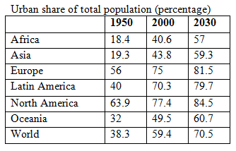
What changes in urbanization are predicted to occur in the next 30 years, and where will that change occur
The places are growing in municipal areas as there are many profits in urban places like art, crafts, profession. The cities offer freedom to experiment, meet new people, learn new people, but the rural areas have a sense of security and connection, the occupations are based on natural resources. From 1950 till 2000 the population increased and it is expected that by 2030 the population will be double in urban areas.
 It is estimated that in the next 30 years about 3 billion people will crowd the cities and the cities provide housing, transportation, jobs, clean water, proper sanitation to the 2-3 billion new residents of the urban cities thus the cities will be crowded. Cities will have better schooling, belief, business, record keeping, and political power. The changes in urbanization that are estimated to happen in the subsequent 30 years-
• More immigration from rural areas to urban areas
• More construction of the houses in a sustainable manner
• More jobs in the cities
• Sustainable developments
These changes will take place more in the emergent countries, around 90% of the human population will grow in developing countries like China and almost all the escalation will happen in the cities.
It is estimated that in the next 30 years about 3 billion people will crowd the cities and the cities provide housing, transportation, jobs, clean water, proper sanitation to the 2-3 billion new residents of the urban cities thus the cities will be crowded. Cities will have better schooling, belief, business, record keeping, and political power. The changes in urbanization that are estimated to happen in the subsequent 30 years-• More immigration from rural areas to urban areas
• More construction of the houses in a sustainable manner
• More jobs in the cities
• Sustainable developments
These changes will take place more in the emergent countries, around 90% of the human population will grow in developing countries like China and almost all the escalation will happen in the cities.
3
Look at the major urban area(s) in your state. Why were they built where they are Are those features now a benefit or drawback
NO ANSWER
4
We've often used very large numbers in this book. Millions of people suffer from common diseases. Hundreds of millions are moving from the country to the city. Billions of people will probably be added to the world population in the next half century. Cities that didn't exist a few decades ago now have millions of residents. How can we plot such rapid growth and such huge numbers If you use ordinary graph paper, making a scale that goes to millions or billions will run off the edge of the page unless you make the units very large.
Figure 1, for example, shows the growth of Mumbai, India, over the past 150 years plotted with an arithmetic scale (showing constant intervals) for the Y-axis. It looks as if there is very little growth in the first third of this series and then explosive growth duringthe last few decades, yet we know that the rate of growth was actually greater at the beginning than at the end of this time. How could we display this differently One way to make the graph easier to interpret is to use a logarithmic scale. A logarithmic scale, or "log scale," progresses by factor of 10. So the Y-axis would be numbered 0, 1, 10, 100, 1,000…. The effect on a graph is to spread out the smaller values and compress the larger values. In figure 2 , the same data are plotted using a log scale for the Y-axis, which makes it much easier to see what happened throughout this time period.
FIGURE 1 The growth of Mumbai.
FIGURE 2 The growth of Mumbai.
How many lived there in 2000
Unlock Deck
Unlock for access to all 22 flashcards in this deck.
Unlock Deck
k this deck
5
From memory, list five of the world's largest cities. Check your list against table 22.2. How many were among the largest in 1900
Unlock Deck
Unlock for access to all 22 flashcards in this deck.
Unlock Deck
k this deck
6
Weigh the costs and benefits of automobiles in modern American life. Is there a way to have the freedom and convenience of a private automobile without its negative aspects
Unlock Deck
Unlock for access to all 22 flashcards in this deck.
Unlock Deck
k this deck
7
We've often used very large numbers in this book. Millions of people suffer from common diseases. Hundreds of millions are moving from the country to the city. Billions of people will probably be added to the world population in the next half century. Cities that didn't exist a few decades ago now have millions of residents. How can we plot such rapid growth and such huge numbers If you use ordinary graph paper, making a scale that goes to millions or billions will run off the edge of the page unless you make the units very large.
Figure 1, for example, shows the growth of Mumbai, India, over the past 150 years plotted with an arithmetic scale (showing constant intervals) for the Y-axis. It looks as if there is very little growth in the first third of this series and then explosive growth duringthe last few decades, yet we know that the rate of growth was actually greater at the beginning than at the end of this time. How could we display this differently One way to make the graph easier to interpret is to use a logarithmic scale. A logarithmic scale, or "log scale," progresses by factor of 10. So the Y-axis would be numbered 0, 1, 10, 100, 1,000…. The effect on a graph is to spread out the smaller values and compress the larger values. In figure 2 , the same data are plotted using a log scale for the Y-axis, which makes it much easier to see what happened throughout this time period.
FIGURE 1 The growth of Mumbai.
FIGURE 2 The growth of Mumbai.
When did growth of Mumbai begin to slow
Unlock Deck
Unlock for access to all 22 flashcards in this deck.
Unlock Deck
k this deck
8
Describe the current conditions in a typical megacity of the developing world. What forces contribute to its growth
Unlock Deck
Unlock for access to all 22 flashcards in this deck.
Unlock Deck
k this deck
9
Boulder, Colorado, has been a leader in controlling urban growth. One consequence is that the city has stayed small and charming, so housing prices have skyrocketed and poor people have been driven out. If you lived in Boulder, what solutions might you suggest What do you think is an optimum city size
Unlock Deck
Unlock for access to all 22 flashcards in this deck.
Unlock Deck
k this deck
10
Picture yourself living in a rural village or a developing world city. What aspects of life there would you enjoy What would be the most difficult for you to accept
Unlock Deck
Unlock for access to all 22 flashcards in this deck.
Unlock Deck
k this deck
11
We've often used very large numbers in this book. Millions of people suffer from common diseases. Hundreds of millions are moving from the country to the city. Billions of people will probably be added to the world population in the next half century. Cities that didn't exist a few decades ago now have millions of residents. How can we plot such rapid growth and such huge numbers If you use ordinary graph paper, making a scale that goes to millions or billions will run off the edge of the page unless you make the units very large.
Figure 1, for example, shows the growth of Mumbai, India, over the past 150 years plotted with an arithmetic scale (showing constant intervals) for the Y-axis. It looks as if there is very little growth in the first third of this series and then explosive growth duringthe last few decades, yet we know that the rate of growth was actually greater at the beginning than at the end of this time. How could we display this differently One way to make the graph easier to interpret is to use a logarithmic scale. A logarithmic scale, or "log scale," progresses by factor of 10. So the Y-axis would be numbered 0, 1, 10, 100, 1,000…. The effect on a graph is to spread out the smaller values and compress the larger values. In figure 2 , the same data are plotted using a log scale for the Y-axis, which makes it much easier to see what happened throughout this time period.
FIGURE 1 The growth of Mumbai.
FIGURE 2 The growth of Mumbai.
What percentage did the population increase between 1850 and 2000
Unlock Deck
Unlock for access to all 22 flashcards in this deck.
Unlock Deck
k this deck
12
We've often used very large numbers in this book. Millions of people suffer from common diseases. Hundreds of millions are moving from the country to the city. Billions of people will probably be added to the world population in the next half century. Cities that didn't exist a few decades ago now have millions of residents. How can we plot such rapid growth and such huge numbers If you use ordinary graph paper, making a scale that goes to millions or billions will run off the edge of the page unless you make the units very large.
Figure 1, for example, shows the growth of Mumbai, India, over the past 150 years plotted with an arithmetic scale (showing constant intervals) for the Y-axis. It looks as if there is very little growth in the first third of this series and then explosive growth duringthe last few decades, yet we know that the rate of growth was actually greater at the beginning than at the end of this time. How could we display this differently One way to make the graph easier to interpret is to use a logarithmic scale. A logarithmic scale, or "log scale," progresses by factor of 10. So the Y-axis would be numbered 0, 1, 10, 100, 1,000…. The effect on a graph is to spread out the smaller values and compress the larger values. In figure 2 , the same data are plotted using a log scale for the Y-axis, which makes it much easier to see what happened throughout this time period.
FIGURE 1 The growth of Mumbai.
FIGURE 2 The growth of Mumbai.
Do these two graphing techniques give you a different impression of what's happening in Mumbai
Unlock Deck
Unlock for access to all 22 flashcards in this deck.
Unlock Deck
k this deck
13
Describe the difference between slums and shantytowns.
Unlock Deck
Unlock for access to all 22 flashcards in this deck.
Unlock Deck
k this deck
14
What is the difference between a city and a village and between rural and urban
Unlock Deck
Unlock for access to all 22 flashcards in this deck.
Unlock Deck
k this deck
15
Why are urban areas in U.S. cities decaying
Unlock Deck
Unlock for access to all 22 flashcards in this deck.
Unlock Deck
k this deck
16
Why would people move to one of the megacities of the developing world if conditions are so difficult there
Unlock Deck
Unlock for access to all 22 flashcards in this deck.
Unlock Deck
k this deck
17
How has transportation affected the development of cities What have been the benefits and disadvantages of freeways
Unlock Deck
Unlock for access to all 22 flashcards in this deck.
Unlock Deck
k this deck
18
We've often used very large numbers in this book. Millions of people suffer from common diseases. Hundreds of millions are moving from the country to the city. Billions of people will probably be added to the world population in the next half century. Cities that didn't exist a few decades ago now have millions of residents. How can we plot such rapid growth and such huge numbers If you use ordinary graph paper, making a scale that goes to millions or billions will run off the edge of the page unless you make the units very large.
Figure 1, for example, shows the growth of Mumbai, India, over the past 150 years plotted with an arithmetic scale (showing constant intervals) for the Y-axis. It looks as if there is very little growth in the first third of this series and then explosive growth duringthe last few decades, yet we know that the rate of growth was actually greater at the beginning than at the end of this time. How could we display this differently One way to make the graph easier to interpret is to use a logarithmic scale. A logarithmic scale, or "log scale," progresses by factor of 10. So the Y-axis would be numbered 0, 1, 10, 100, 1,000…. The effect on a graph is to spread out the smaller values and compress the larger values. In figure 2 , the same data are plotted using a log scale for the Y-axis, which makes it much easier to see what happened throughout this time period.
FIGURE 1 The growth of Mumbai.
FIGURE 2 The growth of Mumbai.
How might researchers use one or the other of these scales to convey a particular message or illustrate details in a specific part of the growth curve
Unlock Deck
Unlock for access to all 22 flashcards in this deck.
Unlock Deck
k this deck
19
Describe some ways that American cities and suburbs could be redesigned to be more ecologically sound, socially just, and culturally amenable.
Unlock Deck
Unlock for access to all 22 flashcards in this deck.
Unlock Deck
k this deck
20
How many people now live in cities, and how many live in rural areas worldwide
Unlock Deck
Unlock for access to all 22 flashcards in this deck.
Unlock Deck
k this deck
21
Explain the difference between greenfield and brownfield development. Why is brownfield development becoming popular
Unlock Deck
Unlock for access to all 22 flashcards in this deck.
Unlock Deck
k this deck
22
A city could be considered an ecosystem. Using what you learned in chapters 3 and 4, describe the structure and function of a city in ecological terms.
Unlock Deck
Unlock for access to all 22 flashcards in this deck.
Unlock Deck
k this deck
Unlock Deck
Unlock for access to all 22 flashcards in this deck.


