Deck 2: Frequency Distributions and Graphs
Full screen (f)
Question
Question
Question
Question
Question
Question
Question
Question
Question
Question
Question
Question
Question
Question
Question
Question
Question
Question
Question
Question
Question
Question
Question
Question
Question
Question
Question
Question
Question
Question
Question
Question
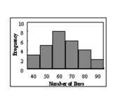 Find the class with the least number of data values.
A)70
B)90
C)60
D)40
Question
Question
Question
 Find the class with the greatest number of data values.
A)70
B)90
C)60
D)40
Question
Question
Question
Question
Question
Question
Given the following frequency distribution, how many pieces of data were less than 28.5? 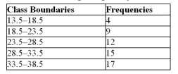
A)12
B)9
C)25
D)17
A)12
B)9
C)25
D)17
Question
Question
Question
The total frequency of the data whose ogive shown below 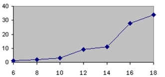 is approximately
A)12
B)18
C)34
D)90
is approximatelyA)12
B)18
C)34
D)90
Question
Question
Which of the following could be an ogive?
A)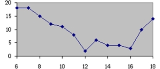
B)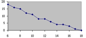
C)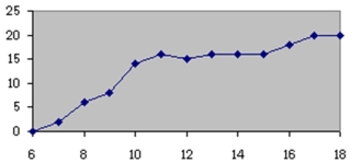
D)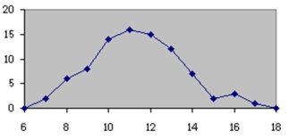
A)
B)
C)
D)
Question
Question
Which of the following is a frequency polygon?
A)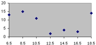
B)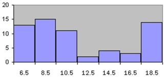
C)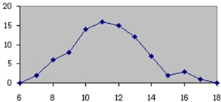
D)
A)
B)
C)
D)
Question
Question
Question
Which of the following could be a cumulative frequency graph?
A)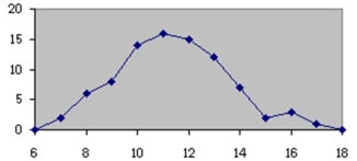
B)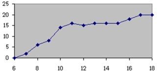
C)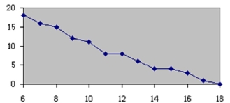 D
D
A)
B)
C)
D Question
Question
Question
The total frequency of the data whose histogram is shown below is approximately
A)11
B)22
A)11
B)22
Question
Question
Which of the following is a histogram?
A)
B)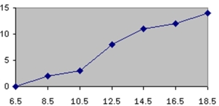
C)
D)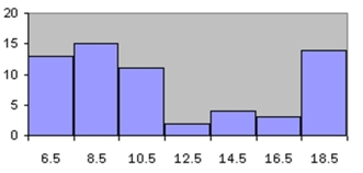
A)
B)
C)
D)
Question
Question
 What type of graph is the figure below?
A)Pareto chart
B)pictograph
C)ogive
D)pie graph
Question
Question
Which of the following is a Pareto chart?
A)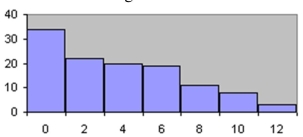
B)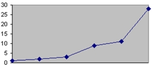
C)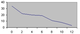
D)
A)
B)
C)
D)
Question
Question
 Construct a Pareto chart for the following distribution:
 Question
Question
Question
 Construct a Pareto chart for the following distribution:
 Question
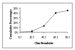 In the figure below, what class boundary has 30% of the data?
A)0.5-20.5
B)20.5-40.5
C)40.5-60.5
D)60.5-80.5
Question
Question
Choose the correct statement describing the following stem and leaf plot for grades on a linear algebra exam. 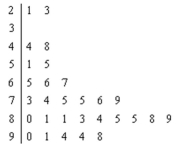
A)The range of the grades is between 23 and 98.
B)Of the 29 students who took the exam, nine scored between 80 and 89.
C)There are no gaps in the data.
D)The data is bimodal.
A)The range of the grades is between 23 and 98.
B)Of the 29 students who took the exam, nine scored between 80 and 89.
C)There are no gaps in the data.
D)The data is bimodal.
Question
Question
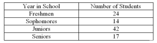
The following information shows the colours of cars preferred by customers.Draw
a pie graph and indicate how many degrees the black represents in a pie graph?
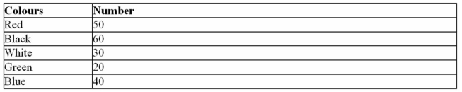
a pie graph and indicate how many degrees the black represents in a pie graph?
Question
A local fundraiser wants to graphically display the contributions they have
received over the past five years.Construct a time series graph for the following
data.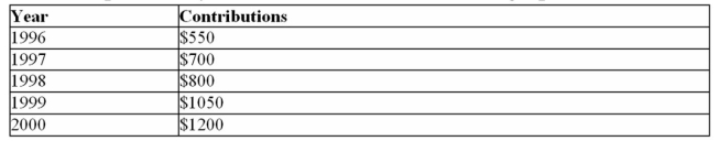
received over the past five years.Construct a time series graph for the following
data.
Question
 Construct a pie chart for the following distribution:
 Question
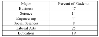
For the table below, calculate the percent of students that fell within the B class. 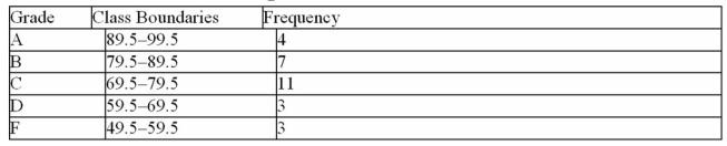
A)14%
B)25%
C)11%
D)39%
A)14%
B)25%
C)11%
D)39%
Question
Using the following frequency distribution, construct a frequency
polygon.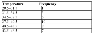
polygon.
Question
Question
Question
Question
 Construct a pie chart for the following distribution:
 Question

Unlock Deck
Sign up to unlock the cards in this deck!
Unlock Deck
Unlock Deck
1/79
Play
Full screen (f)
Deck 2: Frequency Distributions and Graphs
1
An ogive and a frequency polygon have the same overall shape.
False
2
When two sets of data are compared on the same graph using two lines, it is called a compound time
series graph.
series graph.
True
3
The cumulative frequency is the sum of the frequencies accumulated to the upper boundary of a class in
the distribution.
the distribution.
True
4
A histogram is a graph that represents the cumulative frequencies for the classes in a frequency
distribution.
distribution.
Unlock Deck
Unlock for access to all 79 flashcards in this deck.
Unlock Deck
k this deck
5
A grouped frequency distribution is used when the range of the data values is relatively small.
Unlock Deck
Unlock for access to all 79 flashcards in this deck.
Unlock Deck
k this deck
6
A time series graph represents data that occur over a specific period.
Unlock Deck
Unlock for access to all 79 flashcards in this deck.
Unlock Deck
k this deck
7
A pie graph was created showing the number of children per family.If 234 families were in the survey
and the section depicting families with three children represented 120°, the number of families with three
children was 78.
and the section depicting families with three children represented 120°, the number of families with three
children was 78.
Unlock Deck
Unlock for access to all 79 flashcards in this deck.
Unlock Deck
k this deck
8
The lower class limit represents the smallest data value that can be included in the class.
Unlock Deck
Unlock for access to all 79 flashcards in this deck.
Unlock Deck
k this deck
9
A Pareto chart is useful for showing percentages of the total.
Unlock Deck
Unlock for access to all 79 flashcards in this deck.
Unlock Deck
k this deck
10
A pie graph would best represent the number of inches of rain that has fallen in Thunder Bay, Ontario
each day for the past 2 months.
each day for the past 2 months.
Unlock Deck
Unlock for access to all 79 flashcards in this deck.
Unlock Deck
k this deck
11
A frequency polygon and a histogram have the same overall shape.
Unlock Deck
Unlock for access to all 79 flashcards in this deck.
Unlock Deck
k this deck
12
An ogive graph is also called a cumulative frequency graph.
Unlock Deck
Unlock for access to all 79 flashcards in this deck.
Unlock Deck
k this deck
13
A histogram uses the midpoints for the x values and the frequencies as the y values.
Unlock Deck
Unlock for access to all 79 flashcards in this deck.
Unlock Deck
k this deck
14
Graphs give a visual representation that enables readers to analyze and interpret data more easily than
they could simply by looking at numbers.
they could simply by looking at numbers.
Unlock Deck
Unlock for access to all 79 flashcards in this deck.
Unlock Deck
k this deck
15
A Pareto chart arranges data from largest to smallest according to frequencies.
Unlock Deck
Unlock for access to all 79 flashcards in this deck.
Unlock Deck
k this deck
16
The frequency polygon is a graph that displays the data by using lines that connect points plotted for the
frequencies at the midpoints of the classes.
frequencies at the midpoints of the classes.
Unlock Deck
Unlock for access to all 79 flashcards in this deck.
Unlock Deck
k this deck
17
A stem and leaf plot is useful for keeping more precision than a grouped frequency distribution.
Unlock Deck
Unlock for access to all 79 flashcards in this deck.
Unlock Deck
k this deck
18
If the limits for a class were 20-38, the boundaries would be 19.5-38.5.
Unlock Deck
Unlock for access to all 79 flashcards in this deck.
Unlock Deck
k this deck
19
For the class 16.3-23.8, the width is 7.
Unlock Deck
Unlock for access to all 79 flashcards in this deck.
Unlock Deck
k this deck
20
A time series graph is useful for detecting long term trends over a period of time.
Unlock Deck
Unlock for access to all 79 flashcards in this deck.
Unlock Deck
k this deck
21
A stem and leaf plot is a data plot that uses part of a data value as the stem and part of the data value as
the leaf to form groups or classes.
the leaf to form groups or classes.
Unlock Deck
Unlock for access to all 79 flashcards in this deck.
Unlock Deck
k this deck
22
The larger the sample size, the larger the relative frequencies.
Unlock Deck
Unlock for access to all 79 flashcards in this deck.
Unlock Deck
k this deck
23
What is the midpoint of the class 4-15?
A)4
B)9.5
C)4 and 15
D)9.5 and 11
A)4
B)9.5
C)4 and 15
D)9.5 and 11
Unlock Deck
Unlock for access to all 79 flashcards in this deck.
Unlock Deck
k this deck
24
What is the lower class limit in the class 13-17?
A)15
B)17
C)13
D)12.5
A)15
B)17
C)13
D)12.5
Unlock Deck
Unlock for access to all 79 flashcards in this deck.
Unlock Deck
k this deck
25
Which of the following should not be done when constructing a frequency distribution?
A)select the number of classes desired
B)find the range
C)use a class width with an even number
D)use classes that are mutually exclusive
A)select the number of classes desired
B)find the range
C)use a class width with an even number
D)use classes that are mutually exclusive
Unlock Deck
Unlock for access to all 79 flashcards in this deck.
Unlock Deck
k this deck
26
The rate of mortality of children is very high in the first weeks of life.It then decreases rapidly until 1 or
2 years of age and then increases slowly into the teen years.In this situation one should construct relative
frequency distributions (per year of age) with narrow class widths during the first year of life so as to
exhibit the quickly changing mortality rate.
2 years of age and then increases slowly into the teen years.In this situation one should construct relative
frequency distributions (per year of age) with narrow class widths during the first year of life so as to
exhibit the quickly changing mortality rate.
Unlock Deck
Unlock for access to all 79 flashcards in this deck.
Unlock Deck
k this deck
27
One disadvantage of pie charts is that it is difficult to visually compare 2 frequency distributions.Plotting
relative frequency distributions (polygons or ogives) on the same axes is usually more informative.
relative frequency distributions (polygons or ogives) on the same axes is usually more informative.
Unlock Deck
Unlock for access to all 79 flashcards in this deck.
Unlock Deck
k this deck
28
What are the boundaries of the class 1.87-3.43?
A)1.9-3.4
B)1.87-3.43
C)1.879-3.439
D)1.865-3.435
A)1.9-3.4
B)1.87-3.43
C)1.879-3.439
D)1.865-3.435
Unlock Deck
Unlock for access to all 79 flashcards in this deck.
Unlock Deck
k this deck
29
What are the boundaries of the class 4-18?
A)4
B)14
C)4 and 18
D)3.5 and 14.5
A)4
B)14
C)4 and 18
D)3.5 and 14.5
Unlock Deck
Unlock for access to all 79 flashcards in this deck.
Unlock Deck
k this deck
30
In order to graphically compare two frequency distributions, one should use relative frequency
distributions in order to take differing sample sizes into account.
distributions in order to take differing sample sizes into account.
Unlock Deck
Unlock for access to all 79 flashcards in this deck.
Unlock Deck
k this deck
31
Using the class 23-35, what is the upper class boundary?
A)35
B)29
C)35.5
D)23
A)35
B)29
C)35.5
D)23
Unlock Deck
Unlock for access to all 79 flashcards in this deck.
Unlock Deck
k this deck
32
Find the class with the least number of data values.A)70
B)90
C)60
D)40
Unlock Deck
Unlock for access to all 79 flashcards in this deck.
Unlock Deck
k this deck
33
What would be the boundaries on the average age for high school graduates if they were reported to be 18 years old?
A)17.5-18.5 years old
B)17.5-19.5 years old
C)17.6-18.6 years old
D)17.5-19 years old
A)17.5-18.5 years old
B)17.5-19.5 years old
C)17.6-18.6 years old
D)17.5-19 years old
Unlock Deck
Unlock for access to all 79 flashcards in this deck.
Unlock Deck
k this deck
34
Thirty students recorded the colours of their eyes, choosing from the colours brown, blue, green, hazel, and black.This data can be appropriately summarized in a
A)Open-ended distribution
B)Categorical frequency distribution
C)Grouped frequency distribution
D)Upper boundary
A)Open-ended distribution
B)Categorical frequency distribution
C)Grouped frequency distribution
D)Upper boundary
Unlock Deck
Unlock for access to all 79 flashcards in this deck.
Unlock Deck
k this deck
35
Find the class with the greatest number of data values.A)70
B)90
C)60
D)40
Unlock Deck
Unlock for access to all 79 flashcards in this deck.
Unlock Deck
k this deck
36
For the class 10-18, the upper class limit is
A)9
B)10
C)18
D)19
A)9
B)10
C)18
D)19
Unlock Deck
Unlock for access to all 79 flashcards in this deck.
Unlock Deck
k this deck
37
What is the midpoint of the classes 13.5-17.3?
A)13.4
B)15.4
C)17.3
D)14.3
A)13.4
B)15.4
C)17.3
D)14.3
Unlock Deck
Unlock for access to all 79 flashcards in this deck.
Unlock Deck
k this deck
38
What is the lower class limit in the class -7 to 14
A)-7
B)3.5
C)14
D)-7.5
A)-7
B)3.5
C)14
D)-7.5
Unlock Deck
Unlock for access to all 79 flashcards in this deck.
Unlock Deck
k this deck
39
For the numbers -5, -2, -7, and 0, which of the following that includes all four is a good class?
A)-8 to 1
B)-5 to 1
C)-7 to 0
D)-7 to 1
A)-8 to 1
B)-5 to 1
C)-7 to 0
D)-7 to 1
Unlock Deck
Unlock for access to all 79 flashcards in this deck.
Unlock Deck
k this deck
40
Greg wants to construct a frequency distribution for the political affiliation of the employees at Owen's Hardware Store.What type of distribution should he use?
A)ungrouped
B)grouped
C)categorical
D)cumulative
A)ungrouped
B)grouped
C)categorical
D)cumulative
Unlock Deck
Unlock for access to all 79 flashcards in this deck.
Unlock Deck
k this deck
41
Given the following frequency distribution, how many pieces of data were less than 28.5?
A)12
B)9
C)25
D)17
A)12
B)9
C)25
D)17
Unlock Deck
Unlock for access to all 79 flashcards in this deck.
Unlock Deck
k this deck
42
An automobile dealer wants to construct a pie graph to represent types of cars sold in July.He sold 72 cars; 16 of which were convertibles.The convertibles will represent how many degrees in the circle?
A)60°
B)80°
C)100°
D)50°
A)60°
B)80°
C)100°
D)50°
Unlock Deck
Unlock for access to all 79 flashcards in this deck.
Unlock Deck
k this deck
43
A pie graph is not useful to show which of the following characteristics of data?
A)The trend of the data over time
B)The relative frequencies of each category of the distribution
C)Which categories make up the larger proportions of the total
D)Which categories make up the smaller proportions of the total
A)The trend of the data over time
B)The relative frequencies of each category of the distribution
C)Which categories make up the larger proportions of the total
D)Which categories make up the smaller proportions of the total
Unlock Deck
Unlock for access to all 79 flashcards in this deck.
Unlock Deck
k this deck
44
The total frequency of the data whose ogive shown below is approximately
A)12
B)18
C)34
D)90
is approximatelyA)12
B)18
C)34
D)90
Unlock Deck
Unlock for access to all 79 flashcards in this deck.
Unlock Deck
k this deck
45
A weatherman records the amount of rain that has fallen in Vancouver, B.C. during each day.What type of graph should he use?
A)pie graph
B)pictograph
C)time series graph
D)ogive
A)pie graph
B)pictograph
C)time series graph
D)ogive
Unlock Deck
Unlock for access to all 79 flashcards in this deck.
Unlock Deck
k this deck
46
Which of the following could be an ogive?
A)
B)
C)
D)
A)
B)
C)
D)
Unlock Deck
Unlock for access to all 79 flashcards in this deck.
Unlock Deck
k this deck
47
In a pie graph, if pepperoni pizza were 24/72 of the distribution, how many degrees would be needed to represent pepperoni?
A)90°
B)120°
C)60°
D)150°
A)90°
B)120°
C)60°
D)150°
Unlock Deck
Unlock for access to all 79 flashcards in this deck.
Unlock Deck
k this deck
48
Which of the following is a frequency polygon?
A)
B)
C)
D)
A)
B)
C)
D)
Unlock Deck
Unlock for access to all 79 flashcards in this deck.
Unlock Deck
k this deck
49
Exaggerating a one-dimensional increase by showing it in two dimensions is an example of a(n)
A)pictograph.
B)pie graph.
C)ogive.
D)misleading graph.
A)pictograph.
B)pie graph.
C)ogive.
D)misleading graph.
Unlock Deck
Unlock for access to all 79 flashcards in this deck.
Unlock Deck
k this deck
50
Which graph should be used to represent the frequencies that certain types of classes are taken at Sir Robert Borden High School?
A)Pareto chart
B)time series graph
C)pie graph
D)pictograph
A)Pareto chart
B)time series graph
C)pie graph
D)pictograph
Unlock Deck
Unlock for access to all 79 flashcards in this deck.
Unlock Deck
k this deck
51
Which of the following could be a cumulative frequency graph?
A)
B)
C) D
A)
B)
C)
D Unlock Deck
Unlock for access to all 79 flashcards in this deck.
Unlock Deck
k this deck
52
Pareto charts have units that are used for the frequency that are
A)decreasing in size.
B)increasing in size.
C)equal in size.
D)proportional in size.
A)decreasing in size.
B)increasing in size.
C)equal in size.
D)proportional in size.
Unlock Deck
Unlock for access to all 79 flashcards in this deck.
Unlock Deck
k this deck
53
The graphs that have their distributions as proportions instead of raw data as frequencies are called
A)relative frequency graphs.
B)ogive graphs.
C)histograms.
A)relative frequency graphs.
B)ogive graphs.
C)histograms.
Unlock Deck
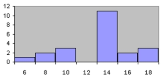
Unlock for access to all 79 flashcards in this deck.
Unlock Deck
k this deck
54
The total frequency of the data whose histogram is shown below is approximately
A)11
B)22
A)11
B)22
Unlock Deck
Unlock for access to all 79 flashcards in this deck.
Unlock Deck
k this deck
55
A time series graph is useful for which of the following purposes?
A)Representing relative frequencies of categories in a specific year
B)Representing the cumulative frequencies of the data in a specific year
C)Representing the frequencies of the data, sorted from largest to smallest
D)Representing the frequencies of a data category over a period of several years
A)Representing relative frequencies of categories in a specific year
B)Representing the cumulative frequencies of the data in a specific year
C)Representing the frequencies of the data, sorted from largest to smallest
D)Representing the frequencies of a data category over a period of several years
Unlock Deck
Unlock for access to all 79 flashcards in this deck.
Unlock Deck
k this deck
56
Which of the following is a histogram?
A)
B)
C)
D)
A)
B)
C)
D)
Unlock Deck
Unlock for access to all 79 flashcards in this deck.
Unlock Deck
k this deck
57
A Pareto chart does not have which of the following properties?
A)It is a bar chart
B)The frequencies are arranged from highest to lowest
C)The frequencies are arranged from lowest to highest
D)It is used to represent categorical data
A)It is a bar chart
B)The frequencies are arranged from highest to lowest
C)The frequencies are arranged from lowest to highest
D)It is used to represent categorical data
Unlock Deck
Unlock for access to all 79 flashcards in this deck.
Unlock Deck
k this deck
58
What type of graph is the figure below?A)Pareto chart
B)pictograph
C)ogive
D)pie graph
Unlock Deck
Unlock for access to all 79 flashcards in this deck.
Unlock Deck
k this deck
59
Which type of graph represents the data by using vertical bars of various heights to indicate frequencies?
A)ogive
B)frequency polygon
C)histogram
D)cumulative frequency
A)ogive
B)frequency polygon
C)histogram
D)cumulative frequency
Unlock Deck
Unlock for access to all 79 flashcards in this deck.
Unlock Deck
k this deck
60
Which of the following is a Pareto chart?
A)
B)
C)
D)
A)
B)
C)
D)
Unlock Deck
Unlock for access to all 79 flashcards in this deck.
Unlock Deck
k this deck
61
The percentage of white, wheat, and rye bread sold at a supermarket each week is best shown using a
__________ graph
________________________________________
__________ graph
________________________________________
Unlock Deck
Unlock for access to all 79 flashcards in this deck.
Unlock Deck
k this deck
62
Construct a Pareto chart for the following distribution: Unlock Deck
Unlock for access to all 79 flashcards in this deck.
Unlock Deck
k this deck
63
Karen is constructing a pie graph to represent the number of hours her classmates do homework each day. She found that 8/24 did homework for three hours each day.In her pie graph, this would represent how
Many degrees?
A)135°
B)45°
C)120°
D)240°
Many degrees?
A)135°
B)45°
C)120°
D)240°
Unlock Deck
Unlock for access to all 79 flashcards in this deck.
Unlock Deck
k this deck
64
When the range is large and classes that are several units in width are needed, a __________ frequency
distribution is used.
________________________________________
distribution is used.
________________________________________
Unlock Deck
Unlock for access to all 79 flashcards in this deck.
Unlock Deck
k this deck
65
Construct a Pareto chart for the following distribution: Unlock Deck
Unlock for access to all 79 flashcards in this deck.
Unlock Deck
k this deck
66
In the figure below, what class boundary has 30% of the data?A)0.5-20.5
B)20.5-40.5
C)40.5-60.5
D)60.5-80.5
Unlock Deck
Unlock for access to all 79 flashcards in this deck.
Unlock Deck
k this deck
67
A __________ would most appropriately represent the yearly-number of students that were enrolled in
Statistics over the past ten years.
________________________________________
Statistics over the past ten years.
________________________________________
Unlock Deck
Unlock for access to all 79 flashcards in this deck.
Unlock Deck
k this deck
68
Choose the correct statement describing the following stem and leaf plot for grades on a linear algebra exam.
A)The range of the grades is between 23 and 98.
B)Of the 29 students who took the exam, nine scored between 80 and 89.
C)There are no gaps in the data.
D)The data is bimodal.
A)The range of the grades is between 23 and 98.
B)Of the 29 students who took the exam, nine scored between 80 and 89.
C)There are no gaps in the data.
D)The data is bimodal.
Unlock Deck
Unlock for access to all 79 flashcards in this deck.
Unlock Deck
k this deck
69
The __________ is obtained by first adding the lower and upper limits and then dividing by 2.
________________________________________
________________________________________
Unlock Deck
Unlock for access to all 79 flashcards in this deck.
Unlock Deck
k this deck
70
The following information shows the colours of cars preferred by customers.Draw
a pie graph and indicate how many degrees the black represents in a pie graph?
a pie graph and indicate how many degrees the black represents in a pie graph?
Unlock Deck
Unlock for access to all 79 flashcards in this deck.
Unlock Deck
k this deck
71
A local fundraiser wants to graphically display the contributions they have
received over the past five years.Construct a time series graph for the following
data.
received over the past five years.Construct a time series graph for the following
data.
Unlock Deck
Unlock for access to all 79 flashcards in this deck.
Unlock Deck
k this deck
72
Construct a pie chart for the following distribution: Unlock Deck
Unlock for access to all 79 flashcards in this deck.
Unlock Deck
k this deck
73
For the table below, calculate the percent of students that fell within the B class.
A)14%
B)25%
C)11%
D)39%
A)14%
B)25%
C)11%
D)39%
Unlock Deck
Unlock for access to all 79 flashcards in this deck.
Unlock Deck
k this deck
74
Using the following frequency distribution, construct a frequency
polygon.
polygon.
Unlock Deck
Unlock for access to all 79 flashcards in this deck.
Unlock Deck
k this deck
75
When data are collected in original form, they are called __________.
________________________________________
________________________________________
Unlock Deck
Unlock for access to all 79 flashcards in this deck.
Unlock Deck
k this deck
76
If a frequency distribution had class boundaries of 132.5-147.5, what would be the class width?
Unlock Deck
Unlock for access to all 79 flashcards in this deck.
Unlock Deck
k this deck
77
The three most commonly used graphs in research are the histogram, the __________, and the cumulative
frequency graph (ogive).
________________________________________
frequency graph (ogive).
________________________________________
Unlock Deck
Unlock for access to all 79 flashcards in this deck.
Unlock Deck
k this deck
78
Construct a pie chart for the following distribution: Unlock Deck
Unlock for access to all 79 flashcards in this deck.
Unlock Deck
k this deck
79
The __________ is the number of values in a specific class of a frequency distribution.
________________________________________
________________________________________
Unlock Deck
Unlock for access to all 79 flashcards in this deck.
Unlock Deck
k this deck
Unlock Deck
Unlock for access to all 79 flashcards in this deck.


