Deck 1: Extension: Understanding Graphs
Full screen (f)
Question
Question
Question
Use the figure The Production Possibilities Frontier I. What is the x-variable in this graph?
Figure: The Production Possibilities Frontier I

A) point G
B) point I
C) the quantity of televisions
D) the quantity of lamps
Figure: The Production Possibilities Frontier I
A) point G
B) point I
C) the quantity of televisions
D) the quantity of lamps
Question
Use the figure The Production Possibilities Frontier I. What is the value of the x-variable at point F in this graph?
Figure: The Production Possibilities Frontier I
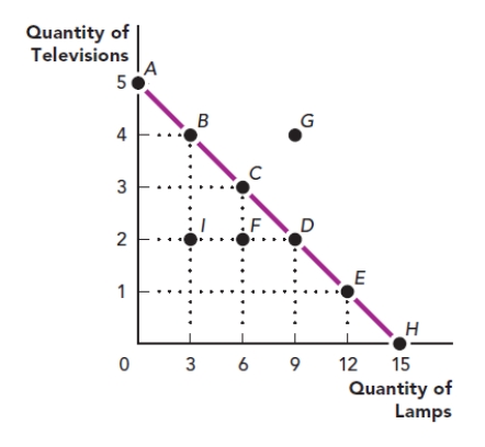
A) six lamps
B) two televisions
C) six televisions
D) two lamps
Figure: The Production Possibilities Frontier I
A) six lamps
B) two televisions
C) six televisions
D) two lamps
Question
Use the figure The Production Possibilities Frontier I. What are the coordinates of point E in this graph?
Figure: The Production Possibilities Frontier I

A) 12 televisions and one lamp
B) 12 lamps and one television
C) four televisions and 12 lamps
D) 12 lamps and two televisions
Figure: The Production Possibilities Frontier I
A) 12 televisions and one lamp
B) 12 lamps and one television
C) four televisions and 12 lamps
D) 12 lamps and two televisions
Question
Question
Question
Question
Question
Question
Question
Use the figure The Production Possibilities Frontier III. What is the slope of the line between point H and point I?
Figure: The Production Possibilities Frontier III

A) -3
B) -6/5
C) -9/10
D) 5
Figure: The Production Possibilities Frontier III
A) -3
B) -6/5
C) -9/10
D) 5
Question
Use the figure The Production Possibilities Frontier III. What is the slope of the line between point I and point K?
Figure: The Production Possibilities Frontier III
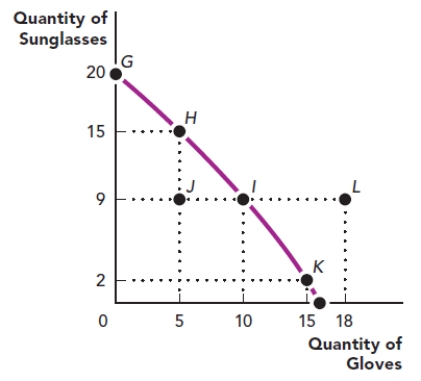
A) 7.5
B) -9/10
C) 9
D) -7/5
Figure: The Production Possibilities Frontier III
A) 7.5
B) -9/10
C) 9
D) -7/5
Question
Use the figure The Net Loss to Society Due to the Overproduction of a Good. What is the area of the shaded triangle in this graph?
Figure: The Net Loss to Society Due to the Overproduction of a Good
A) $575
B) $40
C) $20
D) $345
Figure: The Net Loss to Society Due to the Overproduction of a Good
A) $575
B) $40
C) $20
D) $345
Question
Use the figure The Net Loss to Society Due to the Overproduction of a Good. What is the correct way to calculate the area of the shaded triangle in this graph?
Figure: The Net Loss to Society Due to the Overproduction of a Good
![<strong>Use the figure The Net Loss to Society Due to the Overproduction of a Good. What is the correct way to calculate the area of the shaded triangle in this graph? Figure: The Net Loss to Society Due to the Overproduction of a Good </strong> A) $25 × $23 B) $15 × $23 C) ($25 - $15) × ($27 - $23) D) [($25 - $15) × ($27- $23)] / 2 <div style=padding-top: 35px>](https://d2lvgg3v3hfg70.cloudfront.net/TBMC1062/11ed6286_202d_b72e_93eb_4956a39ee4d3_TBMC1062_00.jpg)
A) $25 × $23
B) $15 × $23
C) ($25 - $15) × ($27 - $23)
D) [($25 - $15) × ($27- $23)] / 2
Figure: The Net Loss to Society Due to the Overproduction of a Good
A) $25 × $23
B) $15 × $23
C) ($25 - $15) × ($27 - $23)
D) [($25 - $15) × ($27- $23)] / 2
Question
Use the figure A Firm's Profit. What is the area of the shape shaded in this graph?
Figure: A Firm's Profit
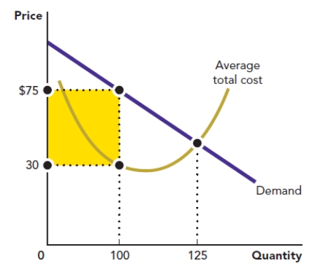
A) $4,500
B) $562.50
C) $7,500
D) $3,000
Figure: A Firm's Profit
A) $4,500
B) $562.50
C) $7,500
D) $3,000
Question
Use the figure A Firm's Profit. What is the correct method for calculating the area of the shape shaded in this graph?
Figure: A Firm's Profit

A) ($75 - $30) / 2
B) ($75 - $30) × 100
C) ($75 - $30) × 125
D) ($75 - $30) × (125 - 100)
Figure: A Firm's Profit
A) ($75 - $30) / 2
B) ($75 - $30) × 100
C) ($75 - $30) × 125
D) ($75 - $30) × (125 - 100)
Question
Use the figure Area of a Triangle I. The triangle in the accompanying graph represents the net gain to producers from selling a good. Calculate the area of the triangle.
Figure: Area of a Triangle I
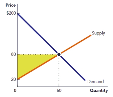
Figure: Area of a Triangle I
Question
Use Figure: Area of a Triangle I The rectangle in the accompanying graph represents the tax revenue that is gained when a tariff is placed on a good. Calculate the area of the rectangle.
Figure: Area of a Rectangle I
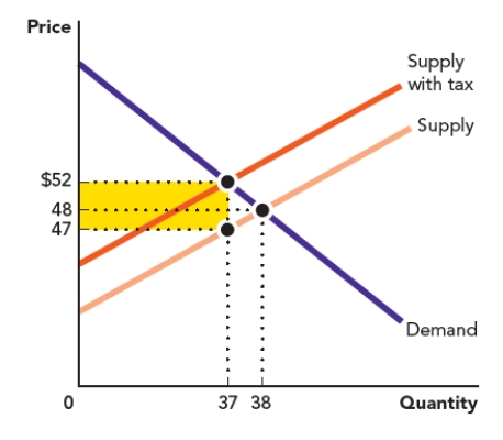
Figure: Area of a Rectangle I
Question
Use the figure Area of a Triangle II. The triangle in the accompanying graph represents the welfare loss to consumers who no longer participate in a market after a tax is placed on a good. Calculate the area of the triangle.
Figure: Area of a Triangle II
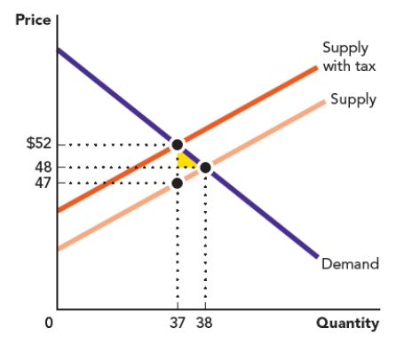
Figure: Area of a Triangle II
Question
Use the figure Area of a Rectangle II. The rectangle in the accompanying graph represents the loss to a firm when it produces a quantity of 20 at a price of $10. Calculate the area of the rectangle.
Figure: Area of a Rectangle II
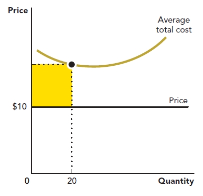
Figure: Area of a Rectangle II
Question
Use the figure Area of a Rectangle III. The rectangle in the accompanying graph represents the loss to a firm when it produces a quantity of 20 at a price of $500. Calculate the area of the rectangle.
Figure: Area of a Rectangle III
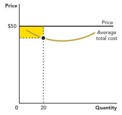
Figure: Area of a Rectangle III
Question
Question
Question
Question
Question

Unlock Deck
Sign up to unlock the cards in this deck!
Unlock Deck
Unlock Deck
1/27
Play
Full screen (f)
Deck 1: Extension: Understanding Graphs
1
What measures can take on more than one value?
A) axes
B) origins
C) points
D) variables
A) axes
B) origins
C) points
D) variables
D
2
What is represented by a point on a coordinate graph?
A) the value of the x-variable and the y-variable
B) the value of the x-variable
C) the value of the z-variable
D) the difference between the x-variable and the y-variable
A) the value of the x-variable and the y-variable
B) the value of the x-variable
C) the value of the z-variable
D) the difference between the x-variable and the y-variable
A
3
Use the figure The Production Possibilities Frontier I. What is the x-variable in this graph?
Figure: The Production Possibilities Frontier I
A) point G
B) point I
C) the quantity of televisions
D) the quantity of lamps
Figure: The Production Possibilities Frontier I
A) point G
B) point I
C) the quantity of televisions
D) the quantity of lamps
D
4
Use the figure The Production Possibilities Frontier I. What is the value of the x-variable at point F in this graph?
Figure: The Production Possibilities Frontier I
A) six lamps
B) two televisions
C) six televisions
D) two lamps
Figure: The Production Possibilities Frontier I
A) six lamps
B) two televisions
C) six televisions
D) two lamps
Unlock Deck
Unlock for access to all 27 flashcards in this deck.
Unlock Deck
k this deck
5
Use the figure The Production Possibilities Frontier I. What are the coordinates of point E in this graph?
Figure: The Production Possibilities Frontier I
A) 12 televisions and one lamp
B) 12 lamps and one television
C) four televisions and 12 lamps
D) 12 lamps and two televisions
Figure: The Production Possibilities Frontier I
A) 12 televisions and one lamp
B) 12 lamps and one television
C) four televisions and 12 lamps
D) 12 lamps and two televisions
Unlock Deck
Unlock for access to all 27 flashcards in this deck.
Unlock Deck
k this deck
6
A variable that is influenced by another variable is the:
A) dependent variable.
B) independent variable.
C) origin.
D) coordinate.
A) dependent variable.
B) independent variable.
C) origin.
D) coordinate.
Unlock Deck
Unlock for access to all 27 flashcards in this deck.
Unlock Deck
k this deck
7
Dorothy is interested in the relationship between how often she waters her plants and how many flowers they produce. What is true about the variable describing how often she waters her plants?
A) It is the origin.
B) It is the dependent variable.
C) It is the independent variable.
D) It is not a variable.
A) It is the origin.
B) It is the dependent variable.
C) It is the independent variable.
D) It is not a variable.
Unlock Deck
Unlock for access to all 27 flashcards in this deck.
Unlock Deck
k this deck
8
To find the slope of a straight line, you:
A) divide the change in the y-variable by the change in the x-variable.
B) subtract the change in the y-variable from the change in the x-variable.
C) add the change in the y-variable to the change in the x-variable.
D) subtract the change in the x-variable from the change in the y-variable.
A) divide the change in the y-variable by the change in the x-variable.
B) subtract the change in the y-variable from the change in the x-variable.
C) add the change in the y-variable to the change in the x-variable.
D) subtract the change in the x-variable from the change in the y-variable.
Unlock Deck
Unlock for access to all 27 flashcards in this deck.
Unlock Deck
k this deck
9
The rate at which a line rises or falls from left to right is its:
A) origin.
B) slope.
C) independent variable.
D) dependent variable.
A) origin.
B) slope.
C) independent variable.
D) dependent variable.
Unlock Deck
Unlock for access to all 27 flashcards in this deck.
Unlock Deck
k this deck
10
The price of a good is the y-variable and the quantity of a good that people want to buy is the x-variable. When the price of a hamburger increases from $10 to $12, the quantity of hamburger that people want to buy in a day decreases from 20 to 16. What is the slope of the line that describes the relationship between price and the quantity of hamburgers that people want to buy?
A) -1/2
B) -2
C) -10
D) 5
A) -1/2
B) -2
C) -10
D) 5
Unlock Deck
Unlock for access to all 27 flashcards in this deck.
Unlock Deck
k this deck
11
How is the slope of a line calculated?
A) Rise - Run
B) Rise x Run
C) Rise/Run
D) Rise + Run
A) Rise - Run
B) Rise x Run
C) Rise/Run
D) Rise + Run
Unlock Deck
Unlock for access to all 27 flashcards in this deck.
Unlock Deck
k this deck
12
Use the figure The Production Possibilities Frontier III. What is the slope of the line between point H and point I?
Figure: The Production Possibilities Frontier III
A) -3
B) -6/5
C) -9/10
D) 5
Figure: The Production Possibilities Frontier III
A) -3
B) -6/5
C) -9/10
D) 5
Unlock Deck
Unlock for access to all 27 flashcards in this deck.
Unlock Deck
k this deck
13
Use the figure The Production Possibilities Frontier III. What is the slope of the line between point I and point K?
Figure: The Production Possibilities Frontier III
A) 7.5
B) -9/10
C) 9
D) -7/5
Figure: The Production Possibilities Frontier III
A) 7.5
B) -9/10
C) 9
D) -7/5
Unlock Deck
Unlock for access to all 27 flashcards in this deck.
Unlock Deck
k this deck
14
Use the figure The Net Loss to Society Due to the Overproduction of a Good. What is the area of the shaded triangle in this graph?
Figure: The Net Loss to Society Due to the Overproduction of a Good
A) $575
B) $40
C) $20
D) $345
Figure: The Net Loss to Society Due to the Overproduction of a Good
A) $575
B) $40
C) $20
D) $345
Unlock Deck
Unlock for access to all 27 flashcards in this deck.
Unlock Deck
k this deck
15
Use the figure The Net Loss to Society Due to the Overproduction of a Good. What is the correct way to calculate the area of the shaded triangle in this graph?
Figure: The Net Loss to Society Due to the Overproduction of a Good
A) $25 × $23
B) $15 × $23
C) ($25 - $15) × ($27 - $23)
D) [($25 - $15) × ($27- $23)] / 2
Figure: The Net Loss to Society Due to the Overproduction of a Good
A) $25 × $23
B) $15 × $23
C) ($25 - $15) × ($27 - $23)
D) [($25 - $15) × ($27- $23)] / 2
Unlock Deck
Unlock for access to all 27 flashcards in this deck.
Unlock Deck
k this deck
16
Use the figure A Firm's Profit. What is the area of the shape shaded in this graph?
Figure: A Firm's Profit
A) $4,500
B) $562.50
C) $7,500
D) $3,000
Figure: A Firm's Profit
A) $4,500
B) $562.50
C) $7,500
D) $3,000
Unlock Deck
Unlock for access to all 27 flashcards in this deck.
Unlock Deck
k this deck
17
Use the figure A Firm's Profit. What is the correct method for calculating the area of the shape shaded in this graph?
Figure: A Firm's Profit
A) ($75 - $30) / 2
B) ($75 - $30) × 100
C) ($75 - $30) × 125
D) ($75 - $30) × (125 - 100)
Figure: A Firm's Profit
A) ($75 - $30) / 2
B) ($75 - $30) × 100
C) ($75 - $30) × 125
D) ($75 - $30) × (125 - 100)
Unlock Deck
Unlock for access to all 27 flashcards in this deck.
Unlock Deck
k this deck
18
Use the figure Area of a Triangle I. The triangle in the accompanying graph represents the net gain to producers from selling a good. Calculate the area of the triangle.
Figure: Area of a Triangle I
Figure: Area of a Triangle I
Unlock Deck
Unlock for access to all 27 flashcards in this deck.
Unlock Deck
k this deck
19
Use Figure: Area of a Triangle I The rectangle in the accompanying graph represents the tax revenue that is gained when a tariff is placed on a good. Calculate the area of the rectangle.
Figure: Area of a Rectangle I
Figure: Area of a Rectangle I
Unlock Deck
Unlock for access to all 27 flashcards in this deck.
Unlock Deck
k this deck
20
Use the figure Area of a Triangle II. The triangle in the accompanying graph represents the welfare loss to consumers who no longer participate in a market after a tax is placed on a good. Calculate the area of the triangle.
Figure: Area of a Triangle II
Figure: Area of a Triangle II
Unlock Deck
Unlock for access to all 27 flashcards in this deck.
Unlock Deck
k this deck
21
Use the figure Area of a Rectangle II. The rectangle in the accompanying graph represents the loss to a firm when it produces a quantity of 20 at a price of $10. Calculate the area of the rectangle.
Figure: Area of a Rectangle II
Figure: Area of a Rectangle II
Unlock Deck
Unlock for access to all 27 flashcards in this deck.
Unlock Deck
k this deck
22
Use the figure Area of a Rectangle III. The rectangle in the accompanying graph represents the loss to a firm when it produces a quantity of 20 at a price of $500. Calculate the area of the rectangle.
Figure: Area of a Rectangle III
Figure: Area of a Rectangle III
Unlock Deck
Unlock for access to all 27 flashcards in this deck.
Unlock Deck
k this deck
23
A _____ is a graph that indicates the value of dependent variables for each value of an independent variable using rectangles.
A) scatter plot
B) pie chart
C) coordinate plane
D) bar chart
A) scatter plot
B) pie chart
C) coordinate plane
D) bar chart
Unlock Deck
Unlock for access to all 27 flashcards in this deck.
Unlock Deck
k this deck
24
Jose has a chart showing the relationship between income and life expectancy in 100 countries. Each country has its own data point, but there is no line connecting the data points. What kind of graph does Jose have?
A) bar chart
B) box plot
C) scatter diagram
D) pie chart
A) bar chart
B) box plot
C) scatter diagram
D) pie chart
Unlock Deck
Unlock for access to all 27 flashcards in this deck.
Unlock Deck
k this deck
25
Eloise has data on the different categories of spending on supplies at her company. She wants to illustrate this using a graph that shows a larger value - all spending on supplies - broken up into the smaller pieces for each category. What kind of graph should Eloise use?
A) bar graph
B) pie chart
C) scatter plot
D) Cartesian plane
A) bar graph
B) pie chart
C) scatter plot
D) Cartesian plane
Unlock Deck
Unlock for access to all 27 flashcards in this deck.
Unlock Deck
k this deck
26
An economist wants to visualize whether there is a relationship between two variables by observing all of the different data points. What kind of graph is the most appropriate for this purpose?
A) a graph of the area of a triangle
B) a scatter diagram
C) a bar chart
D) a pie chart
A) a graph of the area of a triangle
B) a scatter diagram
C) a bar chart
D) a pie chart
Unlock Deck
Unlock for access to all 27 flashcards in this deck.
Unlock Deck
k this deck
27
A scatter diagram shows a falling pattern of points in a graph representing the relationship between education and the probability of having a chronic illness. What can be concluded based on that pattern?
A) There is generally an inverse relationship between education and chronic illness.
B) There is generally a positive relationship between education and chronic illness.
C) There is at first a positive relationship and then a negative relationship between education and chronic illness.
D) There is at first a negative relationship and then a positive relationship between education and chronic illness.
Unlock Deck
Unlock for access to all 27 flashcards in this deck.
Unlock Deck
k this deck
Unlock Deck
Unlock for access to all 27 flashcards in this deck.


