Deck 9: Analyzing and Charting Financial Data
Full screen (f)
Question
Question
Question
Question
Question
Question
Question
Question
Question
Question
Question
Question
Question
Question
Question
Question
Question
Question
Question
Question
Question
Question
Question
Question
Question
Question
Question
Question
Question
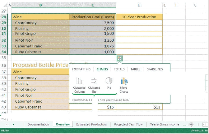
Referring to the figure above, if you were to create a Wine Production Chart pie chart using the information in B28:C34, the data source for that chart would be ____.
A) B28:C34
B) B29:C33
C) B28:B34
D) B29:C34
Question
Question
In the lower right corner, below C34, the _____ tool displays.
A) Screen Tip
B) Quick Analysis
C) What-If
D) Quick Chart
Question
Question
Question
Question
Question
Question
In the figure above, the biggest slice is the cases of _______.
A) Riesling
B) Chardonnay
C) Pinot Grigio
D) Ruby Cabernet
Question
Question
Question
Question
Question
Question
Which of the following represents the pointer when it is over the chart area?
A)
B)
C)
D)
A)
B)
C)
D)
Question
Question
Question
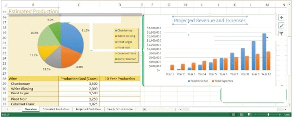
Referring to the figure above, the entry 31.5%, shown next to the largest pie slice, is a ____.
A) data label
B) chart key
C) legend
D) series value
Question
The columns and pie slices in the charts above are ____.
A) data markers
B) chart areas
C) major tick marks
D) minor tick marks
Question
Question
Question
Question
Referring to the figure above, the rectangular area to the right of the pie chart is the ____.
A) perspective
B) plot area
C) legend
D) data marker
Question
Referring to the figure above, in the column chart, the values along the left side ($200,000, $400,000, $600,000, etc.) are ____.
A) plot markers
B) plot marks
C) data markers
D) axis labels
Question
Question
Question
Question
Question
Question
Referring to the figure above, the chart title for the pie chart is ____.
A) Estimated Production
B) Projected Revenue and Expenses
C) Total Revenue
D) Production
Question
Question
Question
Question
Question
Question
Question
Question
Question
Question
Question
Question
Question
Question
Question
Question
Question
Question
Question
Question
Question
Question

Unlock Deck
Sign up to unlock the cards in this deck!
Unlock Deck
Unlock Deck
1/100
Play
Full screen (f)
Deck 9: Analyzing and Charting Financial Data
1
The PMT function calculates the payment required in each period to pay back the loan.
True
2
Sparklines differ from data bars in that the sparklines are always placed in the cells containing the value they represent.
False
3
Each slice in a pie chart represents a single value from a data series.
True
4
A color bar is a conditional format that adds a horizontal bar to the background of a cell containing a numeric value. _________________________
Unlock Deck
Unlock for access to all 100 flashcards in this deck.
Unlock Deck
k this deck
5
In a line chart, the data markers are the points connected by the line. _________________________
Unlock Deck
Unlock for access to all 100 flashcards in this deck.
Unlock Deck
k this deck
6
The cell with the largest value contains a data marker that extends across the entire width of the cell, and the lengths of the other bars in the selected range are determined relative to that bar. _________________________
Unlock Deck
Unlock for access to all 100 flashcards in this deck.
Unlock Deck
k this deck
7
Line charts are best suited for representing data that follows some nonsequential order.
Unlock Deck
Unlock for access to all 100 flashcards in this deck.
Unlock Deck
k this deck
8
Pie charts are most effective with ten or fewer slices. _________________________
Unlock Deck
Unlock for access to all 100 flashcards in this deck.
Unlock Deck
k this deck
9
By default, Excel inserts a chart as an embedded chart. _________________________
Unlock Deck
Unlock for access to all 100 flashcards in this deck.
Unlock Deck
k this deck
10
In pie charts, it's best to make the slice colors as similar as possible.
Unlock Deck
Unlock for access to all 100 flashcards in this deck.
Unlock Deck
k this deck
11
Excel charts are either placed in their own chart sheets or embedded in a worksheet.
Unlock Deck
Unlock for access to all 100 flashcards in this deck.
Unlock Deck
k this deck
12
A column chart turned on its side is called a bar chart, with the length of the bar determined by the data value.
Unlock Deck
Unlock for access to all 100 flashcards in this deck.
Unlock Deck
k this deck
13
You can move a chart from one worksheet to another, or you can place the chart in its own chart sheet.
Unlock Deck
Unlock for access to all 100 flashcards in this deck.
Unlock Deck
k this deck
14
When you create sparklines, clicking any cell in the data range selects all of the sparklines in the group. _________________________
Unlock Deck
Unlock for access to all 100 flashcards in this deck.
Unlock Deck
k this deck
15
A watermark can be inserted into the header or footer of a worksheet. _________________________
Unlock Deck
Unlock for access to all 100 flashcards in this deck.
Unlock Deck
k this deck
16
You can quickly change the appearance of the entire chart by selecting a different chart style in the Chart Design gallery. _________________________
Unlock Deck
Unlock for access to all 100 flashcards in this deck.
Unlock Deck
k this deck
17
Every chart contains elements that can be formatted, added to the chart, or removed
from the chart.
from the chart.
Unlock Deck
Unlock for access to all 100 flashcards in this deck.
Unlock Deck
k this deck
18
Combination charts enable you to show three sets of data using the chart type that is best for each data set. _________________________
Unlock Deck
Unlock for access to all 100 flashcards in this deck.
Unlock Deck
k this deck
19
Interest is the amount of money being loaned.
Unlock Deck
Unlock for access to all 100 flashcards in this deck.
Unlock Deck
k this deck
20
Interest is the amount added to the principal by the lender. _________________________
Unlock Deck
Unlock for access to all 100 flashcards in this deck.
Unlock Deck
k this deck
21
The ____ CHART TOOLS contextual tabs appear on the Ribbon when you select a chart.
A) INSERT and DESIGN
B) DESIGN and FORMAT
C) INSERT and FORMAT
D) FORMAT and PRINT
A) INSERT and DESIGN
B) DESIGN and FORMAT
C) INSERT and FORMAT
D) FORMAT and PRINT
Unlock Deck
Unlock for access to all 100 flashcards in this deck.
Unlock Deck
k this deck
22
A ________ contains the actual values that are plotted on the chart
A) data source
B) data series
C) category values
D) legend
A) data source
B) data series
C) category values
D) legend
Unlock Deck
Unlock for access to all 100 flashcards in this deck.
Unlock Deck
k this deck
23
MATCHING
Identify the letter of the chart type that best matches the phrase or definition.
a.Scatter
b.Column
c.XY
d.Line
e.Radar
f.Pie
g.Stock
h.Bar
i.Surface
j.Area
Displays stock market data
Identify the letter of the chart type that best matches the phrase or definition.
a.Scatter
b.Column
c.XY
d.Line
e.Radar
f.Pie
g.Stock
h.Bar
i.Surface
j.Area
Displays stock market data
Unlock Deck
Unlock for access to all 100 flashcards in this deck.
Unlock Deck
k this deck
24
MATCHING
Identify the letter of the chart type that best matches the phrase or definition.
a.Scatter
b.Column
c.XY
d.Line
e.Radar
f.Pie
g.Stock
h.Bar
i.Surface
j.Area
Compares relative values of different categories to the whole. A value is indicated by the area of a(n) ____
Identify the letter of the chart type that best matches the phrase or definition.
a.Scatter
b.Column
c.XY
d.Line
e.Radar
f.Pie
g.Stock
h.Bar
i.Surface
j.Area
Compares relative values of different categories to the whole. A value is indicated by the area of a(n) ____
Unlock Deck
Unlock for access to all 100 flashcards in this deck.
Unlock Deck
k this deck
25
MATCHING
Identify the letter of the chart type that best matches the phrase or definition.
a.Scatter
b.Column
c.XY
d.Line
e.Radar
f.Pie
g.Stock
h.Bar
i.Surface
j.Area
Compares values from different categories. A value is indicated by the length of the ____
Identify the letter of the chart type that best matches the phrase or definition.
a.Scatter
b.Column
c.XY
d.Line
e.Radar
f.Pie
g.Stock
h.Bar
i.Surface
j.Area
Compares values from different categories. A value is indicated by the length of the ____
Unlock Deck
Unlock for access to all 100 flashcards in this deck.
Unlock Deck
k this deck
26
MATCHING
Identify the letter of the chart type that best matches the phrase or definition.
a.Scatter
b.Column
c.XY
d.Line
e.Radar
f.Pie
g.Stock
h.Bar
i.Surface
j.Area
Compares values from different categories. Areas under the lines contain a fill color
Identify the letter of the chart type that best matches the phrase or definition.
a.Scatter
b.Column
c.XY
d.Line
e.Radar
f.Pie
g.Stock
h.Bar
i.Surface
j.Area
Compares values from different categories. Areas under the lines contain a fill color
Unlock Deck
Unlock for access to all 100 flashcards in this deck.
Unlock Deck
k this deck
27
MATCHING
Identify the letter of the chart type that best matches the phrase or definition.
a.Scatter
b.Column
c.XY
d.Line
e.Radar
f.Pie
g.Stock
h.Bar
i.Surface
j.Area
Similar to a Scatter chart
Identify the letter of the chart type that best matches the phrase or definition.
a.Scatter
b.Column
c.XY
d.Line
e.Radar
f.Pie
g.Stock
h.Bar
i.Surface
j.Area
Similar to a Scatter chart
Unlock Deck
Unlock for access to all 100 flashcards in this deck.
Unlock Deck
k this deck
28
MATCHING
Identify the letter of the chart type that best matches the phrase or definition.
a.Scatter
b.Column
c.XY
d.Line
e.Radar
f.Pie
g.Stock
h.Bar
i.Surface
j.Area
Compares values from different categories. A value is indicated by the height of each ____.
Identify the letter of the chart type that best matches the phrase or definition.
a.Scatter
b.Column
c.XY
d.Line
e.Radar
f.Pie
g.Stock
h.Bar
i.Surface
j.Area
Compares values from different categories. A value is indicated by the height of each ____.
Unlock Deck
Unlock for access to all 100 flashcards in this deck.
Unlock Deck
k this deck
29
Referring to the figure above, if you were to create a Wine Production Chart pie chart using the information in B28:C34, the data source for that chart would be ____.
A) B28:C34
B) B29:C33
C) B28:B34
D) B29:C34
Unlock Deck
Unlock for access to all 100 flashcards in this deck.
Unlock Deck
k this deck
30
MATCHING
Identify the letter of the chart type that best matches the phrase or definition.
a.Scatter
b.Column
c.XY
d.Line
e.Radar
f.Pie
g.Stock
h.Bar
i.Surface
j.Area
Compares a collection of values from several different data sets.
Identify the letter of the chart type that best matches the phrase or definition.
a.Scatter
b.Column
c.XY
d.Line
e.Radar
f.Pie
g.Stock
h.Bar
i.Surface
j.Area
Compares a collection of values from several different data sets.
Unlock Deck
Unlock for access to all 100 flashcards in this deck.
Unlock Deck
k this deck
31
In the lower right corner, below C34, the _____ tool displays.
A) Screen Tip
B) Quick Analysis
C) What-If
D) Quick Chart
Unlock Deck
Unlock for access to all 100 flashcards in this deck.
Unlock Deck
k this deck
32
Placing a chart in a ____ displays only the chart and no worksheet cells.
A) new worksheet
B) tabbed view
C) graph display
D) chart sheet
A) new worksheet
B) tabbed view
C) graph display
D) chart sheet
Unlock Deck
Unlock for access to all 100 flashcards in this deck.
Unlock Deck
k this deck
33
The ____ is the only one of the following charts to compare relative values from different categories to the whole.
A) pie
B) column
C) line
D) area
A) pie
B) column
C) line
D) area
Unlock Deck
Unlock for access to all 100 flashcards in this deck.
Unlock Deck
k this deck
34
To add and remove chart elements, you can use the Add Chart Element button in the Charts Layout group on the ____ tab.
A) CHART TOOLS LAYOUT
B) CHART TOOLS DESIGN
C) INSERT
D) HOME
A) CHART TOOLS LAYOUT
B) CHART TOOLS DESIGN
C) INSERT
D) HOME
Unlock Deck
Unlock for access to all 100 flashcards in this deck.
Unlock Deck
k this deck
35
The ____ dialog box provides options for moving charts between worksheets and chart sheets.
A) Insert New
B) Tab
C) Move Chart
D) Change Chart
A) Insert New
B) Tab
C) Move Chart
D) Change Chart
Unlock Deck
Unlock for access to all 100 flashcards in this deck.
Unlock Deck
k this deck
36
Category values are usually located in the ____ of the data source.
A) first row
B) first column
C) either a or b
D) neither a nor b
A) first row
B) first column
C) either a or b
D) neither a nor b
Unlock Deck
Unlock for access to all 100 flashcards in this deck.
Unlock Deck
k this deck
37
In the figure above, the biggest slice is the cases of _______.
A) Riesling
B) Chardonnay
C) Pinot Grigio
D) Ruby Cabernet
Unlock Deck
Unlock for access to all 100 flashcards in this deck.
Unlock Deck
k this deck
38
MATCHING
Identify the letter of the chart type that best matches the phrase or definition.
a.Scatter
b.Column
c.XY
d.Line
e.Radar
f.Pie
g.Stock
h.Bar
i.Surface
j.Area
Compares three sets of values in a three-dimensional chart
Identify the letter of the chart type that best matches the phrase or definition.
a.Scatter
b.Column
c.XY
d.Line
e.Radar
f.Pie
g.Stock
h.Bar
i.Surface
j.Area
Compares three sets of values in a three-dimensional chart
Unlock Deck
Unlock for access to all 100 flashcards in this deck.
Unlock Deck
k this deck
39
MATCHING
Identify the letter of the chart type that best matches the phrase or definition.
a.Scatter
b.Column
c.XY
d.Line
e.Radar
f.Pie
g.Stock
h.Bar
i.Surface
j.Area
Often used to show trends and changes over time
Identify the letter of the chart type that best matches the phrase or definition.
a.Scatter
b.Column
c.XY
d.Line
e.Radar
f.Pie
g.Stock
h.Bar
i.Surface
j.Area
Often used to show trends and changes over time
Unlock Deck
Unlock for access to all 100 flashcards in this deck.
Unlock Deck
k this deck
40
MATCHING
Identify the letter of the chart type that best matches the phrase or definition.
a.Scatter
b.Column
c.XY
d.Line
e.Radar
f.Pie
g.Stock
h.Bar
i.Surface
j.Area
Shows patterns or relationship between two or more sets of values. Often used in scientific studies and statistical analyses.
Identify the letter of the chart type that best matches the phrase or definition.
a.Scatter
b.Column
c.XY
d.Line
e.Radar
f.Pie
g.Stock
h.Bar
i.Surface
j.Area
Shows patterns or relationship between two or more sets of values. Often used in scientific studies and statistical analyses.
Unlock Deck
Unlock for access to all 100 flashcards in this deck.
Unlock Deck
k this deck
41
A pie slice is a data marker that represents ____ from a data series.
A) only one value
B) at least one value
C) no more than three values
D) no more than five values
A) only one value
B) at least one value
C) no more than three values
D) no more than five values
Unlock Deck
Unlock for access to all 100 flashcards in this deck.
Unlock Deck
k this deck
42
The range of values or _______, of an axis is based on the values in the data source.
A) scale
B) defined range
C) series
D) length
A) scale
B) defined range
C) series
D) length
Unlock Deck
Unlock for access to all 100 flashcards in this deck.
Unlock Deck
k this deck
43
Which of the following represents the pointer when it is over the chart area?
A)
B)
C)
D)
A)
B)
C)
D)
Unlock Deck
Unlock for access to all 100 flashcards in this deck.
Unlock Deck
k this deck
44
You can choose Center, Inside End, Outside End, or Best Fit for the data label positions in the in the ____ pane.
A) Format Data Labels
B) Format Legend
C) Format Chart Area
D) Format Axis
A) Format Data Labels
B) Format Legend
C) Format Chart Area
D) Format Axis
Unlock Deck
Unlock for access to all 100 flashcards in this deck.
Unlock Deck
k this deck
45
To reposition the legend to the left-hand side of a chart, click the _________ button, point to Legend, click the right arrow icon, and click Left.
A) Legend
B) Chart Elements
C) Formatting
D) Layout
A) Legend
B) Chart Elements
C) Formatting
D) Layout
Unlock Deck
Unlock for access to all 100 flashcards in this deck.
Unlock Deck
k this deck
46
Referring to the figure above, the entry 31.5%, shown next to the largest pie slice, is a ____.
A) data label
B) chart key
C) legend
D) series value
Unlock Deck
Unlock for access to all 100 flashcards in this deck.
Unlock Deck
k this deck
47
The columns and pie slices in the charts above are ____.
A) data markers
B) chart areas
C) major tick marks
D) minor tick marks
Unlock Deck
Unlock for access to all 100 flashcards in this deck.
Unlock Deck
k this deck
48
You already created a line chart, but now decide that you want to change this chart to a pie chart. To do this, you click ____ from the Type group in the Chart Tools Design tab.
A) Change Chart Type
B) New Chart
C) Alter Existing Chart
D) Modify Chart
A) Change Chart Type
B) New Chart
C) Alter Existing Chart
D) Modify Chart
Unlock Deck
Unlock for access to all 100 flashcards in this deck.
Unlock Deck
k this deck
49
To move one slice of a pie chart away from the pie creates a(n) ____.
A) spontaneous pie chart
B) perfect pie chart
C) exploded pie chart
D) exponential pie chart
A) spontaneous pie chart
B) perfect pie chart
C) exploded pie chart
D) exponential pie chart
Unlock Deck
Unlock for access to all 100 flashcards in this deck.
Unlock Deck
k this deck
50
A chart that compares three set of values in a three-dimensional chart is _____.
A) Stock
B) Radar
C) Surface
D) Scatter
A) Stock
B) Radar
C) Surface
D) Scatter
Unlock Deck
Unlock for access to all 100 flashcards in this deck.
Unlock Deck
k this deck
51
Referring to the figure above, the rectangular area to the right of the pie chart is the ____.
A) perspective
B) plot area
C) legend
D) data marker
Unlock Deck
Unlock for access to all 100 flashcards in this deck.
Unlock Deck
k this deck
52
Referring to the figure above, in the column chart, the values along the left side ($200,000, $400,000, $600,000, etc.) are ____.
A) plot markers
B) plot marks
C) data markers
D) axis labels
Unlock Deck
Unlock for access to all 100 flashcards in this deck.
Unlock Deck
k this deck
53
Edward Tufte said that ____ ink is any part of the chart that does not convey information about the data.
A) data
B) non-data
C) information
D) non-information
A) data
B) non-data
C) information
D) non-information
Unlock Deck
Unlock for access to all 100 flashcards in this deck.
Unlock Deck
k this deck
54
A chart sheet can contain ____.
A) only one chart
B) one or two charts
C) one to four charts
D) one to six charts
A) only one chart
B) one or two charts
C) one to four charts
D) one to six charts
Unlock Deck
Unlock for access to all 100 flashcards in this deck.
Unlock Deck
k this deck
55
Edward Tufte was concerned with what he termed as "chart ____," in which a proliferation of chart elements-chosen because they look "nice"-confuse and distract the reader.
A) espionage
B) clutter
C) confusion
D) junk
A) espionage
B) clutter
C) confusion
D) junk
Unlock Deck
Unlock for access to all 100 flashcards in this deck.
Unlock Deck
k this deck
56
Excel supports all of the following types of sparklines EXCEPT ____.
A) A win/loss sparkline for highlighting positive and negative values
B) A column sparkline used for column charts
C) A line sparkline for highlighting trends
D) a true/false sparkline for help making decisions
A) A win/loss sparkline for highlighting positive and negative values
B) A column sparkline used for column charts
C) A line sparkline for highlighting trends
D) a true/false sparkline for help making decisions
Unlock Deck
Unlock for access to all 100 flashcards in this deck.
Unlock Deck
k this deck
57
Which of the following shows the correct order of steps for adding a data series to a chart?
A) Select the chart, Click the Add button, Click the Select Data button, Select the range
B) Select the chart, Click the Select Data button, Click the Add button, Select the range
C) Select the range, Click the Select Data button, Click the Add button, Select the chart
D) Select the range, Select the chart, Click the Select Data button, Click the Add button
Unlock Deck
Unlock for access to all 100 flashcards in this deck.
Unlock Deck
k this deck
58
Referring to the figure above, the chart title for the pie chart is ____.
A) Estimated Production
B) Projected Revenue and Expenses
C) Total Revenue
D) Production
Unlock Deck
Unlock for access to all 100 flashcards in this deck.
Unlock Deck
k this deck
59
____provide descriptive text for the individual data markers, such as pie slices
A) Asset labels
B) Legend values
C) Data labels
D) Leader lines
A) Asset labels
B) Legend values
C) Data labels
D) Leader lines
Unlock Deck
Unlock for access to all 100 flashcards in this deck.
Unlock Deck
k this deck
60
To resize an embedded chart, ____.
A) select the chart and drag the corner sizing handle of the selection box
B) right click the chart and then click Resize on the shortcut menu
C) select the chart and press Tab
D) both a and b
A) select the chart and drag the corner sizing handle of the selection box
B) right click the chart and then click Resize on the shortcut menu
C) select the chart and press Tab
D) both a and b
Unlock Deck
Unlock for access to all 100 flashcards in this deck.
Unlock Deck
k this deck
61
The FV function stands for ____.
A) function value
B) future value
C) financial value
D) formulated value
A) function value
B) future value
C) financial value
D) formulated value
Unlock Deck
Unlock for access to all 100 flashcards in this deck.
Unlock Deck
k this deck
62
To format an individual sparkline, select the sparkline you want to format, and then click the Ungroup button in the Group group on the SPARKLINE TOOLS ____ tab.
A) CREATE
B) VIEW
C) LAYOUT
D) DESIGN
A) CREATE
B) VIEW
C) LAYOUT
D) DESIGN
Unlock Deck
Unlock for access to all 100 flashcards in this deck.
Unlock Deck
k this deck
63
The _______ displays the data series in separate columns side-by-side so that you can compare the relative heights of the columns in the three series.
A) clustered column chart
B) stacked column chart
C) 100% stacked column chart
D) column chart
A) clustered column chart
B) stacked column chart
C) 100% stacked column chart
D) column chart
Unlock Deck
Unlock for access to all 100 flashcards in this deck.
Unlock Deck
k this deck
64
Mya has just surveyed 100 students to get their reaction to a new textbook she is reviewing. She has one data series that she wants to represent graphically, and she needs to display her data in a way that lets her visually compate the data values and see how much contributes to the whole.
Since Mya is still reviewing her data, she wants to make sure that her chart reflects any changes she makes in her data source. She should ____.
A) paste her chart in as a picture
B) do nothing since charts in Excel remain linked to data sources
C) manually adjust data in a chart
D) create a new chart each time she modifies her data
Unlock Deck
Unlock for access to all 100 flashcards in this deck.
Unlock Deck
k this deck
65
Simon has just started a job with the police department. His director has given him the last six months of test results from four local precincts. Simon has organized the results as four data series and needs to display the trends in a graphic format.
Simon wants to change the chart's border. To do this, he should select the CHART TOOLS ____ tab.
A) FORMAT
B) EDIT
C) DESIGN
D) LAYOUT
Simon wants to change the chart's border. To do this, he should select the CHART TOOLS ____ tab.
A) FORMAT
B) EDIT
C) DESIGN
D) LAYOUT
Unlock Deck
Unlock for access to all 100 flashcards in this deck.
Unlock Deck
k this deck
66
The ____ identifies which data markers are associated with each data series.
A) x-axis
B) y-axis
C) chart area
D) legend
A) x-axis
B) y-axis
C) chart area
D) legend
Unlock Deck
Unlock for access to all 100 flashcards in this deck.
Unlock Deck
k this deck
67
Simon has just started a job with the police department. His director has given him the last six months of test results from four local precincts. Simon has organized the results as four data series and needs to display the trends in a graphic format.
Simon has finished his chart but needs to save some space. What's the most effective way for Andy to reduce space without losing important data?
A) Delete parts of the data
B) Delete the legend
C) Delete the title
D) Overlay the legend in areas without data
Simon has finished his chart but needs to save some space. What's the most effective way for Andy to reduce space without losing important data?
A) Delete parts of the data
B) Delete the legend
C) Delete the title
D) Overlay the legend in areas without data
Unlock Deck
Unlock for access to all 100 flashcards in this deck.
Unlock Deck
k this deck
68
In the figure above, pv stands for the ____.
A) payments verified
B) principal value of the loan
C) present value of the loan
D) primary interest rate of the loan
A) payments verified
B) principal value of the loan
C) present value of the loan
D) primary interest rate of the loan
Unlock Deck
Unlock for access to all 100 flashcards in this deck.
Unlock Deck
k this deck
69
Simon has just started a job with the police department. His director has given him the last six months of test results from four local precincts. Simon has organized the results as four data series and needs to display the trends in a graphic format.
It's difficult to read the exact scale on some of Simon's data. Adding ____ would make it easier to read.
A) a legend
B) major tick marks
C) colors
D) more numbers
It's difficult to read the exact scale on some of Simon's data. Adding ____ would make it easier to read.
A) a legend
B) major tick marks
C) colors
D) more numbers
Unlock Deck
Unlock for access to all 100 flashcards in this deck.
Unlock Deck
k this deck
70
Mya has just surveyed 100 students to get their reaction to a new textbook she is reviewing. She has one data series that she wants to represent graphically, and she needs to display her data in a way that lets her visually compate the data values and see how much contributes to the whole.
Sometimes Mya might want to see information on only specific slices. Rather than creating a new chart that includes only those selections, she can _____ an existing chart.
A) search
B) filter
C) find
D) examine
Sometimes Mya might want to see information on only specific slices. Rather than creating a new chart that includes only those selections, she can _____ an existing chart.
A) search
B) filter
C) find
D) examine
Unlock Deck
Unlock for access to all 100 flashcards in this deck.
Unlock Deck
k this deck
71
The possible values for the type argument in the function above are.
A) 0 or null
B) 0 or 1
C) 0, 1, or 2
D) 0, 1, 2, or 3
A) 0 or null
B) 0 or 1
C) 0, 1, or 2
D) 0, 1, 2, or 3
Unlock Deck
Unlock for access to all 100 flashcards in this deck.
Unlock Deck
k this deck
72
In the figure above, fv and type are ____.
A) financial functions
B) required arguments
C) comparison operators
D) optional arguments
A) financial functions
B) required arguments
C) comparison operators
D) optional arguments
Unlock Deck
Unlock for access to all 100 flashcards in this deck.
Unlock Deck
k this deck
73
In the figure above, nper stands for the ____.
A) total number of payment periods
B) total number of payments that have already been made
C) number of payments per year
D) number of interest payments per year
A) total number of payment periods
B) total number of payments that have already been made
C) number of payments per year
D) number of interest payments per year
Unlock Deck
Unlock for access to all 100 flashcards in this deck.
Unlock Deck
k this deck
74
The amount of money being loaned is known as the ____.
A) mortgage
B) principal
C) loan amount
D) proposed principal
A) mortgage
B) principal
C) loan amount
D) proposed principal
Unlock Deck
Unlock for access to all 100 flashcards in this deck.
Unlock Deck
k this deck
75
____ is the amount added to the prinicpal of a loan by the lender.
A) Rate
B) Simple
C) Interest
D) Maximum
A) Rate
B) Simple
C) Interest
D) Maximum
Unlock Deck
Unlock for access to all 100 flashcards in this deck.
Unlock Deck
k this deck
76
Mya has just surveyed 100 students to get their reaction to a new textbook she is reviewing. She has one data series that she wants to represent graphically, and she needs to display her data in a way that lets her visually compate the data values and see how much contributes to the whole.
Mya has decided she needs to move her chart so that it appears below her data source. Before she can move or resize her chart she must ______.
A) select the chart
B) hold down the SHIFT key
C) adjust the sizing handles
D) move the mouse pointer to the center of the chart.
Mya has decided she needs to move her chart so that it appears below her data source. Before she can move or resize her chart she must ______.
A) select the chart
B) hold down the SHIFT key
C) adjust the sizing handles
D) move the mouse pointer to the center of the chart.
Unlock Deck
Unlock for access to all 100 flashcards in this deck.
Unlock Deck
k this deck
77
When combination charts have data series with vastly different values, you can create ____ charts.
A) dual axis
B) secondary
C) multivalued
D) multiple axis
A) dual axis
B) secondary
C) multivalued
D) multiple axis
Unlock Deck
Unlock for access to all 100 flashcards in this deck.
Unlock Deck
k this deck
78
Simon has just started a job with the police department. His director has given him the last six months of test results from four local precincts. Simon has organized the results as four data series and needs to display the trends in a graphic format.
Simon's boss wants him to compare the values in this chart with several different data sets. Simon should prepare a(n) ____ for his boss.
A) Radar chart
B) Line graph
C) Pie chart
D) XY scatter chart
Simon's boss wants him to compare the values in this chart with several different data sets. Simon should prepare a(n) ____ for his boss.
A) Radar chart
B) Line graph
C) Pie chart
D) XY scatter chart
Unlock Deck
Unlock for access to all 100 flashcards in this deck.
Unlock Deck
k this deck
79
Generally, _____ are given a "washed-out" appearance and are placed behind text or charts on the sheet so that they do not obscure any of the other content on the sheet.
A) charts
B) watermarks
C) graphics
D) pictures
A) charts
B) watermarks
C) graphics
D) pictures
Unlock Deck
Unlock for access to all 100 flashcards in this deck.
Unlock Deck
k this deck
80
Mya has just surveyed 100 students to get their reaction to a new textbook she is reviewing. She has one data series that she wants to represent graphically, and she needs to display her data in a way that lets her visually compate the data values and see how much contributes to the whole.
Since it's important for Mya to keep percentages of her whole reviewer base in mind, she wants to represent data as parts of a whole. What chart type would you suggest to Mya?
A) bar
B) column
C) scatter
D) pie
Since it's important for Mya to keep percentages of her whole reviewer base in mind, she wants to represent data as parts of a whole. What chart type would you suggest to Mya?
A) bar
B) column
C) scatter
D) pie
Unlock Deck
Unlock for access to all 100 flashcards in this deck.
Unlock Deck
k this deck
Unlock Deck
Unlock for access to all 100 flashcards in this deck.


