Deck 2: Descriptive Statistics: Tabular and Graphical Methods
Full screen (f)
Question
Question
Question
Question
Question
Question
Question
Question
Question
Question
Question
Question
Question
Question
Question
Question
Question
Question
Question
Question
Question
Question
Question
Question
Question
Question
Question
Question
Question
Question
Question
Question
Question
Question
Question
Question
Question
Question
Question
Question
Question
Question
Question
Question
Question
Question
Question
Question
Question
Question
Question
Question
Question
Question
Question
Question
Question
Question
Question
Question
Question
Question
Recently an advertising company called 200 people and asked them to identify the company that was in an ad running nationwide.They obtained the following results. 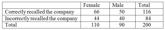 Construct a table of column percentages.
Construct a table of column percentages. Question
The number of items rejected daily by a manufacturer because of defects for the last 30 days are:
20,21,8,17,22,19,18,19,14,17,11,6,21,25,4,19,9,12,16,16,10,28,24,6,21,20,25,5,17,8
Complete this frequency table for these data.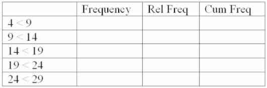
20,21,8,17,22,19,18,19,14,17,11,6,21,25,4,19,9,12,16,16,10,28,24,6,21,20,25,5,17,8
Complete this frequency table for these data.
Question
Question
Consider the following data on distances traveled by people to visit the local amusement park. 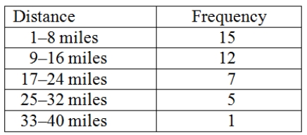 Construct an ogive plot that corresponds to the frequency table.
Construct an ogive plot that corresponds to the frequency table. Question
Fill in the missing components of the following frequency distribution constructed for a sample size of 50. 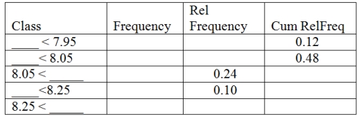
Question
Question
A local electronics retailer recently conducted a study on purchasers of large screen televisions.The study recorded the type of television and the credit account balance of the customer at the time of purchase.They obtained the following results.  Construct a table of row percentages.
Construct a table of row percentages. Question
Question
The following is a relative frequency distribution of grades in an introductory statistics course.  If we wish to depict these data using a pie chart,find how many degrees (out of 360 degrees)should be assigned to each grade.
If we wish to depict these data using a pie chart,find how many degrees (out of 360 degrees)should be assigned to each grade. Question
The following is a relative frequency distribution of grades in an introductory statistics course.  Construct a percent frequency bar chart for this data.
Construct a percent frequency bar chart for this data. Question
The following is a relative frequency distribution of grades in an introductory statistics course. 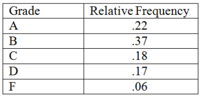 If this was the distribution of 200 students,give the frequency distribution for this data.
If this was the distribution of 200 students,give the frequency distribution for this data. Question
Question
Question
Consider the following data.  Create a stem-and-leaf display for the sample.
Create a stem-and-leaf display for the sample. Question
Recently an advertising company called 200 people and asked them to identify the company that was in an ad running nationwide.They obtained the following results. 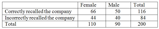 Construct a table of row percentages.
Construct a table of row percentages. Question
Question
Question
A local electronics retailer recently conducted a study on purchasers of large screen televisions.The study recorded the type of television and the credit account balance of the customer at the time of purchase.They obtained the following results. 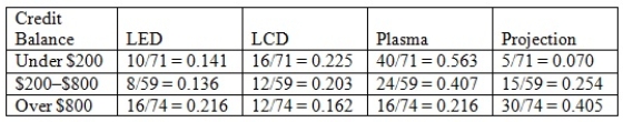 Construct a table of column percentages.
Construct a table of column percentages. Question

Unlock Deck
Sign up to unlock the cards in this deck!
Unlock Deck
Unlock Deck
1/85
Play
Full screen (f)
Deck 2: Descriptive Statistics: Tabular and Graphical Methods
1
Stem-and-leaf displays and dot plots are useful for detecting outliers.
True
2
When constructing any graphical display that utilizes categorical data,classes that have frequencies of 5 percent or less are usually combined together into a single category.
True
3
A stem-and-leaf display is a graphical portrayal of a data set that shows the data set's overall pattern of variation.
True
4
Splitting the stems refers to assigning the same stem to two or more rows of the stem-and-leaf display.
Unlock Deck
Unlock for access to all 85 flashcards in this deck.
Unlock Deck
k this deck
5
In the first step of setting up a Pareto chart,a frequency table should be constructed of the defects (or categories)in decreasing order of frequency.
Unlock Deck
Unlock for access to all 85 flashcards in this deck.
Unlock Deck
k this deck
6
The stem-and-leaf display is advantageous because it allows us to actually see the measurements in the data set.
Unlock Deck
Unlock for access to all 85 flashcards in this deck.
Unlock Deck
k this deck
7
The relative frequency is the frequency of a class divided by the total number of measurements.
Unlock Deck
Unlock for access to all 85 flashcards in this deck.
Unlock Deck
k this deck
8
When establishing the classes for a frequency table,it is generally agreed that the more classes you use the better your frequency table will be.
Unlock Deck
Unlock for access to all 85 flashcards in this deck.
Unlock Deck
k this deck
9
A runs plot is a form of scatter plot.
Unlock Deck
Unlock for access to all 85 flashcards in this deck.
Unlock Deck
k this deck
10
When we wish to summarize the proportion (or fraction)of items in a class,we use the frequency distribution for each class.
Unlock Deck
Unlock for access to all 85 flashcards in this deck.
Unlock Deck
k this deck
11
In a Pareto chart,the bar for the "Other" category should be placed to the far left of the chart.
Unlock Deck
Unlock for access to all 85 flashcards in this deck.
Unlock Deck
k this deck
12
A frequency table includes row and column percentages.
Unlock Deck
Unlock for access to all 85 flashcards in this deck.
Unlock Deck
k this deck
13
Each stem of a stem-and-leaf display should be a single digit.
Unlock Deck
Unlock for access to all 85 flashcards in this deck.
Unlock Deck
k this deck
14
A scatter plot can be used to identify outliers.
Unlock Deck
Unlock for access to all 85 flashcards in this deck.
Unlock Deck
k this deck
15
A bar chart is a graphic that can be used to depict qualitative data.
Unlock Deck
Unlock for access to all 85 flashcards in this deck.
Unlock Deck
k this deck
16
When looking at the shape of the distribution using a stem-and-leaf,a distribution is skewed to the right when the left tail is shorter than the right tail.
Unlock Deck
Unlock for access to all 85 flashcards in this deck.
Unlock Deck
k this deck
17
Beginning the vertical scale of a graph at a value different from zero can cause increases to look more dramatic.
Unlock Deck
Unlock for access to all 85 flashcards in this deck.
Unlock Deck
k this deck
18
The sample cumulative distribution function is nondecreasing.
Unlock Deck
Unlock for access to all 85 flashcards in this deck.
Unlock Deck
k this deck
19
It is possible to create different interpretations of the same graphical display by simply using different captions.
Unlock Deck
Unlock for access to all 85 flashcards in this deck.
Unlock Deck
k this deck
20
When data are qualitative,the bars should never be separated by gaps.
Unlock Deck
Unlock for access to all 85 flashcards in this deck.
Unlock Deck
k this deck
21
Row or column percentages can be found in
A) frequency tables.
B) relative frequency tables
C) cross-tabulation tables.
D) cumulative frequency tables.
A) frequency tables.
B) relative frequency tables
C) cross-tabulation tables.
D) cumulative frequency tables.
Unlock Deck
Unlock for access to all 85 flashcards in this deck.
Unlock Deck
k this deck
22
Leaves on a stem-and-leaf display should be rearranged so that they are in increasing order from left to right.
Unlock Deck
Unlock for access to all 85 flashcards in this deck.
Unlock Deck
k this deck
23
Sparklines are line charts often embedded with the text where they are being discussed.
Unlock Deck
Unlock for access to all 85 flashcards in this deck.
Unlock Deck
k this deck
24
Which of the following is the best analytic dashboard graphical method for visualizing hierarchical information?
A) bullet graph
B) sparkline
C) treemap
D) gauge
A) bullet graph
B) sparkline
C) treemap
D) gauge
Unlock Deck
Unlock for access to all 85 flashcards in this deck.
Unlock Deck
k this deck
25
Gauges feature a single measure showing variation over time.
Unlock Deck
Unlock for access to all 85 flashcards in this deck.
Unlock Deck
k this deck
26
An analytic dashboard presents both current and historical trends of a business's key performance indicators.
Unlock Deck
Unlock for access to all 85 flashcards in this deck.
Unlock Deck
k this deck
27
Treemaps are used to display qualitative measures of performance.
Unlock Deck
Unlock for access to all 85 flashcards in this deck.
Unlock Deck
k this deck
28
Data drill down is a form of data discovery.
Unlock Deck
Unlock for access to all 85 flashcards in this deck.
Unlock Deck
k this deck
29
If space is an issue when presenting analytic dashboard graphics,gauges should be used most frequently.
Unlock Deck
Unlock for access to all 85 flashcards in this deck.
Unlock Deck
k this deck
30
A treemap graphic is a series of clustered rectangles.
Unlock Deck
Unlock for access to all 85 flashcards in this deck.
Unlock Deck
k this deck
31
________ can be used to study the relationship between two variables.
A) Cross-tabulation tables
B) Frequency tables
C) Cumulative frequency distributions
D) Dot plots
A) Cross-tabulation tables
B) Frequency tables
C) Cumulative frequency distributions
D) Dot plots
Unlock Deck
Unlock for access to all 85 flashcards in this deck.
Unlock Deck
k this deck
32
Which of the following dashboard graphical methods will show variation over time?
A) bullet graph
B) sparkline
C) treemap
D) gauge
A) bullet graph
B) sparkline
C) treemap
D) gauge
Unlock Deck
Unlock for access to all 85 flashcards in this deck.
Unlock Deck
k this deck
33
A bullet graph features a single measure as either a horizontal or vertical bar.
Unlock Deck
Unlock for access to all 85 flashcards in this deck.
Unlock Deck
k this deck
34
A(n)______ is a graph of a cumulative distribution.
A) histogram
B) scatter plot
C) ogive plot
D) pie chart
A) histogram
B) scatter plot
C) ogive plot
D) pie chart
Unlock Deck
Unlock for access to all 85 flashcards in this deck.
Unlock Deck
k this deck
35
Which of the following is not a graphical tool for descriptive analytics (dashboards)?
A) bullet graph
B) sparkline
C) scatter plot
D) treemap
E) gauge
A) bullet graph
B) sparkline
C) scatter plot
D) treemap
E) gauge
Unlock Deck
Unlock for access to all 85 flashcards in this deck.
Unlock Deck
k this deck
36
As a business owner,I have requested my staff to develop a set of dashboards that can be used by the public to show wait time at each of my four local coffee shops at peak times during the day and whether the time is short,medium,or long.Which of the following graphical displays would be the best choice?
A) bullet graph
B) sparkline
C) treemap
D) gauges
A) bullet graph
B) sparkline
C) treemap
D) gauges
Unlock Deck
Unlock for access to all 85 flashcards in this deck.
Unlock Deck
k this deck
37
All of the following are used to describe quantitative data except the ___________.
A) histogram
B) stem-and-leaf chart
C) dot plot
D) pie chart
A) histogram
B) stem-and-leaf chart
C) dot plot
D) pie chart
Unlock Deck
Unlock for access to all 85 flashcards in this deck.
Unlock Deck
k this deck
38
Key performance indicators are best represented by a data discovery method.
Unlock Deck
Unlock for access to all 85 flashcards in this deck.
Unlock Deck
k this deck
39
Sparklines always need to be displayed with either their axes or coordinates.
Unlock Deck
Unlock for access to all 85 flashcards in this deck.
Unlock Deck
k this deck
40
A(n)_____________ is a graphical presentation of the current status and historical trends of a business's key performance indicators.
A) frequence distribution
B) histogram
C) Pareto chart
D) dashboard
A) frequence distribution
B) histogram
C) Pareto chart
D) dashboard
Unlock Deck
Unlock for access to all 85 flashcards in this deck.
Unlock Deck
k this deck
41
When developing a frequency distribution,the class (group)intervals should be ___________.
A) large
B) small
C) integer
D) mutually exclusive
E) equal
A) large
B) small
C) integer
D) mutually exclusive
E) equal
Unlock Deck
Unlock for access to all 85 flashcards in this deck.
Unlock Deck
k this deck
42
A ______________ shows the relationship between two variables.
A) stem-and-leaf
B) bar chart
C) histogram
D) scatter plot
E) pie chart
A) stem-and-leaf
B) bar chart
C) histogram
D) scatter plot
E) pie chart
Unlock Deck
Unlock for access to all 85 flashcards in this deck.
Unlock Deck
k this deck
43
Which one of the following graphical tools is used with quantitative data?
A) bar chart
B) histogram
C) pie chart
D) Pareto chart
A) bar chart
B) histogram
C) pie chart
D) Pareto chart
Unlock Deck
Unlock for access to all 85 flashcards in this deck.
Unlock Deck
k this deck
44
An observation separated from the rest of the data is a(n)___________.
A) absolute extreme
B) outlier
C) mode
D) quartile
A) absolute extreme
B) outlier
C) mode
D) quartile
Unlock Deck
Unlock for access to all 85 flashcards in this deck.
Unlock Deck
k this deck
45
If there are 62 values in a data set,how many classes should be created for a frequency histogram?
A) 4
B) 5
C) 6
D) 7
E) 8
A) 4
B) 5
C) 6
D) 7
E) 8
Unlock Deck
Unlock for access to all 85 flashcards in this deck.
Unlock Deck
k this deck
46
______________ and _____________ are used to describe qualitative (categorical)data.
A) Stem-and-leaf displays,scatter plots
B) Scatter plots,histograms
C) Box plots,bar charts
D) Bar charts,pie charts
E) Pie charts,histograms
A) Stem-and-leaf displays,scatter plots
B) Scatter plots,histograms
C) Box plots,bar charts
D) Bar charts,pie charts
E) Pie charts,histograms
Unlock Deck
Unlock for access to all 85 flashcards in this deck.
Unlock Deck
k this deck
47
A ______________ can be used to differentiate the "vital few" causes of quality problems from the "trivial many" causes of quality problems.
A) histogram
B) scatter plot
C) Pareto chart
D) ogive plot
E) stem-and-leaf display
A) histogram
B) scatter plot
C) Pareto chart
D) ogive plot
E) stem-and-leaf display
Unlock Deck
Unlock for access to all 85 flashcards in this deck.
Unlock Deck
k this deck
48
A flaw possessed by a population or sample unit is ___________.
A) always random
B) a defect
C) displayed by a dot plot
D) the cause for extreme skewness to the right
A) always random
B) a defect
C) displayed by a dot plot
D) the cause for extreme skewness to the right
Unlock Deck
Unlock for access to all 85 flashcards in this deck.
Unlock Deck
k this deck
49
If there are 30 values in a data set,how many classes should be created for a frequency histogram?
A) 4
B) 5
C) 6
D) 7
E) 8
A) 4
B) 5
C) 6
D) 7
E) 8
Unlock Deck
Unlock for access to all 85 flashcards in this deck.
Unlock Deck
k this deck
50
If there are 130 values in a data set,how many classes should be created for a frequency histogram?
A) 4
B) 5
C) 6
D) 7
E) 8
A) 4
B) 5
C) 6
D) 7
E) 8
Unlock Deck
Unlock for access to all 85 flashcards in this deck.
Unlock Deck
k this deck
51
A plot of the values of two variables is a _____ plot.
A) runs
B) scatter
C) dot
D) ogive
A) runs
B) scatter
C) dot
D) ogive
Unlock Deck
Unlock for access to all 85 flashcards in this deck.
Unlock Deck
k this deck
52
Which of the following graphs is for qualitative data?
A) histogram
B) bar chart
C) ogive plot
D) stem-and-leaf
A) histogram
B) bar chart
C) ogive plot
D) stem-and-leaf
Unlock Deck
Unlock for access to all 85 flashcards in this deck.
Unlock Deck
k this deck
53
A graphical portrayal of a quantitative data set that divides the data into classes and gives the frequency of each class is a(n)___________.
A) ogive plot
B) dot plot
C) histogram
D) Pareto chart
E) bar chart
A) ogive plot
B) dot plot
C) histogram
D) Pareto chart
E) bar chart
Unlock Deck
Unlock for access to all 85 flashcards in this deck.
Unlock Deck
k this deck
54
When grouping a large sample of measurements into classes,the ______________ is a better tool than the ___________.
A) histogram,stem-and-leaf display
B) box plot,histogram
C) stem-and-leaf display,scatter plot
D) scatter plot,box plot
A) histogram,stem-and-leaf display
B) box plot,histogram
C) stem-and-leaf display,scatter plot
D) scatter plot,box plot
Unlock Deck
Unlock for access to all 85 flashcards in this deck.
Unlock Deck
k this deck
55
All of the following are used to describe qualitative data except the ___________.
A) bar chart
B) pie chart
C) histogram
D) pareto chart
A) bar chart
B) pie chart
C) histogram
D) pareto chart
Unlock Deck
Unlock for access to all 85 flashcards in this deck.
Unlock Deck
k this deck
56
The number of measurements falling within a class interval is called the ___________.
A) frequency
B) relative frequency
C) leaf
D) cumulative sum
A) frequency
B) relative frequency
C) leaf
D) cumulative sum
Unlock Deck
Unlock for access to all 85 flashcards in this deck.
Unlock Deck
k this deck
57
A _____________ displays the frequency of each group with qualitative data and a _____________ displays the frequency of each group with quantitative data.
A) histogram,stem-and-leaf display
B) bar chart,histogram
C) scatter plot,bar chart
D) stem-and-leaf,pie chart
A) histogram,stem-and-leaf display
B) bar chart,histogram
C) scatter plot,bar chart
D) stem-and-leaf,pie chart
Unlock Deck
Unlock for access to all 85 flashcards in this deck.
Unlock Deck
k this deck
58
Which of the following graphical tools is not used to study the shapes of distributions?
A) stem-and-leaf display
B) scatter plot
C) histogram
D) dot plot
A) stem-and-leaf display
B) scatter plot
C) histogram
D) dot plot
Unlock Deck
Unlock for access to all 85 flashcards in this deck.
Unlock Deck
k this deck
59
If there are 120 values in a data set,how many classes should be created for a frequency histogram?
A) 4
B) 5
C) 6
D) 7
E) 8
A) 4
B) 5
C) 6
D) 7
E) 8
Unlock Deck
Unlock for access to all 85 flashcards in this deck.
Unlock Deck
k this deck
60
A Stem-and-leaf display is best used to ___________.
A) provide a point estimate of the variability of the data set
B) provide a point estimate of the central tendency of the data set
C) display the shape of the distribution
D) None of the other choices is correct.
A) provide a point estimate of the variability of the data set
B) provide a point estimate of the central tendency of the data set
C) display the shape of the distribution
D) None of the other choices is correct.
Unlock Deck
Unlock for access to all 85 flashcards in this deck.
Unlock Deck
k this deck
61
The number of items rejected daily by a manufacturer because of defects for the last 30 days are:
20,21,8,17,22,19,18,19,14,17,11,6,21,25,4,19,9,12,16,16,10,28,24,6,21,20,25,5,17,8
Construct a stem-and-leaf plot.
20,21,8,17,22,19,18,19,14,17,11,6,21,25,4,19,9,12,16,16,10,28,24,6,21,20,25,5,17,8
Construct a stem-and-leaf plot.
Unlock Deck
Unlock for access to all 85 flashcards in this deck.
Unlock Deck
k this deck
62
Recently an advertising company called 200 people and asked them to identify the company that was in an ad running nationwide.They obtained the following results. Construct a table of column percentages.
Construct a table of column percentages. Unlock Deck
Unlock for access to all 85 flashcards in this deck.
Unlock Deck
k this deck
63
The number of items rejected daily by a manufacturer because of defects for the last 30 days are:
20,21,8,17,22,19,18,19,14,17,11,6,21,25,4,19,9,12,16,16,10,28,24,6,21,20,25,5,17,8
Complete this frequency table for these data.
20,21,8,17,22,19,18,19,14,17,11,6,21,25,4,19,9,12,16,16,10,28,24,6,21,20,25,5,17,8
Complete this frequency table for these data.
Unlock Deck
Unlock for access to all 85 flashcards in this deck.
Unlock Deck
k this deck
64
An example of manipulating a graphical display to distort reality is ___________.
A) starting the axes at zero
B) making the bars in a histogram equal widths
C) stretching the axes
D) starting the axes at zero and stretching the axes
A) starting the axes at zero
B) making the bars in a histogram equal widths
C) stretching the axes
D) starting the axes at zero and stretching the axes
Unlock Deck
Unlock for access to all 85 flashcards in this deck.
Unlock Deck
k this deck
65
Consider the following data on distances traveled by people to visit the local amusement park. Construct an ogive plot that corresponds to the frequency table.
Construct an ogive plot that corresponds to the frequency table. Unlock Deck
Unlock for access to all 85 flashcards in this deck.
Unlock Deck
k this deck
66
Fill in the missing components of the following frequency distribution constructed for a sample size of 50.
Unlock Deck
Unlock for access to all 85 flashcards in this deck.
Unlock Deck
k this deck
67
The number of weekly sales calls by a sample of 25 pharmaceutical salespersons is below.24,56,43,35,37,27,29,44,34,28,33,28,46,31,38,41,48,38,27,29,37,33,31,40,50
Construct an ogive plot.
Construct an ogive plot.
Unlock Deck
Unlock for access to all 85 flashcards in this deck.
Unlock Deck
k this deck
68
A local electronics retailer recently conducted a study on purchasers of large screen televisions.The study recorded the type of television and the credit account balance of the customer at the time of purchase.They obtained the following results. Construct a table of row percentages.
Construct a table of row percentages. Unlock Deck
Unlock for access to all 85 flashcards in this deck.
Unlock Deck
k this deck
69
The percentage of measurements in a class is called the ___________ of that class.
A) frequency
B) relative frequency
C) leaf
D) cumulative percentage
A) frequency
B) relative frequency
C) leaf
D) cumulative percentage
Unlock Deck
Unlock for access to all 85 flashcards in this deck.
Unlock Deck
k this deck
70
The following is a relative frequency distribution of grades in an introductory statistics course. If we wish to depict these data using a pie chart,find how many degrees (out of 360 degrees)should be assigned to each grade.
If we wish to depict these data using a pie chart,find how many degrees (out of 360 degrees)should be assigned to each grade. Unlock Deck
Unlock for access to all 85 flashcards in this deck.
Unlock Deck
k this deck
71
The following is a relative frequency distribution of grades in an introductory statistics course. Construct a percent frequency bar chart for this data.
Construct a percent frequency bar chart for this data. Unlock Deck
Unlock for access to all 85 flashcards in this deck.
Unlock Deck
k this deck
72
The following is a relative frequency distribution of grades in an introductory statistics course. If this was the distribution of 200 students,give the frequency distribution for this data.
If this was the distribution of 200 students,give the frequency distribution for this data. Unlock Deck
Unlock for access to all 85 flashcards in this deck.
Unlock Deck
k this deck
73
A very simple graph that can be used to summarize a quantitative data set is called a(n)___________.
A) runs plot
B) ogive plot
C) dot plot
D) pie chart
A) runs plot
B) ogive plot
C) dot plot
D) pie chart
Unlock Deck
Unlock for access to all 85 flashcards in this deck.
Unlock Deck
k this deck
74
A relative frequency curve having a long tail to the right is said to be ___________.
A) skewed to the left
B) normal
C) a scatter plot
D) skewed to the right
A) skewed to the left
B) normal
C) a scatter plot
D) skewed to the right
Unlock Deck
Unlock for access to all 85 flashcards in this deck.
Unlock Deck
k this deck
75
Consider the following data. Create a stem-and-leaf display for the sample.
Create a stem-and-leaf display for the sample. Unlock Deck
Unlock for access to all 85 flashcards in this deck.
Unlock Deck
k this deck
76
Recently an advertising company called 200 people and asked them to identify the company that was in an ad running nationwide.They obtained the following results. Construct a table of row percentages.
Construct a table of row percentages. Unlock Deck
Unlock for access to all 85 flashcards in this deck.
Unlock Deck
k this deck
77
The number of items rejected daily by a manufacturer because of defects for the last 30 days are:
20,21,8,17,22,19,18,19,14,17,11,6,21,25,4,19,9,12,16,16,10,28,24,6,21,20,25,5,17,8
Construct an ogive plot.
20,21,8,17,22,19,18,19,14,17,11,6,21,25,4,19,9,12,16,16,10,28,24,6,21,20,25,5,17,8
Construct an ogive plot.
Unlock Deck
Unlock for access to all 85 flashcards in this deck.
Unlock Deck
k this deck
78
A histogram that tails out toward smaller values is ___________.
A) skewed to the left
B) normal
C) a scatter plot
D) skewed to the right
A) skewed to the left
B) normal
C) a scatter plot
D) skewed to the right
Unlock Deck
Unlock for access to all 85 flashcards in this deck.
Unlock Deck
k this deck
79
A local electronics retailer recently conducted a study on purchasers of large screen televisions.The study recorded the type of television and the credit account balance of the customer at the time of purchase.They obtained the following results. Construct a table of column percentages.
Construct a table of column percentages. Unlock Deck
Unlock for access to all 85 flashcards in this deck.
Unlock Deck
k this deck
80
A histogram that tails out toward larger values is ___________.
A) skewed to the left
B) normal
C) a scatter plot
D) skewed to the right
A) skewed to the left
B) normal
C) a scatter plot
D) skewed to the right
Unlock Deck
Unlock for access to all 85 flashcards in this deck.
Unlock Deck
k this deck
Unlock Deck
Unlock for access to all 85 flashcards in this deck.


