Deck 2: Tabular and Graphical Methods
Full screen (f)
Question
Question
Exhibit 2-1.An auto parts chain asked customers to complete a survey rating the chain's customer service as average,above average,or below average.The following shows the results from the survey:  Refer to Exhibit 2-1.A rating of Average or Above Average accounted for what number of responses to the survey?
A)3
B)7
C)8
D)10
Refer to Exhibit 2-1.A rating of Average or Above Average accounted for what number of responses to the survey?A)3
B)7
C)8
D)10
Question
Question
Question
Question
Question
Exhibit 2-1.An auto parts chain asked customers to complete a survey rating the chain's customer service as average,above average,or below average.The following shows the results from the survey: 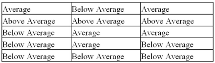 Refer to Exhibit 2-1.The proportion of customers that felt the customer service was average is closest to ______.
A)0.20
B)0.33
C)0.46
D)0.53
Refer to Exhibit 2-1.The proportion of customers that felt the customer service was average is closest to ______.A)0.20
B)0.33
C)0.46
D)0.53
Question
Question
Question
Question
Question
Question
To approximate the width of a class in the creation of a bar chart,we may use this formula: 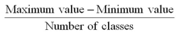 .
.
. Question
Question
Question
Question
Question
Question
Question
Question
Exhibit 2-6.The following data represent the recent sales price (in $1,000s)of 24 homes in a Midwestern city.  Refer to Exhibit 2-6.Suppose the data on house prices will be grouped into five classes.The width of the classes for a frequency distribution or histogram is closest to ______.
A)15
B)20
C)25
D)30
Refer to Exhibit 2-6.Suppose the data on house prices will be grouped into five classes.The width of the classes for a frequency distribution or histogram is closest to ______.A)15
B)20
C)25
D)30
Question
Question
Exhibit 2-5.The following data represent scores on a pop quiz in a statistics section: 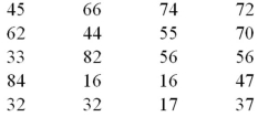 Refer to Exhibit 2-5.Suppose the data is grouped into five classes,and one of them will be "30 up to 44"-that is,{x;30 ≤ x < 44}.The relative frequency of this class is ____.
A)0.20
B)0.25
C)4
D)5
Refer to Exhibit 2-5.Suppose the data is grouped into five classes,and one of them will be "30 up to 44"-that is,{x;30 ≤ x < 44}.The relative frequency of this class is ____.A)0.20
B)0.25
C)4
D)5
Question
Exhibit 2-6.The following data represent the recent sales price (in $1,000s)of 24 homes in a Midwestern city.  Refer to Exhibit 2-6.Suppose the data is grouped into five classes,and one of them will be "165 up to 190"- that is,{x;165 ≤ x < 190}.The frequency of this class is ____.
A)6/24
B)7/24
C)6
D)7
Refer to Exhibit 2-6.Suppose the data is grouped into five classes,and one of them will be "165 up to 190"- that is,{x;165 ≤ x < 190}.The frequency of this class is ____.A)6/24
B)7/24
C)6
D)7
Question
Question
Exhibit 2-4.Students in Professor Smith's Business Statistics course have evaluated the overall effectiveness of the professor's instruction on a five-point scale,where a score of 1 indicates very poor performance and a score of 5 indicates outstanding performance.The raw scores are displayed in the accompanying table:  Refer to Exhibit 2-4.What is the most common score given in the evaluations?
A)2
B)3
C)4
D)5
Refer to Exhibit 2-4.What is the most common score given in the evaluations?A)2
B)3
C)4
D)5
Question
The accompanying chart shows the number of books written by each author in a collection of cookbooks.What type of data is being represented? 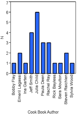
A)Quantitative,ordinal
B)Quantitative,ratio
C)Qualitative,nominal
D)Qualitative,ordinal
A)Quantitative,ordinal
B)Quantitative,ratio
C)Qualitative,nominal
D)Qualitative,ordinal
Question
Exhibit 2-2.The following is a list of five of the world's busiest airports by passenger traffic for 2010.  Refer to Exhibit 2-2.How many more millions of passengers flew out of Atlanta than flew out of Chicago?
A)13
B)21
C)23
D)25
Refer to Exhibit 2-2.How many more millions of passengers flew out of Atlanta than flew out of Chicago?A)13
B)21
C)23
D)25
Question
Exhibit 2-5.The following data represent scores on a pop quiz in a statistics section:  Refer to Exhibit 2-5.Suppose the data on quiz scores will be grouped into five classes.The width of the classes for a frequency distribution or histogram is closest to _____.
A)10
B)12
C)14
D)16
Refer to Exhibit 2-5.Suppose the data on quiz scores will be grouped into five classes.The width of the classes for a frequency distribution or histogram is closest to _____.A)10
B)12
C)14
D)16
Question
Exhibit 2-2.The following is a list of five of the world's busiest airports by passenger traffic for 2010. 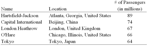 Refer to Exhibit 2-2.The percentage of passenger traffic in the five busiest airports that occurred in Asia is closest to __________.
A)18%
B)21%
C)25%
D)38%
Refer to Exhibit 2-2.The percentage of passenger traffic in the five busiest airports that occurred in Asia is closest to __________.A)18%
B)21%
C)25%
D)38%
Question
Exhibit 2-3.A city in California spent six million dollars repairing damage to its public buildings in 2010.The following table shows the categories where the money was directed.  Refer to Exhibit 2-3.How much did the city spend to fix damage caused by mold?
A)$360,000
B)$720,000
C)$1,440,000
D)$1,800,000
Refer to Exhibit 2-3.How much did the city spend to fix damage caused by mold?A)$360,000
B)$720,000
C)$1,440,000
D)$1,800,000
Question
The accompanying chart shows the numbers of books written by each author in a collection of cookbooks.What type of chart is this? 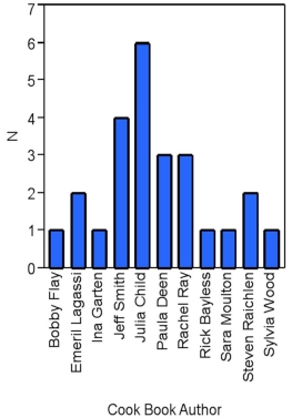
A)Bar chart for qualitative data
B)Bar chart for quantitative data
C)Frequency histogram for qualitative data
D)Frequency histogram for quantitative data
A)Bar chart for qualitative data
B)Bar chart for quantitative data
C)Frequency histogram for qualitative data
D)Frequency histogram for quantitative data
Question
Exhibit 2-5.The following data represent scores on a pop quiz in a statistics section:  Refer to Exhibit 2-5.Suppose the data is grouped into 5 classes,and one of them will be "30 up to 44"-that is,{x;30 ≤ x < 44}.The frequency of this class is ____.
A)0.20
B)0.25
C)4
D)5
Refer to Exhibit 2-5.Suppose the data is grouped into 5 classes,and one of them will be "30 up to 44"-that is,{x;30 ≤ x < 44}.The frequency of this class is ____.A)0.20
B)0.25
C)4
D)5
Question
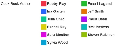
In the following pie chart representing a collection of cookbooks,which author has more titles? 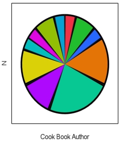
A)Jeff Smith
B)Julia Child
C)Rachel Ray
D)Paula Deen
A)Jeff Smith
B)Julia Child
C)Rachel Ray
D)Paula Deen
Question
Exhibit 2-3.A city in California spent six million dollars repairing damage to its public buildings in 2010.The following table shows the categories where the money was directed. 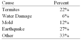 Refer to Exhibit 2-3.How much more did the city spend to fix damage caused by termites compared to the damage caused by water?
A)$360,000
B)$720,000
C)$960,000
D)$1,320,000
Refer to Exhibit 2-3.How much more did the city spend to fix damage caused by termites compared to the damage caused by water?A)$360,000
B)$720,000
C)$960,000
D)$1,320,000
Question
Question
Exhibit 2-4.Students in Professor Smith's Business Statistics course have evaluated the overall effectiveness of the professor's instruction on a five-point scale,where a score of 1 indicates very poor performance and a score of 5 indicates outstanding performance.The raw scores are displayed in the accompanying table:  Refer to Exhibit 2-4.What percentage of students gave Professor Smith an evaluation of 2 or less?
A)6.7%
B)13.3%
C)20%
D)80%
Refer to Exhibit 2-4.What percentage of students gave Professor Smith an evaluation of 2 or less?A)6.7%
B)13.3%
C)20%
D)80%
Question
Exhibit 2-6.The following data represent the recent sales price (in $1,000s)of 24 homes in a Midwestern city. 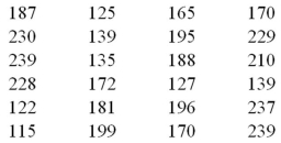 Refer to Exhibit 2-6.Suppose the data is grouped into five classes,and one of them will be "115 up to 140"- that is,{x;115 ≤ x < 140}.The relative frequency of this class is _____.
A)6/24
B)7/24
C)6
D)7
Refer to Exhibit 2-6.Suppose the data is grouped into five classes,and one of them will be "115 up to 140"- that is,{x;115 ≤ x < 140}.The relative frequency of this class is _____.A)6/24
B)7/24
C)6
D)7
Question
Exhibit 2-4.Students in Professor Smith's Business Statistics course have evaluated the overall effectiveness of the professor's instruction on a five-point scale,where a score of 1 indicates very poor performance and a score of 5 indicates outstanding performance.The raw scores are displayed in the accompanying table: 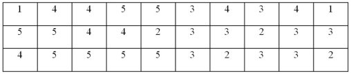 Refer to Exhibit 2-4.What percentage of students gave Professor Smith an evaluation higher than 3?
A)20%
B)30%
C)50%
D)80%
Refer to Exhibit 2-4.What percentage of students gave Professor Smith an evaluation higher than 3?A)20%
B)30%
C)50%
D)80%
Question
Exhibit 2-4.Students in Professor Smith's Business Statistics course have evaluated the overall effectiveness of the professor's instruction on a five-point scale,where a score of 1 indicates very poor performance and a score of 5 indicates outstanding performance.The raw scores are displayed in the accompanying table: 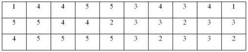 Refer to Exhibit 2-4.What is the relative frequency of the students who gave Professor Smith an evaluation of 3?
A)0.3
B)0.5
C)9
D)15
Refer to Exhibit 2-4.What is the relative frequency of the students who gave Professor Smith an evaluation of 3?A)0.3
B)0.5
C)9
D)15
Question
Exhibit 2-7.Thirty students at Eastside High School took the SAT on the same Saturday.Their raw scores are given next. 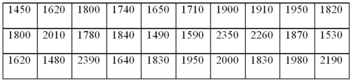 Refer to Exhibit 2-7.Consider a frequency distribution of the data that groups the data in classes of 1400 up to 1600,1600 up to 1800,1800 up to 2000,and so on.How many students scored at least 1800 but less than 2000?
A)3
B)7
C)12
D)18
Refer to Exhibit 2-7.Consider a frequency distribution of the data that groups the data in classes of 1400 up to 1600,1600 up to 1800,1800 up to 2000,and so on.How many students scored at least 1800 but less than 2000?A)3
B)7
C)12
D)18
Question
Exhibit 2-10.Automobiles traveling on a road with a posted speed limit of 65 miles per hour are checked for speed by a state police radar system.The following table is a frequency distribution of speeds. 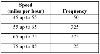 Refer to Exhibit 2-10.How many of the cars traveled less than 75 miles per hour?
A)275
B)325
C)650
D)675
Refer to Exhibit 2-10.How many of the cars traveled less than 75 miles per hour?A)275
B)325
C)650
D)675
Question
Exhibit 2-8.Consider the following frequency distribution.  Refer to Exhibit 2-8.How many observations are less than 21?
A)6
B)12
C)18
D)24
Refer to Exhibit 2-8.How many observations are less than 21?A)6
B)12
C)18
D)24
Question
Exhibit 2-10.Automobiles traveling on a road with a posted speed limit of 65 miles per hour are checked for speed by a state police radar system.The following table is a frequency distribution of speeds.  Refer to Exhibit 2-10.What proportion of the cars traveled at least 55 but less than 65 miles per hour?
A)0.33
B)0.48
C)0.56
D)0.80
Refer to Exhibit 2-10.What proportion of the cars traveled at least 55 but less than 65 miles per hour?A)0.33
B)0.48
C)0.56
D)0.80
Question
Exhibit 2-10.Automobiles traveling on a road with a posted speed limit of 65 miles per hour are checked for speed by a state police radar system.The following table is a frequency distribution of speeds.  Refer to Exhibit 2-10.When using a polygon to graph quantitative data,what does each point represent?
A)The lower limit of a particular class and its width
B)The midpoint of a particular class and its associated frequency or relative frequency
C)The midpoint of a particular class and its associated cumulative frequency or cumulative relative frequency
D)The upper limit of a particular class and its associated cumulative frequency or cumulative relative frequency
Refer to Exhibit 2-10.When using a polygon to graph quantitative data,what does each point represent?A)The lower limit of a particular class and its width
B)The midpoint of a particular class and its associated frequency or relative frequency
C)The midpoint of a particular class and its associated cumulative frequency or cumulative relative frequency
D)The upper limit of a particular class and its associated cumulative frequency or cumulative relative frequency
Question
Exhibit 2-9.An analyst constructed the following frequency distribution on the monthly returns for 50 selected stocks:  Refer to Exhibit 2-9.The number of stocks with returns of less than 10% is _____.
A)8
B)25
C)33
D)48
Refer to Exhibit 2-9.The number of stocks with returns of less than 10% is _____.A)8
B)25
C)33
D)48
Question
Exhibit 2-7.Thirty students at Eastside High School took the SAT on the same Saturday.Their raw scores are given next.  Refer to Exhibit 2-7.Consider a frequency distribution of the data that groups the data in classes of 1400 up to 1600,1600 up to 1800,1800 up to 2000,and so on.What percent of students scored less than 2200?
A)10%
B)20%
C)80%
D)90%
Refer to Exhibit 2-7.Consider a frequency distribution of the data that groups the data in classes of 1400 up to 1600,1600 up to 1800,1800 up to 2000,and so on.What percent of students scored less than 2200?A)10%
B)20%
C)80%
D)90%
Question
Exhibit 2-8.Consider the following frequency distribution.  Refer to Exhibit 2-8.How many observations are at least 15 but less than 18?
A)3
B)4
C)5
D)6
Refer to Exhibit 2-8.How many observations are at least 15 but less than 18?A)3
B)4
C)5
D)6
Question
Exhibit 2-9.An analyst constructed the following frequency distribution on the monthly returns for 50 selected stocks: 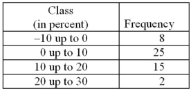 Refer to Exhibit 2-9.The proportion of stocks with returns of less than 10% is ____.
A)0.30
B)0.50
C)0.66
D)0.80
Refer to Exhibit 2-9.The proportion of stocks with returns of less than 10% is ____.A)0.30
B)0.50
C)0.66
D)0.80
Question
The following histogram represents the number of pages in each book within a collection.What is the frequency of books containing at least 250 but less than 400 pages? 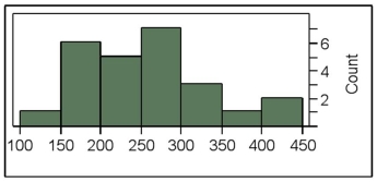
A)7
B)10
C)11
D)12
A)7
B)10
C)11
D)12
Question
Exhibit 2-9.An analyst constructed the following frequency distribution on the monthly returns for 50 selected stocks:  Refer to Exhibit 2-9.The proportion of stocks with returns of 0% up to 10% is _____.
A)0.30
B)0.50
C)0.66
D)0.80
Refer to Exhibit 2-9.The proportion of stocks with returns of 0% up to 10% is _____.A)0.30
B)0.50
C)0.66
D)0.80
Question
Exhibit 2-7.Thirty students at Eastside High School took the SAT on the same Saturday.Their raw scores are given next.  Refer to Exhibit 2-7.Consider a frequency distribution of the data that groups the data in classes of 1400 up to 1600,1600 up to 1800,1800 up to 2000,and so on.What is the approximate relative frequency of students who scored more than 1600 but less than 1800?
A)0.17
B)0.23
C)0.40
D)0.77
Refer to Exhibit 2-7.Consider a frequency distribution of the data that groups the data in classes of 1400 up to 1600,1600 up to 1800,1800 up to 2000,and so on.What is the approximate relative frequency of students who scored more than 1600 but less than 1800?A)0.17
B)0.23
C)0.40
D)0.77
Question
Exhibit 2-8.Consider the following frequency distribution.  Refer to Exhibit 2-8.What proportion of the observations are less than 21?
A)0.30
B)0.60
C)0.90
D)1
Refer to Exhibit 2-8.What proportion of the observations are less than 21?A)0.30
B)0.60
C)0.90
D)1
Question
Exhibit 2-9.An analyst constructed the following frequency distribution on the monthly returns for 50 selected stocks:  Refer to Exhibit 2-9.The number of stocks with returns of 0% up to 10% is ________.
A)2
B)8
C)15
D)25
Refer to Exhibit 2-9.The number of stocks with returns of 0% up to 10% is ________.A)2
B)8
C)15
D)25
Question
The following histogram represents the number of pages in each book within a collection.What is the frequency of books containing at least 200 but less than 250 pages? 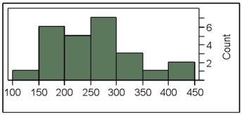
A)4
B)5
C)6
D)7
A)4
B)5
C)6
D)7
Question
Exhibit 2-8.Consider the following frequency distribution.  Refer to Exhibit 2-8.The total number of observations in the frequency distribution is _____.
A)5
B)6
C)20
D)24
Refer to Exhibit 2-8.The total number of observations in the frequency distribution is _____.A)5
B)6
C)20
D)24
Question
Exhibit 2-8.Consider the following frequency distribution.  Refer to Exhibit 2-8.What proportion of the observations are at least 15 but less than 18?
A)0.20
B)0.25
C)0.30
D)0.35
Refer to Exhibit 2-8.What proportion of the observations are at least 15 but less than 18?A)0.20
B)0.25
C)0.30
D)0.35
Question
The accompanying table shows students' scores from the final exam in a history course.  How many of the students scored at least 70 but less than 90?
A)24
B)31
C)55
D)88
How many of the students scored at least 70 but less than 90?A)24
B)31
C)55
D)88
Question
The following histogram represents the number of pages in each book within a collection.What is the frequency of books containing at least 250 but less than 300 pages? 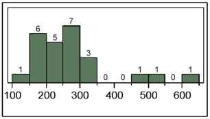
A)5
B)6
C)7
D)12
A)5
B)6
C)7
D)12
Question
Exhibit 2-7.Thirty students at Eastside High School took the SAT on the same Saturday.Their raw scores are given next.  Refer to Exhibit 2-7.Consider a frequency distribution of the data that groups the data in classes of 1400 up to 1600,1600 up to 1800,1800 up to 2000,and so on.What graphical tool would you use to display the cumulative relative frequency of the grouped data?
A)Ogive
B)Polygon
C)Pie Chart
D)Bar Chart
Refer to Exhibit 2-7.Consider a frequency distribution of the data that groups the data in classes of 1400 up to 1600,1600 up to 1800,1800 up to 2000,and so on.What graphical tool would you use to display the cumulative relative frequency of the grouped data?A)Ogive
B)Polygon
C)Pie Chart
D)Bar Chart
Question
What type of relationship is indicated in the scatterplot? 
A)No relationship
B)A negative linear relationship
C)A negative curvilinear relationship
D)A positive linear or curvilinear relationship
A)No relationship
B)A negative linear relationship
C)A negative curvilinear relationship
D)A positive linear or curvilinear relationship
Question
Exhibit 2-14.In the accompanying stem-and-leaf diagram,the values in the stem and leaf portions represent 10s and 1s digits,respectively.  Refer to Exhibit 2-14.The stem-and-leaf diagram shows that the distribution is __________.
A)Symmetric
B)Positively skewed
C)Negatively skewed
D)None of the above
Refer to Exhibit 2-14.The stem-and-leaf diagram shows that the distribution is __________.A)Symmetric
B)Positively skewed
C)Negatively skewed
D)None of the above
Question
Question
Exhibit 2-14.In the accompanying stem-and-leaf diagram,the values in the stem and leaf portions represent 10s and 1s digits,respectively. 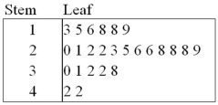 Refer to Exhibit 2-14.Which of the following numbers appears in the stem-and-leaf diagram?
A)3800
B)380
C)38
D)3.8
Refer to Exhibit 2-14.Which of the following numbers appears in the stem-and-leaf diagram?A)3800
B)380
C)38
D)3.8
Question
Exhibit 2-11.The accompanying relative frequency distribution represents the last year car sales for the sales force at Kelly's Mega Used Car Center.  Refer to Exhibit 2-11.If Kelly's employs 100 salespeople,how many of these salespeople have sold at least 45 but less than 65 cars in the last year?
A)15
B)31
C)40
D)46
Refer to Exhibit 2-11.If Kelly's employs 100 salespeople,how many of these salespeople have sold at least 45 but less than 65 cars in the last year?A)15
B)31
C)40
D)46
Question
The following stem-and-leaf diagram shows the speeds in miles per hour (mph)of 14 cars approaching a toll booth on a bridge in Oakland,California. 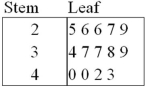 How many of the cars were traveling faster than 25 mph but slower than 40 mph?
A)8
B)9
C)10
D)12
How many of the cars were traveling faster than 25 mph but slower than 40 mph?A)8
B)9
C)10
D)12
Question
Exhibit 2-14.In the accompanying stem-and-leaf diagram,the values in the stem and leaf portions represent 10s and 1s digits,respectively.  Refer to Exhibit 2-14.How many values are at least 25 but less than 35?
A)10
B)11
C)12
D)13
Refer to Exhibit 2-14.How many values are at least 25 but less than 35?A)10
B)11
C)12
D)13
Question
Question
Exhibit 2-13.The organization of the Girl Sprouts has completed its annual cookie drive.The sales are reported in the accompanying ogive.  Refer to Exhibit 2-13.Approximate the percentage of girls who sold less than 90 boxes of cookies.
A)45%
B)55%
C)65%
D)75%
Refer to Exhibit 2-13.Approximate the percentage of girls who sold less than 90 boxes of cookies.A)45%
B)55%
C)65%
D)75%
Question
The following stem-and-leaf diagram shows the last 20 dividend payments (in cents)paid by Proctor and Gamble. 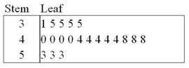 The most common dividend payment is ____.
A)0.35
B)0.40
C)0.44
D)0.48
The most common dividend payment is ____.A)0.35
B)0.40
C)0.44
D)0.48
Question
Question
Exhibit 2-11.The accompanying relative frequency distribution represents the last year car sales for the sales force at Kelly's Mega Used Car Center.  Refer to Exhibit 2-11.If Kelly's employs 100 salespeople,how many of these salespeople have sold at least 65 cars in the last year?
A)22
B)25
C)31
D)47
Refer to Exhibit 2-11.If Kelly's employs 100 salespeople,how many of these salespeople have sold at least 65 cars in the last year?A)22
B)25
C)31
D)47
Question
Exhibit 2-11.The accompanying relative frequency distribution represents the last year car sales for the sales force at Kelly's Mega Used Car Center. 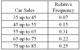 Refer to Exhibit 2-11.If Kelly's employs 100 salespeople,how many of these salespeople have sold at least 35 but less than 45 cars in the last year?
A)5
B)7
C)10
D)15
Refer to Exhibit 2-11.If Kelly's employs 100 salespeople,how many of these salespeople have sold at least 35 but less than 45 cars in the last year?A)5
B)7
C)10
D)15
Question
Exhibit 2-14.In the accompanying stem-and-leaf diagram,the values in the stem and leaf portions represent 10s and 1s digits,respectively.  Refer to Exhibit 2-14.Find the frequency associated with data values that are more than 28.
A)8
B)9
C)10
D)11
Refer to Exhibit 2-14.Find the frequency associated with data values that are more than 28.A)8
B)9
C)10
D)11
Question
Exhibit 2-13.The organization of the Girl Sprouts has completed its annual cookie drive.The sales are reported in the accompanying ogive. 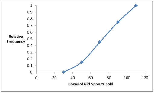 Refer to Exhibit 2-13.Approximate the percentage of girls who sold more than 70 boxes of cookies.
A)45%
B)55%
C)65%
D)75%
Refer to Exhibit 2-13.Approximate the percentage of girls who sold more than 70 boxes of cookies.A)45%
B)55%
C)65%
D)75%
Question
What type of relationship is indicated in the scatterplot? 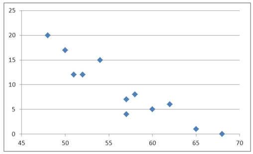
A)No relationship
B)A negative linear relationship
C)A positive linear relationship
D)A positive curvilinear relationship
A)No relationship
B)A negative linear relationship
C)A positive linear relationship
D)A positive curvilinear relationship
Question
Question
What type of relationship is indicated in the scatterplot? 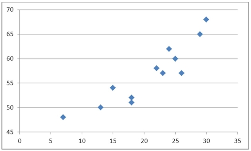
A)No relationship
B)A negative linear relationship
C)A negative curvilinear relationship
D)A positive linear or curvilinear relationship
A)No relationship
B)A negative linear relationship
C)A negative curvilinear relationship
D)A positive linear or curvilinear relationship
Question
Exhibit 2-14.In the accompanying stem-and-leaf diagram,the values in the stem and leaf portions represent 10s and 1s digits,respectively.  Refer to Exhibit 2-14.What would be the frequency of the class 35 up to 45,that is {x;35 ≤ x < 45}?
A)0
B)1
C)2
D)3
Refer to Exhibit 2-14.What would be the frequency of the class 35 up to 45,that is {x;35 ≤ x < 45}?A)0
B)1
C)2
D)3
Question
The following table shows the number of payroll jobs the government added during the years its added jobs (since 1973).The jobs are in thousands. 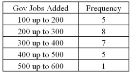 Approximately what percent of the time did the government add 200,000 or more jobs?
A)19%
B)50%
C)77%
D)81%
Approximately what percent of the time did the government add 200,000 or more jobs?A)19%
B)50%
C)77%
D)81%

Unlock Deck
Sign up to unlock the cards in this deck!
Unlock Deck
Unlock Deck
1/99
Play
Full screen (f)
Deck 2: Tabular and Graphical Methods
1
A pie chart is a segmented circle that portrays the categories and relative sizes of some quantitative variable.
False
2
Exhibit 2-1.An auto parts chain asked customers to complete a survey rating the chain's customer service as average,above average,or below average.The following shows the results from the survey: Refer to Exhibit 2-1.A rating of Average or Above Average accounted for what number of responses to the survey?
A)3
B)7
C)8
D)10
Refer to Exhibit 2-1.A rating of Average or Above Average accounted for what number of responses to the survey?A)3
B)7
C)8
D)10
8
3
For which of the following data sets will a pie chart be most useful?
A)Heights of high school freshmen
B)Ambient temperatures in the U.S.Capitol Building
C)Percentage of net sales by product for Lenovo in 2011
D)Growth rates of firms in a particular industry
A)Heights of high school freshmen
B)Ambient temperatures in the U.S.Capitol Building
C)Percentage of net sales by product for Lenovo in 2011
D)Growth rates of firms in a particular industry
Percentage of net sales by product for Lenovo in 2011
4
A stem-and-leaf diagram is useful in that it gives an overall picture of where quantitative data are centered and how the data are dispersed from the center.
Unlock Deck
Unlock for access to all 99 flashcards in this deck.
Unlock Deck
k this deck
5
The percent frequency of a category equals the frequency of the category multiplied by 100%.
Unlock Deck
Unlock for access to all 99 flashcards in this deck.
Unlock Deck
k this deck
6
A scatterplot is a graphical tool that helps determine whether or not two quantitative variables are related.
Unlock Deck
Unlock for access to all 99 flashcards in this deck.
Unlock Deck
k this deck
7
Exhibit 2-1.An auto parts chain asked customers to complete a survey rating the chain's customer service as average,above average,or below average.The following shows the results from the survey: Refer to Exhibit 2-1.The proportion of customers that felt the customer service was average is closest to ______.
A)0.20
B)0.33
C)0.46
D)0.53
Refer to Exhibit 2-1.The proportion of customers that felt the customer service was average is closest to ______.A)0.20
B)0.33
C)0.46
D)0.53
Unlock Deck
Unlock for access to all 99 flashcards in this deck.
Unlock Deck
k this deck
8
A bar chart depicts the frequency or relative frequency of each category of qualitative data as a bar rising vertically from the horizontal axis.It is also acceptable for the bar to extend horizontally from the vertical axis.
Unlock Deck
Unlock for access to all 99 flashcards in this deck.
Unlock Deck
k this deck
9
A polygon connects a series of neighboring points where each point represents the midpoint of a particular class and its associated frequency or relative frequency.
Unlock Deck
Unlock for access to all 99 flashcards in this deck.
Unlock Deck
k this deck
10
For quantitative data,a cumulative frequency distribution records the number of observations that fall below the upper limit of each class.
Unlock Deck
Unlock for access to all 99 flashcards in this deck.
Unlock Deck
k this deck
11
When constructing a scatterplot for two quantitative variables,we usually refer to one variable as x and another one as y.Typically,we graph x on the vertical axis and y on the horizontal axis.
Unlock Deck
Unlock for access to all 99 flashcards in this deck.
Unlock Deck
k this deck
12
Frequency distributions may be used to describe which of the following types of data?
A)Nominal and ordinal data only
B)Nominal and interval data only
C)Nominal,ordinal,and interval data only
D)Nominal,ordinal,interval,and ratio data
A)Nominal and ordinal data only
B)Nominal and interval data only
C)Nominal,ordinal,and interval data only
D)Nominal,ordinal,interval,and ratio data
Unlock Deck
Unlock for access to all 99 flashcards in this deck.
Unlock Deck
k this deck
13
To approximate the width of a class in the creation of a bar chart,we may use this formula: .
. Unlock Deck
Unlock for access to all 99 flashcards in this deck.
Unlock Deck
k this deck
14
For quantitative data,a cumulative relative frequency distribution records the proportion (fraction)of values that fall below the upper limit of each class.
Unlock Deck
Unlock for access to all 99 flashcards in this deck.
Unlock Deck
k this deck
15
For both qualitative and quantitative data,what is the difference between the relative frequency and the percent frequency?
A)The relative frequency equals the percent frequency multiplied by 100.
B)The percent frequency equals the relative frequency multiplied by 100.
C)As opposed to the relative frequency,the percent frequency is divided by the number of observations in the data set.
D)As opposed to the percent frequency,the relative frequency is divided by the number of observations in the data set.
Unlock Deck
Unlock for access to all 99 flashcards in this deck.
Unlock Deck
k this deck
16
A frequency distribution for qualitative data groups this data into classes called intervals and records the total number of observations in each class.
Unlock Deck
Unlock for access to all 99 flashcards in this deck.
Unlock Deck
k this deck
17
An ogive is a graph that plots the cumulative frequency (or the cumulative relative frequency)of each class above the lower limit of the corresponding class.
Unlock Deck
Unlock for access to all 99 flashcards in this deck.
Unlock Deck
k this deck
18
In order to summarize qualitative data,a useful tool is a _________.
A)Histogram
B)Frequency distribution
C)Stem-and-leaf diagram
D)All of the above
A)Histogram
B)Frequency distribution
C)Stem-and-leaf diagram
D)All of the above
Unlock Deck
Unlock for access to all 99 flashcards in this deck.
Unlock Deck
k this deck
19
The relative frequency of a category is calculated by dividing the category's frequency by the total number of observations.
Unlock Deck
Unlock for access to all 99 flashcards in this deck.
Unlock Deck
k this deck
20
A histogram is a series of rectangles where the width and height of each rectangle represent the frequency (or relative frequency)and the width of the class,respectively.
Unlock Deck
Unlock for access to all 99 flashcards in this deck.
Unlock Deck
k this deck
21
Exhibit 2-6.The following data represent the recent sales price (in $1,000s)of 24 homes in a Midwestern city. Refer to Exhibit 2-6.Suppose the data on house prices will be grouped into five classes.The width of the classes for a frequency distribution or histogram is closest to ______.
A)15
B)20
C)25
D)30
Refer to Exhibit 2-6.Suppose the data on house prices will be grouped into five classes.The width of the classes for a frequency distribution or histogram is closest to ______.A)15
B)20
C)25
D)30
Unlock Deck
Unlock for access to all 99 flashcards in this deck.
Unlock Deck
k this deck
22
What graphical tool is best used to display the relative frequency of grouped quantitative data?
A)Ogive
B)Pie chart
C)Bar chart
D)Histogram
A)Ogive
B)Pie chart
C)Bar chart
D)Histogram
Unlock Deck
Unlock for access to all 99 flashcards in this deck.
Unlock Deck
k this deck
23
Exhibit 2-5.The following data represent scores on a pop quiz in a statistics section: Refer to Exhibit 2-5.Suppose the data is grouped into five classes,and one of them will be "30 up to 44"-that is,{x;30 ≤ x < 44}.The relative frequency of this class is ____.
A)0.20
B)0.25
C)4
D)5
Refer to Exhibit 2-5.Suppose the data is grouped into five classes,and one of them will be "30 up to 44"-that is,{x;30 ≤ x < 44}.The relative frequency of this class is ____.A)0.20
B)0.25
C)4
D)5
Unlock Deck
Unlock for access to all 99 flashcards in this deck.
Unlock Deck
k this deck
24
Exhibit 2-6.The following data represent the recent sales price (in $1,000s)of 24 homes in a Midwestern city. Refer to Exhibit 2-6.Suppose the data is grouped into five classes,and one of them will be "165 up to 190"- that is,{x;165 ≤ x < 190}.The frequency of this class is ____.
A)6/24
B)7/24
C)6
D)7
Refer to Exhibit 2-6.Suppose the data is grouped into five classes,and one of them will be "165 up to 190"- that is,{x;165 ≤ x < 190}.The frequency of this class is ____.A)6/24
B)7/24
C)6
D)7
Unlock Deck
Unlock for access to all 99 flashcards in this deck.
Unlock Deck
k this deck
25
When constructing a frequency distribution for quantitative data,it is important to remember that ____________.
A)Classes are mutually exclusive
B)Classes are collectively exhaustive
C)The total number of classes usually ranges from 5 to 20
D)All of the above
A)Classes are mutually exclusive
B)Classes are collectively exhaustive
C)The total number of classes usually ranges from 5 to 20
D)All of the above
Unlock Deck
Unlock for access to all 99 flashcards in this deck.
Unlock Deck
k this deck
26
Exhibit 2-4.Students in Professor Smith's Business Statistics course have evaluated the overall effectiveness of the professor's instruction on a five-point scale,where a score of 1 indicates very poor performance and a score of 5 indicates outstanding performance.The raw scores are displayed in the accompanying table: Refer to Exhibit 2-4.What is the most common score given in the evaluations?
A)2
B)3
C)4
D)5
Refer to Exhibit 2-4.What is the most common score given in the evaluations?A)2
B)3
C)4
D)5
Unlock Deck
Unlock for access to all 99 flashcards in this deck.
Unlock Deck
k this deck
27
The accompanying chart shows the number of books written by each author in a collection of cookbooks.What type of data is being represented?
A)Quantitative,ordinal
B)Quantitative,ratio
C)Qualitative,nominal
D)Qualitative,ordinal
A)Quantitative,ordinal
B)Quantitative,ratio
C)Qualitative,nominal
D)Qualitative,ordinal
Unlock Deck
Unlock for access to all 99 flashcards in this deck.
Unlock Deck
k this deck
28
Exhibit 2-2.The following is a list of five of the world's busiest airports by passenger traffic for 2010. Refer to Exhibit 2-2.How many more millions of passengers flew out of Atlanta than flew out of Chicago?
A)13
B)21
C)23
D)25
Refer to Exhibit 2-2.How many more millions of passengers flew out of Atlanta than flew out of Chicago?A)13
B)21
C)23
D)25
Unlock Deck
Unlock for access to all 99 flashcards in this deck.
Unlock Deck
k this deck
29
Exhibit 2-5.The following data represent scores on a pop quiz in a statistics section: Refer to Exhibit 2-5.Suppose the data on quiz scores will be grouped into five classes.The width of the classes for a frequency distribution or histogram is closest to _____.
A)10
B)12
C)14
D)16
Refer to Exhibit 2-5.Suppose the data on quiz scores will be grouped into five classes.The width of the classes for a frequency distribution or histogram is closest to _____.A)10
B)12
C)14
D)16
Unlock Deck
Unlock for access to all 99 flashcards in this deck.
Unlock Deck
k this deck
30
Exhibit 2-2.The following is a list of five of the world's busiest airports by passenger traffic for 2010. Refer to Exhibit 2-2.The percentage of passenger traffic in the five busiest airports that occurred in Asia is closest to __________.
A)18%
B)21%
C)25%
D)38%
Refer to Exhibit 2-2.The percentage of passenger traffic in the five busiest airports that occurred in Asia is closest to __________.A)18%
B)21%
C)25%
D)38%
Unlock Deck
Unlock for access to all 99 flashcards in this deck.
Unlock Deck
k this deck
31
Exhibit 2-3.A city in California spent six million dollars repairing damage to its public buildings in 2010.The following table shows the categories where the money was directed. Refer to Exhibit 2-3.How much did the city spend to fix damage caused by mold?
A)$360,000
B)$720,000
C)$1,440,000
D)$1,800,000
Refer to Exhibit 2-3.How much did the city spend to fix damage caused by mold?A)$360,000
B)$720,000
C)$1,440,000
D)$1,800,000
Unlock Deck
Unlock for access to all 99 flashcards in this deck.
Unlock Deck
k this deck
32
The accompanying chart shows the numbers of books written by each author in a collection of cookbooks.What type of chart is this?
A)Bar chart for qualitative data
B)Bar chart for quantitative data
C)Frequency histogram for qualitative data
D)Frequency histogram for quantitative data
A)Bar chart for qualitative data
B)Bar chart for quantitative data
C)Frequency histogram for qualitative data
D)Frequency histogram for quantitative data
Unlock Deck
Unlock for access to all 99 flashcards in this deck.
Unlock Deck
k this deck
33
Exhibit 2-5.The following data represent scores on a pop quiz in a statistics section: Refer to Exhibit 2-5.Suppose the data is grouped into 5 classes,and one of them will be "30 up to 44"-that is,{x;30 ≤ x < 44}.The frequency of this class is ____.
A)0.20
B)0.25
C)4
D)5
Refer to Exhibit 2-5.Suppose the data is grouped into 5 classes,and one of them will be "30 up to 44"-that is,{x;30 ≤ x < 44}.The frequency of this class is ____.A)0.20
B)0.25
C)4
D)5
Unlock Deck
Unlock for access to all 99 flashcards in this deck.
Unlock Deck
k this deck
34
In the following pie chart representing a collection of cookbooks,which author has more titles?
A)Jeff Smith
B)Julia Child
C)Rachel Ray
D)Paula Deen
A)Jeff Smith
B)Julia Child
C)Rachel Ray
D)Paula Deen
Unlock Deck
Unlock for access to all 99 flashcards in this deck.
Unlock Deck
k this deck
35
Exhibit 2-3.A city in California spent six million dollars repairing damage to its public buildings in 2010.The following table shows the categories where the money was directed. Refer to Exhibit 2-3.How much more did the city spend to fix damage caused by termites compared to the damage caused by water?
A)$360,000
B)$720,000
C)$960,000
D)$1,320,000
Refer to Exhibit 2-3.How much more did the city spend to fix damage caused by termites compared to the damage caused by water?A)$360,000
B)$720,000
C)$960,000
D)$1,320,000
Unlock Deck
Unlock for access to all 99 flashcards in this deck.
Unlock Deck
k this deck
36
Which of the following best describes a frequency distribution for qualitative data?
A)It groups data into histograms and records the proportion (fraction)of observations in each histogram.
B)It groups data into categories and records the number of observations in each category.
C)It groups data into intervals called classes and records the proportion (fraction)of observations in each class.
D)It groups data into intervals called classes and records the number of observations in each class.
Unlock Deck
Unlock for access to all 99 flashcards in this deck.
Unlock Deck
k this deck
37
Exhibit 2-4.Students in Professor Smith's Business Statistics course have evaluated the overall effectiveness of the professor's instruction on a five-point scale,where a score of 1 indicates very poor performance and a score of 5 indicates outstanding performance.The raw scores are displayed in the accompanying table: Refer to Exhibit 2-4.What percentage of students gave Professor Smith an evaluation of 2 or less?
A)6.7%
B)13.3%
C)20%
D)80%
Refer to Exhibit 2-4.What percentage of students gave Professor Smith an evaluation of 2 or less?A)6.7%
B)13.3%
C)20%
D)80%
Unlock Deck
Unlock for access to all 99 flashcards in this deck.
Unlock Deck
k this deck
38
Exhibit 2-6.The following data represent the recent sales price (in $1,000s)of 24 homes in a Midwestern city. Refer to Exhibit 2-6.Suppose the data is grouped into five classes,and one of them will be "115 up to 140"- that is,{x;115 ≤ x < 140}.The relative frequency of this class is _____.
A)6/24
B)7/24
C)6
D)7
Refer to Exhibit 2-6.Suppose the data is grouped into five classes,and one of them will be "115 up to 140"- that is,{x;115 ≤ x < 140}.The relative frequency of this class is _____.A)6/24
B)7/24
C)6
D)7
Unlock Deck
Unlock for access to all 99 flashcards in this deck.
Unlock Deck
k this deck
39
Exhibit 2-4.Students in Professor Smith's Business Statistics course have evaluated the overall effectiveness of the professor's instruction on a five-point scale,where a score of 1 indicates very poor performance and a score of 5 indicates outstanding performance.The raw scores are displayed in the accompanying table: Refer to Exhibit 2-4.What percentage of students gave Professor Smith an evaluation higher than 3?
A)20%
B)30%
C)50%
D)80%
Refer to Exhibit 2-4.What percentage of students gave Professor Smith an evaluation higher than 3?A)20%
B)30%
C)50%
D)80%
Unlock Deck
Unlock for access to all 99 flashcards in this deck.
Unlock Deck
k this deck
40
Exhibit 2-4.Students in Professor Smith's Business Statistics course have evaluated the overall effectiveness of the professor's instruction on a five-point scale,where a score of 1 indicates very poor performance and a score of 5 indicates outstanding performance.The raw scores are displayed in the accompanying table: Refer to Exhibit 2-4.What is the relative frequency of the students who gave Professor Smith an evaluation of 3?
A)0.3
B)0.5
C)9
D)15
Refer to Exhibit 2-4.What is the relative frequency of the students who gave Professor Smith an evaluation of 3?A)0.3
B)0.5
C)9
D)15
Unlock Deck
Unlock for access to all 99 flashcards in this deck.
Unlock Deck
k this deck
41
Exhibit 2-7.Thirty students at Eastside High School took the SAT on the same Saturday.Their raw scores are given next. Refer to Exhibit 2-7.Consider a frequency distribution of the data that groups the data in classes of 1400 up to 1600,1600 up to 1800,1800 up to 2000,and so on.How many students scored at least 1800 but less than 2000?
A)3
B)7
C)12
D)18
Refer to Exhibit 2-7.Consider a frequency distribution of the data that groups the data in classes of 1400 up to 1600,1600 up to 1800,1800 up to 2000,and so on.How many students scored at least 1800 but less than 2000?A)3
B)7
C)12
D)18
Unlock Deck
Unlock for access to all 99 flashcards in this deck.
Unlock Deck
k this deck
42
Exhibit 2-10.Automobiles traveling on a road with a posted speed limit of 65 miles per hour are checked for speed by a state police radar system.The following table is a frequency distribution of speeds. Refer to Exhibit 2-10.How many of the cars traveled less than 75 miles per hour?
A)275
B)325
C)650
D)675
Refer to Exhibit 2-10.How many of the cars traveled less than 75 miles per hour?A)275
B)325
C)650
D)675
Unlock Deck
Unlock for access to all 99 flashcards in this deck.
Unlock Deck
k this deck
43
Exhibit 2-8.Consider the following frequency distribution. Refer to Exhibit 2-8.How many observations are less than 21?
A)6
B)12
C)18
D)24
Refer to Exhibit 2-8.How many observations are less than 21?A)6
B)12
C)18
D)24
Unlock Deck
Unlock for access to all 99 flashcards in this deck.
Unlock Deck
k this deck
44
Exhibit 2-10.Automobiles traveling on a road with a posted speed limit of 65 miles per hour are checked for speed by a state police radar system.The following table is a frequency distribution of speeds. Refer to Exhibit 2-10.What proportion of the cars traveled at least 55 but less than 65 miles per hour?
A)0.33
B)0.48
C)0.56
D)0.80
Refer to Exhibit 2-10.What proportion of the cars traveled at least 55 but less than 65 miles per hour?A)0.33
B)0.48
C)0.56
D)0.80
Unlock Deck
Unlock for access to all 99 flashcards in this deck.
Unlock Deck
k this deck
45
Exhibit 2-10.Automobiles traveling on a road with a posted speed limit of 65 miles per hour are checked for speed by a state police radar system.The following table is a frequency distribution of speeds. Refer to Exhibit 2-10.When using a polygon to graph quantitative data,what does each point represent?
A)The lower limit of a particular class and its width
B)The midpoint of a particular class and its associated frequency or relative frequency
C)The midpoint of a particular class and its associated cumulative frequency or cumulative relative frequency
D)The upper limit of a particular class and its associated cumulative frequency or cumulative relative frequency
Refer to Exhibit 2-10.When using a polygon to graph quantitative data,what does each point represent?A)The lower limit of a particular class and its width
B)The midpoint of a particular class and its associated frequency or relative frequency
C)The midpoint of a particular class and its associated cumulative frequency or cumulative relative frequency
D)The upper limit of a particular class and its associated cumulative frequency or cumulative relative frequency
Unlock Deck
Unlock for access to all 99 flashcards in this deck.
Unlock Deck
k this deck
46
Exhibit 2-9.An analyst constructed the following frequency distribution on the monthly returns for 50 selected stocks: Refer to Exhibit 2-9.The number of stocks with returns of less than 10% is _____.
A)8
B)25
C)33
D)48
Refer to Exhibit 2-9.The number of stocks with returns of less than 10% is _____.A)8
B)25
C)33
D)48
Unlock Deck
Unlock for access to all 99 flashcards in this deck.
Unlock Deck
k this deck
47
Exhibit 2-7.Thirty students at Eastside High School took the SAT on the same Saturday.Their raw scores are given next. Refer to Exhibit 2-7.Consider a frequency distribution of the data that groups the data in classes of 1400 up to 1600,1600 up to 1800,1800 up to 2000,and so on.What percent of students scored less than 2200?
A)10%
B)20%
C)80%
D)90%
Refer to Exhibit 2-7.Consider a frequency distribution of the data that groups the data in classes of 1400 up to 1600,1600 up to 1800,1800 up to 2000,and so on.What percent of students scored less than 2200?A)10%
B)20%
C)80%
D)90%
Unlock Deck
Unlock for access to all 99 flashcards in this deck.
Unlock Deck
k this deck
48
Exhibit 2-8.Consider the following frequency distribution. Refer to Exhibit 2-8.How many observations are at least 15 but less than 18?
A)3
B)4
C)5
D)6
Refer to Exhibit 2-8.How many observations are at least 15 but less than 18?A)3
B)4
C)5
D)6
Unlock Deck
Unlock for access to all 99 flashcards in this deck.
Unlock Deck
k this deck
49
Exhibit 2-9.An analyst constructed the following frequency distribution on the monthly returns for 50 selected stocks: Refer to Exhibit 2-9.The proportion of stocks with returns of less than 10% is ____.
A)0.30
B)0.50
C)0.66
D)0.80
Refer to Exhibit 2-9.The proportion of stocks with returns of less than 10% is ____.A)0.30
B)0.50
C)0.66
D)0.80
Unlock Deck
Unlock for access to all 99 flashcards in this deck.
Unlock Deck
k this deck
50
The following histogram represents the number of pages in each book within a collection.What is the frequency of books containing at least 250 but less than 400 pages?
A)7
B)10
C)11
D)12
A)7
B)10
C)11
D)12
Unlock Deck
Unlock for access to all 99 flashcards in this deck.
Unlock Deck
k this deck
51
Exhibit 2-9.An analyst constructed the following frequency distribution on the monthly returns for 50 selected stocks: Refer to Exhibit 2-9.The proportion of stocks with returns of 0% up to 10% is _____.
A)0.30
B)0.50
C)0.66
D)0.80
Refer to Exhibit 2-9.The proportion of stocks with returns of 0% up to 10% is _____.A)0.30
B)0.50
C)0.66
D)0.80
Unlock Deck
Unlock for access to all 99 flashcards in this deck.
Unlock Deck
k this deck
52
Exhibit 2-7.Thirty students at Eastside High School took the SAT on the same Saturday.Their raw scores are given next. Refer to Exhibit 2-7.Consider a frequency distribution of the data that groups the data in classes of 1400 up to 1600,1600 up to 1800,1800 up to 2000,and so on.What is the approximate relative frequency of students who scored more than 1600 but less than 1800?
A)0.17
B)0.23
C)0.40
D)0.77
Refer to Exhibit 2-7.Consider a frequency distribution of the data that groups the data in classes of 1400 up to 1600,1600 up to 1800,1800 up to 2000,and so on.What is the approximate relative frequency of students who scored more than 1600 but less than 1800?A)0.17
B)0.23
C)0.40
D)0.77
Unlock Deck
Unlock for access to all 99 flashcards in this deck.
Unlock Deck
k this deck
53
Exhibit 2-8.Consider the following frequency distribution. Refer to Exhibit 2-8.What proportion of the observations are less than 21?
A)0.30
B)0.60
C)0.90
D)1
Refer to Exhibit 2-8.What proportion of the observations are less than 21?A)0.30
B)0.60
C)0.90
D)1
Unlock Deck
Unlock for access to all 99 flashcards in this deck.
Unlock Deck
k this deck
54
Exhibit 2-9.An analyst constructed the following frequency distribution on the monthly returns for 50 selected stocks: Refer to Exhibit 2-9.The number of stocks with returns of 0% up to 10% is ________.
A)2
B)8
C)15
D)25
Refer to Exhibit 2-9.The number of stocks with returns of 0% up to 10% is ________.A)2
B)8
C)15
D)25
Unlock Deck
Unlock for access to all 99 flashcards in this deck.
Unlock Deck
k this deck
55
The following histogram represents the number of pages in each book within a collection.What is the frequency of books containing at least 200 but less than 250 pages?
A)4
B)5
C)6
D)7
A)4
B)5
C)6
D)7
Unlock Deck
Unlock for access to all 99 flashcards in this deck.
Unlock Deck
k this deck
56
Exhibit 2-8.Consider the following frequency distribution. Refer to Exhibit 2-8.The total number of observations in the frequency distribution is _____.
A)5
B)6
C)20
D)24
Refer to Exhibit 2-8.The total number of observations in the frequency distribution is _____.A)5
B)6
C)20
D)24
Unlock Deck
Unlock for access to all 99 flashcards in this deck.
Unlock Deck
k this deck
57
Exhibit 2-8.Consider the following frequency distribution. Refer to Exhibit 2-8.What proportion of the observations are at least 15 but less than 18?
A)0.20
B)0.25
C)0.30
D)0.35
Refer to Exhibit 2-8.What proportion of the observations are at least 15 but less than 18?A)0.20
B)0.25
C)0.30
D)0.35
Unlock Deck
Unlock for access to all 99 flashcards in this deck.
Unlock Deck
k this deck
58
The accompanying table shows students' scores from the final exam in a history course. How many of the students scored at least 70 but less than 90?
A)24
B)31
C)55
D)88
How many of the students scored at least 70 but less than 90?A)24
B)31
C)55
D)88
Unlock Deck
Unlock for access to all 99 flashcards in this deck.
Unlock Deck
k this deck
59
The following histogram represents the number of pages in each book within a collection.What is the frequency of books containing at least 250 but less than 300 pages?
A)5
B)6
C)7
D)12
A)5
B)6
C)7
D)12
Unlock Deck
Unlock for access to all 99 flashcards in this deck.
Unlock Deck
k this deck
60
Exhibit 2-7.Thirty students at Eastside High School took the SAT on the same Saturday.Their raw scores are given next. Refer to Exhibit 2-7.Consider a frequency distribution of the data that groups the data in classes of 1400 up to 1600,1600 up to 1800,1800 up to 2000,and so on.What graphical tool would you use to display the cumulative relative frequency of the grouped data?
A)Ogive
B)Polygon
C)Pie Chart
D)Bar Chart
Refer to Exhibit 2-7.Consider a frequency distribution of the data that groups the data in classes of 1400 up to 1600,1600 up to 1800,1800 up to 2000,and so on.What graphical tool would you use to display the cumulative relative frequency of the grouped data?A)Ogive
B)Polygon
C)Pie Chart
D)Bar Chart
Unlock Deck
Unlock for access to all 99 flashcards in this deck.
Unlock Deck
k this deck
61
What type of relationship is indicated in the scatterplot?
A)No relationship
B)A negative linear relationship
C)A negative curvilinear relationship
D)A positive linear or curvilinear relationship
A)No relationship
B)A negative linear relationship
C)A negative curvilinear relationship
D)A positive linear or curvilinear relationship
Unlock Deck
Unlock for access to all 99 flashcards in this deck.
Unlock Deck
k this deck
62
Exhibit 2-14.In the accompanying stem-and-leaf diagram,the values in the stem and leaf portions represent 10s and 1s digits,respectively. Refer to Exhibit 2-14.The stem-and-leaf diagram shows that the distribution is __________.
A)Symmetric
B)Positively skewed
C)Negatively skewed
D)None of the above
Refer to Exhibit 2-14.The stem-and-leaf diagram shows that the distribution is __________.A)Symmetric
B)Positively skewed
C)Negatively skewed
D)None of the above
Unlock Deck
Unlock for access to all 99 flashcards in this deck.
Unlock Deck
k this deck
63
When displaying quantitative data,what is an ogive used to plot?
A)Frequency or relative frequency of each class against the midpoint of the corresponding class
B)Cumulative frequency or cumulative relative frequency of each class against the upper limit of the corresponding class
C)A and B
D)None of the above
A)Frequency or relative frequency of each class against the midpoint of the corresponding class
B)Cumulative frequency or cumulative relative frequency of each class against the upper limit of the corresponding class
C)A and B
D)None of the above
Unlock Deck
Unlock for access to all 99 flashcards in this deck.
Unlock Deck
k this deck
64
Exhibit 2-14.In the accompanying stem-and-leaf diagram,the values in the stem and leaf portions represent 10s and 1s digits,respectively. Refer to Exhibit 2-14.Which of the following numbers appears in the stem-and-leaf diagram?
A)3800
B)380
C)38
D)3.8
Refer to Exhibit 2-14.Which of the following numbers appears in the stem-and-leaf diagram?A)3800
B)380
C)38
D)3.8
Unlock Deck
Unlock for access to all 99 flashcards in this deck.
Unlock Deck
k this deck
65
Exhibit 2-11.The accompanying relative frequency distribution represents the last year car sales for the sales force at Kelly's Mega Used Car Center. Refer to Exhibit 2-11.If Kelly's employs 100 salespeople,how many of these salespeople have sold at least 45 but less than 65 cars in the last year?
A)15
B)31
C)40
D)46
Refer to Exhibit 2-11.If Kelly's employs 100 salespeople,how many of these salespeople have sold at least 45 but less than 65 cars in the last year?A)15
B)31
C)40
D)46
Unlock Deck
Unlock for access to all 99 flashcards in this deck.
Unlock Deck
k this deck
66
The following stem-and-leaf diagram shows the speeds in miles per hour (mph)of 14 cars approaching a toll booth on a bridge in Oakland,California. How many of the cars were traveling faster than 25 mph but slower than 40 mph?
A)8
B)9
C)10
D)12
How many of the cars were traveling faster than 25 mph but slower than 40 mph?A)8
B)9
C)10
D)12
Unlock Deck
Unlock for access to all 99 flashcards in this deck.
Unlock Deck
k this deck
67
Exhibit 2-14.In the accompanying stem-and-leaf diagram,the values in the stem and leaf portions represent 10s and 1s digits,respectively. Refer to Exhibit 2-14.How many values are at least 25 but less than 35?
A)10
B)11
C)12
D)13
Refer to Exhibit 2-14.How many values are at least 25 but less than 35?A)10
B)11
C)12
D)13
Unlock Deck
Unlock for access to all 99 flashcards in this deck.
Unlock Deck
k this deck
68
What may be revealed from a scatterplot?
A)No relationship between two variables
B)A linear relationship between two variables
C)A curvilinear relationship between two variables
D)All of the above
A)No relationship between two variables
B)A linear relationship between two variables
C)A curvilinear relationship between two variables
D)All of the above
Unlock Deck
Unlock for access to all 99 flashcards in this deck.
Unlock Deck
k this deck
69
Exhibit 2-13.The organization of the Girl Sprouts has completed its annual cookie drive.The sales are reported in the accompanying ogive. Refer to Exhibit 2-13.Approximate the percentage of girls who sold less than 90 boxes of cookies.
A)45%
B)55%
C)65%
D)75%
Refer to Exhibit 2-13.Approximate the percentage of girls who sold less than 90 boxes of cookies.A)45%
B)55%
C)65%
D)75%
Unlock Deck
Unlock for access to all 99 flashcards in this deck.
Unlock Deck
k this deck
70
The following stem-and-leaf diagram shows the last 20 dividend payments (in cents)paid by Proctor and Gamble. The most common dividend payment is ____.
A)0.35
B)0.40
C)0.44
D)0.48
The most common dividend payment is ____.A)0.35
B)0.40
C)0.44
D)0.48
Unlock Deck
Unlock for access to all 99 flashcards in this deck.
Unlock Deck
k this deck
71
How does an ogive differ from a polygon?
A)An ogive is used for qualitative data,while a polygon is used for quantitative data.
B)An ogive is used for quantitative data,while a polygon is used for qualitative data.
C)An ogive is a graphical depiction of a frequency or relative distribution,while a polygon is a graphical depiction of a cumulative frequency or cumulative relative frequency distribution.
D)An ogive is a graphical depiction of a cumulative frequency or cumulative relative frequency distribution,while a polygon is a graphical depiction of a frequency or relative frequency distribution.
Unlock Deck
Unlock for access to all 99 flashcards in this deck.
Unlock Deck
k this deck
72
Exhibit 2-11.The accompanying relative frequency distribution represents the last year car sales for the sales force at Kelly's Mega Used Car Center. Refer to Exhibit 2-11.If Kelly's employs 100 salespeople,how many of these salespeople have sold at least 65 cars in the last year?
A)22
B)25
C)31
D)47
Refer to Exhibit 2-11.If Kelly's employs 100 salespeople,how many of these salespeople have sold at least 65 cars in the last year?A)22
B)25
C)31
D)47
Unlock Deck
Unlock for access to all 99 flashcards in this deck.
Unlock Deck
k this deck
73
Exhibit 2-11.The accompanying relative frequency distribution represents the last year car sales for the sales force at Kelly's Mega Used Car Center. Refer to Exhibit 2-11.If Kelly's employs 100 salespeople,how many of these salespeople have sold at least 35 but less than 45 cars in the last year?
A)5
B)7
C)10
D)15
Refer to Exhibit 2-11.If Kelly's employs 100 salespeople,how many of these salespeople have sold at least 35 but less than 45 cars in the last year?A)5
B)7
C)10
D)15
Unlock Deck
Unlock for access to all 99 flashcards in this deck.
Unlock Deck
k this deck
74
Exhibit 2-14.In the accompanying stem-and-leaf diagram,the values in the stem and leaf portions represent 10s and 1s digits,respectively. Refer to Exhibit 2-14.Find the frequency associated with data values that are more than 28.
A)8
B)9
C)10
D)11
Refer to Exhibit 2-14.Find the frequency associated with data values that are more than 28.A)8
B)9
C)10
D)11
Unlock Deck
Unlock for access to all 99 flashcards in this deck.
Unlock Deck
k this deck
75
Exhibit 2-13.The organization of the Girl Sprouts has completed its annual cookie drive.The sales are reported in the accompanying ogive. Refer to Exhibit 2-13.Approximate the percentage of girls who sold more than 70 boxes of cookies.
A)45%
B)55%
C)65%
D)75%
Refer to Exhibit 2-13.Approximate the percentage of girls who sold more than 70 boxes of cookies.A)45%
B)55%
C)65%
D)75%
Unlock Deck
Unlock for access to all 99 flashcards in this deck.
Unlock Deck
k this deck
76
What type of relationship is indicated in the scatterplot?
A)No relationship
B)A negative linear relationship
C)A positive linear relationship
D)A positive curvilinear relationship
A)No relationship
B)A negative linear relationship
C)A positive linear relationship
D)A positive curvilinear relationship
Unlock Deck
Unlock for access to all 99 flashcards in this deck.
Unlock Deck
k this deck
77
A stem-and-leaf diagram is constructed by separating each value of a data set into two parts.What are these parts?
A)Stem consisting of the last digit and leaf consisting of the leftmost digits.
B)Stem consisting of the leftmost digits and leaf consisting of the second digit.
C)Stem consisting of the second digit and leaf consisting of the last digit.
D)Stem consisting of the leftmost digits and leaf consisting of the last digit.
Unlock Deck
Unlock for access to all 99 flashcards in this deck.
Unlock Deck
k this deck
78
What type of relationship is indicated in the scatterplot?
A)No relationship
B)A negative linear relationship
C)A negative curvilinear relationship
D)A positive linear or curvilinear relationship
A)No relationship
B)A negative linear relationship
C)A negative curvilinear relationship
D)A positive linear or curvilinear relationship
Unlock Deck
Unlock for access to all 99 flashcards in this deck.
Unlock Deck
k this deck
79
Exhibit 2-14.In the accompanying stem-and-leaf diagram,the values in the stem and leaf portions represent 10s and 1s digits,respectively. Refer to Exhibit 2-14.What would be the frequency of the class 35 up to 45,that is {x;35 ≤ x < 45}?
A)0
B)1
C)2
D)3
Refer to Exhibit 2-14.What would be the frequency of the class 35 up to 45,that is {x;35 ≤ x < 45}?A)0
B)1
C)2
D)3
Unlock Deck
Unlock for access to all 99 flashcards in this deck.
Unlock Deck
k this deck
80
The following table shows the number of payroll jobs the government added during the years its added jobs (since 1973).The jobs are in thousands. Approximately what percent of the time did the government add 200,000 or more jobs?
A)19%
B)50%
C)77%
D)81%
Approximately what percent of the time did the government add 200,000 or more jobs?A)19%
B)50%
C)77%
D)81%
Unlock Deck
Unlock for access to all 99 flashcards in this deck.
Unlock Deck
k this deck
Unlock Deck
Unlock for access to all 99 flashcards in this deck.


