Deck 2: Charts and Graphs
Full screen (f)
Question
Question
Question
Question
Question
Question
Question
Question
Question
Question
Question
Question
Question
Question
Question
Question
Question
Question
Question
Question
Question
The staff of Mr.Wayne Wertz,VP of Operations at Portland Peoples Bank,prepared a cumulative frequency ogive of waiting time for walk-in customers. 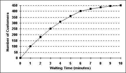 The percentage of walk-in customers waiting more than 6 minutes was ______.
A)22%
B)11%
C)67%
D)10%
E)75%
The percentage of walk-in customers waiting more than 6 minutes was ______.A)22%
B)11%
C)67%
D)10%
E)75%
Question
Each day,the office staff at Oasis Quick Shop prepares a frequency distribution and an ogive of sales transactions by dollar value of the transactions.Saturday's cumulative frequency ogive follows. 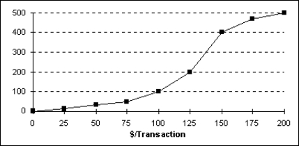 The percentage of sales transactions on Saturday that were between $100 and $150 was _____________.
A)20%
B)40%
C)60%
D)80%
E)10%
The percentage of sales transactions on Saturday that were between $100 and $150 was _____________.A)20%
B)40%
C)60%
D)80%
E)10%
Question
Question
Each day,the office staff at Oasis Quick Shop prepares a frequency distribution and an ogive of sales transactions by dollar value of the transactions.Saturday's cumulative frequency ogive follows.  The total number of sales transactions on Saturday was _____________.
A)200
B)500
C)300
D)100
E)400
The total number of sales transactions on Saturday was _____________.A)200
B)500
C)300
D)100
E)400
Question
The staff of Mr.Wayne Wertz,VP of Operations at Portland Peoples Bank,prepared a cumulative frequency ogive of waiting time for walk-in customers.  The total number of walk-in customers included in the study was _________.
A)100
B)250
C)300
D)450
E)500
The total number of walk-in customers included in the study was _________.A)100
B)250
C)300
D)450
E)500
Question
Each day,the manager at Jamie's Auto Care Shop prepares a frequency distribution and a histogram of sales transactions by dollar value of the transactions.Friday's histogram follows. 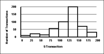 On Friday,the approximate number of sales transactions in the 75-under 100 category was _____________.
A)50
B)100
C)150
D)200
E)60
On Friday,the approximate number of sales transactions in the 75-under 100 category was _____________.A)50
B)100
C)150
D)200
E)60
Question
Each day,the office staff at Oasis Quick Shop prepares a frequency distribution and an ogive of sales transactions by dollar value of the transactions.Saturday's cumulative frequency ogive follows.  The percentage of sales transactions on Saturday that were at least $100 each was _____________.
A)100
B)10
C)80
D)20
E)15
The percentage of sales transactions on Saturday that were at least $100 each was _____________.A)100
B)10
C)80
D)20
E)15
Question
A recent survey of U.S.automobile owners showed the following preferences for exterior automobile colors:  What type of graph is used to depict exterior automobile color preferences? a.Frequency polygon
B.Pareto chart
C.Bar graph
D.Ogive
E.Histogram
What type of graph is used to depict exterior automobile color preferences? a.Frequency polygonB.Pareto chart
C.Bar graph
D.Ogive
E.Histogram
Question
The staff of Mr.Wayne Wertz,VP of Operations at Portland Peoples Bank,prepared a cumulative frequency ogive of waiting time for walk-in customers.  The percentage of walk-in customers waiting one minute or less was _________.
A)22%
B)11%
C)67%
D)10%
E)5%
The percentage of walk-in customers waiting one minute or less was _________.A)22%
B)11%
C)67%
D)10%
E)5%
Question
The staff of Ms.Tamara Hill,VP of Technical Analysis at Blue Sky Brokerage,prepared a frequency histogram of market capitalization of the 937 corporations listed on the American Stock Exchange in January 2013. 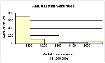 Approximately ________ corporations had capitalization exceeding $200,000,000.
A)50
B)100
C)700
D)800
E)890
Approximately ________ corporations had capitalization exceeding $200,000,000.A)50
B)100
C)700
D)800
E)890
Question
The staff of Mr.Wayne Wertz,VP of Operations at Portland Peoples Bank,prepared a frequency histogram of waiting time for drive up ATM customers. 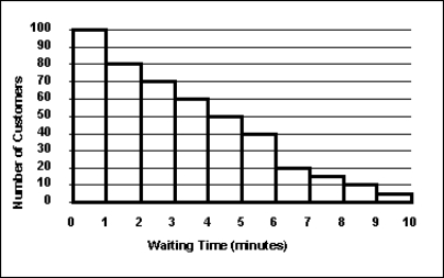 Approximately _____ drive up ATM customers waited less than 2 minutes.
A)20
B)30
C)100
D)180
E)200
Approximately _____ drive up ATM customers waited less than 2 minutes.A)20
B)30
C)100
D)180
E)200
Question
Each day,the manager at Jamie's Auto Care prepares a frequency distribution and a histogram of sales transactions by dollar value of the transactions.Friday's histogram follows.  On Friday,the approximate number of sales transactions between $150 and $175 was _____________.
A)75
B)200
C)300
D)400
E)500
On Friday,the approximate number of sales transactions between $150 and $175 was _____________.A)75
B)200
C)300
D)400
E)500
Question
The staff of Mr.Wayne Wertz,VP of Operations at Portland Peoples Bank,prepared a frequency histogram of waiting time for drive up ATM customers.  Approximately ____ drive up ATM customers waited at least 7 minutes.
A)20
B)30
C)100
D)180
E)200
Approximately ____ drive up ATM customers waited at least 7 minutes.A)20
B)30
C)100
D)180
E)200
Question
The staff of Ms.Tamara Hill,VP of Technical Analysis at Blue Sky Brokerage,prepared a frequency histogram of market capitalization of the 937 corporations listed on the American Stock Exchange in January 2013. 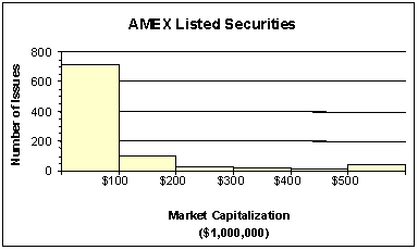 Approximately ________ corporations had capitalizations of $200,000,000 or less.
A)50
B)100
C)700
D)800
E)900
Approximately ________ corporations had capitalizations of $200,000,000 or less.A)50
B)100
C)700
D)800
E)900
Question
Each day,the office staff at Oasis Quick Shop prepares a frequency distribution and an ogive of sales transactions by dollar value of the transactions.Saturday's cumulative frequency ogive follows.  The percentage of sales transactions on Saturday that were under $100 each was _____________.
A)100
B)10
C)80
D)20
E)15
The percentage of sales transactions on Saturday that were under $100 each was _____________.A)100
B)10
C)80
D)20
E)15
Question
Question
The staff of Mr.Wayne Wertz,VP of Operations at Portland Peoples Bank,prepared a cumulative frequency ogive of waiting time for walk-in customers.  The percentage of walk-in customers waiting between 1 and 6 minutes was ___.
A)22%
B)11%
C)37%
D)10%
E)67%
The percentage of walk-in customers waiting between 1 and 6 minutes was ___.A)22%
B)11%
C)37%
D)10%
E)67%
Question
Question
A recent survey of U.S.automobile owners showed the following preferences for exterior automobile colors: 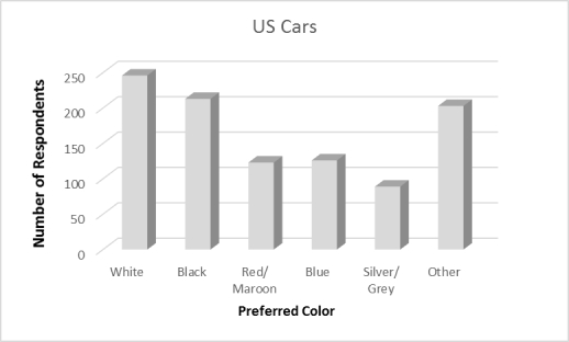 What are the top two color preferences for automobiles? a.White and Black
B.White and Red/ Maroon
C.White and Blue
D.White and Siver/Grey
E.White and Other
What are the top two color preferences for automobiles? a.White and BlackB.White and Red/ Maroon
C.White and Blue
D.White and Siver/Grey
E.White and Other
Question
Question
According to the following graphic,"Bent Pins" account for ____% of PCB Failures. 
A)10
B)20
C)30
D)40
E)50
A)10
B)20
C)30
D)40
E)50
Question
The following graphic of residential housing data (selling price and size in square feet)indicates _____________. 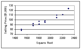
A)an inverse relation between the two variables
B)no relation between the two variables
C)a direct relation between the two variables
D)a negative exponential relation between the two variables
E)a sinusoidal relationship between the two variables
A)an inverse relation between the two variables
B)no relation between the two variables
C)a direct relation between the two variables
D)a negative exponential relation between the two variables
E)a sinusoidal relationship between the two variables
Question
According to the following graphic,the most common cause of PCB Failures is a _____________. 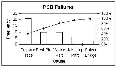
A)Cracked Trace
B)Bent Pin
C)Missing Part
D)Solder Bridge
E)Wrong Part
A)Cracked Trace
B)Bent Pin
C)Missing Part
D)Solder Bridge
E)Wrong Part
Question
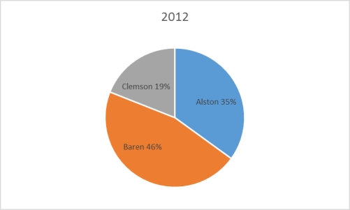
The 2010 and 2012 market share data of the three competitors (Alston,Baren,and Clemson)in an oligopolistic industry are presented in the following pie charts.Total sales for this industry were $1.5 billion in 2010 and $1.8 billion in 2012. Baren's sales in 2010 were ___________. 

A)$342 million
B)$630 million
C)$675 million
D)$828 million
E)$928 million
A)$342 million
B)$630 million
C)$675 million
D)$828 million
E)$928 million
Question
The 2010 and 2012 market share data of the three competitors (Alston,Baren,and Clemson)in an oligopolistic industry are presented in the following pie charts. 
 Which of the following is true?
A)Only Baren share.
B)Only Clemson lost market share.
C)Alston lost market share.
D)Baren lost market share.
E)All companies lost market share
Which of the following is true?A)Only Baren share.
B)Only Clemson lost market share.
C)Alston lost market share.
D)Baren lost market share.
E)All companies lost market share
Question
The 2010 and 2012 market share data of the three competitors (Alston,Baren,and Clemson)in an oligopolistic industry are presented in the following pie charts.Total sales for this industry were $1.5 billion in 2010 and $1.8 billion in 2012.Clemson's sales in 2010 were ___________. 

A)$342 million
B)$630 million
C)$675 million
D)$828 million
E)$928 million
A)$342 million
B)$630 million
C)$675 million
D)$828 million
E)$928 million
Question
The following graphic of residential housing data (selling price and size in square feet)is a _____________. 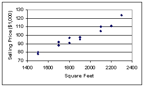
A)scatter plot
B)Pareto chart
C)pie chart
D)cumulative histogram
E)cumulative frequency distribuion
A)scatter plot
B)Pareto chart
C)pie chart
D)cumulative histogram
E)cumulative frequency distribuion
Question
The 2010 and 2012 market share data of the three competitors (Alston,Baren,and Clemson)in an oligopolistic industry are presented in the following pie charts. 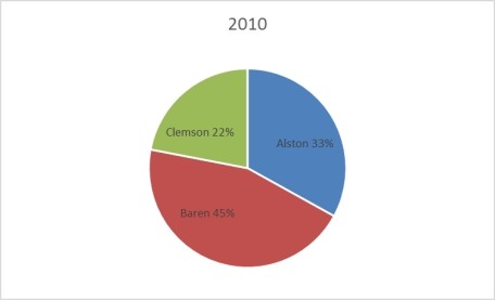
 Which of the following may be a false statement?
A)Sales revenues declined at Clemson.
B)Only Clemson lost market share.
C)Alston gained market share.
D)Baren gained market share.
E)Both Alston and Baren gained market share
Which of the following may be a false statement?A)Sales revenues declined at Clemson.
B)Only Clemson lost market share.
C)Alston gained market share.
D)Baren gained market share.
E)Both Alston and Baren gained market share
Question
The following graphic of PCB Failures is a _____________. 
A)Scatter Plot
B)Pareto Chart
C)Pie Chart
D)Cumulative Histogram Chart
E)Line diagram
A)Scatter Plot
B)Pareto Chart
C)Pie Chart
D)Cumulative Histogram Chart
E)Line diagram
Question
The following is a bar chart of the self-reported race for 189 pregnant women. 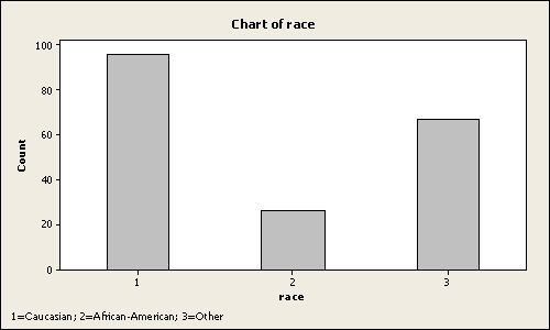 Approximately _____ percent of pregnant women are African-American
A)20
B)14
C)5
D)35
E)50
Approximately _____ percent of pregnant women are African-AmericanA)20
B)14
C)5
D)35
E)50
Question
Suppose a market survey of 200 consumers was conducted to determine the likelihood of each consumer purchasing a new computer next year.The data were collected based on the income
Level of the consumer and are shown below:

 Using the table above,which of the following statements is true?
A.Wealthier consumers are more likely to purchase a computer next year.
B.Income does not seem to be related to likelihood of purchasing a computer next year.
C.The wealthier a consumer is the less likely they are to purchase a computer next year.
D.Individuals with greater than $120K are least likely to purchase a new computer next
Year.
E.None of the above statements are true.
Level of the consumer and are shown below:
Using the table above,which of the following statements is true?A.Wealthier consumers are more likely to purchase a computer next year.
B.Income does not seem to be related to likelihood of purchasing a computer next year.
C.The wealthier a consumer is the less likely they are to purchase a computer next year.
D.Individuals with greater than $120K are least likely to purchase a new computer next
Year.
E.None of the above statements are true.
Question
The following graphic of cigarettes smoked (sold)per capita (CIG)and deaths per 100K population from lung cancer (LUNG)indicates _________ 
A)a weak relation between the two variables
B)a pretty strong relation between the two variables
C)when the number of cigarettes smoked (sold)per capita (CIG)increases the deaths per 100K population from lung cancer (LUNG)decreases
D)a negative relation between the two variables
E)no relation between the two variables
Question
Suppose a market survey of 200 consumers was conducted to determine the likelihood of each consumer purchasing a new computer next year.The data were collected based on the age of the
Consumer and are shown below:
 Using the table above,which of the following statements is true?
A.Younger consumers are more likely to purchase a computer next year.
B.Older consumers are more likely to purchase a computer next year.
C.There does not appear to be a relationship between age and purchasing a computer.
D.Individuals between 25 and 34 are most likely to purchase a new computer next year.
E.None of the above statements are true.
Consumer and are shown below:
Using the table above,which of the following statements is true?A.Younger consumers are more likely to purchase a computer next year.
B.Older consumers are more likely to purchase a computer next year.
C.There does not appear to be a relationship between age and purchasing a computer.
D.Individuals between 25 and 34 are most likely to purchase a new computer next year.
E.None of the above statements are true.
Question
The United Nations Development Programme website provides comparative data by country on key metrics,such metrics as life expectancy over time.The table below show data on life
Expectancy over time in the United States.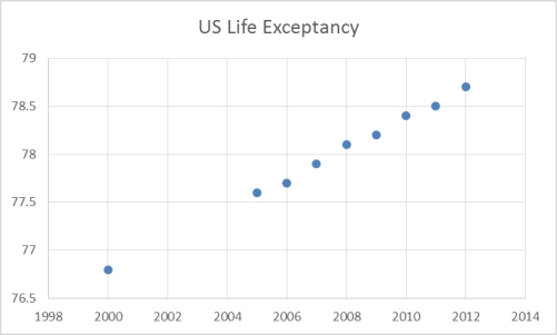 Which of the following statements are not true based on the scatterplot of U.S.Life Expectancy
Over time?
A.The life expectancy in the U.S.is increasing over time.
B.U.S.citizens lived fewer years in 2010 than they did in in 2008.
C.The scatterplot shows an increasing trend in life expectancy in the U.S.
D.Based on the scatterplot,one can assume the life expectancy in 2014 will be higher
Than 78 years.
E.All of the above statements are true.
Expectancy over time in the United States.
Which of the following statements are not true based on the scatterplot of U.S.Life ExpectancyOver time?
A.The life expectancy in the U.S.is increasing over time.
B.U.S.citizens lived fewer years in 2010 than they did in in 2008.
C.The scatterplot shows an increasing trend in life expectancy in the U.S.
D.Based on the scatterplot,one can assume the life expectancy in 2014 will be higher
Than 78 years.
E.All of the above statements are true.
Question
The United Nations Development Programme website provides comparative data by country on key metrics.Two such metrics are life expectancy and expenditures on health as a percent of
GDP.The table below show data on life expectancy and health expenditures in the United States.
 Which of the following scatterplots best depicts the relationship between life expectancy and
Expenditures on health as a percent of GDP?
A.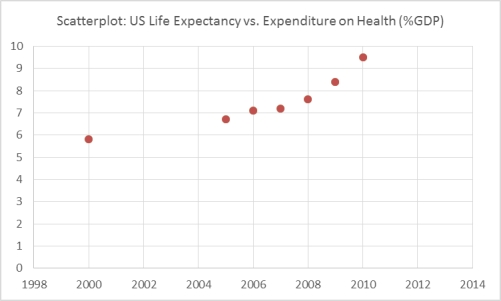 b.
b. 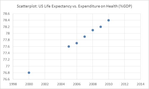 c.
c. 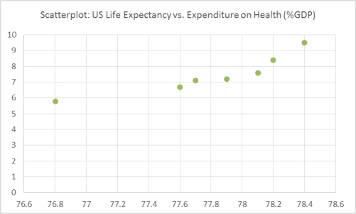 d.
d. 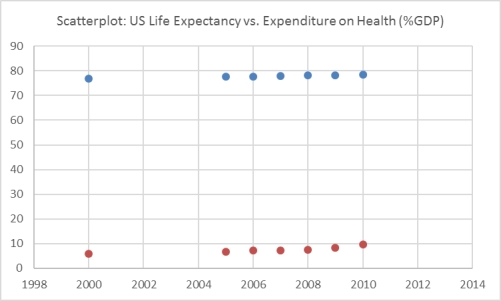
GDP.The table below show data on life expectancy and health expenditures in the United States.
Which of the following scatterplots best depicts the relationship between life expectancy andExpenditures on health as a percent of GDP?
A.
b. c. d. 
Unlock Deck
Sign up to unlock the cards in this deck!
Unlock Deck
Unlock Deck
1/55
Play
Full screen (f)
Deck 2: Charts and Graphs
1
In contrast to quantitative data graphs that are plotted along a numerical scale,qualitative graphs are plotted using non-numerical categories.
True
2
One advantage of a stem and leaf plot over a frequency distribution is that the values of the original data are retained.
True
3
A cumulative frequency distribution provides a running total of the frequencies in the classes.
True
4
In a histogram,the tallest bar represents the class with the highest cumulative frequency.
Unlock Deck
Unlock for access to all 55 flashcards in this deck.
Unlock Deck
k this deck
5
For any given data set,a frequency distribution with a larger number of classes will always be better than the one with a smaller number of classes.
Unlock Deck
Unlock for access to all 55 flashcards in this deck.
Unlock Deck
k this deck
6
Dot Plots are mainly used to display a large data set.
Unlock Deck
Unlock for access to all 55 flashcards in this deck.
Unlock Deck
k this deck
7
A scatter plot is a two-dimensional graph plot of data containing pairs of observations on two numerical variables.
Unlock Deck
Unlock for access to all 55 flashcards in this deck.
Unlock Deck
k this deck
8
A cumulative frequency polygon is also called an ogive.
Unlock Deck
Unlock for access to all 55 flashcards in this deck.
Unlock Deck
k this deck
9
A scatter plot shows how the numbers in a data set are scattered around their average.
Unlock Deck
Unlock for access to all 55 flashcards in this deck.
Unlock Deck
k this deck
10
A graphical representation of a frequency distribution is called a pie chart.
Unlock Deck
Unlock for access to all 55 flashcards in this deck.
Unlock Deck
k this deck
11
If the individual class frequency is divided by the total frequency,the result is the median frequency.
Unlock Deck
Unlock for access to all 55 flashcards in this deck.
Unlock Deck
k this deck
12
A scatter plot is useful for examining the relationship between two numerical variables.
Unlock Deck
Unlock for access to all 55 flashcards in this deck.
Unlock Deck
k this deck
13
One rule that must always be followed in constructing frequency distributions is that the adjacent classes must overlap.
Unlock Deck
Unlock for access to all 55 flashcards in this deck.
Unlock Deck
k this deck
14
A Pareto chart and a pie chart are both types of qualitative graphs.
Unlock Deck
Unlock for access to all 55 flashcards in this deck.
Unlock Deck
k this deck
15
The difference between the highest number and the lowest number in a set of data is called the differential frequency.
Unlock Deck
Unlock for access to all 55 flashcards in this deck.
Unlock Deck
k this deck
16
A histogram can be described as a type of vertical bar chart.
Unlock Deck
Unlock for access to all 55 flashcards in this deck.
Unlock Deck
k this deck
17
A summary of data in which raw data are grouped into different intervals and the number of items in each group is listed is called a frequency distribution.
Unlock Deck
Unlock for access to all 55 flashcards in this deck.
Unlock Deck
k this deck
18
An instructor made a frequency table of the scores his students got on a test Score Frequency
30-under 40 1
40-under 50 4
50-under 60 5
60-under 70 10
70-under 80 20
80-under 90 10
90-under 100 5
The midpoint of the last class interval is _________.
A)90
B)5
C)95
D)100
E)50
30-under 40 1
40-under 50 4
50-under 60 5
60-under 70 10
70-under 80 20
80-under 90 10
90-under 100 5
The midpoint of the last class interval is _________.
A)90
B)5
C)95
D)100
E)50
Unlock Deck
Unlock for access to all 55 flashcards in this deck.
Unlock Deck
k this deck
19
An instructor made a frequency table of the scores his students got on a test Score Frequency
30-under 40 1
40-under 50 4
50-under 60 5
60-under 70 10
70-under 80 20
80-under 90 10
90-under 100 5
Approximately what percent of students got more than 70?
A)36
B)20
C)50
D)10
E)64
30-under 40 1
40-under 50 4
50-under 60 5
60-under 70 10
70-under 80 20
80-under 90 10
90-under 100 5
Approximately what percent of students got more than 70?
A)36
B)20
C)50
D)10
E)64
Unlock Deck
Unlock for access to all 55 flashcards in this deck.
Unlock Deck
k this deck
20
For a company in gardening supplies business,the best graphical way to show the percentage of a total budget that is spent on each of a number of different expense categories is the stem and leaf plot.
Unlock Deck
Unlock for access to all 55 flashcards in this deck.
Unlock Deck
k this deck
21
The staff of Mr.Wayne Wertz,VP of Operations at Portland Peoples Bank,prepared a cumulative frequency ogive of waiting time for walk-in customers. The percentage of walk-in customers waiting more than 6 minutes was ______.
A)22%
B)11%
C)67%
D)10%
E)75%
The percentage of walk-in customers waiting more than 6 minutes was ______.A)22%
B)11%
C)67%
D)10%
E)75%
Unlock Deck
Unlock for access to all 55 flashcards in this deck.
Unlock Deck
k this deck
22
Each day,the office staff at Oasis Quick Shop prepares a frequency distribution and an ogive of sales transactions by dollar value of the transactions.Saturday's cumulative frequency ogive follows. The percentage of sales transactions on Saturday that were between $100 and $150 was _____________.
A)20%
B)40%
C)60%
D)80%
E)10%
The percentage of sales transactions on Saturday that were between $100 and $150 was _____________.A)20%
B)40%
C)60%
D)80%
E)10%
Unlock Deck
Unlock for access to all 55 flashcards in this deck.
Unlock Deck
k this deck
23
The following represent the ages of students in a class: 19,23,21,19,19,20,22,31,21,20
If a stem and leaf plot were to be developed from this,how many stems would there be?
A)2
B)3
C)4
D)5
E)10
If a stem and leaf plot were to be developed from this,how many stems would there be?
A)2
B)3
C)4
D)5
E)10
Unlock Deck
Unlock for access to all 55 flashcards in this deck.
Unlock Deck
k this deck
24
Each day,the office staff at Oasis Quick Shop prepares a frequency distribution and an ogive of sales transactions by dollar value of the transactions.Saturday's cumulative frequency ogive follows. The total number of sales transactions on Saturday was _____________.
A)200
B)500
C)300
D)100
E)400
The total number of sales transactions on Saturday was _____________.A)200
B)500
C)300
D)100
E)400
Unlock Deck
Unlock for access to all 55 flashcards in this deck.
Unlock Deck
k this deck
25
The staff of Mr.Wayne Wertz,VP of Operations at Portland Peoples Bank,prepared a cumulative frequency ogive of waiting time for walk-in customers. The total number of walk-in customers included in the study was _________.
A)100
B)250
C)300
D)450
E)500
The total number of walk-in customers included in the study was _________.A)100
B)250
C)300
D)450
E)500
Unlock Deck
Unlock for access to all 55 flashcards in this deck.
Unlock Deck
k this deck
26
Each day,the manager at Jamie's Auto Care Shop prepares a frequency distribution and a histogram of sales transactions by dollar value of the transactions.Friday's histogram follows. On Friday,the approximate number of sales transactions in the 75-under 100 category was _____________.
A)50
B)100
C)150
D)200
E)60
On Friday,the approximate number of sales transactions in the 75-under 100 category was _____________.A)50
B)100
C)150
D)200
E)60
Unlock Deck
Unlock for access to all 55 flashcards in this deck.
Unlock Deck
k this deck
27
Each day,the office staff at Oasis Quick Shop prepares a frequency distribution and an ogive of sales transactions by dollar value of the transactions.Saturday's cumulative frequency ogive follows. The percentage of sales transactions on Saturday that were at least $100 each was _____________.
A)100
B)10
C)80
D)20
E)15
The percentage of sales transactions on Saturday that were at least $100 each was _____________.A)100
B)10
C)80
D)20
E)15
Unlock Deck
Unlock for access to all 55 flashcards in this deck.
Unlock Deck
k this deck
28
A recent survey of U.S.automobile owners showed the following preferences for exterior automobile colors: What type of graph is used to depict exterior automobile color preferences? a.Frequency polygon
B.Pareto chart
C.Bar graph
D.Ogive
E.Histogram
What type of graph is used to depict exterior automobile color preferences? a.Frequency polygonB.Pareto chart
C.Bar graph
D.Ogive
E.Histogram
Unlock Deck
Unlock for access to all 55 flashcards in this deck.
Unlock Deck
k this deck
29
The staff of Mr.Wayne Wertz,VP of Operations at Portland Peoples Bank,prepared a cumulative frequency ogive of waiting time for walk-in customers. The percentage of walk-in customers waiting one minute or less was _________.
A)22%
B)11%
C)67%
D)10%
E)5%
The percentage of walk-in customers waiting one minute or less was _________.A)22%
B)11%
C)67%
D)10%
E)5%
Unlock Deck
Unlock for access to all 55 flashcards in this deck.
Unlock Deck
k this deck
30
The staff of Ms.Tamara Hill,VP of Technical Analysis at Blue Sky Brokerage,prepared a frequency histogram of market capitalization of the 937 corporations listed on the American Stock Exchange in January 2013. Approximately ________ corporations had capitalization exceeding $200,000,000.
A)50
B)100
C)700
D)800
E)890
Approximately ________ corporations had capitalization exceeding $200,000,000.A)50
B)100
C)700
D)800
E)890
Unlock Deck
Unlock for access to all 55 flashcards in this deck.
Unlock Deck
k this deck
31
The staff of Mr.Wayne Wertz,VP of Operations at Portland Peoples Bank,prepared a frequency histogram of waiting time for drive up ATM customers. Approximately _____ drive up ATM customers waited less than 2 minutes.
A)20
B)30
C)100
D)180
E)200
Approximately _____ drive up ATM customers waited less than 2 minutes.A)20
B)30
C)100
D)180
E)200
Unlock Deck
Unlock for access to all 55 flashcards in this deck.
Unlock Deck
k this deck
32
Each day,the manager at Jamie's Auto Care prepares a frequency distribution and a histogram of sales transactions by dollar value of the transactions.Friday's histogram follows. On Friday,the approximate number of sales transactions between $150 and $175 was _____________.
A)75
B)200
C)300
D)400
E)500
On Friday,the approximate number of sales transactions between $150 and $175 was _____________.A)75
B)200
C)300
D)400
E)500
Unlock Deck
Unlock for access to all 55 flashcards in this deck.
Unlock Deck
k this deck
33
The staff of Mr.Wayne Wertz,VP of Operations at Portland Peoples Bank,prepared a frequency histogram of waiting time for drive up ATM customers. Approximately ____ drive up ATM customers waited at least 7 minutes.
A)20
B)30
C)100
D)180
E)200
Approximately ____ drive up ATM customers waited at least 7 minutes.A)20
B)30
C)100
D)180
E)200
Unlock Deck
Unlock for access to all 55 flashcards in this deck.
Unlock Deck
k this deck
34
The staff of Ms.Tamara Hill,VP of Technical Analysis at Blue Sky Brokerage,prepared a frequency histogram of market capitalization of the 937 corporations listed on the American Stock Exchange in January 2013. Approximately ________ corporations had capitalizations of $200,000,000 or less.
A)50
B)100
C)700
D)800
E)900
Approximately ________ corporations had capitalizations of $200,000,000 or less.A)50
B)100
C)700
D)800
E)900
Unlock Deck
Unlock for access to all 55 flashcards in this deck.
Unlock Deck
k this deck
35
Each day,the office staff at Oasis Quick Shop prepares a frequency distribution and an ogive of sales transactions by dollar value of the transactions.Saturday's cumulative frequency ogive follows. The percentage of sales transactions on Saturday that were under $100 each was _____________.
A)100
B)10
C)80
D)20
E)15
The percentage of sales transactions on Saturday that were under $100 each was _____________.A)100
B)10
C)80
D)20
E)15
Unlock Deck
Unlock for access to all 55 flashcards in this deck.
Unlock Deck
k this deck
36
The staffs of the accounting and the quality control departments rated their respective supervisor's leadership style as either (1)authoritarian or (2)participatory.Sixty-eight percent of the accounting staff rated their supervisor "authoritarian," and thirty-two percent rated him "participatory." Forty percent of the quality control staff rated their supervisor "authoritarian," and sixty percent rated her "participatory." The best graphic depiction of these data would be two ___________________.
A)histograms
B)frequency polygons
C)ogives
D)pie charts
E)scatter plots
A)histograms
B)frequency polygons
C)ogives
D)pie charts
E)scatter plots
Unlock Deck
Unlock for access to all 55 flashcards in this deck.
Unlock Deck
k this deck
37
The staff of Mr.Wayne Wertz,VP of Operations at Portland Peoples Bank,prepared a cumulative frequency ogive of waiting time for walk-in customers. The percentage of walk-in customers waiting between 1 and 6 minutes was ___.
A)22%
B)11%
C)37%
D)10%
E)67%
The percentage of walk-in customers waiting between 1 and 6 minutes was ___.A)22%
B)11%
C)37%
D)10%
E)67%
Unlock Deck
Unlock for access to all 55 flashcards in this deck.
Unlock Deck
k this deck
38
The cumulative frequency for a class is 27.The cumulative frequency for the next (non-empty)class will be _______.
A)less than 27
B)equal to 27
C)next class frequency minus 27
D)27 minus the next class frequency
E)27 plus the next class frequency
A)less than 27
B)equal to 27
C)next class frequency minus 27
D)27 minus the next class frequency
E)27 plus the next class frequency
Unlock Deck
Unlock for access to all 55 flashcards in this deck.
Unlock Deck
k this deck
39
A recent survey of U.S.automobile owners showed the following preferences for exterior automobile colors: What are the top two color preferences for automobiles? a.White and Black
B.White and Red/ Maroon
C.White and Blue
D.White and Siver/Grey
E.White and Other
What are the top two color preferences for automobiles? a.White and BlackB.White and Red/ Maroon
C.White and Blue
D.White and Siver/Grey
E.White and Other
Unlock Deck
Unlock for access to all 55 flashcards in this deck.
Unlock Deck
k this deck
40
An instructor has decided to graphically represent the grades on a test.The instructor uses a plus/minus grading system (i.e.she gives grades of A-,B+,etc.).Which of the following would provide the most information for the students?
A)A histogram
B)bar chart
C)A cumulative frequency distribution
D)A frequency distribution
E)A scatter plot
A)A histogram
B)bar chart
C)A cumulative frequency distribution
D)A frequency distribution
E)A scatter plot
Unlock Deck
Unlock for access to all 55 flashcards in this deck.
Unlock Deck
k this deck
41
According to the following graphic,"Bent Pins" account for ____% of PCB Failures.
A)10
B)20
C)30
D)40
E)50
A)10
B)20
C)30
D)40
E)50
Unlock Deck
Unlock for access to all 55 flashcards in this deck.
Unlock Deck
k this deck
42
The following graphic of residential housing data (selling price and size in square feet)indicates _____________.
A)an inverse relation between the two variables
B)no relation between the two variables
C)a direct relation between the two variables
D)a negative exponential relation between the two variables
E)a sinusoidal relationship between the two variables
A)an inverse relation between the two variables
B)no relation between the two variables
C)a direct relation between the two variables
D)a negative exponential relation between the two variables
E)a sinusoidal relationship between the two variables
Unlock Deck
Unlock for access to all 55 flashcards in this deck.
Unlock Deck
k this deck
43
According to the following graphic,the most common cause of PCB Failures is a _____________.
A)Cracked Trace
B)Bent Pin
C)Missing Part
D)Solder Bridge
E)Wrong Part
A)Cracked Trace
B)Bent Pin
C)Missing Part
D)Solder Bridge
E)Wrong Part
Unlock Deck
Unlock for access to all 55 flashcards in this deck.
Unlock Deck
k this deck
44
The 2010 and 2012 market share data of the three competitors (Alston,Baren,and Clemson)in an oligopolistic industry are presented in the following pie charts.Total sales for this industry were $1.5 billion in 2010 and $1.8 billion in 2012. Baren's sales in 2010 were ___________.
A)$342 million
B)$630 million
C)$675 million
D)$828 million
E)$928 million
A)$342 million
B)$630 million
C)$675 million
D)$828 million
E)$928 million
Unlock Deck
Unlock for access to all 55 flashcards in this deck.
Unlock Deck
k this deck
45
The 2010 and 2012 market share data of the three competitors (Alston,Baren,and Clemson)in an oligopolistic industry are presented in the following pie charts. Which of the following is true?
A)Only Baren share.
B)Only Clemson lost market share.
C)Alston lost market share.
D)Baren lost market share.
E)All companies lost market share
Which of the following is true?A)Only Baren share.
B)Only Clemson lost market share.
C)Alston lost market share.
D)Baren lost market share.
E)All companies lost market share
Unlock Deck
Unlock for access to all 55 flashcards in this deck.
Unlock Deck
k this deck
46
The 2010 and 2012 market share data of the three competitors (Alston,Baren,and Clemson)in an oligopolistic industry are presented in the following pie charts.Total sales for this industry were $1.5 billion in 2010 and $1.8 billion in 2012.Clemson's sales in 2010 were ___________.
A)$342 million
B)$630 million
C)$675 million
D)$828 million
E)$928 million
A)$342 million
B)$630 million
C)$675 million
D)$828 million
E)$928 million
Unlock Deck
Unlock for access to all 55 flashcards in this deck.
Unlock Deck
k this deck
47
The following graphic of residential housing data (selling price and size in square feet)is a _____________.
A)scatter plot
B)Pareto chart
C)pie chart
D)cumulative histogram
E)cumulative frequency distribuion
A)scatter plot
B)Pareto chart
C)pie chart
D)cumulative histogram
E)cumulative frequency distribuion
Unlock Deck
Unlock for access to all 55 flashcards in this deck.
Unlock Deck
k this deck
48
The 2010 and 2012 market share data of the three competitors (Alston,Baren,and Clemson)in an oligopolistic industry are presented in the following pie charts. Which of the following may be a false statement?
A)Sales revenues declined at Clemson.
B)Only Clemson lost market share.
C)Alston gained market share.
D)Baren gained market share.
E)Both Alston and Baren gained market share
Which of the following may be a false statement?A)Sales revenues declined at Clemson.
B)Only Clemson lost market share.
C)Alston gained market share.
D)Baren gained market share.
E)Both Alston and Baren gained market share
Unlock Deck
Unlock for access to all 55 flashcards in this deck.
Unlock Deck
k this deck
49
The following graphic of PCB Failures is a _____________.
A)Scatter Plot
B)Pareto Chart
C)Pie Chart
D)Cumulative Histogram Chart
E)Line diagram
A)Scatter Plot
B)Pareto Chart
C)Pie Chart
D)Cumulative Histogram Chart
E)Line diagram
Unlock Deck
Unlock for access to all 55 flashcards in this deck.
Unlock Deck
k this deck
50
The following is a bar chart of the self-reported race for 189 pregnant women. Approximately _____ percent of pregnant women are African-American
A)20
B)14
C)5
D)35
E)50
Approximately _____ percent of pregnant women are African-AmericanA)20
B)14
C)5
D)35
E)50
Unlock Deck
Unlock for access to all 55 flashcards in this deck.
Unlock Deck
k this deck
51
Suppose a market survey of 200 consumers was conducted to determine the likelihood of each consumer purchasing a new computer next year.The data were collected based on the income
Level of the consumer and are shown below:
Using the table above,which of the following statements is true?
A.Wealthier consumers are more likely to purchase a computer next year.
B.Income does not seem to be related to likelihood of purchasing a computer next year.
C.The wealthier a consumer is the less likely they are to purchase a computer next year.
D.Individuals with greater than $120K are least likely to purchase a new computer next
Year.
E.None of the above statements are true.
Level of the consumer and are shown below:
Using the table above,which of the following statements is true?A.Wealthier consumers are more likely to purchase a computer next year.
B.Income does not seem to be related to likelihood of purchasing a computer next year.
C.The wealthier a consumer is the less likely they are to purchase a computer next year.
D.Individuals with greater than $120K are least likely to purchase a new computer next
Year.
E.None of the above statements are true.
Unlock Deck
Unlock for access to all 55 flashcards in this deck.
Unlock Deck
k this deck
52
The following graphic of cigarettes smoked (sold)per capita (CIG)and deaths per 100K population from lung cancer (LUNG)indicates _________
A)a weak relation between the two variables
B)a pretty strong relation between the two variables
C)when the number of cigarettes smoked (sold)per capita (CIG)increases the deaths per 100K population from lung cancer (LUNG)decreases
D)a negative relation between the two variables
E)no relation between the two variables
Unlock Deck
Unlock for access to all 55 flashcards in this deck.
Unlock Deck
k this deck
53
Suppose a market survey of 200 consumers was conducted to determine the likelihood of each consumer purchasing a new computer next year.The data were collected based on the age of the
Consumer and are shown below:
Using the table above,which of the following statements is true?
A.Younger consumers are more likely to purchase a computer next year.
B.Older consumers are more likely to purchase a computer next year.
C.There does not appear to be a relationship between age and purchasing a computer.
D.Individuals between 25 and 34 are most likely to purchase a new computer next year.
E.None of the above statements are true.
Consumer and are shown below:
Using the table above,which of the following statements is true?A.Younger consumers are more likely to purchase a computer next year.
B.Older consumers are more likely to purchase a computer next year.
C.There does not appear to be a relationship between age and purchasing a computer.
D.Individuals between 25 and 34 are most likely to purchase a new computer next year.
E.None of the above statements are true.
Unlock Deck
Unlock for access to all 55 flashcards in this deck.
Unlock Deck
k this deck
54
The United Nations Development Programme website provides comparative data by country on key metrics,such metrics as life expectancy over time.The table below show data on life
Expectancy over time in the United States. Which of the following statements are not true based on the scatterplot of U.S.Life Expectancy
Over time?
A.The life expectancy in the U.S.is increasing over time.
B.U.S.citizens lived fewer years in 2010 than they did in in 2008.
C.The scatterplot shows an increasing trend in life expectancy in the U.S.
D.Based on the scatterplot,one can assume the life expectancy in 2014 will be higher
Than 78 years.
E.All of the above statements are true.
Expectancy over time in the United States.
Which of the following statements are not true based on the scatterplot of U.S.Life ExpectancyOver time?
A.The life expectancy in the U.S.is increasing over time.
B.U.S.citizens lived fewer years in 2010 than they did in in 2008.
C.The scatterplot shows an increasing trend in life expectancy in the U.S.
D.Based on the scatterplot,one can assume the life expectancy in 2014 will be higher
Than 78 years.
E.All of the above statements are true.
Unlock Deck
Unlock for access to all 55 flashcards in this deck.
Unlock Deck
k this deck
55
The United Nations Development Programme website provides comparative data by country on key metrics.Two such metrics are life expectancy and expenditures on health as a percent of
GDP.The table below show data on life expectancy and health expenditures in the United States.
Which of the following scatterplots best depicts the relationship between life expectancy and
Expenditures on health as a percent of GDP?
A. b. c. d.
GDP.The table below show data on life expectancy and health expenditures in the United States.
Which of the following scatterplots best depicts the relationship between life expectancy andExpenditures on health as a percent of GDP?
A.
b. c. d. Unlock Deck
Unlock for access to all 55 flashcards in this deck.
Unlock Deck
k this deck
Unlock Deck
Unlock for access to all 55 flashcards in this deck.


