
Macroeconomics 11th Edition by Michael Parkin
Edition 11ISBN: 9780133423884Macroeconomics 11th Edition by Michael Parkin
Edition 11ISBN: 9780133423884 Exercise 2
Explain how we "read" the three scatter diagrams in Fig. 1 and 2.
FIGURE 1 A Scatter Diagram
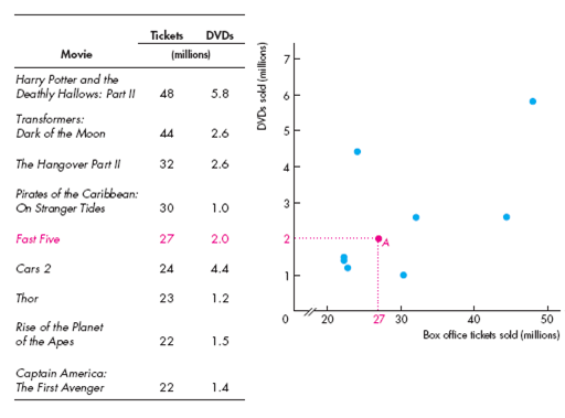
The table lists the number of tickets sold at the box office and the number of DVDs sold for nine popular movies.
The scatter diagram reveals the relationship between these two variables. Each point shows the values of the two variables for a specific movie. For example, point A shows the point for Fast Five, which sold 27 million tickets at the box office and 2 million DVDs.
The pattern formed by the points shows that there is a tendency for large box office sales to bring greater DVD sales. But you couldn't predict how many DVDs a movie would sell just by knowing its box office sales.
FIGURE 2 Two Economic Scatter Diagrams
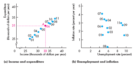
The scatter diagram in part (a) shows the relationship between income and expenditure from 2001 to 2011. Point A shows that in 2006, income was $33 (thousand) on the x -axis and expenditure was $31 (thousand) on the y -axis. This graph shows that as income rises, so does expenditure and the relationship is a close one.
The scatter diagram in part (b) shows a weak relationship between unemployment and inflation in the United States during most of the years.
FIGURE 1 A Scatter Diagram
The table lists the number of tickets sold at the box office and the number of DVDs sold for nine popular movies.
The scatter diagram reveals the relationship between these two variables. Each point shows the values of the two variables for a specific movie. For example, point A shows the point for Fast Five, which sold 27 million tickets at the box office and 2 million DVDs.
The pattern formed by the points shows that there is a tendency for large box office sales to bring greater DVD sales. But you couldn't predict how many DVDs a movie would sell just by knowing its box office sales.
FIGURE 2 Two Economic Scatter Diagrams
The scatter diagram in part (a) shows the relationship between income and expenditure from 2001 to 2011. Point A shows that in 2006, income was $33 (thousand) on the x -axis and expenditure was $31 (thousand) on the y -axis. This graph shows that as income rises, so does expenditure and the relationship is a close one.
The scatter diagram in part (b) shows a weak relationship between unemployment and inflation in the United States during most of the years.
Explanation Verified
Relationship between number of DVD and number of ticket sold:
Figure-1 illustrates the relationship between the number of DVD sold in the market and number of ticket sold at box office. One unit is equal to one million.
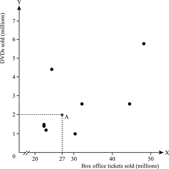 Figure-1
In Figure-1, X axis measures the number of tickets sold in the market and Y axis measures the number of DVD sold in the market. Point A represents 27 millions of tickets are sold at box office at the time when 2 million DVDs are sold in the market.
Relationship between income and expenditure:
Figure-2 panel (A) illustrates the relationship between the level of income and the level of expenditure. One unit is equal to thousand. Figure-2 panel (B) illustrates the relationship between the percentage of unemployment rate and the percentage of inflation rate.
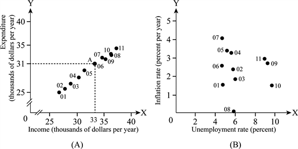 Figure -2
In Figure-2 Panel (A), X axis measures the income level and Y axis measures the expenditure level. Point A represents the expenditure as $31 thousand when the income level is $33 thousand. The values of expenditure are given near the point, for the corresponding value of the income level in the X axis. The scatter plots show the positive relationship between the income and expenditure. If the income level increases, then the level of expenditure increases and vice versa.
In Figure-2 Panel (B), X axis measures the percentage of unemployment rate and Y axis measures the percentage of inflation rate. The values of percentage of inflation rate are given near the point, for the corresponding value of the percentage of unemployment rate in the X axis. The scatter plots show the existence of weak relationship between the percentage of inflation rate and the percentage of unemployment rate.
Figure-1 illustrates the relationship between the number of DVD sold in the market and number of ticket sold at box office. One unit is equal to one million.
Figure-1 In Figure-1, X axis measures the number of tickets sold in the market and Y axis measures the number of DVD sold in the market. Point A represents 27 millions of tickets are sold at box office at the time when 2 million DVDs are sold in the market.
Relationship between income and expenditure:
Figure-2 panel (A) illustrates the relationship between the level of income and the level of expenditure. One unit is equal to thousand. Figure-2 panel (B) illustrates the relationship between the percentage of unemployment rate and the percentage of inflation rate.
Figure -2In Figure-2 Panel (A), X axis measures the income level and Y axis measures the expenditure level. Point A represents the expenditure as $31 thousand when the income level is $33 thousand. The values of expenditure are given near the point, for the corresponding value of the income level in the X axis. The scatter plots show the positive relationship between the income and expenditure. If the income level increases, then the level of expenditure increases and vice versa.
In Figure-2 Panel (B), X axis measures the percentage of unemployment rate and Y axis measures the percentage of inflation rate. The values of percentage of inflation rate are given near the point, for the corresponding value of the percentage of unemployment rate in the X axis. The scatter plots show the existence of weak relationship between the percentage of inflation rate and the percentage of unemployment rate.
Macroeconomics 11th Edition by Michael Parkin
Why don’t you like this exercise?
Other Minimum 8 character and maximum 255 character
Character 255


