
Ecology 7th Edition by Manuel Molles
Edition 7ISBN: 978-0077837280Ecology 7th Edition by Manuel Molles
Edition 7ISBN: 978-0077837280 Exercise 3
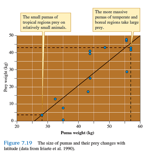
Ecologists are often interested in the relationship between two variables, which we might call X and Y. For example, in chapter 7 we reviewed a study of how the size of pumas, variable X, is related to the size of prey that they take, variable Y (see fig. 7.19 ). The scatter plot shown in figure 7.19 is one of an infinite number of possible relationships between two variables.
Let's consider just three of the possible relationships, which are shown in figure 1. The most basic scatter plot is one in which there is no relationship between X and Y. This situation is represented by figure 1 a , where there is no correlation between values of X and values of Y. As a result, the scatter plot forms a more or less circular pattern. In contrast the pattern
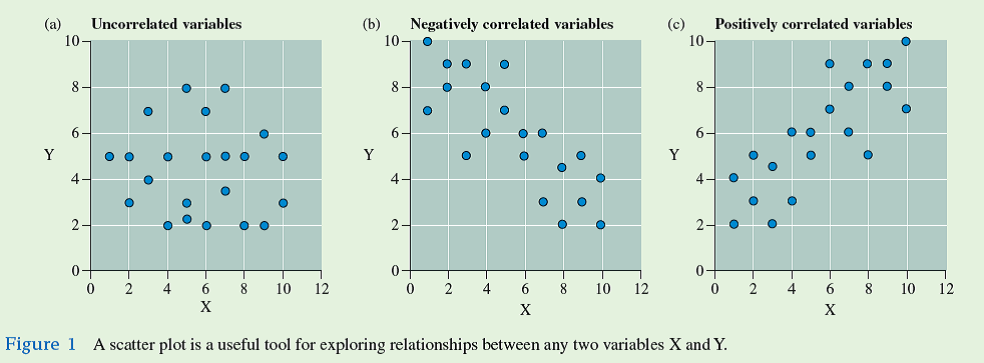
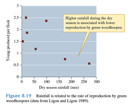
shown in figure 1 b , which represents the situation where as X increases, Y decreases, follows an approximately linear pattern that slopes downward to the right. The relationship between rainfall and green woodhoopoe reproduction we will examine in chapter 8 shows this pattern (see fig. 8.19). This type of relationship between X and Y is called a negative correlation. The opposite pattern, shown by figure 1 c , is called a positive correlation. When two variables are positively correlated, increases in X are associated with increases in Y. For instance, increased body size in populations of pumas are correlated with increased size of the prey they eat (see fig. 7.19 ).
Suppose that during a field study you find a positive correlation between some variable X and another variable Y- for example, between higher concentrations of the stable isotope 13 C in the tissues of migrating redstarts and later arrival dates on their northern breeding grounds (see chapter 1, p. 5). Does this positive correlation demonstrate that an increase in X directly causes an increase in Y
Let's consider just three of the possible relationships, which are shown in figure 1. The most basic scatter plot is one in which there is no relationship between X and Y. This situation is represented by figure 1 a , where there is no correlation between values of X and values of Y. As a result, the scatter plot forms a more or less circular pattern. In contrast the pattern
shown in figure 1 b , which represents the situation where as X increases, Y decreases, follows an approximately linear pattern that slopes downward to the right. The relationship between rainfall and green woodhoopoe reproduction we will examine in chapter 8 shows this pattern (see fig. 8.19). This type of relationship between X and Y is called a negative correlation. The opposite pattern, shown by figure 1 c , is called a positive correlation. When two variables are positively correlated, increases in X are associated with increases in Y. For instance, increased body size in populations of pumas are correlated with increased size of the prey they eat (see fig. 7.19 ).
Suppose that during a field study you find a positive correlation between some variable X and another variable Y- for example, between higher concentrations of the stable isotope 13 C in the tissues of migrating redstarts and later arrival dates on their northern breeding grounds (see chapter 1, p. 5). Does this positive correlation demonstrate that an increase in X directly causes an increase in Y
Explanation Verified
Redstarts were analyzed for migratory ch...
Ecology 7th Edition by Manuel Molles
Why don’t you like this exercise?
Other Minimum 8 character and maximum 255 character
Character 255


