
Campbell Biology 11th Edition by Lisa Urry,Michael Cain,Steven Wasserman,Peter Minorsky,Jane Reece
Edition 11ISBN: 978-0134093413Campbell Biology 11th Edition by Lisa Urry,Michael Cain,Steven Wasserman,Peter Minorsky,Jane Reece
Edition 11ISBN: 978-0134093413 Exercise 2
At What Phase Is the Cell Cycle Arrested by an Inhibitor Many medical treatments are aimed at stopping cancer cell proliferation by blocking the cell cycle of cancerous tumor cells. One potential treatment is a cell cycle inhibitor derived from human umbilical cord stem cells. In this exercise, you will compare two histograms to determine where in the cell cycle the inhibitor blocks the division of cancer cells.
How the Experiment Was Done In the treated sample, human glioblastoma (brain cancer) cells were grown in tissue culture in the presence of the inhibitor, while control sample cells were grown in its absence. After 72 hours of growth, the two cell samples were harvested. To get a "snapshot" of the phase of the cell cycle each cell was in at that time, the samples were treated with a fluorescent chemical that binds to DNA and then run through a flow cytometer, an instrument that records the fluorescence level of each cell. Computer software then graphed the number of cells in each sample with a particular fluorescence level, as shown below.
Data from the Experiment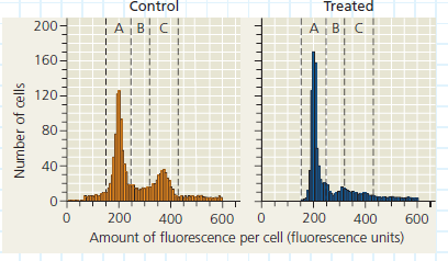
The data are plotted in a type of graph called a histogram (above), which groups values for a numeric variable on the x -axis into intervals. A histogram allows you to see how an entire group of experimental subjects (cells, in this case) are distributed along a continuous variable (amount of fluorescence). In these histograms, the bars are so narrow that the data appear to follow a curve for which you can detect peaks and dips. Each narrow bar represents the number of cells observed to have a level of fluorescence in the range of that interval. This in turn indicates the relative amount of DNA in those cells. Overall, comparing histograms allows you to see how the DNA content of this cell population is altered by the treatment.
Study the data in the histograms. (a) Which axis indirectly shows the relative amount of DNA per cell Explain your answer. (b) In the control sample, compare the first peak in the histogram (in region A) to the second peak (in region C). Which peak shows the population of cells with the higher amount of DNA per cell Explain. (For additional information about graphs, see the Scientific Skills Review in Appendix F and in the Study Area in MasteringBiology.)
Explanation Verified
The cell cycle comprises of various stag...
Campbell Biology 11th Edition by Lisa Urry,Michael Cain,Steven Wasserman,Peter Minorsky,Jane Reece
Why don’t you like this exercise?
Other Minimum 8 character and maximum 255 character
Character 255


