Deck 2: Picturing Variation With Graphs
Full screen (f)
Question
Question
Question
Question
Question
The two histograms below display the exact same data. How do the plots differ? 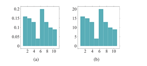
Question
Use the word cloud to answer questions
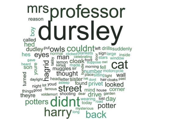
The words "owls" and "eyes" appear to be similar in size. Does this mean that each of these words is used the same number of times in the first chapter of the book? Why or why not?
The words "owls" and "eyes" appear to be similar in size. Does this mean that each of these words is used the same number of times in the first chapter of the book? Why or why not?
Question
Question
Question
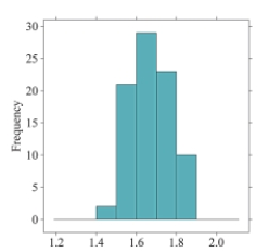
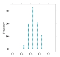
If you were to create a dotplot to display the same data that is represented in the following histogram, how many dots would you draw to represent heights that fall between 1.5 meters and 1.6 meters? 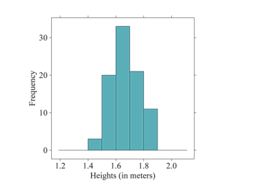
Question
Question
Question
How would you describe the typical value for this histogram? Explain your reasoning. 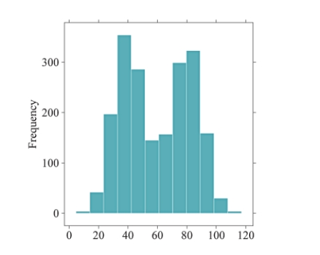
Question
Below are two histograms. One corresponds to the ages at which a sample of people applied for marriage licenses; the other corresponds to the last digit of a sample of social security numbers. Which graph is which, and why? 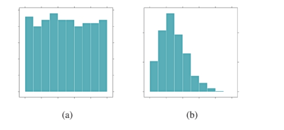
Question
Use the word cloud to answer questions
According to the word cloud, what is the most common word in the first chapter of Harry Potter and the Sorcerer's Stone? Why?
According to the word cloud, what is the most common word in the first chapter of Harry Potter and the Sorcerer's Stone? Why?
Question
The following histogram represents the number of reviews a movie received on a popular website. What is the typical number of reviews a movie is expected to receive, according to this distribution? Explain your reasoning. 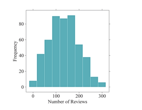
Question
The bar charts below depict the MPAA movie ratings of 489 movies, separated by high and low critic scores. Which bar chart shows more variability in MPAA movie ratings? Why? 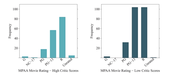
Question
Question
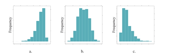
Order the following histograms from least to most variability. Explain your reasoning. 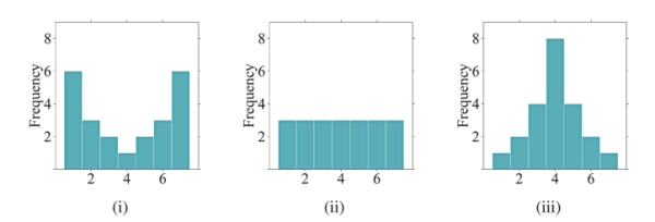
Question
Using the following bar chart, what can you say about the difference in seat belt use for males versus females? 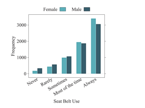
Question
Question
Which dotplot represents the same data as the histogram shown below?
A)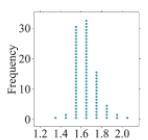
B)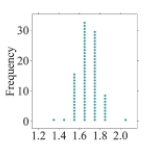
C)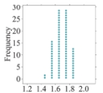
D)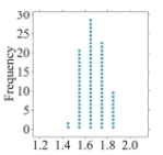
A)
B)
C)
D)
Question
The bar charts below depict the marital statuses of Americans, separated by gender. Which bar chart shows more variability in marital status? Why? 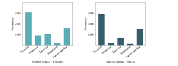
A)The female bar chart shows more variability because many of the observations fall into one category ("Married").
B)The female bar chart shows more variability because there are more observations in the different categories than there are for males.
C)The male bar chart shows more variability because many of the observations fall into one category ("Married").
D)The male bar chart shows more variability because there are more observations in the different categories than there are for females.
Question
Question
The following histogram represents the movie runtimes (length of a movie in minutes) of 489 movies. What is the typical movie runtime according to this distribution? 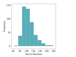
A)The typical value is about 90.
B)The typical value is about 100.
C)The typical value is about 120.
D)The typical value is about 130.
A)The typical value is about 90.
B)The typical value is about 100.
C)The typical value is about 120.
D)The typical value is about 130.
Question
In the following histogram, what can you conclude about the bin width? 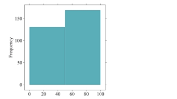
A)The bin width is too small.We are given too much detail.
B)The bin width is too large.We are given too much detail.
C)The bin width is too small.We are hiding details of the distribution.
D)The bin width is too large.We are hiding details of the distribution.
A)The bin width is too small.We are given too much detail.
B)The bin width is too large.We are given too much detail.
C)The bin width is too small.We are hiding details of the distribution.
D)The bin width is too large.We are hiding details of the distribution.
Question
for following questions , match one of the histograms below with its appropriate description.
The distribution of male heights is displayed in histogram .
The distribution of male heights is displayed in histogram .
Question
Question
for following questions , match one of the histograms below with its appropriate description.
The distribution of test scores for a group of students who received a 15-minute study session prior to taking a test is displayed in histogram .
The distribution of test scores for a group of students who received a 15-minute study session prior to taking a test is displayed in histogram .
Question
Question
Question
Question
Question
What is the typical value for the histogram shown below? 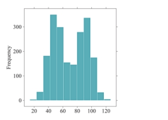
A)The typical value is 70 because it is the average of 50 and 90.
B)The typical value is 70 because it is the center of the distribution.
C)Since the data are bimodal, a typical value cannot be found.
D)Since the data are bimodal, there are two typical values - one is about 50 and the other is about
Question
Question
Question
The two histograms below display the exact same data. How do the plots differ? 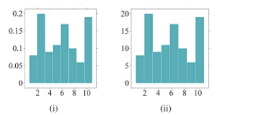
A)Histogram (i) uses frequencies to simply count the number of observations at a given value. Histogram (ii) uses relative frequencies to show the proportion of observations at a given value.
B)Histogram (i) uses relative frequencies to show the proportion of observations at a given value.Histogram (ii) uses frequencies to simply count the number of observations at a given
Value.
C)Histograms (i) and (ii) are exactly the same; there are no differences between the plots.
D)Histograms (i) and (ii) do not display the same data because the values listed on the y-axis do not match.
Question
Which statement below is NOT supported by the following bar chart? 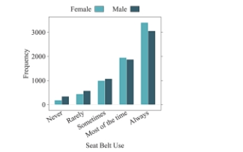
A)In general, people always wear seat belts.
B)About 2000 people wear seat belts "sometimes."
C)More females wear seat belts compared to males.
D)More males wear seat belts compared to females.
A)In general, people always wear seat belts.
B)About 2000 people wear seat belts "sometimes."
C)More females wear seat belts compared to males.
D)More males wear seat belts compared to females.
Question
Order the following histograms from most to least variability. 
A)(i), (ii), (iii)
B)(ii), (i), (iii)
C)(ii), (iii), (i)
D)(iii), (i), (ii)
A)(i), (ii), (iii)
B)(ii), (i), (iii)
C)(ii), (iii), (i)
D)(iii), (i), (ii)
Question
for following questions , match one of the histograms below with its appropriate description.
The distribution of the number of "friends" users of a popular social media site has is displayed in histogram .
The distribution of the number of "friends" users of a popular social media site has is displayed in histogram .
Question
Question
Which histogram represents the same data as the dotplot shown below?
A)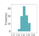
B)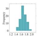
C)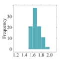
D)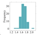
A)
B)
C)
D)
Question
Question
Question
for following questions , match one of the histograms below with its appropriate description.
The distribution of female heights is displayed in histogram .
The distribution of female heights is displayed in histogram .
Question
The bar charts below depict the veteran statuses of Americans, separated by gender. Which bar chart has more variability in veteran status? Why? 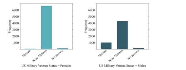
A)The female bar chart shows more variability because many of the observations fall into one category ("Non-Veteran").
B)The female bar chart shows more variability because there are more observations in the different categories than there are for males.
C)The male bar chart shows more variability because many of the observations fall into one category ("Non-Veteran").
D) The male bar chart shows more variability because there are more observations in the different categories than there are for females.
Question
In the following histogram, what can you conclude about the bin width? 
A)The bin width is too small.We are given too much detail.
B)The bin width is too large.We are given too much detail.
C)The bin width is too small.We are hiding details of the distribution.
D)The bin width is too large.We are hiding details of the distribution.
A)The bin width is too small.We are given too much detail.
B)The bin width is too large.We are given too much detail.
C)The bin width is too small.We are hiding details of the distribution.
D)The bin width is too large.We are hiding details of the distribution.
Question
The following histogram represents audience movie ratings (on a scale of 1-100) of 489 movies. What is the typical movie rating given by audiences according to this distribution? 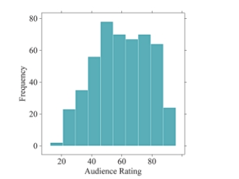
A)The typical value is about 40.
B)The typical value is about 50.
C)The typical value is about 60.
D)The typical value is about 70.
A)The typical value is about 40.
B)The typical value is about 50.
C)The typical value is about 60.
D)The typical value is about 70.
Question
Question
Question
Question
Question
for following questions , match one of the histograms below with its appropriate description.
The distribution of scores on an easy test is displayed in histogram .
The distribution of scores on an easy test is displayed in histogram .
Question
Question
Which statement below is NOT supported by the following bar chart? 
A)More females wear sunscreen than males.
B)Very few people, in general, always wear sunscreen.
C)More males wear sunscreen than females.
D)About 50% of males never wear sunscreen.
A)More females wear sunscreen than males.
B)Very few people, in general, always wear sunscreen.
C)More males wear sunscreen than females.
D)About 50% of males never wear sunscreen.
Question
Question
Question
for following questions , match one of the histograms below with its appropriate description.
The distribution of household income in a large city is displayed in histogram .
The distribution of household income in a large city is displayed in histogram .
Question
Order the following histograms from least to most variability. 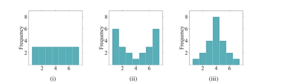
A)(i), (ii), (iii)
B)(ii), (i), (iii)
C)(ii), (iii), (i)
D)(iii), (i), (ii)
A)(i), (ii), (iii)
B)(ii), (i), (iii)
C)(ii), (iii), (i)
D)(iii), (i), (ii)
Question

Unlock Deck
Sign up to unlock the cards in this deck!
Unlock Deck
Unlock Deck
1/59
Play
Full screen (f)
Deck 2: Picturing Variation With Graphs
1
What does it mean to find the mode of a bar chart?
The mode can be found by finding the bar, or category, with the most observations. It will be the highest bar in the plot.
2
Describe a scenario in which a distribution could be bimodal. Explain your reasoning.
Answers may vary. Some examples include: (1) The price of college tuition, including both public and private schools (the different types of colleges would create two modes - private colleges would most likely have higher tuition costs compared to public schools). (2) The heights of all students at a high school (the different genders would create two modes - males are typically taller than females).
3
for following questions , what would you expect the shape of the distribution described to look like? Explain your reasoning.
The distribution of the time (in minutes) it takes to drive to work using the same route each day.
The distribution of the time (in minutes) it takes to drive to work using the same route each day.
The distribution of the time it takes to drive to work using the same route each day should be roughly symmetric because the time you leave your house is probably the same each day. The commute times will be very similar on a day-to-day basis.
4
Use the following information to answer questions
A large state university conducted a survey among their students and received 400
responses. The survey asked the students to provide the following information:
* Age
* Year in School (Freshman, Sophomore, Junior, Senior)
* Gender
What type of graph would you use to describe the variables Gender and Year in School? Explain your reasoning. A word cloud was created using the first chapter of J.K. Rowling's Harry Potter and the Sorcerer's Stone. (Note that filler words such as "the," "a/an," and "and" were excluded from the plot.)
Unlock Deck
Unlock for access to all 59 flashcards in this deck.
Unlock Deck
k this deck
5
The two histograms below display the exact same data. How do the plots differ?
Unlock Deck
Unlock for access to all 59 flashcards in this deck.
Unlock Deck
k this deck
6
Use the word cloud to answer questions
The words "owls" and "eyes" appear to be similar in size. Does this mean that each of these words is used the same number of times in the first chapter of the book? Why or why not?
The words "owls" and "eyes" appear to be similar in size. Does this mean that each of these words is used the same number of times in the first chapter of the book? Why or why not?
Unlock Deck
Unlock for access to all 59 flashcards in this deck.
Unlock Deck
k this deck
7
When examining distributions of numerical data, what three components should you try to describe?
Unlock Deck
Unlock for access to all 59 flashcards in this deck.
Unlock Deck
k this deck
8
Use the following information to answer questions
A large state university conducted a survey among their students and received 400
responses. The survey asked the students to provide the following information:
* Age
* Year in School (Freshman, Sophomore, Junior, Senior)
* Gender
What type of graph would you use to describe the variable Year in School? Explain your reasoning.
Unlock Deck
Unlock for access to all 59 flashcards in this deck.
Unlock Deck
k this deck
9
If you were to create a dotplot to display the same data that is represented in the following histogram, how many dots would you draw to represent heights that fall between 1.5 meters and 1.6 meters?
Unlock Deck
Unlock for access to all 59 flashcards in this deck.
Unlock Deck
k this deck
10
for following questions , what would you expect the shape of the distribution described to look like? Explain your reasoning.
The distribution of the household incomes in a large city.
The distribution of the household incomes in a large city.
Unlock Deck
Unlock for access to all 59 flashcards in this deck.
Unlock Deck
k this deck
11
How is a dotplot similar to a histogram? How is it different?
Unlock Deck
Unlock for access to all 59 flashcards in this deck.
Unlock Deck
k this deck
12
How would you describe the typical value for this histogram? Explain your reasoning.
Unlock Deck
Unlock for access to all 59 flashcards in this deck.
Unlock Deck
k this deck
13
Below are two histograms. One corresponds to the ages at which a sample of people applied for marriage licenses; the other corresponds to the last digit of a sample of social security numbers. Which graph is which, and why?
Unlock Deck
Unlock for access to all 59 flashcards in this deck.
Unlock Deck
k this deck
14
Use the word cloud to answer questions
According to the word cloud, what is the most common word in the first chapter of Harry Potter and the Sorcerer's Stone? Why?
According to the word cloud, what is the most common word in the first chapter of Harry Potter and the Sorcerer's Stone? Why?
Unlock Deck
Unlock for access to all 59 flashcards in this deck.
Unlock Deck
k this deck
15
The following histogram represents the number of reviews a movie received on a popular website. What is the typical number of reviews a movie is expected to receive, according to this distribution? Explain your reasoning.
Unlock Deck
Unlock for access to all 59 flashcards in this deck.
Unlock Deck
k this deck
16
The bar charts below depict the MPAA movie ratings of 489 movies, separated by high and low critic scores. Which bar chart shows more variability in MPAA movie ratings? Why?
Unlock Deck
Unlock for access to all 59 flashcards in this deck.
Unlock Deck
k this deck
17
for following questions , what would you expect the shape of the distribution described to look like? Explain your reasoning.
The distribution of scores on an easy test.
The distribution of scores on an easy test.
Unlock Deck
Unlock for access to all 59 flashcards in this deck.
Unlock Deck
k this deck
18
Order the following histograms from least to most variability. Explain your reasoning.
Unlock Deck
Unlock for access to all 59 flashcards in this deck.
Unlock Deck
k this deck
19
Using the following bar chart, what can you say about the difference in seat belt use for males versus females?
Unlock Deck
Unlock for access to all 59 flashcards in this deck.
Unlock Deck
k this deck
20
What is the difference between a bar chart and a histogram?
Unlock Deck
Unlock for access to all 59 flashcards in this deck.
Unlock Deck
k this deck
21
Which dotplot represents the same data as the histogram shown below?
A)
B)
C)
D)
A)
B)
C)
D)
Unlock Deck
Unlock for access to all 59 flashcards in this deck.
Unlock Deck
k this deck
22
The bar charts below depict the marital statuses of Americans, separated by gender. Which bar chart shows more variability in marital status? Why?
A)The female bar chart shows more variability because many of the observations fall into one category ("Married").
B)The female bar chart shows more variability because there are more observations in the different categories than there are for males.
C)The male bar chart shows more variability because many of the observations fall into one category ("Married").
D)The male bar chart shows more variability because there are more observations in the different categories than there are for females.
Unlock Deck
Unlock for access to all 59 flashcards in this deck.
Unlock Deck
k this deck
23
When examining distributions of numerical data, what three components should you look for?
A)Shape, center, and spread
B)Shape, symmetry, and spread
C)Symmetry, skewness, and spread
D)Symmetry, center, and spread
A)Shape, center, and spread
B)Shape, symmetry, and spread
C)Symmetry, skewness, and spread
D)Symmetry, center, and spread
Unlock Deck
Unlock for access to all 59 flashcards in this deck.
Unlock Deck
k this deck
24
The following histogram represents the movie runtimes (length of a movie in minutes) of 489 movies. What is the typical movie runtime according to this distribution?
A)The typical value is about 90.
B)The typical value is about 100.
C)The typical value is about 120.
D)The typical value is about 130.
A)The typical value is about 90.
B)The typical value is about 100.
C)The typical value is about 120.
D)The typical value is about 130.
Unlock Deck
Unlock for access to all 59 flashcards in this deck.
Unlock Deck
k this deck
25
In the following histogram, what can you conclude about the bin width?
A)The bin width is too small.We are given too much detail.
B)The bin width is too large.We are given too much detail.
C)The bin width is too small.We are hiding details of the distribution.
D)The bin width is too large.We are hiding details of the distribution.
A)The bin width is too small.We are given too much detail.
B)The bin width is too large.We are given too much detail.
C)The bin width is too small.We are hiding details of the distribution.
D)The bin width is too large.We are hiding details of the distribution.
Unlock Deck
Unlock for access to all 59 flashcards in this deck.
Unlock Deck
k this deck
26
for following questions , match one of the histograms below with its appropriate description.
The distribution of male heights is displayed in histogram .
The distribution of male heights is displayed in histogram .
Unlock Deck
Unlock for access to all 59 flashcards in this deck.
Unlock Deck
k this deck
27
What does it mean to find the mode of a bar chart?
A)The mode can be found by finding the bar, or category, with the most observations.
B)You cannot find a mode for categorical data.Modes are only used with numerical data.
C)The mode can be found by adding up the total number of observations and dividing by the number of categories.
D)The mode can be found by adding up the total number of categories.
Unlock Deck
Unlock for access to all 59 flashcards in this deck.
Unlock Deck
k this deck
28
for following questions , match one of the histograms below with its appropriate description.
The distribution of test scores for a group of students who received a 15-minute study session prior to taking a test is displayed in histogram .
The distribution of test scores for a group of students who received a 15-minute study session prior to taking a test is displayed in histogram .
Unlock Deck
Unlock for access to all 59 flashcards in this deck.
Unlock Deck
k this deck
29
How are individual observations recorded in a dotplot versus a stemplot?
A)A dotplot displays the actual values of observations.A stemplot uses bars to display intervals of observations.
B)A dotplot displays the actual values of observations.A stemplot displays a dot for every observation.
C)A dotplot displays a dot for every observation.A stemplot displays the actual values of observations.
D)A dotplot displays a dot for every observation.A stemplot uses bars to display intervals of observations.
Unlock Deck
Unlock for access to all 59 flashcards in this deck.
Unlock Deck
k this deck
30
Which of the following would likely show a bimodal distribution in a histogram?
A)The midterm exam scores for an introduction to Spanish course.
B)The ages of students who attend a local high school.
C)The number of hours a college student spends on homework per night.
D)The price of college tuition, including both public and private schools.
A)The midterm exam scores for an introduction to Spanish course.
B)The ages of students who attend a local high school.
C)The number of hours a college student spends on homework per night.
D)The price of college tuition, including both public and private schools.
Unlock Deck
Unlock for access to all 59 flashcards in this deck.
Unlock Deck
k this deck
31
What information is NOT explicitly portrayed in the word cloud?
A)The words that occur most frequently in the chapter.
B)The number of times each word occurs.
C)The specific word that occurs most often.
A)The words that occur most frequently in the chapter.
B)The number of times each word occurs.
C)The specific word that occurs most often.
Unlock Deck
Unlock for access to all 59 flashcards in this deck.
Unlock Deck
k this deck
32
Use the following information to answer questions (17) - (18):
A large state university conducted a survey among their students and received 400 responses.
The survey asked the students to provide the following information:
* Age
* Year in School (Freshman, Sophomore, Junior, Senior)
* Major
What type of graph would you use to describe the variable Major?
A)A histogram because Major is a numerical variable.
B)A histogram because Major is a categorical variable.
C)A bar chart because Major is a numerical variable.
D)A bar chart because Major is a categorical variable.
Unlock Deck
Unlock for access to all 59 flashcards in this deck.
Unlock Deck
k this deck
33
What is the typical value for the histogram shown below?
A)The typical value is 70 because it is the average of 50 and 90.
B)The typical value is 70 because it is the center of the distribution.
C)Since the data are bimodal, a typical value cannot be found.
D)Since the data are bimodal, there are two typical values - one is about 50 and the other is about
Unlock Deck
Unlock for access to all 59 flashcards in this deck.
Unlock Deck
k this deck
34
What is the difference between a bar chart and a histogram?
A)A bar chart represents categorical data and a histogram represents numerical data.
B)A bar chart represents numerical data and a histogram represents categorical data.
C)They can both be used to represent categorical data.
D)They can both be used to represent numerical data.
A)A bar chart represents categorical data and a histogram represents numerical data.
B)A bar chart represents numerical data and a histogram represents categorical data.
C)They can both be used to represent categorical data.
D)They can both be used to represent numerical data.
Unlock Deck
Unlock for access to all 59 flashcards in this deck.
Unlock Deck
k this deck
35
Use the following information to answer questions (17) - (18):
A large state university conducted a survey among their students and received 400 responses.
The survey asked the students to provide the following information:
* Age
* Year in School (Freshman, Sophomore, Junior, Senior)
* Major
What type of graph would you use to describe the variables Major and Year in School?
A)A side-by-side bar chart should be used since these are two categorical variables.
B)A side-by-side bar chart should be used since these are two numerical variables.
C)A side-by-side histogram should be used since these are two categorical variables.
D)A side-by-side histogram should be used since these are two numerical variables.
Unlock Deck
Unlock for access to all 59 flashcards in this deck.
Unlock Deck
k this deck
36
The two histograms below display the exact same data. How do the plots differ?
A)Histogram (i) uses frequencies to simply count the number of observations at a given value. Histogram (ii) uses relative frequencies to show the proportion of observations at a given value.
B)Histogram (i) uses relative frequencies to show the proportion of observations at a given value.Histogram (ii) uses frequencies to simply count the number of observations at a given
Value.
C)Histograms (i) and (ii) are exactly the same; there are no differences between the plots.
D)Histograms (i) and (ii) do not display the same data because the values listed on the y-axis do not match.
Unlock Deck
Unlock for access to all 59 flashcards in this deck.
Unlock Deck
k this deck
37
Which statement below is NOT supported by the following bar chart?
A)In general, people always wear seat belts.
B)About 2000 people wear seat belts "sometimes."
C)More females wear seat belts compared to males.
D)More males wear seat belts compared to females.
A)In general, people always wear seat belts.
B)About 2000 people wear seat belts "sometimes."
C)More females wear seat belts compared to males.
D)More males wear seat belts compared to females.
Unlock Deck
Unlock for access to all 59 flashcards in this deck.
Unlock Deck
k this deck
38
Order the following histograms from most to least variability.
A)(i), (ii), (iii)
B)(ii), (i), (iii)
C)(ii), (iii), (i)
D)(iii), (i), (ii)
A)(i), (ii), (iii)
B)(ii), (i), (iii)
C)(ii), (iii), (i)
D)(iii), (i), (ii)
Unlock Deck
Unlock for access to all 59 flashcards in this deck.
Unlock Deck
k this deck
39
for following questions , match one of the histograms below with its appropriate description.
The distribution of the number of "friends" users of a popular social media site has is displayed in histogram .
The distribution of the number of "friends" users of a popular social media site has is displayed in histogram .
Unlock Deck
Unlock for access to all 59 flashcards in this deck.
Unlock Deck
k this deck
40
According to the word cloud, which is the most common word in the first chapter of The Fault in Our Stars? Why?
A)The most common word is "thing" because it appears in the middle of the cloud.
B)The most common word is "augustus" because he is a main character in the story.
C)The most common word is "hazel" because that is the narrator's name.
D)The most common word is "augustus" because it is the largest in size.
Unlock Deck
Unlock for access to all 59 flashcards in this deck.
Unlock Deck
k this deck
41
Which histogram represents the same data as the dotplot shown below?
A)
B)
C)
D)
A)
B)
C)
D)
Unlock Deck
Unlock for access to all 59 flashcards in this deck.
Unlock Deck
k this deck
42
What is the difference between a histogram and a relative frequency histogram?
A)A histogram uses numbers to record how many observations are in a data set, and a relative histogram uses categories.
B)A histogram uses categories to record how many observations are in a data set, and a relative histogram uses counts.
C)A histogram uses counts to record how many observations are in a data set, and a relative histogram uses proportions.
D)A histogram uses proportions to record how many observations are in a data set, and a relative histogram uses counts.
Unlock Deck
Unlock for access to all 59 flashcards in this deck.
Unlock Deck
k this deck
43
Which of the following would likely show a bimodal distribution in a histogram?
A)The heights of all students in a high school band.
B)The ages of students who attend a 4-year university.
C)The number of hours preschoolers plays outside.
D)The final exam grades for an introductory statistics course.
A)The heights of all students in a high school band.
B)The ages of students who attend a 4-year university.
C)The number of hours preschoolers plays outside.
D)The final exam grades for an introductory statistics course.
Unlock Deck
Unlock for access to all 59 flashcards in this deck.
Unlock Deck
k this deck
44
for following questions , match one of the histograms below with its appropriate description.
The distribution of female heights is displayed in histogram .
The distribution of female heights is displayed in histogram .
Unlock Deck
Unlock for access to all 59 flashcards in this deck.
Unlock Deck
k this deck
45
The bar charts below depict the veteran statuses of Americans, separated by gender. Which bar chart has more variability in veteran status? Why?
A)The female bar chart shows more variability because many of the observations fall into one category ("Non-Veteran").
B)The female bar chart shows more variability because there are more observations in the different categories than there are for males.
C)The male bar chart shows more variability because many of the observations fall into one category ("Non-Veteran").
D) The male bar chart shows more variability because there are more observations in the different categories than there are for females.
Unlock Deck
Unlock for access to all 59 flashcards in this deck.
Unlock Deck
k this deck
46
In the following histogram, what can you conclude about the bin width?
A)The bin width is too small.We are given too much detail.
B)The bin width is too large.We are given too much detail.
C)The bin width is too small.We are hiding details of the distribution.
D)The bin width is too large.We are hiding details of the distribution.
A)The bin width is too small.We are given too much detail.
B)The bin width is too large.We are given too much detail.
C)The bin width is too small.We are hiding details of the distribution.
D)The bin width is too large.We are hiding details of the distribution.
Unlock Deck
Unlock for access to all 59 flashcards in this deck.
Unlock Deck
k this deck
47
The following histogram represents audience movie ratings (on a scale of 1-100) of 489 movies. What is the typical movie rating given by audiences according to this distribution?
A)The typical value is about 40.
B)The typical value is about 50.
C)The typical value is about 60.
D)The typical value is about 70.
A)The typical value is about 40.
B)The typical value is about 50.
C)The typical value is about 60.
D)The typical value is about 70.
Unlock Deck
Unlock for access to all 59 flashcards in this deck.
Unlock Deck
k this deck
48
Use the following information to answer questions
A large state university conducted a survey among their students and received 300 responses.
The survey asked the students to provide the following information:
* Age
* Year in School (Freshman, Sophomore, Junior, Senior)
* Gender
* GPA
What type of graph would you use to describe the variables Gender and Year in School?
A)A side-by-side histogram should be used since these are two numerical variables.
B)A side-by-side histogram should be used since these are two categorical variables.
C)A side-by-side bar chart should be used since these are two numerical variables.
D)A side-by-side bar chart should be used since these are two categorical variables.
Unlock Deck
Unlock for access to all 59 flashcards in this deck.
Unlock Deck
k this deck
49
What is the difference between a bar chart and a histogram?
A)They can both be used to represent numerical data.
B)They can both be used to represent categorical data.
C)A bar chart represents numerical data and a histogram represents categorical data.
D)A bar chart represents categorical data and a histogram represents numerical data.
A)They can both be used to represent numerical data.
B)They can both be used to represent categorical data.
C)A bar chart represents numerical data and a histogram represents categorical data.
D)A bar chart represents categorical data and a histogram represents numerical data.
Unlock Deck
Unlock for access to all 59 flashcards in this deck.
Unlock Deck
k this deck
50
What information is NOT explicitly portrayed in the word cloud?
A)The words that occur most frequently in the chapter.
B)The specific word that occurs most often.
C)The number of times each word occurs.
A)The words that occur most frequently in the chapter.
B)The specific word that occurs most often.
C)The number of times each word occurs.
Unlock Deck
Unlock for access to all 59 flashcards in this deck.
Unlock Deck
k this deck
51
What does it mean to find the mode of a bar chart?
A)You cannot find a mode for categorical data.Modes are only used with numerical data.
B)The mode can be found by finding the bar, or category, with the most observations.
C)The mode can be found by adding up the total number of categories.
D)The mode can be found by adding up the total number of observations and dividing by the number of categories.
Unlock Deck
Unlock for access to all 59 flashcards in this deck.
Unlock Deck
k this deck
52
for following questions , match one of the histograms below with its appropriate description.
The distribution of scores on an easy test is displayed in histogram .
The distribution of scores on an easy test is displayed in histogram .
Unlock Deck
Unlock for access to all 59 flashcards in this deck.
Unlock Deck
k this deck
53
When examining distributions of numerical data, what three components should you look for?
A)Symmetry, center, and spread
B)Symmetry, skewness, and spread
C)Shape, symmetry, and spread
D)Shape, center, and spread
A)Symmetry, center, and spread
B)Symmetry, skewness, and spread
C)Shape, symmetry, and spread
D)Shape, center, and spread
Unlock Deck
Unlock for access to all 59 flashcards in this deck.
Unlock Deck
k this deck
54
Which statement below is NOT supported by the following bar chart?
A)More females wear sunscreen than males.
B)Very few people, in general, always wear sunscreen.
C)More males wear sunscreen than females.
D)About 50% of males never wear sunscreen.
A)More females wear sunscreen than males.
B)Very few people, in general, always wear sunscreen.
C)More males wear sunscreen than females.
D)About 50% of males never wear sunscreen.
Unlock Deck
Unlock for access to all 59 flashcards in this deck.
Unlock Deck
k this deck
55
How are individual observations recorded in a dotplot, a histogram, and a stemplot?
A)A dotplot displays the actual values of observations.A histogram displays a dot for every observation.A stemplot uses bars to display intervals of observations.
B)A dotplot displays a dot for every observation.A histogram uses bars to display intervals of observations.A stemplot displays the actual values of observations.
C)A dotplot displays the actual values of observations.A histogram uses bars to display intervals of observations.A stemplot displays a dot for every observation.
D)A dotplot uses bars to display intervals of observations.A histogram displays a dot for every observation.A stemplot displays the actual values of observations.
Unlock Deck
Unlock for access to all 59 flashcards in this deck.
Unlock Deck
k this deck
56
According to the word cloud, what is the most common word in the first chapter of Alice's Adventures in Wonderland? Why?
A)The most common word is "alice" because it is the largest in size.
B)The most common word is "alice" because she is a main character in the story.
C)The most common word is "marked" because it appears at the top of the cloud.
D)The most common word is "garden" because it appears in the middle of the cloud.
Unlock Deck
Unlock for access to all 59 flashcards in this deck.
Unlock Deck
k this deck
57
for following questions , match one of the histograms below with its appropriate description.
The distribution of household income in a large city is displayed in histogram .
The distribution of household income in a large city is displayed in histogram .
Unlock Deck
Unlock for access to all 59 flashcards in this deck.
Unlock Deck
k this deck
58
Order the following histograms from least to most variability.
A)(i), (ii), (iii)
B)(ii), (i), (iii)
C)(ii), (iii), (i)
D)(iii), (i), (ii)
A)(i), (ii), (iii)
B)(ii), (i), (iii)
C)(ii), (iii), (i)
D)(iii), (i), (ii)
Unlock Deck
Unlock for access to all 59 flashcards in this deck.
Unlock Deck
k this deck
59
Use the following information to answer questions
A large state university conducted a survey among their students and received 300 responses.
The survey asked the students to provide the following information:
* Age
* Year in School (Freshman, Sophomore, Junior, Senior)
* Gender
* GPA
What type of graph would you use to describe the variable Age?
A)A histogram because Age is a numerical variable.
B)A histogram because Age is a categorical variable.
C)A bar chart because Age is a numerical variable.
D)A bar chart because Age is a categorical variable.
Unlock Deck
Unlock for access to all 59 flashcards in this deck.
Unlock Deck
k this deck
Unlock Deck
Unlock for access to all 59 flashcards in this deck.


