Deck 1: Describing Data With Graphs
Full screen (f)
Question
Question
Question
Question
Question
Question
Question
Question
Question
Question
Question
Question
Question
Question
Question
Question
Question
Question
Question
Question
Question
Question
Question
Question
Question
Question
Question
Question
Question
Question
Question
Question
Question
Question
Question
Question
Question
Question
Question
Question
Question
A high school volleyball coach has summarized the wins, losses, and ties of her team for the past 4 years in the following stacked bar chart. Interpret the chart. 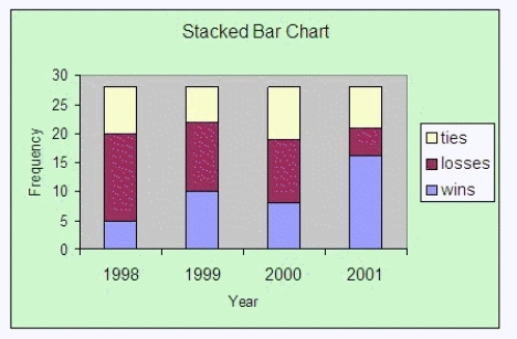
Question
Question
Question
Question
A neighborhood ice cream vendor would like to see if there is a relationship between day of the week and the number of children buying ice cream from her. The following data represent the number of children buying ice cream on each of the seven days of a particular week: 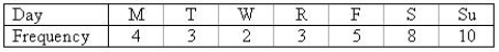
a. Construct a line chart to describe the data.
b. Is there any apparent trend in the data?
________________________________________________________
a. Construct a line chart to describe the data.
b. Is there any apparent trend in the data?
________________________________________________________
Question
Question
The owner of an Italian restaurant would like to see a graphical display of the number of customers that the restaurant serves. The following data are the average number of customers served each day for the last 12 months.
 Construct a line graph.
Explain what the graph tells us.
________________________________________________________
Construct a line graph.Explain what the graph tells us.
________________________________________________________
Question
Question
Question
A limnologist is studying a Minnesota lake in October. He records the temperatures in °C for surface water taken every other day at noon. The data are shown below.
8.5 8.1 7.9 9.0 7.7 7.3 7.1 6.8 9.2
6.8 6.3 7.0 6.5 5.7 5.9 4.9 4.2 6.9
a. Construct a stem and leaf plot to display the distribution of the data.

b. Would you describe the distribution of the data as symmetric, skewed to the right or skewed to the left?
______________
c. Explain.
________________________________________________________
8.5 8.1 7.9 9.0 7.7 7.3 7.1 6.8 9.2
6.8 6.3 7.0 6.5 5.7 5.9 4.9 4.2 6.9
a. Construct a stem and leaf plot to display the distribution of the data.
b. Would you describe the distribution of the data as symmetric, skewed to the right or skewed to the left?
______________
c. Explain.
________________________________________________________
Question
Question
Question
Question
Question
Question
Question
Question
Question
The librarian of a small community library has compiled the number of people who visited the library and the respective number of checked-out books, and created the line chart shown below: 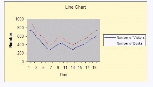 Interpret the chart, where the solid line is the number of visitors and the dashed line is the number of books checked-out.
________________________________________________________
Interpret the chart, where the solid line is the number of visitors and the dashed line is the number of books checked-out.________________________________________________________
Question
Question
Question
Question
Question
Question
Question
Question
Question
Question
Question
Question
Question
Question
Question
Question
Question
Question
Question
Question
Question

Unlock Deck
Sign up to unlock the cards in this deck!
Unlock Deck
Unlock Deck
1/94
Play
Full screen (f)
Deck 1: Describing Data With Graphs
1
The difference between a histogram and a bar chart is that the histogram represents quantitative data while the bar chart represents qualitative data.
True
2
When constructing a relative frequency distribution, if the data are discrete, it will always be necessary to develop class boundaries.
False
3
When a distribution has more values to the left and tails to the right, we say it is skewed to the left.
False
4
The total area of the six bars in a relative frequency histogram for which the width of each bar is five units is 5.
Unlock Deck
Unlock for access to all 94 flashcards in this deck.
Unlock Deck
k this deck
5
The largest value in a set of data is 100, and the lowest value is 20. If the resulting frequency distribution is to have five classes of equal width, the class width will be 16.
Unlock Deck
Unlock for access to all 94 flashcards in this deck.
Unlock Deck
k this deck
6
Relative frequency distributions are specifically constructed for analyzing discrete data.
Unlock Deck
Unlock for access to all 94 flashcards in this deck.
Unlock Deck
k this deck
7
Time series data are often graphically depicted on a line chart, which is a plot of the variable of interest over time.
Unlock Deck
Unlock for access to all 94 flashcards in this deck.
Unlock Deck
k this deck
8
A stem-and-leaf plot describes two-digit integers between 30 and 80. For one of the classes displayed, the row appears as 5|234. The numerical values being described are 25, 35, and 45.
Unlock Deck
Unlock for access to all 94 flashcards in this deck.
Unlock Deck
k this deck
9
A skewed histogram is one with a long tail extending either to the right or left.
Unlock Deck
Unlock for access to all 94 flashcards in this deck.
Unlock Deck
k this deck
10
A pie chart is a portrayal of divisions of some aggregate by a segmented circle in such a way that the sector areas are proportional to the sized of the divisions in question.
Unlock Deck
Unlock for access to all 94 flashcards in this deck.
Unlock Deck
k this deck
11
A bar chart in which the bars are ordered from smallest to largest is called a Pareto chart.
Unlock Deck
Unlock for access to all 94 flashcards in this deck.
Unlock Deck
k this deck
12
Compared to the frequency distribution, the stem-and-leaf plot provides more details, since it can describe the individual data values as well as show how many are in each group, or stem.
Unlock Deck
Unlock for access to all 94 flashcards in this deck.
Unlock Deck
k this deck
13
A dotplot is a graphical portrayal of an absolute or relative frequency distribution of continuous quantitative data in such a way that lower and upper limits of data classes are identified by tick marks on a horizontal axis, while the corresponding absolute or relative class frequencies are represented by the areas of contiguous rectangles that stand on top of each of these class intervals.
Unlock Deck
Unlock for access to all 94 flashcards in this deck.
Unlock Deck
k this deck
14
A relative frequency distribution describes the proportion of data values that fall within each class, and may be presented in a histogram form.
Unlock Deck
Unlock for access to all 94 flashcards in this deck.
Unlock Deck
k this deck
15
For the same data, a relative frequency histogram will look exactly the same as a frequency histogram.
Unlock Deck
Unlock for access to all 94 flashcards in this deck.
Unlock Deck
k this deck
16
The class interval in a frequency distribution is the number of data values falling within each class.
Unlock Deck
Unlock for access to all 94 flashcards in this deck.
Unlock Deck
k this deck
17
If you wish to compare two data sets of different sizes, it is usually a good idea to convert frequency distributions to relative frequency distributions.
Unlock Deck
Unlock for access to all 94 flashcards in this deck.
Unlock Deck
k this deck
18
When a distribution has more values to the right and tails to the left, we say it is skewed to the right.
Unlock Deck
Unlock for access to all 94 flashcards in this deck.
Unlock Deck
k this deck
19
A histogram is said to be symmetric if, when we draw a vertical line down the center of the histogram, the two sides are identical in shape and size.
Unlock Deck
Unlock for access to all 94 flashcards in this deck.
Unlock Deck
k this deck
20
A relative frequency distribution describes the proportion of data values that fall within each category.
Unlock Deck
Unlock for access to all 94 flashcards in this deck.
Unlock Deck
k this deck
21
A relative frequency histogram can be constructed by letting the horizontal axis or the vertical axis represent the variable of interest.
Unlock Deck
Unlock for access to all 94 flashcards in this deck.
Unlock Deck
k this deck
22
A common rule of thumb in constructing a relative frequency histogram is to use:
A) less than 5 classes
B) more than 10 classes
C) between 5 and 12 classes
D) any number of classes
E) at least 10 classes
A) less than 5 classes
B) more than 10 classes
C) between 5 and 12 classes
D) any number of classes
E) at least 10 classes
Unlock Deck
Unlock for access to all 94 flashcards in this deck.
Unlock Deck
k this deck
23
One of the differences between a bar chart and a histogram is that a histogram typically displays data in a percentage form.
Unlock Deck
Unlock for access to all 94 flashcards in this deck.
Unlock Deck
k this deck
24
A relative frequency histogram can be constructed for qualitative as well as quantitative data.
Unlock Deck
Unlock for access to all 94 flashcards in this deck.
Unlock Deck
k this deck
25
The total area of the bars in a relative frequency histogram:
A) depends on the sample size
B) depends on the number of bars
C) depends on the width of each bar
D) depends on the population size
E) depends on the frequency
A) depends on the sample size
B) depends on the number of bars
C) depends on the width of each bar
D) depends on the population size
E) depends on the frequency
Unlock Deck
Unlock for access to all 94 flashcards in this deck.
Unlock Deck
k this deck
26
Which of the following best describes a relative class frequency?
A) It is the number of observations that falls into a given class in a frequency distribution.
B) It is the proportion of all observations that falls into a given class in a frequency distribution.
C) It is the difference between the numerical lower and upper limit of a class of quantitative data.
D) It is the number of observations that falls into the smallest class in a frequency distribution.
E) None of these.
Unlock Deck
Unlock for access to all 94 flashcards in this deck.
Unlock Deck
k this deck
27
The sum of relative frequencies found in a relative frequency distribution for quantitative data necessarily equals:
A) 0
B) 1
C) 100
D) n, the number observations in the data set
E) the number of collectively exhaustive and mutually exclusive class in a frequency distribution
A) 0
B) 1
C) 100
D) n, the number observations in the data set
E) the number of collectively exhaustive and mutually exclusive class in a frequency distribution
Unlock Deck
Unlock for access to all 94 flashcards in this deck.
Unlock Deck
k this deck
28
Bar charts can typically be formed with the bars vertical or horizontal without affecting the interpretation.
Unlock Deck
Unlock for access to all 94 flashcards in this deck.
Unlock Deck
k this deck
29
Stem and leaf plots are often used to analyze qualitative data in most real life applications.
Unlock Deck
Unlock for access to all 94 flashcards in this deck.
Unlock Deck
k this deck
30
Which of the following statements is not true?
A) One form of descriptive statistics uses graphical techniques.
B) One form of descriptive statistics uses numerical techniques.
C) A distribution is skewed to the left if it contains a few unusually large measurements.
D) Statistical inference is used to draw conclusions or inferences about characteristics of populations based on sample data.
E) A distribution is skewed to the left if it is symmetric.
Unlock Deck
Unlock for access to all 94 flashcards in this deck.
Unlock Deck
k this deck
31
In a line chart, the horizontal axis represents time (such as months, years) and the vertical axis represents the value of the variable of interest.
Unlock Deck
Unlock for access to all 94 flashcards in this deck.
Unlock Deck
k this deck
32
The total area of the six bars in a relative frequency histogram for which the width of each bar is ten units is:
A) 6
B) 10
C) 16
D) 60
E) 1
A) 6
B) 10
C) 16
D) 60
E) 1
Unlock Deck
Unlock for access to all 94 flashcards in this deck.
Unlock Deck
k this deck
33
The most important and commonly graphical presentation of quantitative data is the:
A) bar chart
B) histogram
C) pie chart
D) dotplot
E) time series plot
A) bar chart
B) histogram
C) pie chart
D) dotplot
E) time series plot
Unlock Deck
Unlock for access to all 94 flashcards in this deck.
Unlock Deck
k this deck
34
A histogram is a graphical device that is commonly used to analyze:
A) time series data
B) quantitative data
C) qualitative data
D) All of these
E) none of these
A) time series data
B) quantitative data
C) qualitative data
D) All of these
E) none of these
Unlock Deck
Unlock for access to all 94 flashcards in this deck.
Unlock Deck
k this deck
35
A graphical portrayal of a relative frequency distribution of continuous quantitative data in such a way that lower and upper limits of data classes are identified by tick marks on a horizontal axis, while the corresponding relative class frequencies are represented by the areas of vertical rectangles connected to each other and stand on top of each of these class intervals, is called:
A) a bar chart
B) a frequency polygon
C) a pictogram
D) a time series plot
E) none of these
A) a bar chart
B) a frequency polygon
C) a pictogram
D) a time series plot
E) none of these
Unlock Deck
Unlock for access to all 94 flashcards in this deck.
Unlock Deck
k this deck
36
Given 180 observations, a data class with an absolute class frequency of 36 must have a relative class frequency of:
A) .10
B) .20
C) .36
D) .18
E) none of these
A) .10
B) .20
C) .36
D) .18
E) none of these
Unlock Deck
Unlock for access to all 94 flashcards in this deck.
Unlock Deck
k this deck
37
The four classes: p to < 5, 5 to < 10, 10 to < 20, over 20, would be acceptable for developing a frequency distribution.
Unlock Deck
Unlock for access to all 94 flashcards in this deck.
Unlock Deck
k this deck
38
Which of the following is not recommended when constructing a relative frequency histogram?
A) equal width classes
B) mutually exclusive classes
C) open-ended classes
D) none of these
E) all of these
A) equal width classes
B) mutually exclusive classes
C) open-ended classes
D) none of these
E) all of these
Unlock Deck
Unlock for access to all 94 flashcards in this deck.
Unlock Deck
k this deck
39
The data values plotted on a line graph are connected with a straight line between each pair of successive points.
Unlock Deck
Unlock for access to all 94 flashcards in this deck.
Unlock Deck
k this deck
40
In general, incomes of employees in large firms tend to be:
A) skewed to the right
B) skewed to the left
C) symmetric
D) unknown
A) skewed to the right
B) skewed to the left
C) symmetric
D) unknown
Unlock Deck
Unlock for access to all 94 flashcards in this deck.
Unlock Deck
k this deck
41
A high school volleyball coach has summarized the wins, losses, and ties of her team for the past 4 years in the following stacked bar chart. Interpret the chart.
Unlock Deck
Unlock for access to all 94 flashcards in this deck.
Unlock Deck
k this deck
42
A variable is a characteristic that changes or varies over time, and/or for different individuals or objects under consideration. An experimental unit is the individual or object on which a variable is measured.
Unlock Deck
Unlock for access to all 94 flashcards in this deck.
Unlock Deck
k this deck
43
A histogram is usually used to display which of the following characteristics for a quantitative variable?
A) the shape of the distribution
B) the spread or variability in the data
C) the approximate center of the data
D) the spread or variability in the data and the approximate center of the data
E) all of these
A) the shape of the distribution
B) the spread or variability in the data
C) the approximate center of the data
D) the spread or variability in the data and the approximate center of the data
E) all of these
Unlock Deck
Unlock for access to all 94 flashcards in this deck.
Unlock Deck
k this deck
44
Statistical inference is the process of making an estimate, prediction, or decision about a population based on sample data.
Unlock Deck
Unlock for access to all 94 flashcards in this deck.
Unlock Deck
k this deck
45
A neighborhood ice cream vendor would like to see if there is a relationship between day of the week and the number of children buying ice cream from her. The following data represent the number of children buying ice cream on each of the seven days of a particular week:
a. Construct a line chart to describe the data.
b. Is there any apparent trend in the data?
________________________________________________________
a. Construct a line chart to describe the data.
b. Is there any apparent trend in the data?
________________________________________________________
Unlock Deck
Unlock for access to all 94 flashcards in this deck.
Unlock Deck
k this deck
46
The following data represents the number of pages of notes per lecture taken by a student in a beginning statistics course.
1 5 2 6 2 3 3 4 4 4 5
5 5 5 5 5 6 6 6 6 6 6
6 6 5 6 4 5 6
a. Construct a dotplot to describe the data.
b. Would you describe the distribution of the data as symmetric, skewed to the right or skewed to the left?
______________
c. Explain.
________________________________________________________
1 5 2 6 2 3 3 4 4 4 5
5 5 5 5 5 6 6 6 6 6 6
6 6 5 6 4 5 6
a. Construct a dotplot to describe the data.
b. Would you describe the distribution of the data as symmetric, skewed to the right or skewed to the left?
______________
c. Explain.
________________________________________________________
Unlock Deck
Unlock for access to all 94 flashcards in this deck.
Unlock Deck
k this deck
47
The owner of an Italian restaurant would like to see a graphical display of the number of customers that the restaurant serves. The following data are the average number of customers served each day for the last 12 months.
Construct a line graph.
Explain what the graph tells us.
________________________________________________________
Construct a line graph.Explain what the graph tells us.
________________________________________________________
Unlock Deck
Unlock for access to all 94 flashcards in this deck.
Unlock Deck
k this deck
48
The stem-and-leaf plot is used to display the distribution of:
A) qualitative data
B) quantitative data
C) two quantitative variables on the same chart
D) all of these
A) qualitative data
B) quantitative data
C) two quantitative variables on the same chart
D) all of these
Unlock Deck
Unlock for access to all 94 flashcards in this deck.
Unlock Deck
k this deck
49
A bar chart is used to display a:
A) time series data
B) continuous variable
C) qualitative variable
D) quantitative variable
E) discrete variable
A) time series data
B) continuous variable
C) qualitative variable
D) quantitative variable
E) discrete variable
Unlock Deck
Unlock for access to all 94 flashcards in this deck.
Unlock Deck
k this deck
50
A limnologist is studying a Minnesota lake in October. He records the temperatures in °C for surface water taken every other day at noon. The data are shown below.
8.5 8.1 7.9 9.0 7.7 7.3 7.1 6.8 9.2
6.8 6.3 7.0 6.5 5.7 5.9 4.9 4.2 6.9
a. Construct a stem and leaf plot to display the distribution of the data.
b. Would you describe the distribution of the data as symmetric, skewed to the right or skewed to the left?
______________
c. Explain.
________________________________________________________
Unlock Deck
Unlock for access to all 94 flashcards in this deck.
Unlock Deck
k this deck
51
If the manager of a grocery store wishes to display the sales trend, the most effective type of graph will be:
A) a bar chart
B) a pie chart
C) a histogram
D) a line chart
E) all of these
A) a bar chart
B) a pie chart
C) a histogram
D) a line chart
E) all of these
Unlock Deck
Unlock for access to all 94 flashcards in this deck.
Unlock Deck
k this deck
52
One of the differences between a histogram and bar chart is:
A) that the bar chart does have gaps between the bars and the histogram does not
B) that the histogram is used to display the distribution of quantitative data and the bar chart is used to display qualitative data
C) that the width of the bars is the same in both the histogram and the bar chart
D) all of these
E) none of these
Unlock Deck
Unlock for access to all 94 flashcards in this deck.
Unlock Deck
k this deck
53
Bar and pie charts are graphical techniques for qualitative data. The former focus the attention on the frequency of the occurrences of the categories, and the later emphasize the percentage of occurrences of each category.
Unlock Deck
Unlock for access to all 94 flashcards in this deck.
Unlock Deck
k this deck
54
Twenty-five percent of a sample of 200 professional tennis players indicated that their parents did not play tennis. This is an example of descriptive statistics as opposed to inferential statistics.
Unlock Deck
Unlock for access to all 94 flashcards in this deck.
Unlock Deck
k this deck
55
A local cable system using a sample of 1000 subscribers estimates that fifty percent of its subscribers watch premium channel at least five times per week. This is an example of inferential statistics as opposed to descriptive statistics.
Unlock Deck
Unlock for access to all 94 flashcards in this deck.
Unlock Deck
k this deck
56
Individual observations within each class may be found in a frequency distribution.
Unlock Deck
Unlock for access to all 94 flashcards in this deck.
Unlock Deck
k this deck
57
Which of the following statements is false?
A) A bar chart and histogram can be used interchangeably.
B) The bars on a bar chart have the same width.
C) The simplest graph for quantitative data is the dotplot.
D) There are gaps between the bars in a bar chart.
E) All of these.
A) A bar chart and histogram can be used interchangeably.
B) The bars on a bar chart have the same width.
C) The simplest graph for quantitative data is the dotplot.
D) There are gaps between the bars in a bar chart.
E) All of these.
Unlock Deck
Unlock for access to all 94 flashcards in this deck.
Unlock Deck
k this deck
58
In a sample of 1000 students in a university, 125 of them or 12.5% are biology majors. The 12.5% is an example of statistical inference.
Unlock Deck
Unlock for access to all 94 flashcards in this deck.
Unlock Deck
k this deck
59
The librarian of a small community library has compiled the number of people who visited the library and the respective number of checked-out books, and created the line chart shown below: Interpret the chart, where the solid line is the number of visitors and the dashed line is the number of books checked-out.
________________________________________________________
Interpret the chart, where the solid line is the number of visitors and the dashed line is the number of books checked-out.________________________________________________________
Unlock Deck
Unlock for access to all 94 flashcards in this deck.
Unlock Deck
k this deck
60
A math teacher would like to present the midterm results to her class in a way that shows the overall spread of the data. The 25 test scores for the midterm are listed below.
a. Construct a dotplot.
45 78 62 98 50 61 91 89 57 64 77 69 82 73 70 73 79 80 68 72 62 65 78 50 95
b. Explain what the plot tells us.
________________________________________________________
a. Construct a dotplot.
45 78 62 98 50 61 91 89 57 64 77 69 82 73 70 73 79 80 68 72 62 65 78 50 95
b. Explain what the plot tells us.
________________________________________________________
Unlock Deck
Unlock for access to all 94 flashcards in this deck.
Unlock Deck
k this deck
61
In the term "frequency distribution," frequency refers to the number of data values or measurements falling within each class.
Unlock Deck
Unlock for access to all 94 flashcards in this deck.
Unlock Deck
k this deck
62
A branch of the statistics discipline that is used to develop and utilize techniques for effectively presenting numerical information is called inferential statistics.
Unlock Deck
Unlock for access to all 94 flashcards in this deck.
Unlock Deck
k this deck
63
Persons or objects on which an experiment is performed are called experimental units.
Unlock Deck
Unlock for access to all 94 flashcards in this deck.
Unlock Deck
k this deck
64
Which of the following is not the goal of descriptive statistics?
A) summarizing data
B) displaying aspects of the collected data
C) reporting numerical findings
D) estimating characteristics of the population based on a sample
E) none of these
A) summarizing data
B) displaying aspects of the collected data
C) reporting numerical findings
D) estimating characteristics of the population based on a sample
E) none of these
Unlock Deck
Unlock for access to all 94 flashcards in this deck.
Unlock Deck
k this deck
65
A relative frequency distribution is a tabular summary of a data set showing the proportions of all observations that fall into each of several collectively exhaustive and mutually exclusive classes.
Unlock Deck
Unlock for access to all 94 flashcards in this deck.
Unlock Deck
k this deck
66
The relative frequency of a class is computed by:
A) dividing the frequency of the class by the number of classes
B) dividing the frequency of the class by the class width
C) dividing the frequency of the class by the total number of observations in the data set
D) subtracting the lower limit of the class from the upper limit and multiplying the difference by the number of classes
E) adding the lower limit of the class to the upper limit and multiplying the sum by the number of classes
Unlock Deck
Unlock for access to all 94 flashcards in this deck.
Unlock Deck
k this deck
67
A variable that is normally described in words rather than numerically is a qualitative variable.
Unlock Deck
Unlock for access to all 94 flashcards in this deck.
Unlock Deck
k this deck
68
A qualitative variable about which observations can be made in only two categories is a bivariate data set.
Unlock Deck
Unlock for access to all 94 flashcards in this deck.
Unlock Deck
k this deck
69
The sum of the frequencies for all classes will always equal:
A) the number of classes
B) the class width
C) the total number of observations in the data set
D) one
E) the average
A) the number of classes
B) the class width
C) the total number of observations in the data set
D) one
E) the average
Unlock Deck
Unlock for access to all 94 flashcards in this deck.
Unlock Deck
k this deck
70
Persons or objects that have characteristics of interest to statisticians are called variables.
Unlock Deck
Unlock for access to all 94 flashcards in this deck.
Unlock Deck
k this deck
71
The best type of chart for comparing two sets of qualitative data is:
A) a line chart
B) a pie chart
C) a histogram
D) a bar chart
E) all of these
A) a line chart
B) a pie chart
C) a histogram
D) a bar chart
E) all of these
Unlock Deck
Unlock for access to all 94 flashcards in this deck.
Unlock Deck
k this deck
72
Groupings of data, created to enhance an understanding of them, usually by making the groups collectively exhaustive and mutually exclusive are called classes or categories.
Unlock Deck
Unlock for access to all 94 flashcards in this deck.
Unlock Deck
k this deck
73
Descriptive statistics deals with methods of:
A) organizing data
B) summarizing data
C) presenting data in a convenient and informative way
D) all of these
E) only organizing and summarizing data
A) organizing data
B) summarizing data
C) presenting data in a convenient and informative way
D) all of these
E) only organizing and summarizing data
Unlock Deck
Unlock for access to all 94 flashcards in this deck.
Unlock Deck
k this deck
74
The two graphical techniques we usually use to present qualitative data are:
A) bar chart and histogram
B) histogram and pie chart
C) bar chart and pie chart
D) line chart and stem and leaf plot
E) bar chart and line chart
A) bar chart and histogram
B) histogram and pie chart
C) bar chart and pie chart
D) line chart and stem and leaf plot
E) bar chart and line chart
Unlock Deck
Unlock for access to all 94 flashcards in this deck.
Unlock Deck
k this deck
75
A discrete quantitative variable is one that can assume values only at specific points on an interval of values, with inevitable gaps between them.
Unlock Deck
Unlock for access to all 94 flashcards in this deck.
Unlock Deck
k this deck
76
A tabular summary of categorical data set showing the number of observations that fall into each of several collectively exhaustive and mutually exclusive classes is called a bar chart.
Unlock Deck
Unlock for access to all 94 flashcards in this deck.
Unlock Deck
k this deck
77
A continuous quantitative variable is one that can assume values at all points on an interval of values, with no gaps between possible values.
Unlock Deck
Unlock for access to all 94 flashcards in this deck.
Unlock Deck
k this deck
78
Which of the following statements is true?
A) Univariate data result when a single variable is measured on a single experimental unit.
B) Bivariate data result when less than two variables are measured on a single experimental unit.
C) Multivariate data result when more than two variables are measured.
D) Both univariate data result when a single variable is measured on a single experimental unit and multivariate data result when more than two variables are measured are true.
E) Both bivariate data result when less than two variables are measured on a single experimental unit and multivariate data result when more than two variables are measured are true.
Unlock Deck
Unlock for access to all 94 flashcards in this deck.
Unlock Deck
k this deck
79
You asked ten of your classmates about their weight. On the basis of this information, you stated that the average weight of all students in your university or college is 158 pounds. This is an example of:
A) descriptive statistics
B) statistical inference
C) sample
D) population
E) sample and population
A) descriptive statistics
B) statistical inference
C) sample
D) population
E) sample and population
Unlock Deck
Unlock for access to all 94 flashcards in this deck.
Unlock Deck
k this deck
80
A branch of the statistics discipline that is used to develop and utilize techniques for properly making inferences about population characteristics from information contained in a sample drawn from this population is called inferential statistics.
Unlock Deck
Unlock for access to all 94 flashcards in this deck.
Unlock Deck
k this deck
Unlock Deck
Unlock for access to all 94 flashcards in this deck.


