The figure below shows the relationship between cost per unit and the number of firms producing a particular good. The downward shift in the curve from A to B is best explained by a(n) 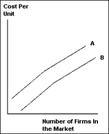
A) increase in the number of firms in the market.
B) increase in market size.
C) decrease in the number of firms in the market.
D) increase in market price.
E) decrease in the market size.
Correct Answer:
Verified
Q102: When countries create a free trade area
Q102: Suppose China and India are both able
Q107: If price is above cost, then
A)there are
Q111: An increase in the number of firms
Q112: When Canada and the United States permitted
Q113: As a market increases in size, average
Q114: If price is above average cost, then
Q116: Explain how there can be gains from
Q117: A huge amount of international trade is
Q119: An increase in the size of the
Unlock this Answer For Free Now!
View this answer and more for free by performing one of the following actions

Scan the QR code to install the App and get 2 free unlocks

Unlock quizzes for free by uploading documents