Refer to the graphs below representing three computer simulations of Earth's climate between 1850 and 2000.Blue lines represent results of the model;red lines are actual climate data.The graph A model includes only natural factors,such as solar input and volcanic activity.The graph B model includes only human-caused (anthropogenic)factors,such as fossil fuel burning and deforestation.The graph C model includes both natural and anthropogenic factors.Curves are expressed as deviations around 0,which represents the average temperature for the late 1800s.Which graph best fits the actual data? What does a comparison of the three graphs indicate about the causes of global temperature increase? 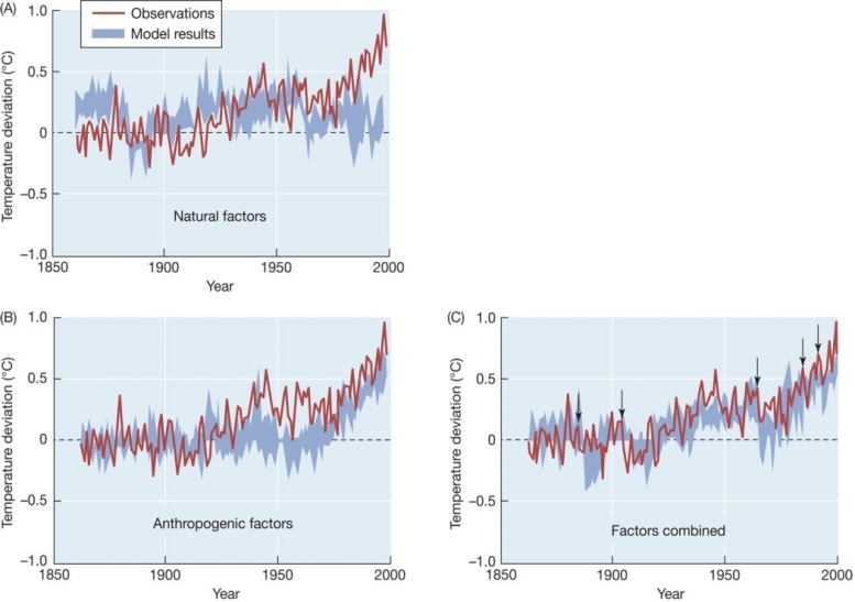
Correct Answer:
Verified
View Answer
Unlock this answer now
Get Access to more Verified Answers free of charge
Q117: Runoff of high- nitrogen substances,such as fertilizer
Q118: Rice cultivation contributes to greenhouse warming through
Q119: At times in the geologic past,five climate
Q120: Is the amount of carbon entering and
Q121: Refer to the graphs below.Given the information
Q122: One prediction about global warming is that
Q123: Refer to the diagram below.What is the
Q125: Two effects of global climate change are
Q126: The Keeling curve has provided more than
Q127: Greenhouse gases,such as CO2 and CH4,are currently
Unlock this Answer For Free Now!
View this answer and more for free by performing one of the following actions

Scan the QR code to install the App and get 2 free unlocks

Unlock quizzes for free by uploading documents