The graph given below compares the GDP of a country with the country's energy consumption.Analyze the graph and identify a statement that is true for the years 1960-2000. 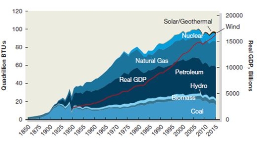
A) The country's GDP has increased with energy consumption.
B) The country's GDP has decreased with energy consumption.
C) Energy derived from coal contributed the most to the GDP.
D) Energy derived from natural gas contributed the most to the GDP.
Correct Answer:
Verified
Q2: Apetates, a food processing company, wants to
Q4: Adam, Ryan, Jason, and Stephen argue about
Q6: Zencorp, an information technology firm, is an
Q7: Kidjois, a plastic toy manufacturing company in
Q8: The energy industry of Zaneland, with the
Q11: Which of the following companies is most
Q15: Which of the following people in Widget
Q16: Instamatic, an information technology company, wants to
Q17: Keyton Tech, an information technology company, reduces
Q19: Unlike analysts on Wall Street, institutional investors:
A)
Unlock this Answer For Free Now!
View this answer and more for free by performing one of the following actions

Scan the QR code to install the App and get 2 free unlocks

Unlock quizzes for free by uploading documents