A newspaper article discussing whether Social Security could be cut offered the information shown in figure. Use the information in these graphs to answer the question. 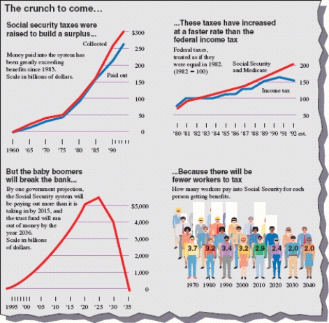 There seems to be an error in the pictograph. What is it?
A) The numbers of people are wrong at the each bar
B) Three-dimensional objects are used to represent linear data
C) There are too many colors in the pictograph
D) The pictograph begins at 1970
E) There are no errors
Correct Answer:
Verified
Q64: The amount of electricity used in a
Q65: The wages of employees of a small
Q66: The graph shows the distribution of scores
Q67: The mean is sometimes called the arithmetic
Q68: Consider the graph and statement shown. Is
Q70: The figure shows a line graph. During
Q71: Consider the graph and statement shown. Is
Q72: Find the three measures of central tendency
Q73: Find the three measures of central tendency
Q74: The wages of employees of a small
Unlock this Answer For Free Now!
View this answer and more for free by performing one of the following actions

Scan the QR code to install the App and get 2 free unlocks

Unlock quizzes for free by uploading documents