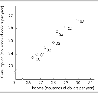
-In the above figure, the axis breaks are used
A) to create a misleading graph.
B) to show that there are no data available for the omitted ranges.
C) to indicate that there are jumps from the origin, 0, to the first values recorded along the axes.
D) to indicate that there are not enough data to be included in the graph.
Correct Answer:
Verified
Q275: Q280: The variable measured on the y-axis increases Q403: You believe that the total amount of Q404: Q405: You notice that when the inflation rate Q406: A positive relationship exists between two variables Unlock this Answer For Free Now! View this answer and more for free by performing one of the following actions Scan the QR code to install the App and get 2 free unlocks Unlock quizzes for free by uploading documents![]()
![]()

