The diagram below shows the supply and demand diagrams for the competitive market for honey in one region.MC0 represents private marginal cost and MB0 represents private marginal benefit. 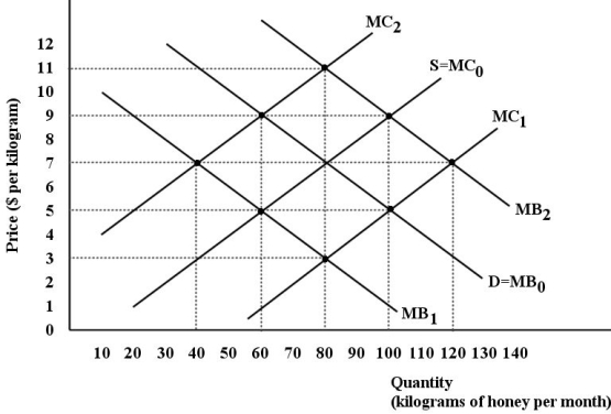 FIGURE 16-3
-Refer to Figure 16-3.Assume there are two types of firms in this region - beekeepers that produce honey and orchard keepers that produce peaches.The bees provide a benefit to the orchard keepers by pollinating their peach trees.In the absence of any government intervention,the equilibrium price and quantity in the honey market are
A) $5 and 60 kg.
B) $5 and 100 kg.
C) $7 and 80 kg.
D) $9 and 60 kg.
E) $11 and 80 kg.
Correct Answer:
Verified
Q41: Why might it be economically efficient to
Q42: The diagram below shows demand and supply
Q43: The diagram below shows demand and supply
Q44: The diagram below shows the supply and
Q45: The diagram below shows the supply and
Q47: An example of a rivalrous good is
A)toxic
Q48: Economists consider a product such as a
Q49: Consider a non-rivalrous good,like national defence,provided by
Q50: If a homeowner uses wood to heat
Q51: A flu vaccine has an associated _
Unlock this Answer For Free Now!
View this answer and more for free by performing one of the following actions

Scan the QR code to install the App and get 2 free unlocks

Unlock quizzes for free by uploading documents