The figure below shows the demand and supply curves for pollution abatement. 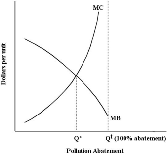 FIGURE 17- 3
-Refer to Figure 17- 3. The MC curve in this diagram is upward sloping because
A) the marginal cost of additional units of pollution abatement is decreasing.
B) the marginal benefit from a given amount of abatement will be higher, the higher the level of pollution abated.
C) the marginal damage generated by additional units of pollution is decreasing.
D) the marginal cost of additional units of pollution abatement increases as the total amount of remaining pollution declines.
E) the marginal benefit from a given amount of abatement will be lower, the lower the level of pollution.
Correct Answer:
Verified
Q94: The diagram below shows the marginal costs
Q95: If residential garbage collection were financed by
Q96: The table below shows the marginal
Q97: The diagram below show the private and
Q98: The diagram below shows the marginal cost
Q100: The marginal benefit of reducing pollution and
Q101: The diagram below shows the marginal cost
Q102: Suppose a competitive market for tradable pollution
Q103: An emissions tax (imposed on each unit
Q104: A paper mill discharges chemicals into a
Unlock this Answer For Free Now!
View this answer and more for free by performing one of the following actions

Scan the QR code to install the App and get 2 free unlocks

Unlock quizzes for free by uploading documents