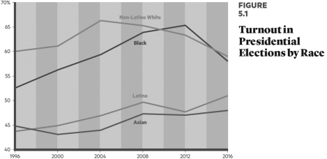
 According to the data in the chart, which one of the following groups voted at the highest proportion in the 2016 presidential election?
A) white Americans
B) African Americans
C) Latino Americans
D) Asian Americans
Correct Answer:
Verified
Q51: Social movements typically succeed
A) fairly quickly.
B) when
Q52: What did the Supreme Court justices do
Q53: What happened when the Supreme Court justices
Q54: What is de jure segregation?
A) policies at
Q55: Before the 1950s, what was the principal
Q57: What is de facto segregation?
A) legal discrimination
Q58: Which one of these events signified a
Q59: What does the Supreme Court's string of
Q60: The poverty rate is roughly three times
Q61: Has civil rights policy been a high
Unlock this Answer For Free Now!
View this answer and more for free by performing one of the following actions

Scan the QR code to install the App and get 2 free unlocks

Unlock quizzes for free by uploading documents