(Figure: Interpreting Aggregate Shifts) The graph shows: 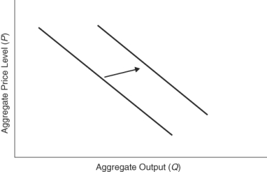
A) a decrease in aggregate quantity supplied.
B) an increase in aggregate quantity supplied.
C) a decrease in aggregate demand.
D) an increase in aggregate demand.
Correct Answer:
Verified
Q18: An increase in aggregate demand can be
Q37: Which set of events would lead to
Q88: Which of the following factors causes a
Q93: Which of the following would cause a
Q95: If Europe has a large increase in
Q96: Which of the following would cause an
Q97: Which of the following sets of events
Q127: In the short run, the aggregate supply
Q133: If oil prices decline, the short-run aggregate
Q230: In the short run, the aggregate supply
Unlock this Answer For Free Now!
View this answer and more for free by performing one of the following actions

Scan the QR code to install the App and get 2 free unlocks

Unlock quizzes for free by uploading documents