(Figure: Interpreting Market Shifts) The graph shows how supply and demand increased between the years 2011 and 2012. The final effect is that: 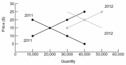
A) only price rose.
B) only quantity rose.
C) both price and quantity fell.
D) both price and quantity rose.
Correct Answer:
Verified
Q27: Two-Buck Chuck wine is an example of
Q44: In the market for cable television, fewer
Q70: If the producers of cotton shirts face
Q96: A decrease in supply causes the equilibrium
Q111: Which scenario is the MOST likely effect
Q221: Which scenario is the MOST likely effect
Q222: (Table) According to the data in
Q231: If the Surgeon General announced that wearing
Q303: An increase in demand causes the equilibrium
Q307: If the demand curve shifts rightward, the
A)
Unlock this Answer For Free Now!
View this answer and more for free by performing one of the following actions

Scan the QR code to install the App and get 2 free unlocks

Unlock quizzes for free by uploading documents