The following graph shows the market demand and average cost curve for electricity (in millions of kilowatts) in an urban centre:
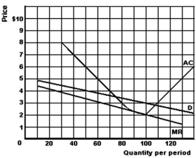
-Refer to the above graph to answer this question.Suppose that the price is $3,and the market is served by two competing firms,each with average costs as shown in the graph and each having 50% of the market.What will be the quantity produced by each firm?
A) 50.
B) 55.
C) 75.
D) 100.
E) 110.
Correct Answer:
Verified
Q71: The following graph gives cost and revenue
Q72: The following graph shows the market demand
Q73: All of the following except one are
Q74: What effect does a lump-sum profit tax
Q75: What is a natural monopoly?
A)A market where
Q77: The following graph gives cost and revenue
Q78: What is the name for a market
Q79: What are public utilities?
A)Goods or services provided
Q80: How do a monopoly lump-sum profits tax
Q81: Define perfect price discrimination.
A)A situation where a
Unlock this Answer For Free Now!
View this answer and more for free by performing one of the following actions

Scan the QR code to install the App and get 2 free unlocks

Unlock quizzes for free by uploading documents