The line chart below shows tomato prices each month from January (month 1) to December last year ($ per pound).By looking at this chart you can see the lowest tomato prices occurred in July. 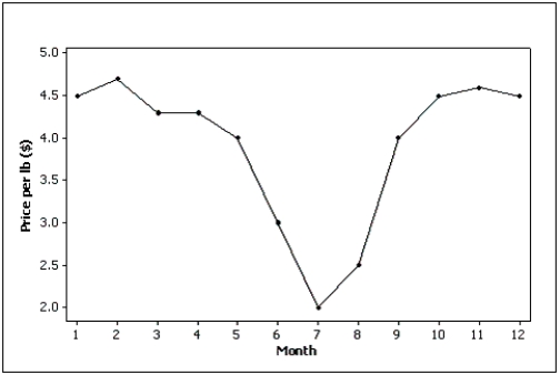
Correct Answer:
Verified
Q62: Internet Classes
A survey of 25 students
Q66: A line chart is created by plotting
Q68: Explain the difference between a histogram and
Q75: Observations that are measured at the same
Q76: Which of the following statements describes a
Q89: The graphical technique used to describe the
Q95: What type of graph depicts the data
Q96: If we draw a straight line through
Q97: The line chart below shows potato prices
Q98: The line chart below shows cucumber prices
Unlock this Answer For Free Now!
View this answer and more for free by performing one of the following actions

Scan the QR code to install the App and get 2 free unlocks

Unlock quizzes for free by uploading documents