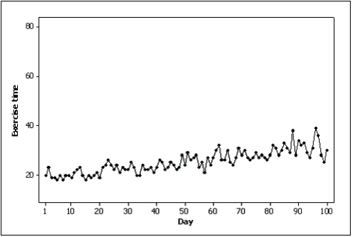
Samantha recorded her amount of exercise time (in minutes) for 100 days.Both of the line charts below were created based on her same data set.Which line chart makes her exercise times look more variable and why? 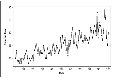
Correct Answer:
Verified
View Answer
Unlock this answer now
Get Access to more Verified Answers free of charge
Q124: Which of the following statements illustrates graphical
Q129: A pie chart showing 80% yes and
Q130: Pie charts only show _,not _.This means
Q136: Is it fair to depict Texas as
Q138: Differences in the frequencies of a histogram
Q141: Slopes and trends in a line chart
Unlock this Answer For Free Now!
View this answer and more for free by performing one of the following actions

Scan the QR code to install the App and get 2 free unlocks

Unlock quizzes for free by uploading documents