NARRBEGIN: Home Care
Home Care
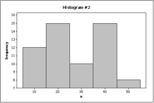
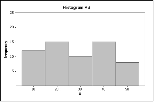
Data are collected on the number of house calls (x) made in a given week by each of 60 nurses in a certain hospital. The same data set is displayed in each of the three histograms below. 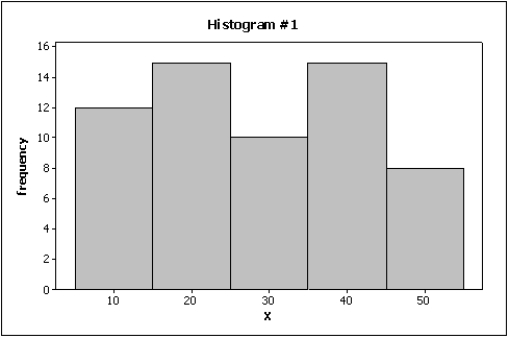
 NARREND
-Below are two line charts where the percentage return for a stock is shown over time. The two graphs are made from the same data set. 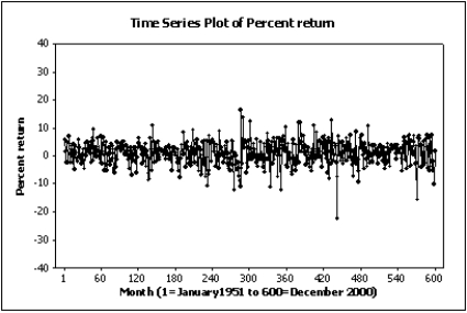
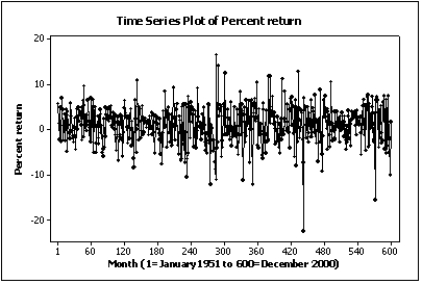 Explain why these two line charts look different.
Correct Answer:
Verified
View Answer
Unlock this answer now
Get Access to more Verified Answers free of charge
Q141: Slopes and trends in a line chart
Q142: Credit Hours The College of Business at
Q146: Home Care Data are collected on
Q148: Credit Hours The College of Business at
Q152: Home Care Data are collected on
Q154: A graph showing trends over time is
Unlock this Answer For Free Now!
View this answer and more for free by performing one of the following actions

Scan the QR code to install the App and get 2 free unlocks

Unlock quizzes for free by uploading documents